This page applies to Apigee and Apigee hybrid.
View
Apigee Edge documentation.
![]()
What does this dashboard tell me?
The Traffic Composition dashboard measures the relative contribution of your top APIs, apps, developers, and products to your overall API program.
Use the report to detect business problems such as lower traffic trends or diminishing contribution from key apps and developers. Based on this data, you can decide what corrective action to take. You can also get early notification of new entities that contribute to API traffic, and take actions to respond — for example, you can determine which new developers are highly contributing and include them in nurturing programs.
The Traffic Composition dashboard
To access the Traffic Composition dashboard:
In the Google Cloud console, go to the Analytics > Developer analysis > Traffic composition page.
The dashboard opens as shown below:

Using the dashboard
The dashboard has a set of dropdown menus that you can use to filter the information shown in the dashboard. The filter dropdown menus are dynamic. For example, if you select a developer from the Developers dropdown, then any proxies, apps, and API products associated with that developer are automatically selected in the other dropdown menus, charts, and tables. For more information, see About filter properties in the Looker Studio documentation.
Use the date selector to pick a start and end date to measure. The date selector only lets you select dates in day increments. You can't select a time range increment that is smaller than a day.
What does this dashboard measure?
This dashboard has two measurement modes, which you select with the Overview and Dimension tabs:
| Mode | Description |
|---|---|
| Overview | Gives you a quick glance at traffic patterns for proxies, developer apps, products, and developers. For example, use this view to see which proxy, app, product, or developer is generating the most traffic. |
| Dimension | Let's you drill in to see a more detailed view of proxy, developer app, product, and developer traffic. |
What the Overview mode tells you
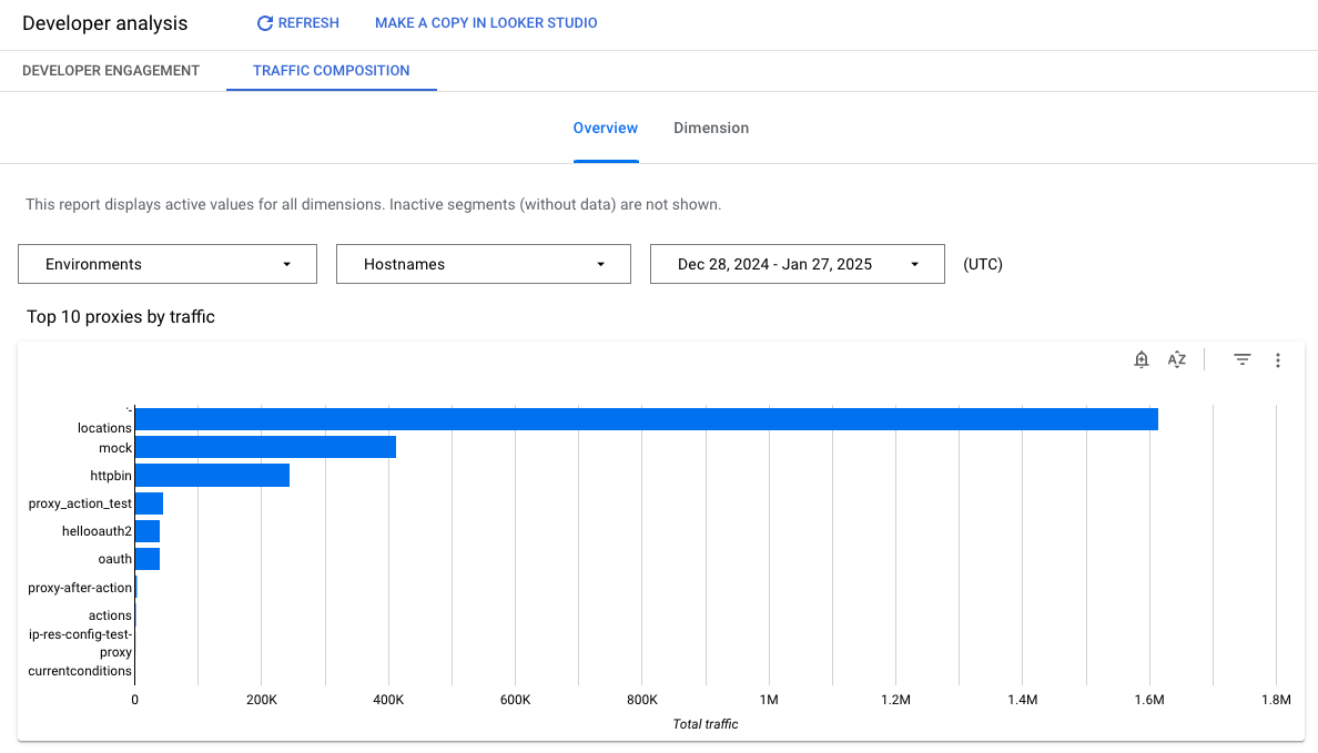
Click Overview to display this mode. This mode presents a set of straight-forward graphs showing traffic patterns proxies, developer apps, developers, and products.
The following figure shows part of the traffic composition overview page:
| Mode | Description |
|---|---|
| Top 10 proxies by traffic | Shows the top 10 proxies measured by API traffic. |
| Top 10 developers by traffic | Shows the top 10 developers measured by API traffic. |
| Top 10 products by traffic | Shows the top 10 products measured by API traffic. |
| Top 10 apps by traffic | Shows the top 10 developer apps measured by API traffic. |
What the Dimension mode tells you
Click Dimension to display this mode. This mode lets you drill in to see traffic pattern details for specific proxies, developer apps, developers, and products.
Details shown in the dimension mode include:
| Metric | Description |
|---|---|
| Traffic over time by proxy | Lets you see the relative traffic contribution of each proxy. |
| Traffic over time by developer | Lets you see the relative traffic contribution of each developer. |
| Traffic over time by product | Lets you see the relative traffic contribution of each API product. |
| Traffic over time by apps | Lets you see the relative traffic contribution of each developer app. |
Make a copy in Looker Studio
You can edit, save, and share a copy of the dashboard in Looker Studio. To get started:
- Click Make a copy in Looker Studio.
- From the dropdown menu, select the report you wish to copy.
- In Looker Studio, click Save and share.
- Click Acknowledge and save.
You can now edit the copy saved in your user account. For details on using Looker Studio to edit and create reports, see the Looker Studio documentation.
