이 페이지는 Apigee 및 Apigee Hybrid에 적용됩니다.
Apigee Edge 문서 보기

API 모니터링 최근 뷰에 프록시별로 API 트래픽의 트리맵이 표시됩니다.
최근 뷰에 액세스하려면 API 모니터링 액세스의 단계를 수행하고 최근을 선택합니다.
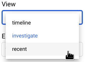
다음 그림에서는 최근을 선택한 경우의 UI를 보여줍니다.
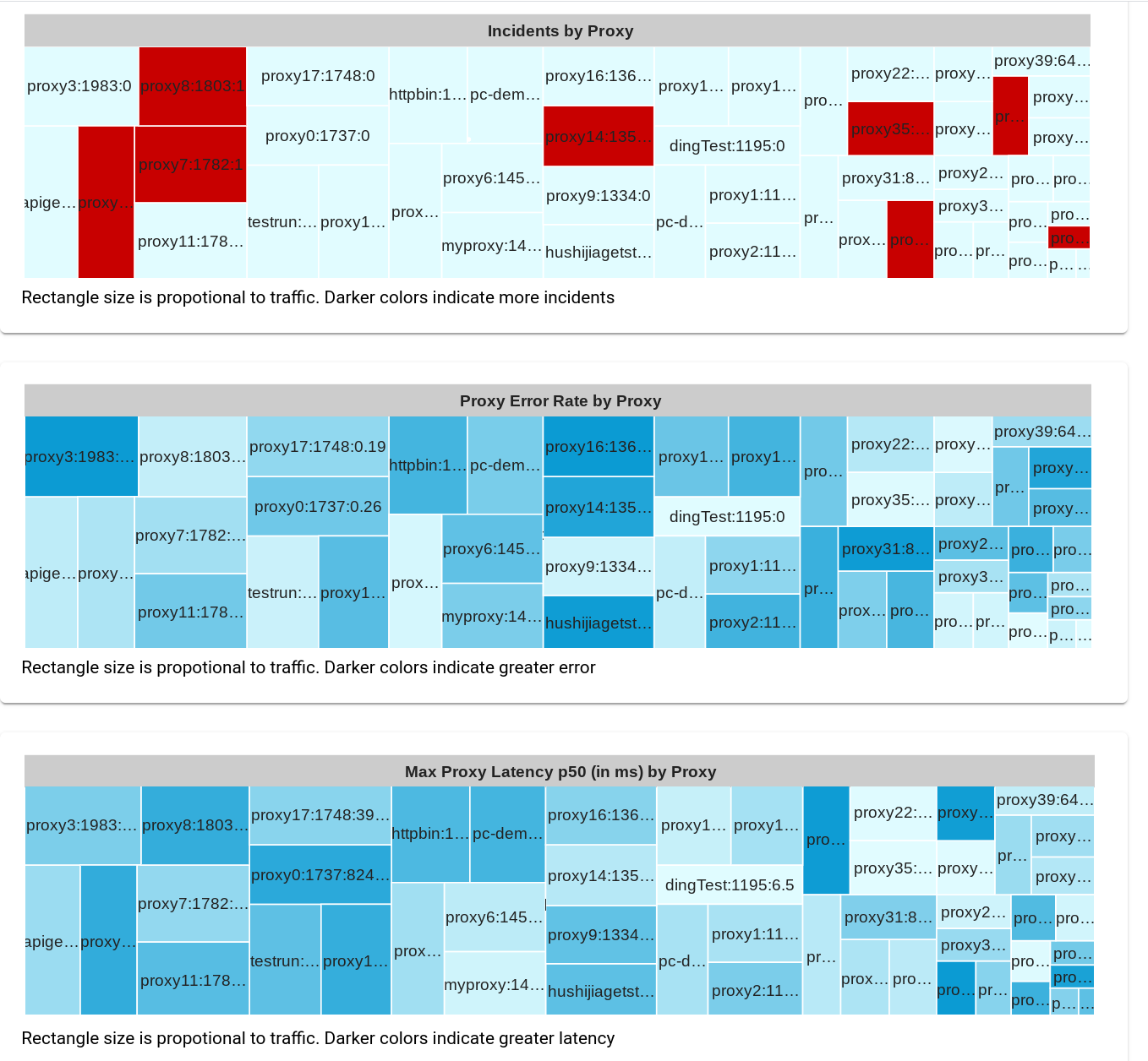
최근 뷰에는 각 프록시의 API 트래픽이 직사각형으로 표시되며 크기가 프록시의 트래픽 양에 비례하는 트리맵 3개가 표시됩니다. 직사각형 색상은 보고 있는 트리맵에 따라 다음 변수 중 하나의 상대적 크기를 나타냅니다.
- 알림에 의해 트리거된 이슈 수
- 오류율
- 최대 지연 시간 50번째 백분위수
직사각형 색상을 무시하면 그래프 3개 모두 동일한 기본 패턴의 직사각형을 표시합니다. 이는 각 프록시의 직사각형 크기가 트래픽에만 의존하기 때문이며, 이는 세 가지 그래프 모두에서 동일합니다.
예를 들어 두 번째 그래프인 프록시별 프록시 오류율에는 각 프록시에 대한 오류율의 상대적 크기가 표시됩니다. 직사각형 색상이 짙을수록 오류율이 커집니다. Apigee UI에서 프록시의 오류율 값을 보려면 커서를 프록시의 직사각형 위로 이동합니다. 다음 예시를 참조하세요.
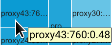
직사각형의 텍스트는 다음과 같은 proxy43의 데이터를 표시합니다.
- 총 트래픽: 760
- 오류율: 0.48
proxy43의 오류율은 모든 프록시 중에서 가장 크므로 그래프의 파란색 직사각형 중 음영이 가장 진합니다.
기본적으로 최근 뷰에는 테이블 3개가 표시됩니다.
- 프록시별 이슈
- 프록시별 프록시 오류율
- 프록시별 최대 프록시 지연 시간 p50(밀리초)
타임라인 뷰와 마찬가지로 그래프 메뉴에서 표시할 테이블 조합을 선택할 수 있습니다. 다른 모든 그래프 옵션은 타임라인 뷰와 동일합니다.
셀 데이터 분포 자세히 살펴보기
조사 뷰와 마찬가지로 셀을 클릭하면 개별 테이블 셀의 데이터를 보다 세부적으로 볼 수 있습니다. 이렇게 하면 오른쪽 패널에 여러 가지 속성에 따른 셀 데이터 분포가 표시됩니다. 자세한 내용은 셀 데이터 배포 보기를 참조하세요.