This page describes the options for editing single value charts in the visualization menu. Click Edit in the upper right corner of the visualization tab.
A single value visualization always displays a value from the first row. You can use sorting and filtering so that the desired data is in the first row.
If your query has multiple fields, you can hide fields from the visualization that you don't want displayed. If your query has multiple unhidden fields, the single value visualization will use the following priority order to choose which field to display:
- The leftmost measure
- The leftmost table calculation based on a measure
- The leftmost dimension
- The leftmost table calculation that does not involve a measure
When several single value visualizations appear on a dashboard, each visualization defaults to using the same font size for a consistent appearance. However, single value visualizations automatically resize fonts when a tile size is reduced. If the font for a visualization cannot show the entire value in the space available, then the value is truncated by an ellipsis (...).
Options that are listed in the menu may be grayed out or hidden when they conflict with other settings that you have chosen.
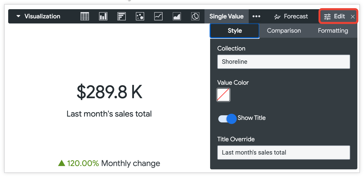
Style menu options
Collection
Choose a color collection from the Collection drop-down menu. A collection lets you create themed visualizations and dashboards that look good together. You can see all the palettes in each of Looker's built-in color collections on the Color collections documentation page. Your Looker admin may also create a custom color collection for your organization.
Value Color
You can set the color of the single value visualization. The default is dark gray.
When you click the color swatch under Value Color, Looker displays a color picker where you can select a color, input a hex string like #2ca6cd, or input a CSS named color string like mediumblue.
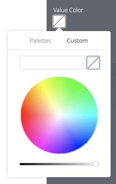
You can also pick one of the colors from the color collection that you selected in the Collection drop-down. To do so, click the Palettes tab on the color picker to scroll through the categorical palettes in that collection.
Looker will use the selected color for single value visualizations both with and without hyperlinks.
Depending on your needs, consider using the following alternate techniques:
- The desire to change font color is often related to showing good or bad results. This can be best handled by turning on the Show Comparison option and choosing Show as Change.
- To change the font color for a particular field's value everywhere, including the data table, a LookML developer can add a
htmlparameter to the field definition.
Show Title
You can determine whether a title displays under the number. For a saved Look, the default title is the name of the Look. You also can specify a different title using the Title field.
Title Override
You can specify a title to display with the value. This field is available when Show Title is on. For a saved Look, if this field is left empty, the title defaults to the name of the saved Look.
Value Format
You can specify the format of the value, independent of the underlying dimension or measure. The field accepts Excel-style formatting. If no formatting is specified, the value displays in the format of the underlying dimension or measure.
MS Excel's complete guide details how to specify these formats in their documentation. However, color formatting is not currently supported in Looker.
For Looker developers: The formatting used in the Value Format field is the same as formatting that is used with the
value_formatLookML parameter, except that thevalue_formatparameter requires the formatting string to be enclosed in double quotes. In the Value Format field, the formatting string is not enclosed in quotes.
The Adding custom formatting to numeric fields documentation page provides more information on how to use custom formatting.
Comparison menu options
Show Comparison
You can use a second field to add comparison information to your single value visualization. In general, the comparison value uses the next field that would be displayed as the single value visualization. If there is no other field in the first row to compare with, a field in the next row is used for comparison. You can affect which field displays by changing the order of fields or choosing Hide from Visualization for fields that you want to skip.
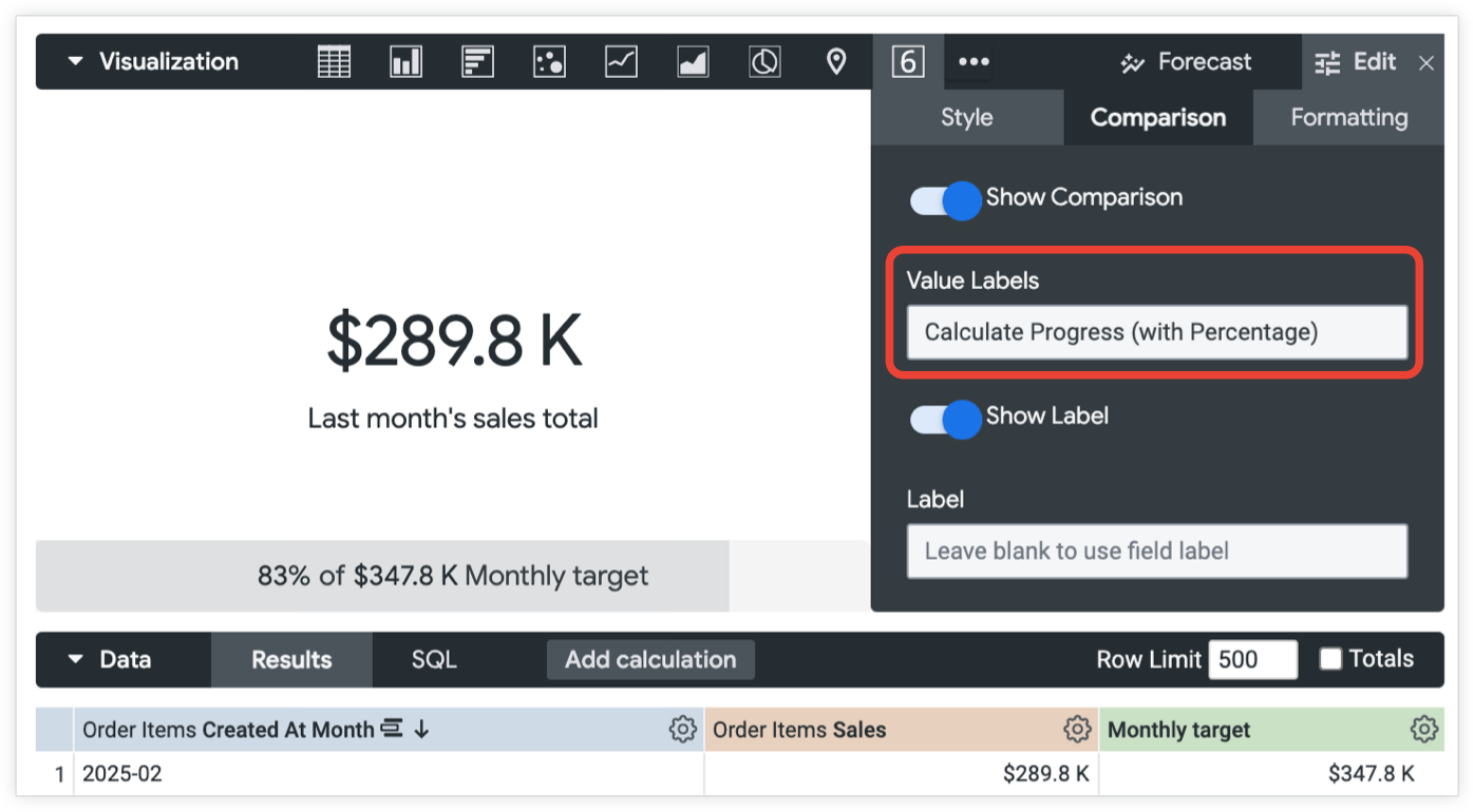
Value Labels
You can specify how the comparison field is used in the single value visualization:
Show as Value — The value of the comparison field displays at the bottom.
Show as Change — The value of the comparison field displays at the bottom. If the value is negative, a triangle points downwards. If the value is positive, the triangle points upward. By default, a negative number displays in red with a red triangle and a positive number displays in green with a green triangle. These colors can be changed using the Positive Values Are Bad field. Looker does not automatically calculate any rate of change when you use this option; it uses the raw value that you provide. Therefore, you must choose a field or create a table calculation to provide the value.
Calculate Progress — The value of the field used for the single value visualization is divided by the comparison field's value. This percentage displays as a progress bar.
Calculate Progress (with Percentage) — The value of the field used for the single value visualization is divided by the comparison field's value. This percentage displays as a progress bar. The bar is labeled with the percentage and the value of the comparison field, such as
83% of $347.8 K. If Show Label isOn, then the progress bar also shows the label for the comparison field, such as83% of $347.8 K Monthly target.
Positive Values Are Bad
Positive Values Are Bad specifies the text and triangle colors that display for the comparison field. When Positive Values Are Bad is turned on, Looker displays the negative numbers as green text with a green triangle, while positive numbers appear as red text with a red triangle. This parameter is only available when the Style is set to Show as Change.
Show Label
You can determine whether a label is shown with the comparison field. By default, the label is the name of the comparison field.
Label
You can provide a different label to the comparison field's name. This option is only available when Show Label is on.
Formatting menu options
Turn on Enable Conditional Formatting to define rules that color code your visualization by specifying values that are of interest.
Selecting a color collection
A collection lets you create themed visualizations and dashboards that look good together. All of Looker's built-in color collections appear on the Color collections documentation page. Your Looker admin may also create a custom color collection for your organization.
You can choose a color collection from the Collection drop-down menu. The palettes that appear for the color swatches in each rule come from that collection.
Defining formatting rules
You specify how to color code your visualization in the Rules section of the Formatting tab. For example, you can create a conditional formatting rule that applies a purple background to the visualization if the value is between 9,999 and 12,000.
When you first enable conditional formatting, there will be one rule, set to the default of If value is equal to and the background color is set to the first color of the first categorical palette in the collection you selected.
Format
Click the Format drop-down to begin customizing the rule.
The Format drop-down provides options such as equal to, not equal to, greater than, less than, between, not between, null, and not null.
Format value ranges such as between, not between, greater than, and less than are exclusive of the numbers listed at the boundaries of that range. For example, if you set a rule with a range If value is between 9 and 14 the rule applies to values 10 through 13.
When you enter values into the rule, don't use thousands separators.
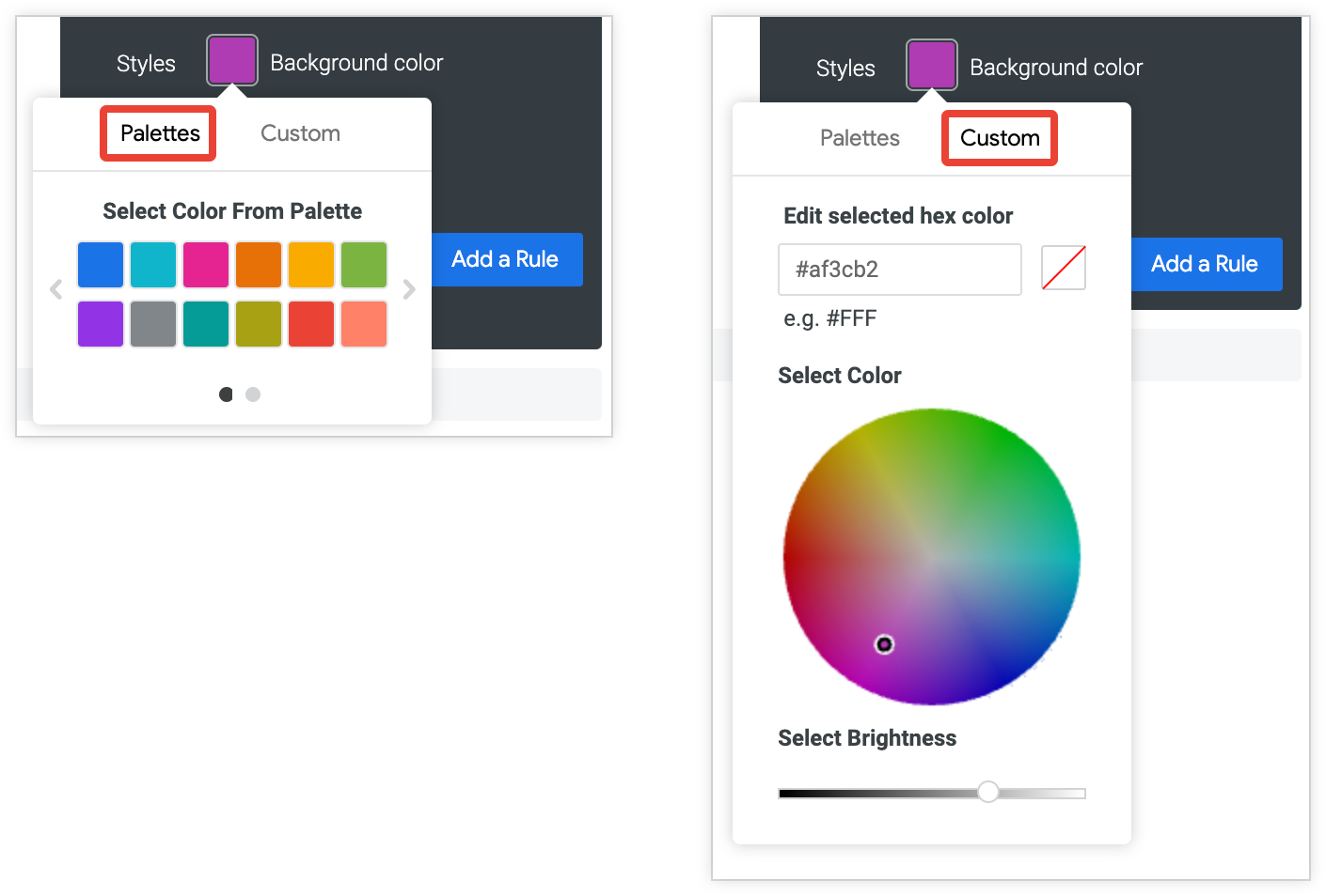
Styles
Click the color swatches next to Background color or Font color to pull up the palette picker, which lets you pick or customize a color:
- To pick a color from a palette, click the Palettes tab of the palette picker, and then use the left and right arrows to scroll through the available palettes. Select a color by clicking on a color in one of the palettes.
- To select a custom color, click the Custom tab of the palette picker, and then either use the color wheel and value slider to choose a custom color, or enter an RGB hex string, such as
#2ca6cd, or CSS color names, such asmediumblue, into the input field.
Multiple rules
You can have multiple rules for conditional formatting:
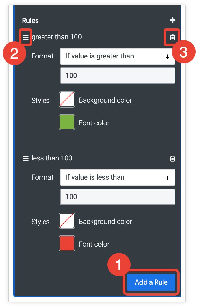
- To add an additional rule, click Add a Rule.
- If you have more than one rule, the rules that are higher on the list have precedence over the rules that are lower on the list. To change the precedence of a rule, click the three horizontal bars at the top left of that rule and drag the rule higher or lower in the list.
- To delete a rule, click the trash can icon delete in the top right corner of that rule section.