Data visualization refers to any visual representation of compiled information. With an effective data visualization, you can communicate key themes and results to your audiences, empowering them to interpret and analyze data that has been customized for their needs. Before you can begin creating visualizations and graphs, you need to select the type of visualization you will use. Selecting the appropriate visualization type helps you present your data clearly and effectively, allowing your audience to make informed decisions and determine next steps. The following sections describe how data can be effectively visualized in a way that centers on both your analytic objectives and your audience's perspectives:
- Consider the characteristics of your data
- Define your audience
- Select the best visualization for your data
Consider the characteristics of your data
Before you decide on a visualization type, consider the characteristics of your data:
Categorical: When your data contains groups of similar patterns and sets, using a visualization type that best supports categorical data, such as a pie chart, is effective. Product category would be an example of categorical data, as it groups items based on similar functions and features.
Ordinal: If your data requires a specific ordered sequence, using a visualization such as a column chart or bar chart can define these orders for the audience. An example of ordinal data would be the numbers of varying starred reviews for a particular product.
Continuous: If you want to visualize data that occurs over a long period of time, use visualizations that support continuous data, such as progression charts. Total product sales over a particular quarter would be an example of continuous data, since evolving data is tracked over time.
Define your audience
An effective visualization considers not only the data but also the perspective and needs of its audience. Customizing a visualization's appearance allows you to convey information effectively to your specific audience. When you define your audience, think about factors like their likely level of technical knowledge and their job functions. How will your audience use your visualization?
Accessibility
When you create a data visualization, make it accessible. Throughout any data visualization project, considering web accessibility provides increased sharing opportunities for all users, including those with visual and cognitive disabilities, who will engage with your created content. The Web Content Accessibility Guidelines (WCAG) include implementation steps for increased accessibility that are applicable to visualization design, including:
Alternative text: Alternative text, or alt text, allows a larger audience to access information from non-text elements, such as people who use screen readers. With Looker, you can add notes to your visualizations that describe key aspects of your visualization. To learn more about adding text descriptions to elements of Looker visualizations, see the information about editing a tile note on the Editing user-defined dashboards documentation page.
Contrast and color accessibility: Incorporating contrast levels that meet the WCAG international standard ensures that perceived differences in color choices are accessible to viewers of the visualizations. To find the contrast ratio of two selected Hex Color codes, see the Contrast Checker from WebAIM. In Looker, the Dalton color collection accommodates specifically for various forms of color deficiency. To learn more about this collection and other color selection options in Looker, see the Color collections documentation page.
For more information about accessibility in creating visualizations and other content, see the latest published version of the Web Content Accessibility Guidelines.
Select the best visualization for your data
The following sections provide an overview of available visualization types in Looker and discuss how to select the best type for your data:
Cartesian charts
A Cartesian chart refers to any chart that is rooted in the Cartesian plane. The Cartesian plane is defined by an x-axis and a y-axis, with corresponding numerical points for all locations on the graph. All Cartesian charts plot data on these axes.
The x-axis and y-axis reflect dimensions and measures. Dimensions reflect values that are qualitative, while measures are quantitative in nature. How these values are charted across the x-axis and y-axis and the visualized expression of this data varies by Cartesian chart type. This section includes the following examples of Cartesian charts:
Column
Best for visualizing data with few categories to compare.
Column charts are vertical Cartesian charts that display information in rectangular, vertical shapes, where the length of the column corresponds to the data value. Typical column charts include data categories on the x-axis and data values on the y-axis.
If your data contains only a couple of categories, a column chart is ideal. If your data contains a larger number of categories, bar charts often work better because they provide more space for axes labels. Because negative values are displayed with a downward direction, column charts can also be a useful way to depict datasets that include negative values.
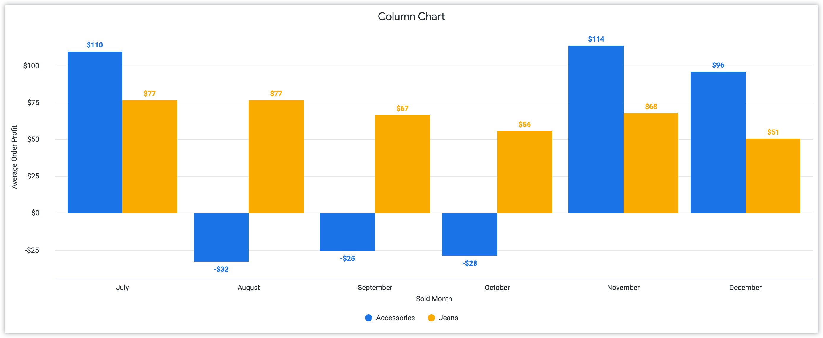
The following example of a column chart includes both positive and negative values to display average order profit for both accessories and jeans sold per month.
See the Column chart options documentation page for more information about creating these charts in Looker.
Bar
Best for visualizing data with long category titles.
Bar charts display data in a similar way to column charts, but through horizontal alignment. Commonly in bar charts, the y-axis represents a data category, while the x-axis represents a numerical value.
If your data contains particularly long category titles, bar charts would be favorable over column charts. Through the alignment on the y-axis, the labels on bar charts optimize space and improve readability. Additionally, bar charts are typically better at representing larger amounts of categories due to spacing alignment as opposed to column charts.
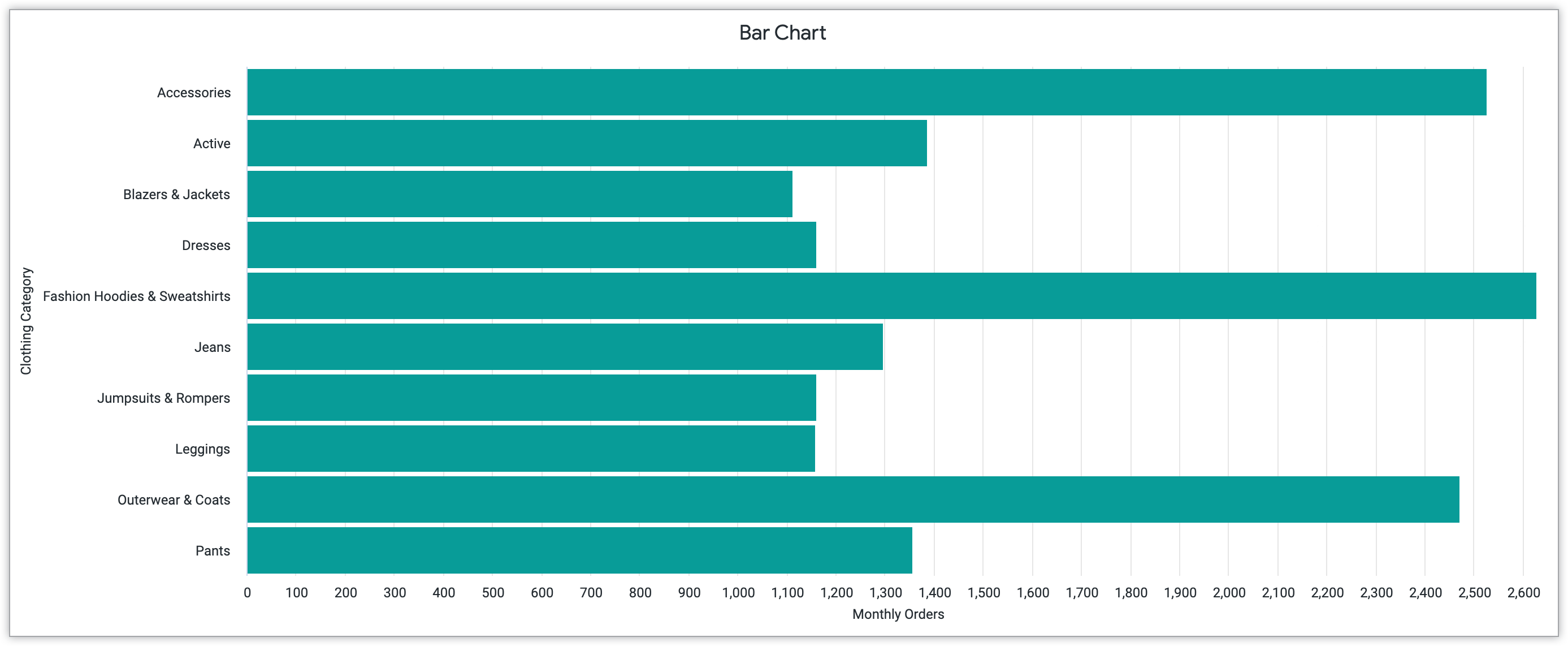
The following example of a bar chart highlights how longer clothing category titles, like "Fashion Hoodies & Sweatshirts" fit on bar chart alignment. This chart shows the amount of monthly orders for 10 separate clothing categories.
To learn more about creating bar charts in Looker, see the Bar chart options documentation page.
Scatterplot
Best for highlighting correlation between two variables.
A scatterplot chart is a form of Cartesian chart that highlights the relationship between two variables. Each plotted point represents a value on the x-axis and y-axis that provides insight about the data. These types of charts particularly highlight trends and patterns that emerge in data.
If your data contains two variables that correlate, a scatterplot can be an ideal visualization method to find and explore correlations. This could be positive correlation, which means that while the x variable increases, the y variable increases. This could also include negative correlation, meaning that while one variable increases, the other decreases. Correlation can also be null, meaning that there is no correlation between the two chosen variables. Awareness of potential data correlation can lead to greater insight about your data and can even guide predictions of future data behavior.
The layout and structure of a scatterplot are key to its effectiveness. The plotted points on scatterplots can also be customized through sizing and color use to identify additional variables or categories for the viewer. Trend lines can also be used with scatterplots; these lines highlight connections between the data that emerge for the viewer. Through customization, ensure that these design choices highlight the overall goal of illustrating a relationship and providing a chance to examine potential patterns, correlations, and trends.
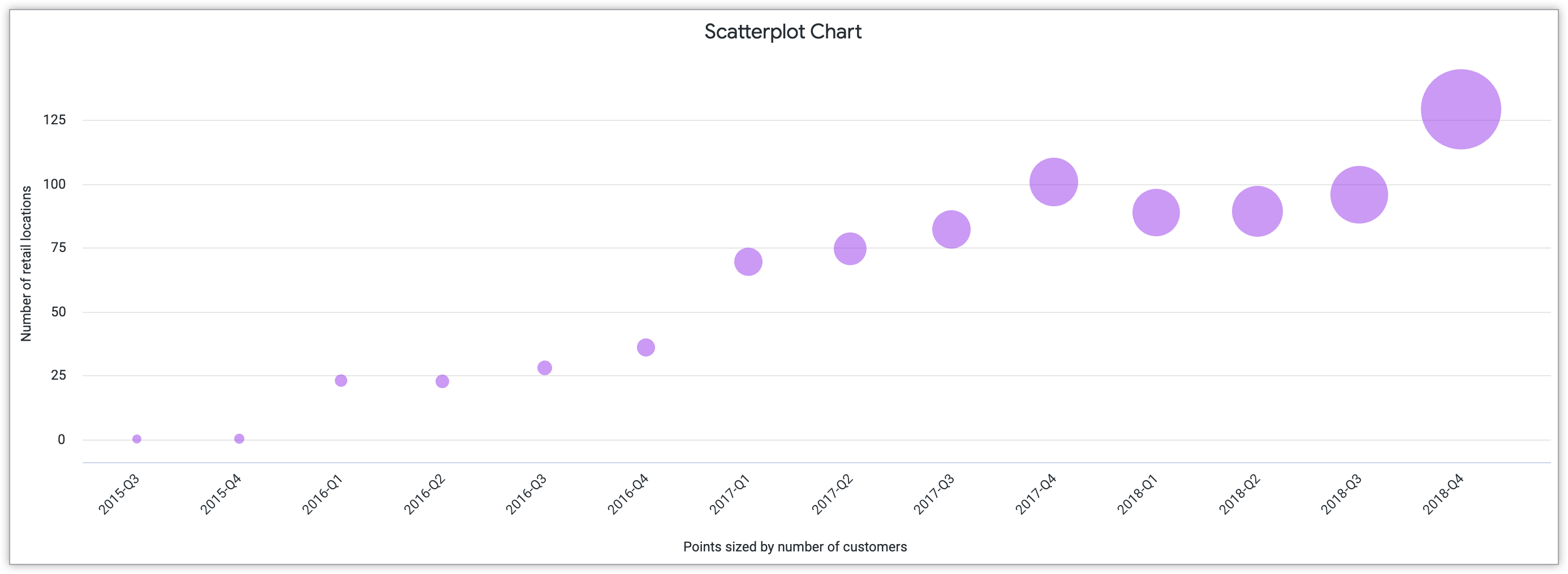
The following scatterplot chart represents the number of customers who frequented locations quarterly from 2015 to 2018. The points on the chart are sized by the number of customers.
To learn more about this type of Cartesian visualization, see the Scatterplot chart options documentation page.
Line
Best for visualizing continuous data over time.
In a line chart, data is displayed through a series of points connected by a straight line. This visualization type specifically highlights continuous data over time.
For clarity in your line chart, the amount of lines present remains key. If you're including multiple lines in your chart, use colors to clearly differentiate between the lines. This will allow the viewer to interpret the values separately rather than merging the lines.
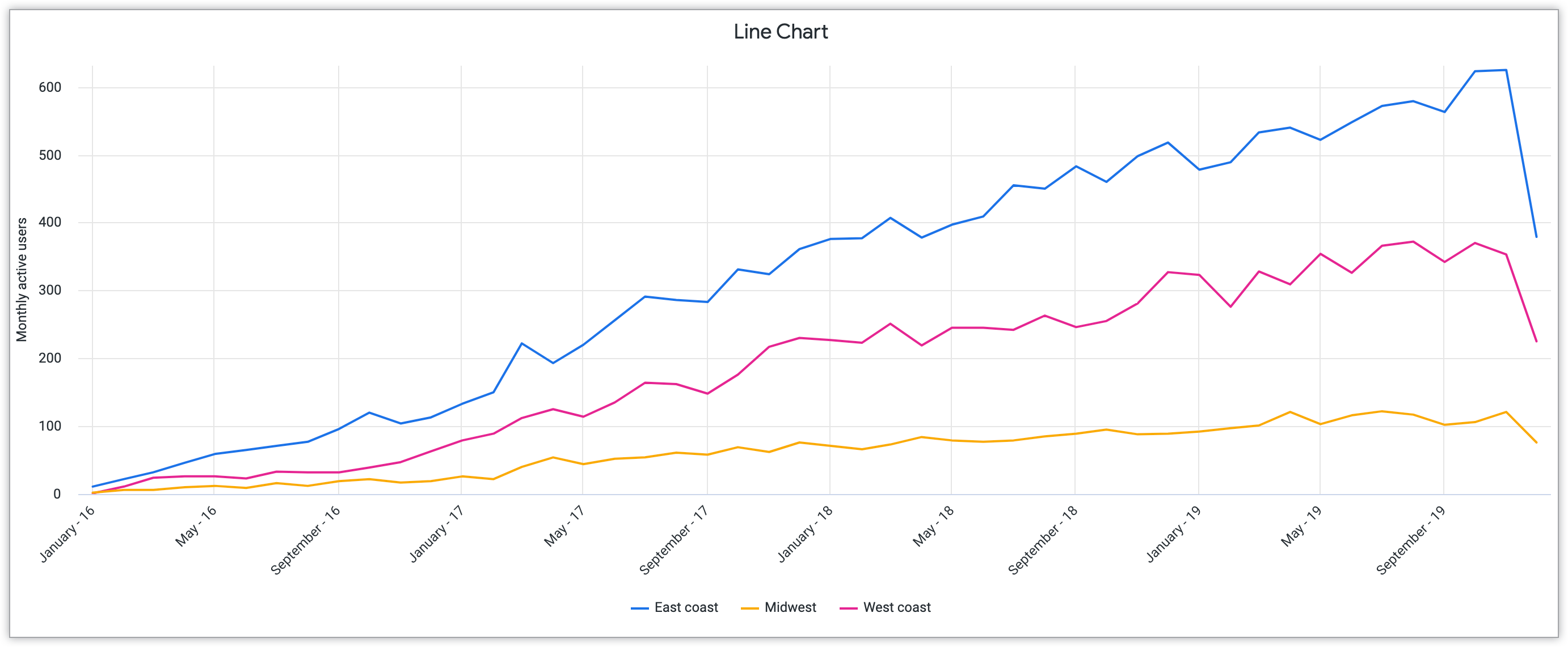
The following line chart represents monthly active website users from 2016 to 2019. The three separate lines represent regions in the United States: the East Coast, Midwest, and West Coast.
See the Line chart options documentation page to learn more about creating a line chart in Looker.
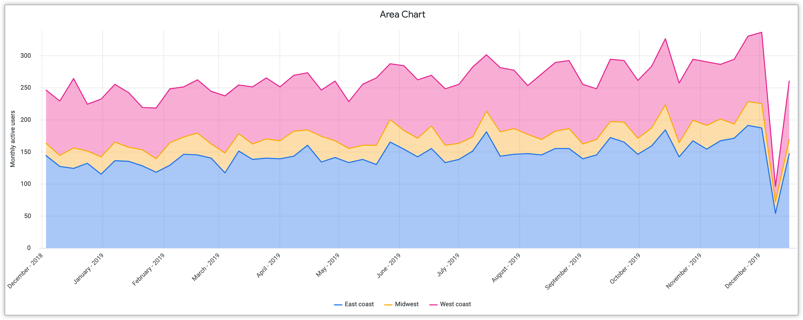
Area
Best for visualizing shifts in quantities over time.
An area chart builds upon characteristics of other Cartesian charts, the bar chart and the line chart. Like line charts, area charts highlight continuous data over time in a linear formation. However, these charts utilize a filled color feature similar to a bar chart to display quantity through the data. This allows for the viewer to clearly see how quantities adjust over time.
Area charts convey overall trends rather than individual data points. Area charts are better when you are comparing a smaller number of trends, due to the color-filled area components. For highlighting data with larger amounts of trends, consider using a line chart instead.
The following area chart mirrors the line chart visualization example by also showing monthly website users across regions in the United States. However, the filled color in this chart particularly highlights the shift in quantities of users from 2018 to 2019 specifically.
To learn more about area charts in Looker, see the Area chart options documentation page.
Pie and donut charts
Pie and donut charts emphasize the relationship between parts to a whole proportion in data. For this reason, they work well to highlight categorical information, meaning information that can clearly be divided into groups based on shared characteristics.
To best highlight the information in the pie and donut charts, select five or fewer categories. If your categories exceed five, consider selecting a different visualization type to highlight the information, such as a bar or column chart.
As a pie or donut chart represents a whole percentage, the values of the categories must add to 100 percent.
Looker offers two variations of a pie chart. This section describes the following charts and highlights their strengths in displaying categorical data:
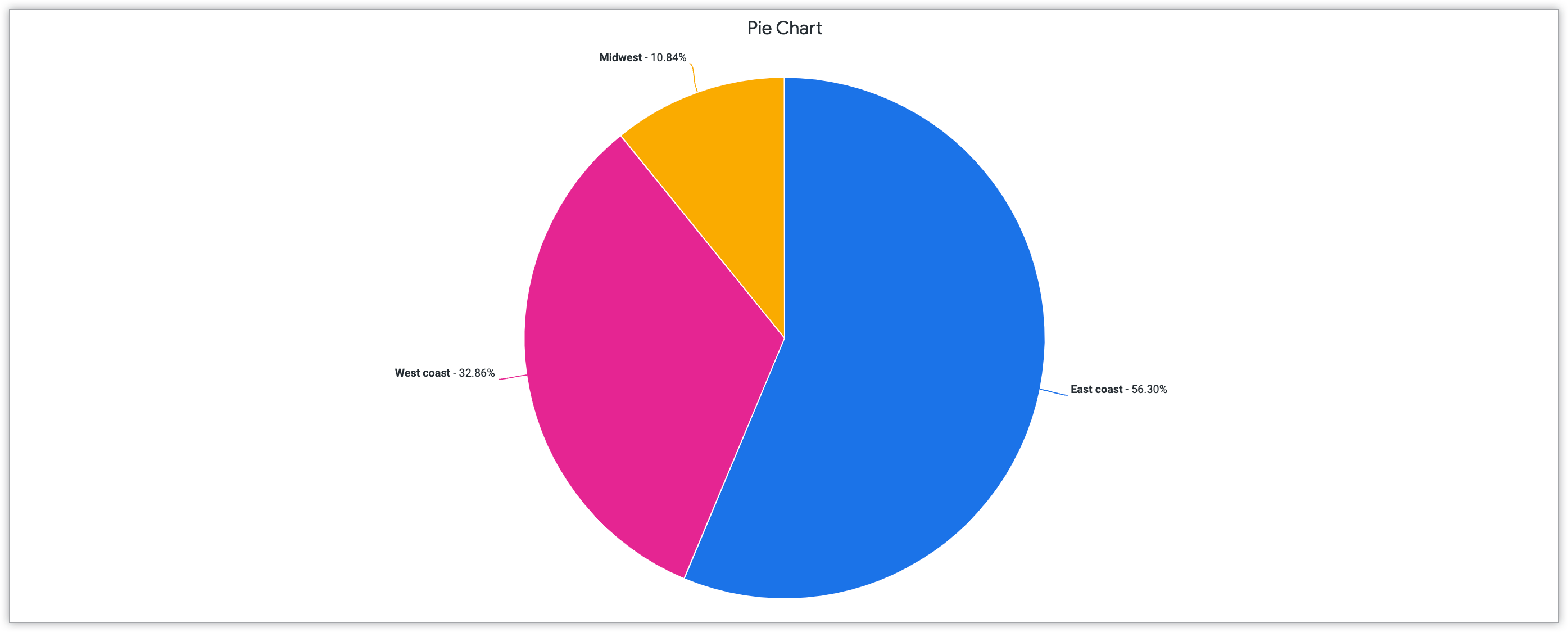
Pie
Best for visualizing proportional values.
A pie chart refers to a complete circular chart that is divided into slices based on categories of information. Through these slice divisions, a focus becomes not specifically on the exact percentage amount, but on how the outlined proportions relate to each other and impact the overall goal of the chart.
If you are working to emphasize the importance of the connections between proportional values, pie charts effectively communicate these relationships. If you are working with more than five categories of data, consider selecting a different visualization chart to highlight the information, such as a bar or column chart. With bars and column charts, it is often easier for viewers to perceive individual differences.
The following pie chart represents the percentages of total customers from three regions in the United States: the East Coast, West Coast, and Midwest. This visualization type communicates the proportional amount of customers from each region.
See the Pie chart options documentation page to learn more about creating these comparison charts in Looker.
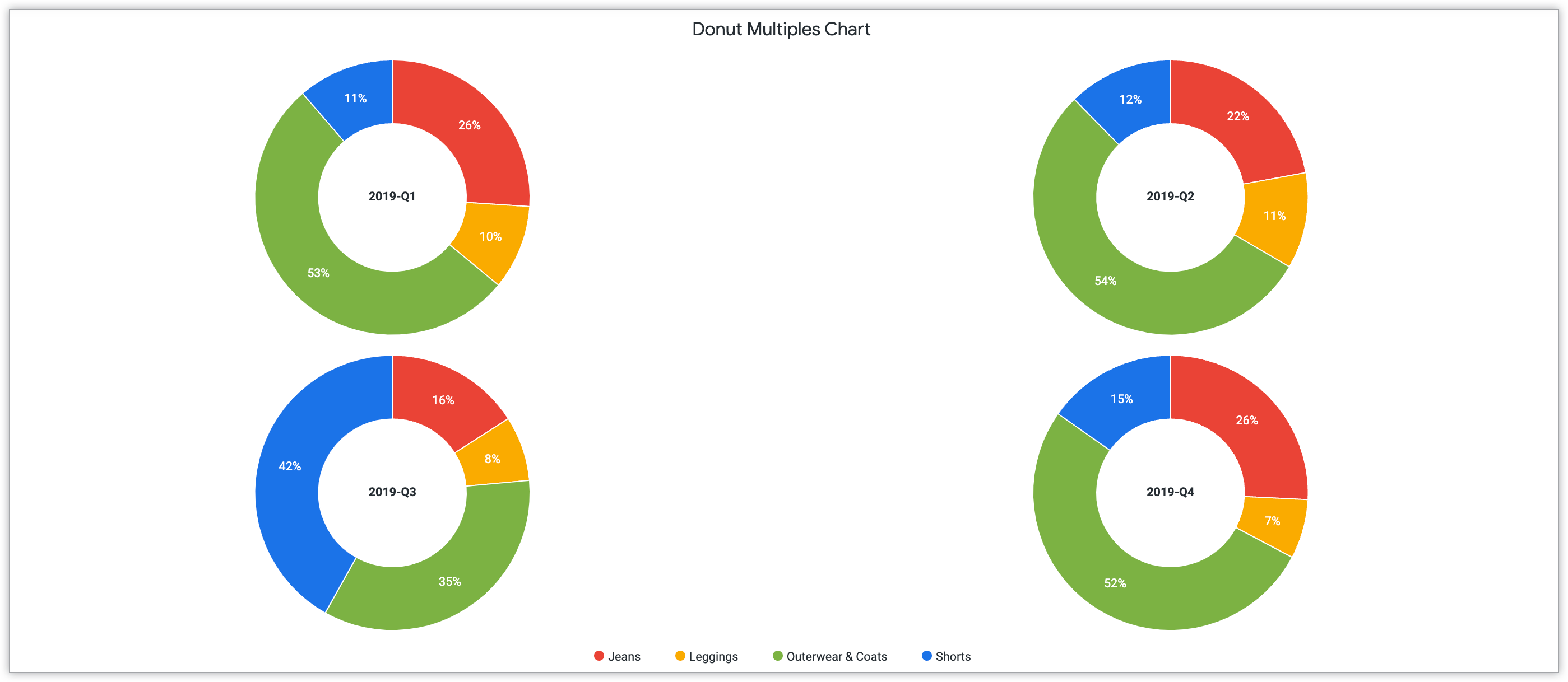
Donut Multiples
Best for visualizing proportional values with multiple components.
Donut multiples let you create a series of donut charts to visualize your data in an interconnected formation. These charts omit the center of the circle, forming arc divisions instead of slice divisions. The added blank space in the middle of the chart allows for further labels and descriptions of your data.
When you create donut multiples charts, make sure there is uniformity and cohesive patterns across categories to highlight their relationship. Additionally, to ensure clarity and viewer understanding, include clear, cumulative material in the center of the chart to highlight the nuance of each particular donut multiples chart.
The following donut multiples chart shows quarterly product sales for multiple categories of clothing: jeans, leggings, outerwear and coats, and shorts. There is a separate donut chart for each quarterly sale. This visualization highlights how each individual clothing category, represented by a uniform color, contributes to overall product sales per quarter.
To learn how to include donut multiples charts in Looker, see the Donut multiples chart options documentation page.
Progression charts
Progression charts highlight information that appears over time. Through these charts, you can highlight this context and how it impacts the data. Progression charts track overall progress and growth. This section contains examples of the following progression charts:
Funnel
Best for visualizing sequential stages.
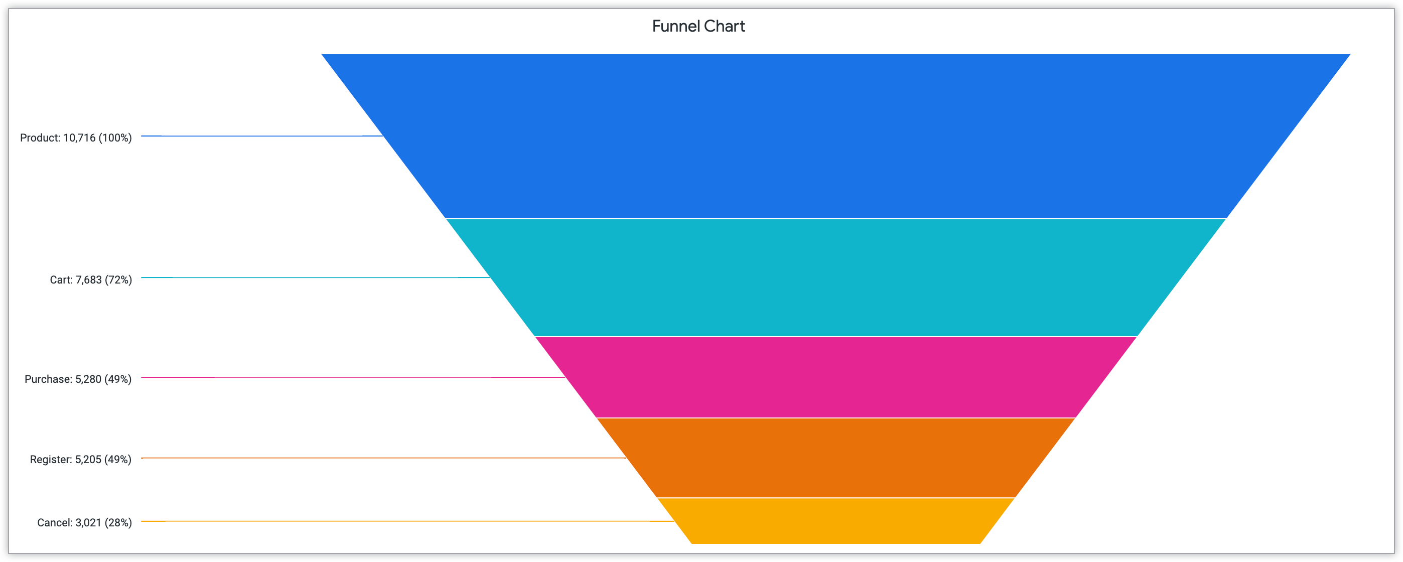
Funnel charts are progression charts that highlight sequential stages. This type of chart has similarities with bar charts, which also represent data through horizontal, rectangular visualizations. This chart creates a funnel shape through the stacked visualizations.
For an effective funnel chart, make sure that the data includes at least four stages. This will ensure a strong visual impact and highlight the process represented as a whole. If you have fewer than four components, consider using another type of visualization, such as a pie chart.
The following funnel visualization highlights five separate stages of customer actions and the percentage values at each stage. The stages, in descending order, are product, cart, purchase, register, and cancel, representing the customers' engagement with the product.
See the Funnel chart options documentation page to learn more about creating this visualization in Looker.
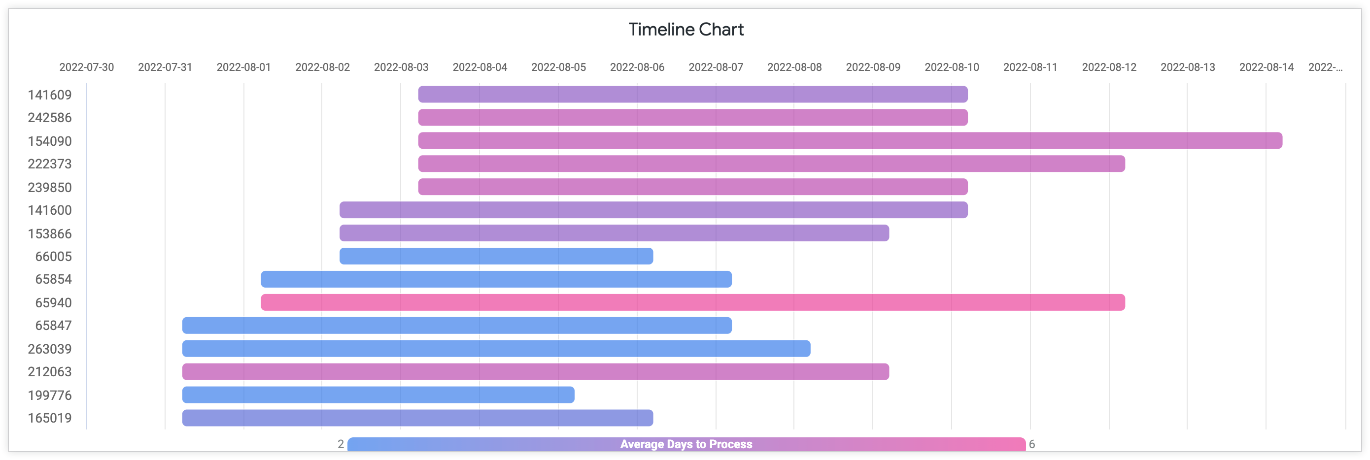
Timeline
Best for visualizing progression of time.
Timeline charts highlight the progression of time by including key events and markers over a set duration. While timeline charts often relate to time, this chart structure can also be applied to numbers and amounts as well.
With the customization of color, multiple timelines can be used on one graph to show how multiple factors vary through progression. For timeline patterns, specifically in Looker, color customization can vary by pallete. Your timeline can have a continuous palette, which reflects a gradient option with two variables on either portion of the gradient. You can also have a categorical palette, meaning that each color represents a category in the data. You can learn more about this color customization and timeline charts in the Timeline chart options documentation page.
The following timeline visualization represents specific order ID numbers and their respective average days to process over months in 2022. The timeline uses a continuous gradient pallette to represent the varying numbers of days.
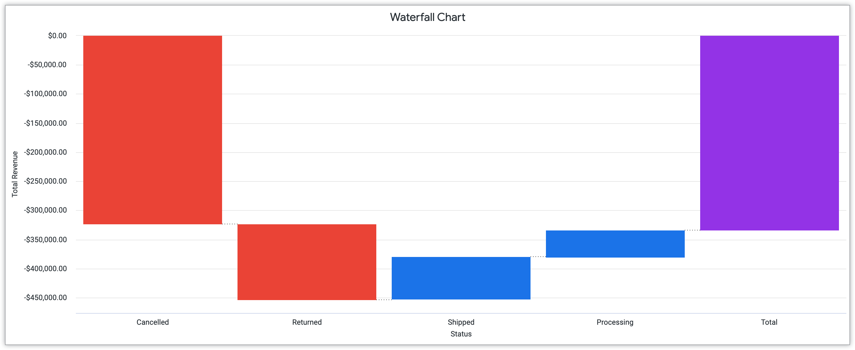
Waterfall
Best for visualizing sequential positive and negative values.
Waterfall charts highlight the relationship between positive and negative values through a sequence. These charts show how a starting value evolves due to various factors. Waterfall charts mirror design elements of a bar chart. Like many other visualization types, time-based markers or category-based markers can structure waterfall charts, depending on your particular dataset.
As waterfall charts work specifically with positive and negative values, clear definition between these two categories is essential. Through color use and text labels, make sure that the visualization clearly differentiates the values in your data.
The following waterfall chart example shows total revenue across stages of the ordering process, including cancelled, returned, shipped, and processing. There is also a total amount calculated.
See the Waterfall chart options documentation page for further details about this visualization type.
Text and tables
When you have meaningful text data to display, selecting text and table displays will highlight the impact of the words. The display of these words can vary — from highlighting a single value to displaying a complex arrangement of words throughout a dataset. This section includes some of the many examples of types of visualization for text and tables:
Single Value
Best for visualizing an isolated piece of data.
A single value chart highlights an individual value from a dataset. Visualizing a value in this way highlights its significance and importance to a larger dataset.
When creating a single value chart, select a value that has significance to the audience and reflects your goals for the visualization. Additionally, ensure that the font family and size customization emphasize the value rather than distracting from or minimizing the data.
The following single value example highlights the number of yearly customers from California, which is 118,126 people.

See the Single Value chart options documentation page for more information about customizing this chart in Looker.
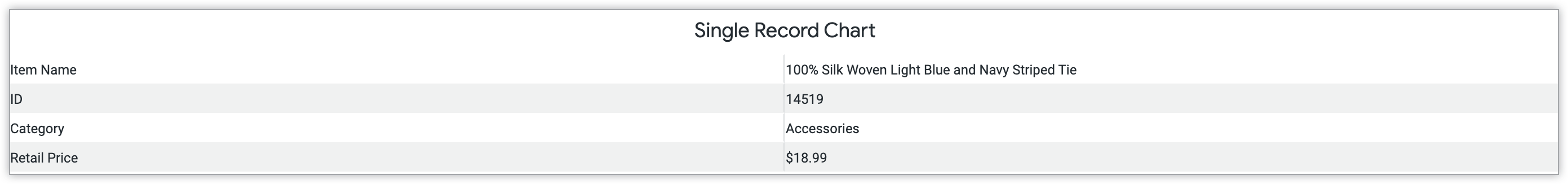
Single Record
Best for visualizing limited data pieces.
Similarly to single value charts, single record charts also highlight selected limited data from a larger dataset to communicate a certain message. Single record charts contain more information than a single value chart, however. This visualization can provide an example from a larger dataset.
Choosing an effective and relevant single record for this type of chart will highlight an example from a dataset. This chart can be customized for readability and clarity through font family and size and color usage.
The following single record chart shows key information about a particular product, the "100% Silk Woven Light Blue and Navy Striped Tie." This includes the product ID, category, and retail price.
To learn more about creating these charts in Looker, see the Single Record chart options documentation page.
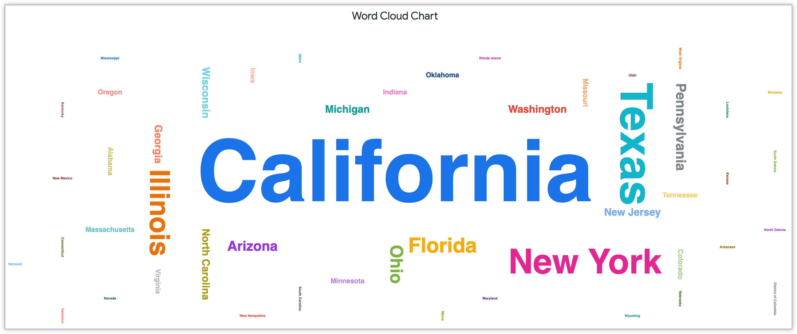
Word Cloud
Best for visualizing data frequency.
Word clouds are data visualizations that display the frequency of data through the customization of font type, size, and color. The key structure of a word cloud is that the higher frequency of a particular word in an analyzed dataset, the larger the font size. Even with a simple glance or a quick scan from a viewer, a word cloud conveys relevant, recurring information in a dataset through a strong visual impact.
Customization of spacing and horizontal and vertical alignment type can achieve this visual impact. In some word clouds, creators group similar thematic words by a certain color, highlighting the connected nature of certain elements. This grouping of words by color can also help contextualize the content for the reader and understand the information being provided.
The following example word cloud highlights the state locations of customers. The state names are sized by the number of customers in each state, California being the state with the greatest number of customers.
To learn about how Looker specifically fuels intuitive word cloud creation through Style menu options, see the Word Cloud chart options documentation page.
Maps
Mapping visualization contextualizes data as it relates to location, making it a useful visualization type if your data relates specifically to geographic regions. The geographic scope of your visualization can be customized in a way that best reflects your collected data. This can include specifying your location through longitude, latitude, and even zip code, depending on your project.
Interactive maps adjust and reconfigure based on customization, while static maps remain consistent once configured. This section specifically addresses the following geographic visualizations:
Google Maps
Best for visualizing geographic data with heatmaps.
Google Maps, Google's web mapping platform, shares geographic information interactively with an audience. With the Google Maps feature in Looker, you can customize the appearance of your map with multiple styles, such as through the Light, Dark, Satellite, Streets, and Outdoors. These styles can highlight your information in different ways depending on the scope and focus of your data. Additionally, the Google Maps visualization allows for heatmap implementation. Heatmaps display information using a color-coded system that indicates data frequency.
The following heatmap Google Maps visualization displays the number of products sold per month in zip codes throughout the United States. The heatmap ranges from 9 to 66 products sold, with a gradient from green to orange that represents this number range. For navigating through this map, keyboard shortcuts are also available.
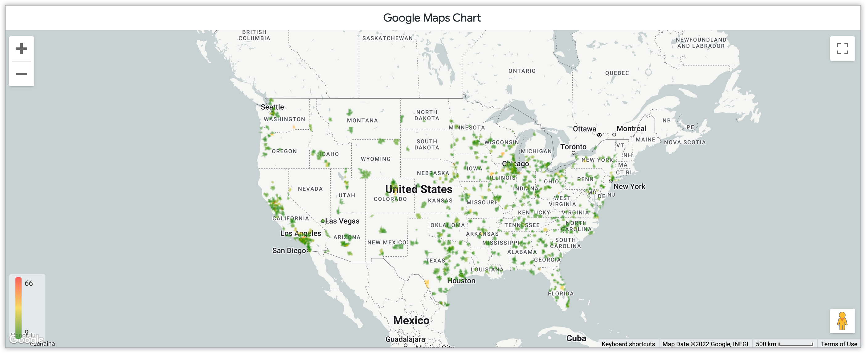
To learn more about the Google Maps feature, see the Google Maps chart options documentation page.
Map
Best for visualizing interactive geographic data.
Interactive map visualizations apply geographic imagery to represent how your data corresponds to a specific location and region. Interactive maps can reflect many other visualization types by combining design aspects. This can include using points, lines, or areas to signify markers in your visualization.
Design of the overall map also can be customized. In Looker specifically, map styles include Light, Dark, and Satellite options. Each of these options have a no labels feature as well. This setting omits key details like city and street names to focus more specifically on the data than on the specifics of the map. When you're choosing a map design, consider the important details for the user to consider, and choose a design that best reflects those details.
The following chart highlights the number of users across zip codes in the United States through a gradient color-coding system. This interactive map allows for zooming features to focus on particular regions of the map.
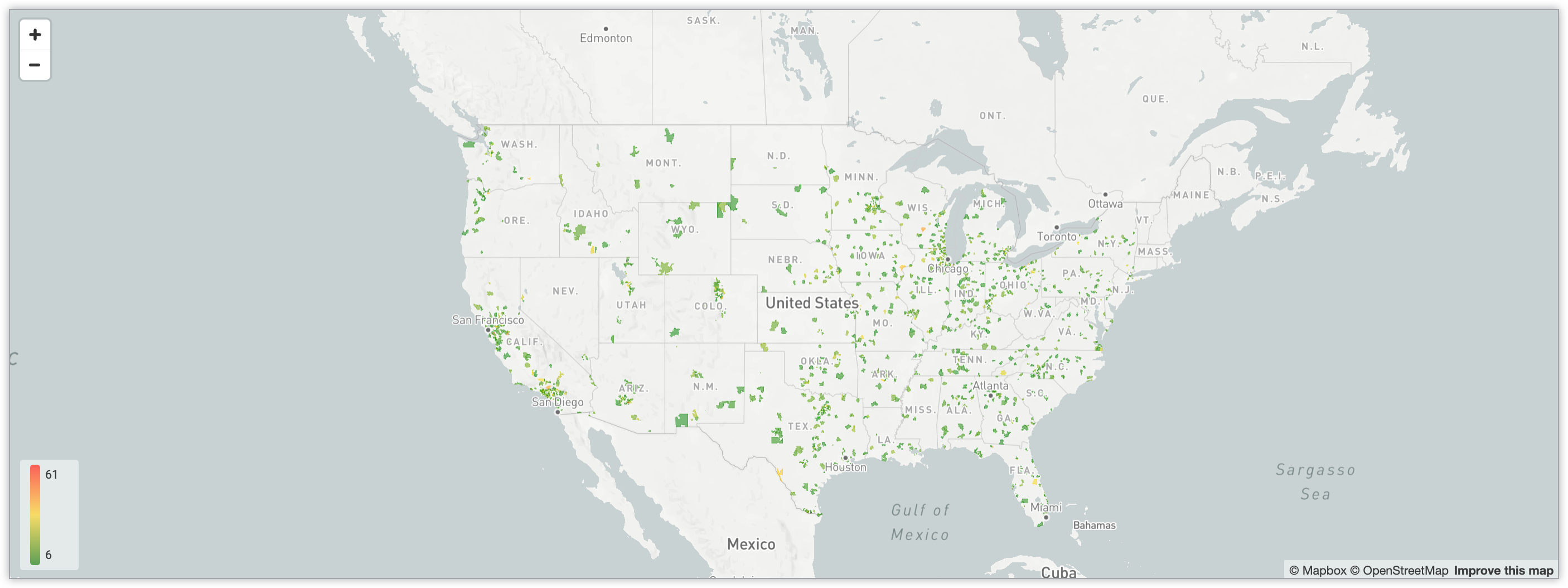
Learn more about interactive maps in Looker through the Map chart options documentation page.
Static Map (Regions)
Best for visualizing regional data.
Static maps by region chart how a particular region is impacted by data. Because the map is static, it cannot change or adjust based on user interaction. This type of visualization is helpful for portraying a distinct circumstance rather than a changing, evolving process over time.
The following regional static map represents the number of store locations in each state in the United States. Through a blue gradient, the darkest blue color represents the largest numbers of store locations. This color usage of this map is not quantized; for greater contrast between states, the Quantize Color switch in the Style menu can be enabled.
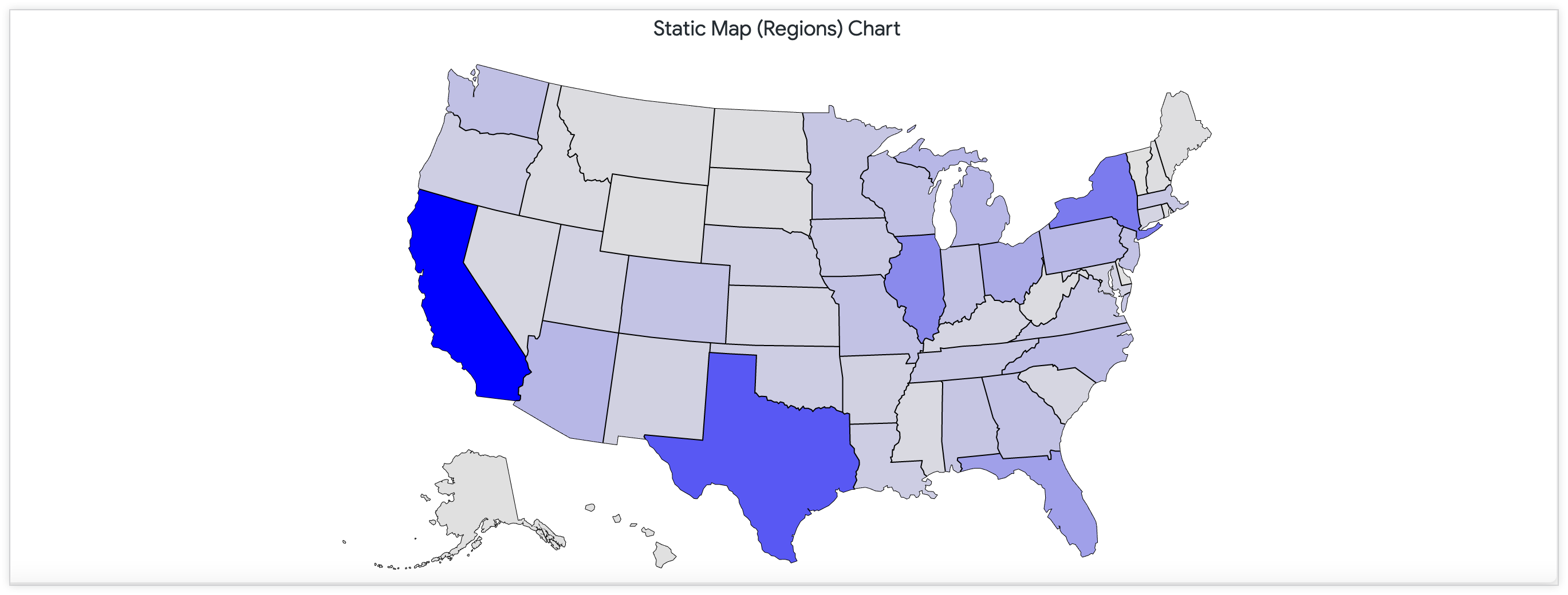
Learn more about this kind of map in Looker through the Static Map (Regions) chart options documentation page.
Static Map (Points)
Best for visualizing geographic point-specific data.
Static maps with points mirror static points with regions. However, these maps visualize through points that overlap across regions. Depending on your focus of your data, this visualization type could be helpful, particularly if there are not clear regional divides with your datasets.
The following static map with points includes points that are sized by number of customers in zip codes throughout the United States.
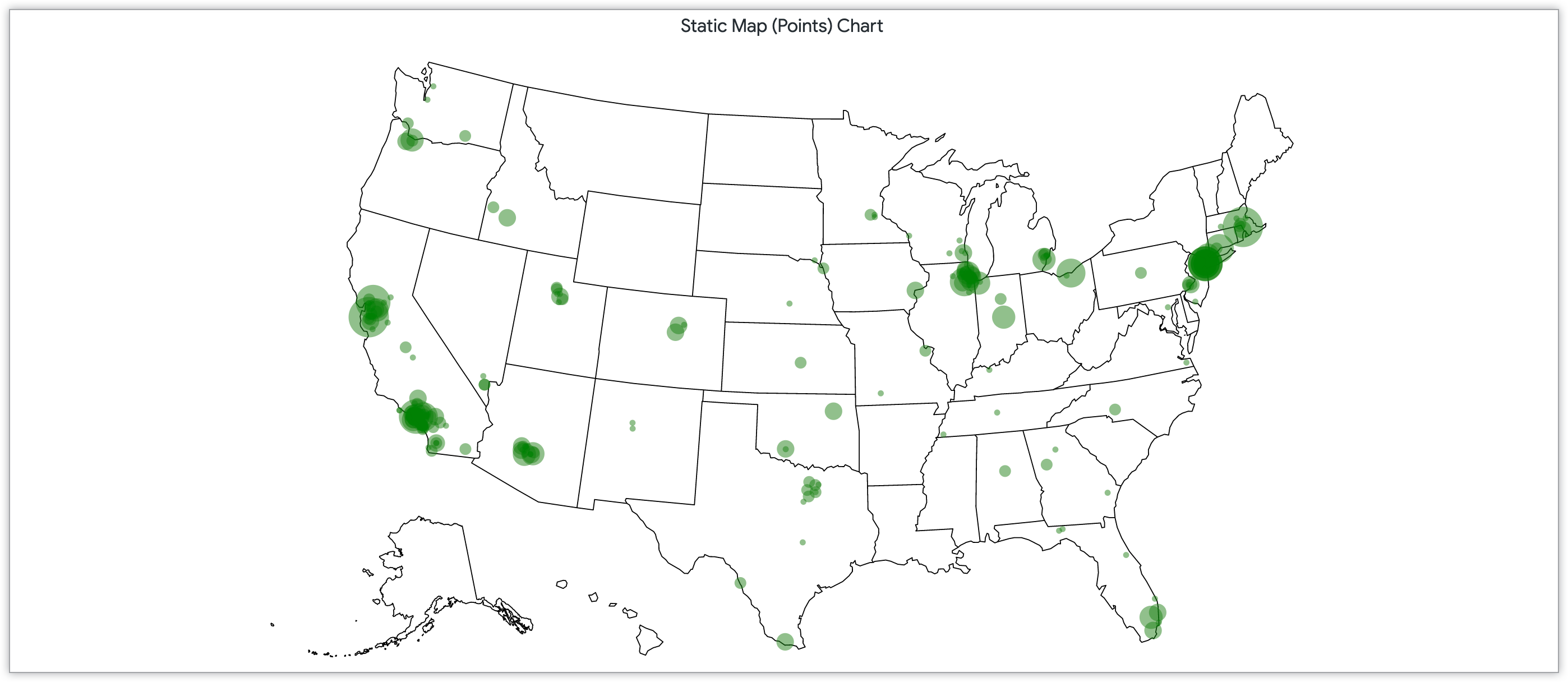
Learn more about this kind of map in Looker through the Static Map (Points) chart options documentation page.
Other charts
Other popular data visualization types available in Looker extend beyond these categories. These additional specific forms of visualization allow for added customization depending on your audience for your data interpretation. This section includes the following chart examples:
Boxplot
Best for visualizing data distribution through statistical summary.
Like scatterplot charts, boxplot charts are also effective for highlighting data distribution. Boxplot charts show this through a statistical summary, or a way of grouping data through observations and patterns. There is a five-number statistical summary for a box plot chart, dividing the data based on the minimum, the maximum, the sample median, and the first and third quartiles. The increased size of a box plot signifies an increased distribution of the data.
The following boxplot chart example highlights the data distribution of products sold from January 2021 to July 2022. Each monthly entry displays, on hover, the minimum, medium, and maximum products sold.
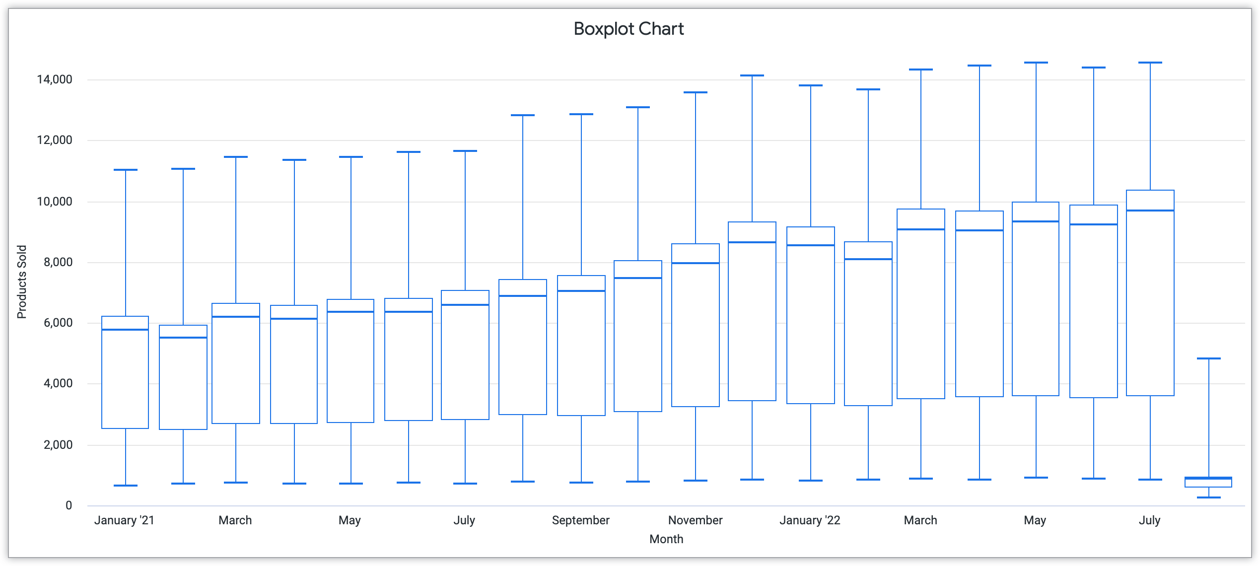
To learn more about boxplots and customizing them in Looker, see the Boxplot chart options documentation page.
Custom visualizations
In addition to the existing visualizations available in Looker, you can also create custom visualization to display your data. You can implement custom visualizations in these ways:
- Adding the custom visualization to create custom visualizations with the
visualizationparameter in the project manifest file - Installing the visualization from the Looker Marketplace directly
- Installing the visualization from the Visualization page in the Admin section of Looker
Examples of custom visualizations that are available as plug-ins include the Calendar Heatmap Visualization and the Aster Plot Visualization. See the Admin settings - Visualizations documentation page to learn more about custom visualization implementation.
Additionally, you can create visualizations unique to your project. See the Developing a custom visualization for the Looker Marketplace documentation page to learn more about creating these visualizations and how they can work to reflect your data visualization goals.