This page explains how to create graphics and charts, based on the results of a query, to best showcase your data. Looker keeps your query details and visualization configuration data together. When you share a query, recipients get your visualization as well as the data.
When you're creating a visualization, it helps to understand what a data series is. A data series is a set of related data points that are plotted on a chart. For example, the number of orders that are placed each day for a set of dates is a series. In a column chart, each series is represented by columns of the same color; in a line chart, each series is represented by a single line; and so on. You can see a list of the series for your chart in the Series tab of the Edit menu. The name of each data series also appears as the chart legend, if you choose to show a legend.
Quick guide
You can add an eye-catching visualization to any query result set on an Explore.

- Create and run your query.
- Open the Visualization tab.
Select the type of visualization that best displays your data. For more options, select
…to the right of the displayed visualization options.
The visualization type that you select determines how Looker represents each data series in your chart.
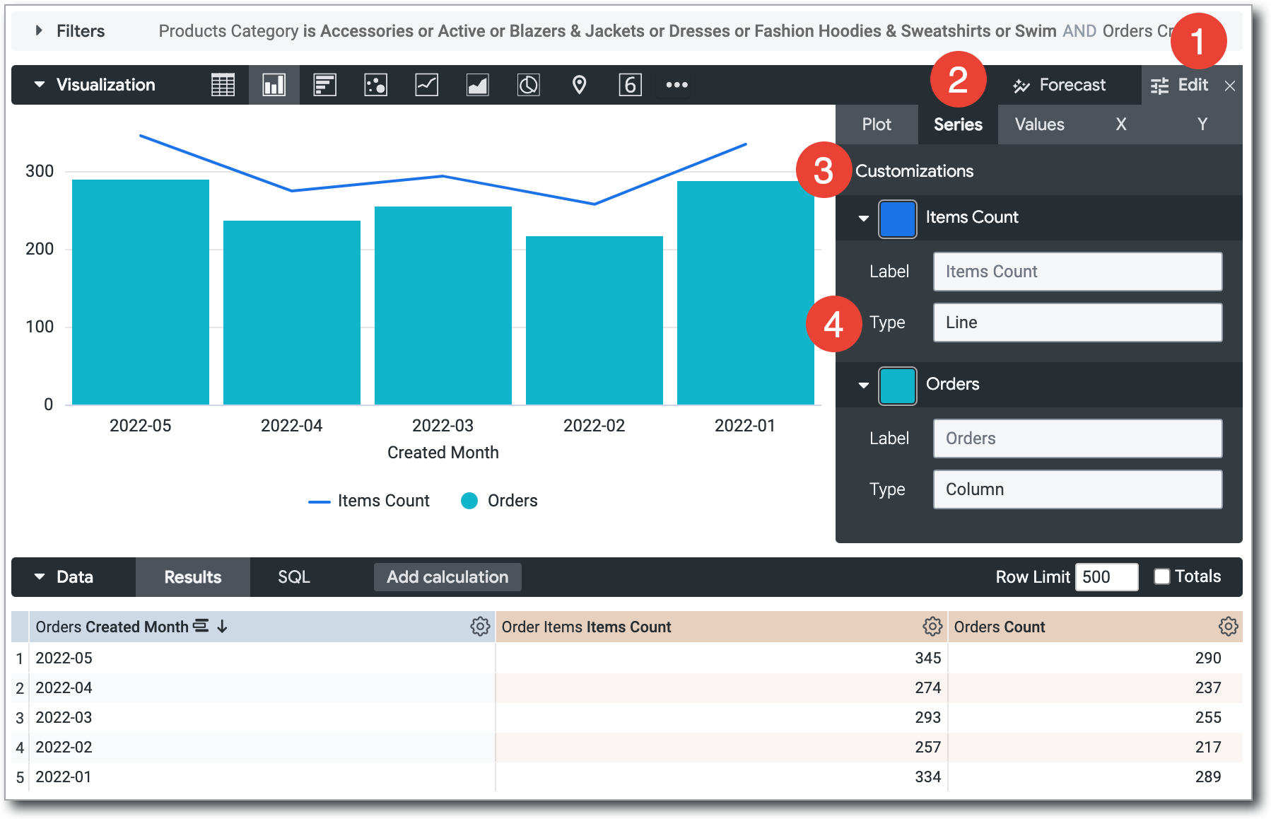
Select Edit to configure the visualization option settings, such as naming and arranging chart axes, choosing the position and type of each data series, or modifying the chart color palette.
You can further customize your visualization by specifying which dimensions and measures to include in the visualization. If your data is missing key values, you can tell Looker to fill in those values on the appropriate part of your visualization.
Customizing visualizations with chart settings
You can customize a visualization to make your data more readable and to add visual styling. Select Edit in the Visualization bar to see the edit menu, and then change the settings to get a result that suits you.
Depending on the visualization type, the settings in the edit menu will change. To see the visualization options that are available for a particular visualization type, select that type on the Visualization types documentation page.
Including multiple visualization types on a single chart
Charts can include multiple types of visualizations. For example, you can create a chart that uses both lines and columns:
To create a chart that includes more than one visualization type, after you have created an initial visualization, follow these steps:
- Select the Edit button to show the customization options.
- Select the Series tab.
- In the Customizations section, an entry appears for each series in the chart. Select the arrow next to the series to display its customization options.
- In the Type box, select the type of visualization to use for that series.
Charts with multiple series types always layer line series and scatter series in front of area, column, and bar series.
To alter the layering order of column, bar, and area series, change the series' positions in the data table and select the Run button. The leftmost series layers on top and the rightmost series layers on bottom.
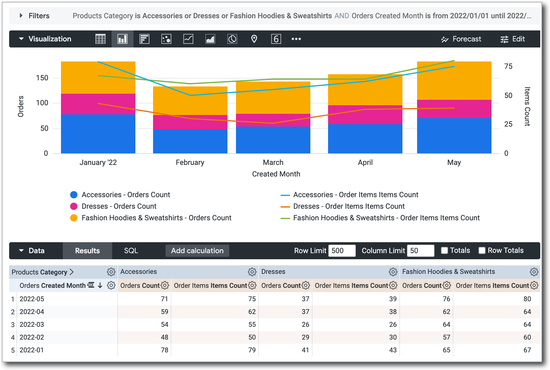
Creating stacked charts with multiple visualization types
You can include stacked series in a chart with multiple visualization types. All series of the same type as the chart type that you selected in the Visualization tab will stack together; series of other types will not stack. For example, in a column chart, column series will stack, but line series will not stack.
To create a chart like this, follow these steps:
- Create and run a query with multiple series. This can be done with multiple measures or with a pivot.
- From the Visualization tab, select a Cartesian chart type (with the exception of boxplot or waterfall).
- Open the Edit menu.
- In the Plot tab, under Series Positioning, select Stacked. This option stacks all series as that Cartesian chart type.
- In the Series tab, under Customizations, expand the series for which you want to change the chart type.
- For each series that you want to change, select one of the available options in the Type field. You can select different chart types for each series.
- By default, all series are added to the left axis. If you want to use different y-axes for the stacked series and the other series, open the Y tab, and drag the series that you want to change from the Right Axes sections to the Left Axes section. Alternatively, you can use multiple y-axes or x-axes.
Hiding fields from visualizations
Looker adds all dimensions and measures that are returned by a query to any visualization. Sometimes, you might not want to display every dimension or measure in the chart. There are several methods to hide fields:
- Temporarily disable a field while viewing a visualization. This is done through the visualization's legend.
- Completely hide a field from the visualization. This is done through the column gear menu in the data table.
- Allow a field to remain available to the visualization but disable it by default in the visualization. This is done by editing the visualization.
Temporarily disabling a field from a visualization
To temporarily hide one or more series from a visualization, when you're viewing the visualization, select the series that you want to hide in the visualization's legend. The name of the series that you select will be grayed out in the legend, and the visualization will be updated to exclude the data from the visualization.
To un-hide the series, again select the name of the series in the legend.
Hiding the series in this manner is not permanent when you're viewing the visualization in a saved Look or a dashboard.
Completely hiding a field from a visualization
To completely hide one or more fields from the visualization, follow these steps:
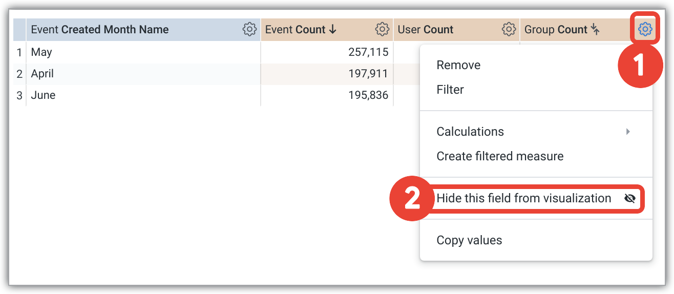
- In the data table, select the gear icon at the top right corner of the column for the series that you want to hide.
- Select Hide this field from visualization.
Disabling a series by default in a visualization
To disable a series by default, follow these steps:
- If the visualization is a saved Look or in a dashboard tile, enter Edit mode for the dashboard tile or Look.
- In the visualization's legend, click on the name or names of the series that you want to disable. When disabled, the series color turns gray in the legend and the data disappears from the chart.
- Save your edits to make the disabled state the default.
Viewers can select the series' name in the legend to temporarily re-enable it.
Hiding data in a pivoted visualization
When you're visualizing pivoted Explore results, a single field is split into multiple series. For example, in the visualization that is shown in the Creating stacked charts with multiple visualization types section of this documentation page, the Orders Count field is split into three series: Accessories - Orders Count, Dresses - Orders Count, and Fashion Hoodies & Sweatshirts - Orders Count.
Each series that is created from a pivoted field can be hidden individually using two of the same techniques that you can use on non-pivoted series, as follows:
Additionally, to hide an individual series completely, you can use a gear menu option that is specific to pivoted results, Hide this column from visualization, which is described in the next section.
Using the gear menu in the data table to completely hide a series
You can use the gear menu in the data table of an Explore to hide specific columns (series) of data from a pivoted visualization.
To hide a specific column of data from a visualization, follow these steps:
- Select the column's gear icon at the top of the column in the data table.
- Choose Hide this column from visualization from the drop-down menu.
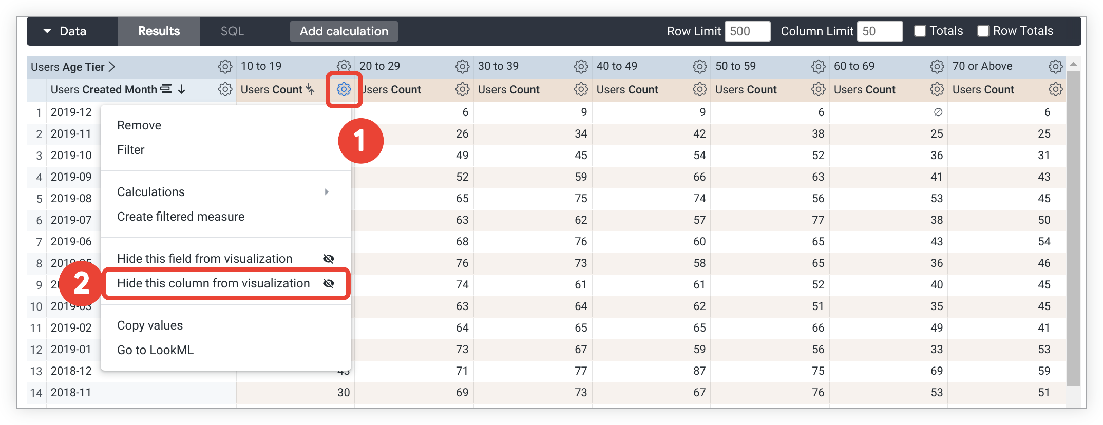
For any column for which you have chosen this option, that data won't be displayed in the visualization, and that series won't be displayed in the legend for the visualization. However, the other series that arecreated from the parent field will still be displayed. For example, in the data that is shown here, selecting Hide this column from visualization for the 10 to 19 - Users Count series, will not affect the other columns, and the other Users Count series will still be displayed.
Using the gear menu in the data table to completely hide a field
The column gear menu in pivoted results also contains the Hide this field from visualization option, which is described in the Completely hiding a field from the visualization section. When you're applying this option to pivoted results, data is hidden from all columns that are created from that field, not just the individual column that you used to make the selection. In other words, every series made from the parent field is hidden. In the preceding example, all Users Count series would be hidden.
Filling in missing dates and values
Some datasets have values, such as dates, that follow a predictable pattern. You might pull data by a timeframe and find that some dates, weeks, months, or other date types don't have a corresponding value. By default, the data table will display only the dates that the query returns and skip any missing dates. Looker's dimension fill option lets you display the missing dates or other values in the data table and on the corresponding axis of the query's visualization. Dimension fill is particularly useful for queries where many days have no data or null data.
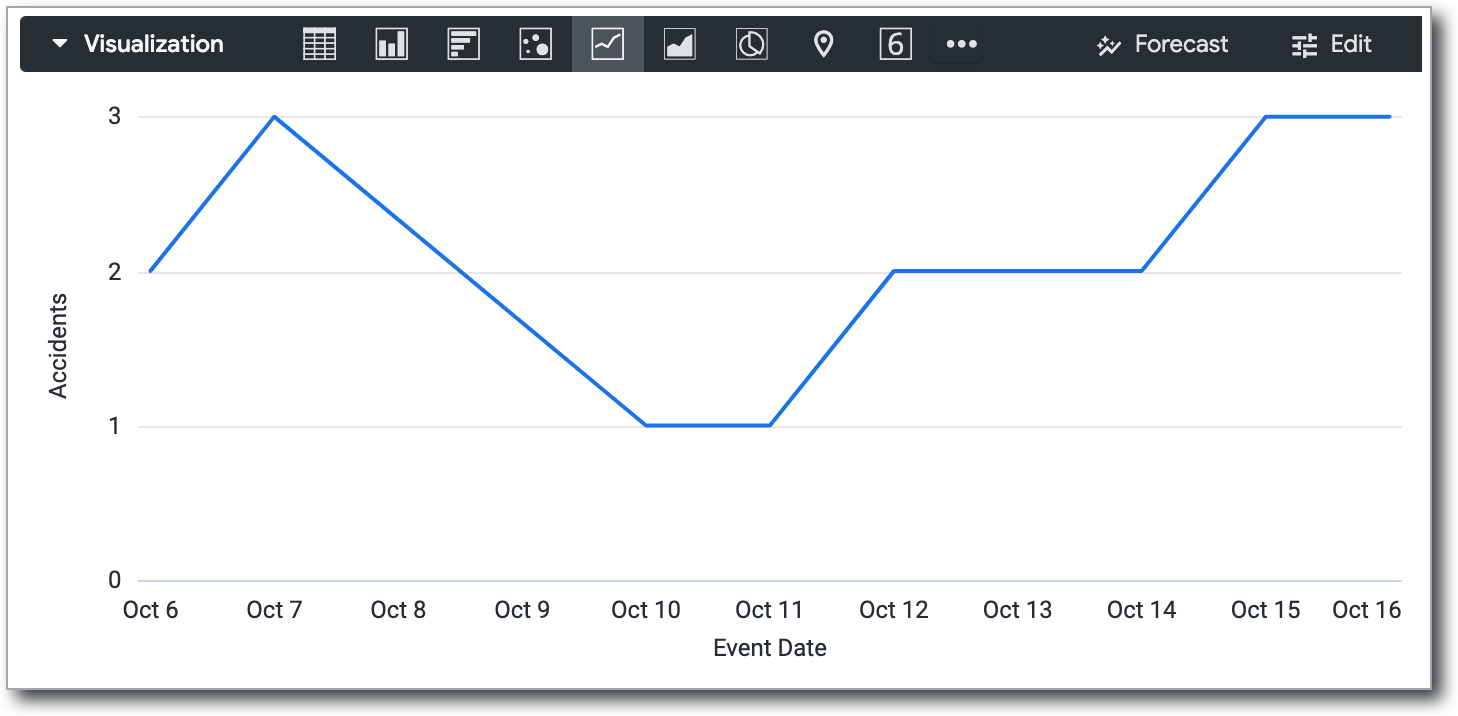
The following data is an example of query results that skip dates with no corresponding value.
| Accidents Event Date | Accidents Count |
|---|---|
| 2011-10-06 | 2 |
| 2011-10-07 | 3 |
| 2011-10-10 | 1 |
| 2011-10-11 | 1 |
| 2011-10-12 | 2 |
| 2011-10-13 | 2 |
| 2011-10-14 | 2 |
| 2011-10-15 | 3 |
| 2011-10-16 | 3 |
If you don't use dimension fill, Looker connects the data points it has, resulting in a potentially misleading graph that doesn't show the dates for which there is no data. In this example, the graph appears to include values for the dates 2011-10-08 and 2011-10-09 even though these dates have no corresponding values in the data table.
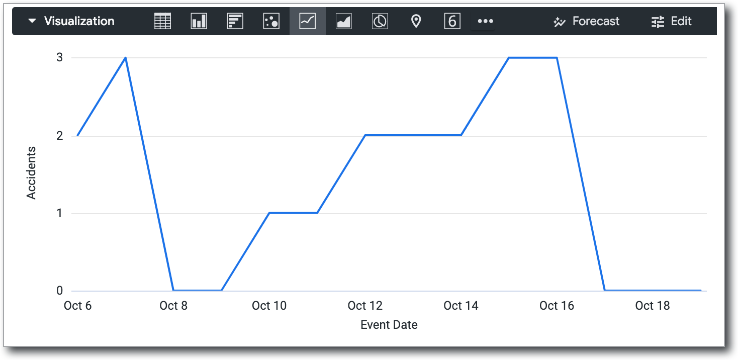
Turning on dimension fill adds the missing dates:
| Date | Value |
|---|---|
| 2011-10-06 | 2 |
| 2011-10-07 | 3 |
| 2011-10-08 | Ø |
| 2011-10-09 | Ø |
| 2011-10-10 | 1 |
| 2011-10-11 | 1 |
| 2011-10-12 | 2 |
| 2011-10-13 | 2 |
| 2011-10-14 | 2 |
| 2011-10-15 | 3 |
| 2011-10-16 | 3 |
| 2011-10-17 | Ø |
| 2011-10-18 | Ø |
In the visualization, dates with null values are plotted as zero. This makes the graph more informative.
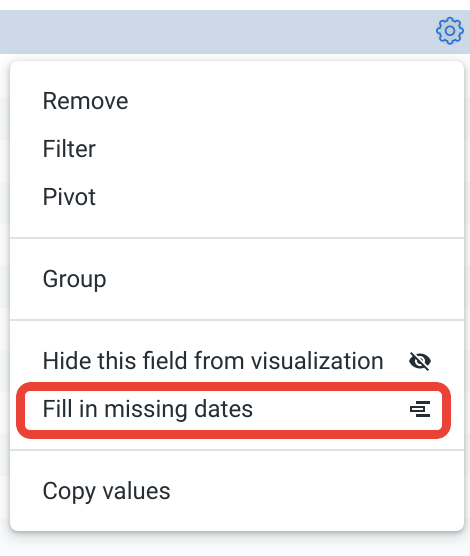
To use dimension fill, select the appropriate dimension's gear menu in the Data section of an Explore. Choose the Fill in Missing Dates or Fill in Missing Values option.
Dimension fill is available for dimensions with yes/no values, tiered values, and most date types. It can also be applied to any dimension based on a list of values, via the case or tier parameters.
Dimension fill turns on automatically for queries that run with a single dimension and/or a single pivot, as long as you haven't applied filters to any measures. Dimension fill can also be applied to multiple dimensions at once in a query — including pivoted dimensions — however, Looker may automatically disable dimension fill to optimize query performance if it detects that too many fields will be generated with filled values.
You cannot use dimension fill in certain cases, such as the following:
When your Looker developer used the
order_by_fieldparameter or disabled theallow_fillparameter on certain dimensions.When dimensions have a filter applied to them and also have a fixed number of values, such as yes/no, days of the week, days of the month, etc. Filtering against these field types eliminates the values that Looker needs to predictably and accurately fill in any missing values.
When Looker detects that too many rows or columns will be generated with filled values and automatically disables dimension fill to optimize query performance.
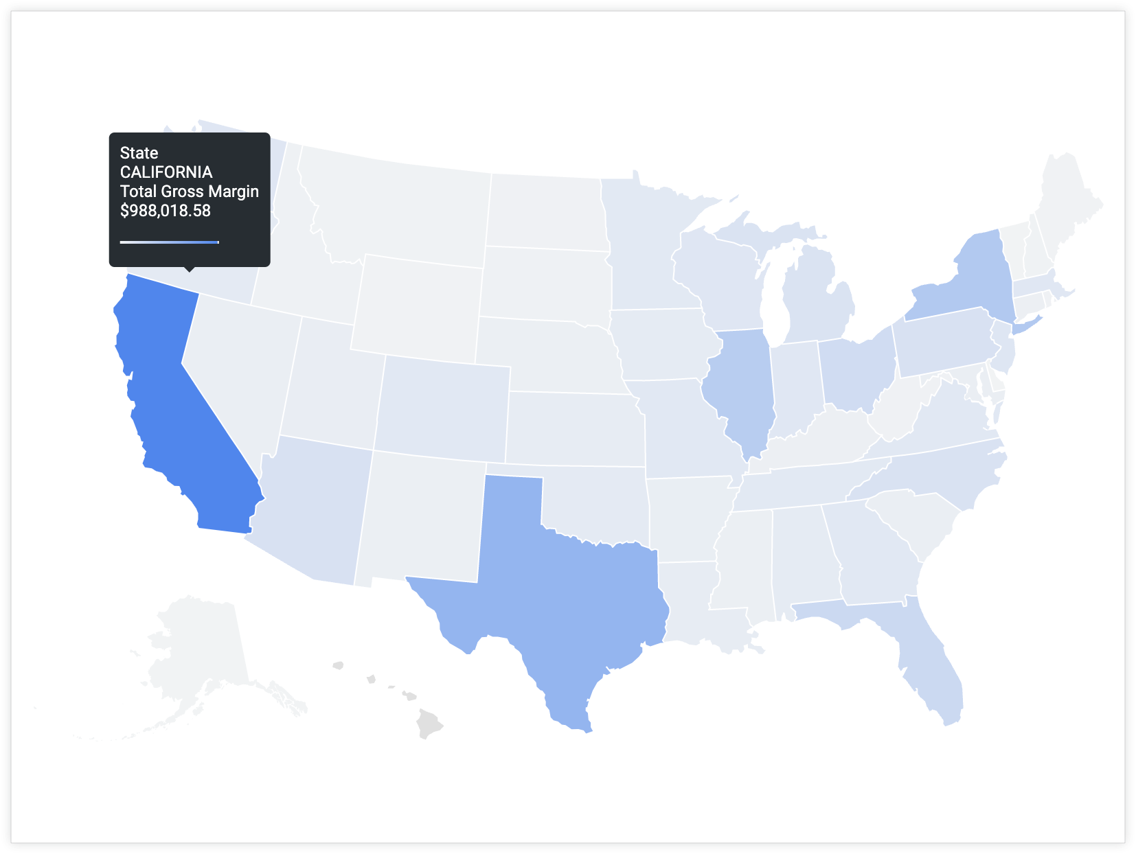
The visualization tooltip
When you hover over a datapoint in a visualization, the tooltip displays the value of the selected dimensions and measures by default.
You can use Liquid variables in an html parameter to customize the information that is displayed in the tooltip. Visit the Getting the most out of visualizations in Looker: Tooltip customization cookbook for a step-by step guide and examples.