Waterfall charts help you visualize how a sequence of positive and negative values adds up to a total. These charts are often used for financial data, to show how various profits and losses make up a total. Waterfall charts can also be used more generally to illustrate how different categories contribute to a total, especially if the data contains positive and negative values.
Building a waterfall chart
To choose a waterfall chart, click the ellipsis (...) in the Visualization bar and select Waterfall.
Ignoring fields that are hidden from the visualization, waterfall visualizations require one of the following options in the Data section:
- One dimension and one measure
- No dimensions and one or more measures
- One dimension, one measure, and one or more pivots
Other configurations prevent a waterfall visualization from rendering.
A waterfall chart automatically calculates a total based on your data values, and adds a Total column to the chart. Totals in your data table are not necessary.
After your chart is created, you can use the visualization options menu. Click Edit in the upper right corner of the visualization tab to edit your chart.

Series menu options
Color Configuration
You can define the color palette for a chart in the Color Configuration section.
Collection
A collection lets you create themed visualizations and dashboards that look good together. All of Looker (Google Cloud core)'s built-in color collections appear on the Color collections documentation page. Your Looker (Google Cloud core) admin may also create a custom color collection for your organization.
You can choose a color collection from the Collection drop-down menu. The Palette section will update with a palette from your chosen color collection.
Palette
Once you've selected a color collection, you can choose a different palette from the collection, or customize your palette, by clicking the color palette itself. This opens the palette picker and displays all the palettes from the collection.
For a categorical palette, the first three colors in the palette apply to the Up Color, Down Color, and Total Color. If your palette contains fewer than three colors, first a lighter and then a darker version of your palette colors will be used. For a sequential or diverging palette, the color at the left end of the palette applies to the Up Color, and the colors for the Down Color and Total Color move to the right on the palette.
Creating a Custom Color Palette
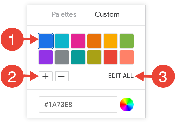
To create a custom color palette, select the Custom tab on the palette picker. You can edit your palette in several ways:

- Click on one of the colors present to edit it.
- Click the + or - buttons to add a color to the end of the palette or to remove a selected color.
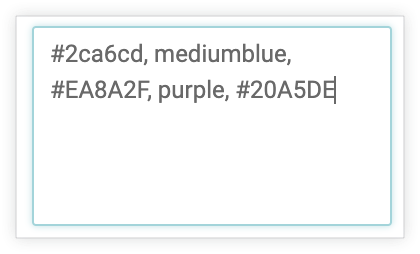
- Click EDIT ALL at the bottom right of the menu to use a comma-separated list of color values.
To change a selected color, or edit all colors at once, you can input hex strings (such as #2ca6cd) or CSS color names (such as mediumblue) into the color value box at the bottom of the picker.

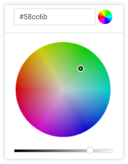
To bring up a color picker to select a color, click the color wheel to the right of the color value box. The corresponding hex value for that color appears in the color value box.

If you click EDIT ALL, the color value box populates with the hex codes of the color palette you've chosen or customized. Copying and pasting this list is the best way to copy custom color palettes from one chart to another.
Reverse Colors
Select Reverse colors to reverse the palette. For a categorical palette, this applies the last three colors in the palette to the Up Color, Down Color, and Total Color. For a sequential or diverging palette, this applies the color at the right end of the palette to the Up Color and move left on the palette for the Down Color and Total Color.
Up Color, Down Color, and Total Color
You can configure the color of the chart's bars, based on whether the underlying data is positive or negative. Click on a color swatch to reveal the palette picker and select a new color from an existing palette or choose a custom color.
- Up Color determines the color of positive values in the chart.
- Down Color determines the color of negative values in the chart.
- Total Color determines the color of the Total bar in the chart.
Edit Chart Config

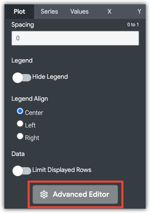
The Edit Chart Config button at the bottom of the visualization menu opens the Chart Config Editor. This editor lets you modify HighCharts visualizations by exposing certain JSON parameters of the visualization, enabling deep customization. These customizations will not dynamically interact with data.
The Edit Chart Config button is available if you have either the Looker Admin role or the can_override_vis_config permission.
See the Examples section of the Chart Config Editor article for examples of some common use cases, including the following examples:
- Changing the background color and axis text color
- Conditional formatting of values within a series
- Customizing tooltip color
- Adding vertical reference bands and captions
- Adding chart annotations
Values menu options
Value Labels
You can toggle the appearance of value labels for each data point on a chart.
Value Colors
You can define the colors of the value labels. This field takes a color value formatted as a RGB hex string (such as #2ca6cd) or as a CSS color name (such as mediumblue).
If no color value is provided, Looker (Google Cloud core) assigns the first color in the palette to the value labels.
X menu options
Scale Type
You can specify how the x-axis scale is calculated and displayed:
Automatic Based on Data: The scale is inferred from the underlying data. This setting is the default.
Ordinal: Data is plotted along the x-axis as evenly spaced, discrete entries, regardless of relative distance between data points.
Time: Data is plotted as time values. The x-axis is labeled with appropriate time increments.
Show Axis Name
You can toggle the appearance of the x-axis name label.
Axis Value Labels
Axis Value Labels toggles the appearance of value labels on the x-axis.
Allow Zoom
This option is available only for Cartesian charts (column, bar, scatterplot, line, area, waterfall, or boxplot charts).
This option defaults to enabled. When it's enabled, you can zoom on a visualization in a dashboard, a Look, or an Explore.
See the Viewing dashboards or Viewing Looks in Looker documentation page for information about how to use the zoom feature.
When this option is disabled, the Allow Zoom option on the Y menu is hidden and you cannot zoom on the visualization.
Y menu options
Show Axis Names
You can toggle the appearance of y-axis name labels.
Axis Value Labels
You can toggle the appearance of value labels on the y-axis.
Gridlines
You can toggle the appearance of gridlines extending from the y-axis. Gridlines are spaced based on the scaling of the y-axis.
Allow Zoom
This option is available only for Cartesian charts (column, bar, scatterplot, line, area, waterfall, or boxplot charts).
This option is available only when the Allow Zoom option on the X menu is enabled. This option defaults to enabled. When it's enabled, you can zoom on a visualization in a dashboard, a Look, or an Explore.
See the Viewing dashboards or Viewing Looks documentation page for information about how to use the zoom feature.
If this option is disabled but the Allow Zoom option on the X menu is enabled, you cannot zoom into a tighter view of the y-axis; you can zoom only into a tighter view of the x-axis.
