You can use the Chart Config Editor to customize formatting options on Looker visualizations that use the HighCharts API. This includes most Cartesian charts, such as the column chart, bar chart, and line chart, among others.
If Gemini in Looker features are enabled, you can use the Visualization Assistant to generate JSON formatting options from text-based prompts to accelerate the customization of Looker visualizations.
Prerequisites
To access the Chart Config Editor, you must have the can_override_vis_config permission.
Customizing a visualization
To customize a visualization with the Chart Config Editor, follow these steps:
- View a visualization in an Explore, or edit a visualization in a Look or dashboard.
- Open the Edit menu in the visualization.
Click the Edit Chart Config button in the Plot tab. Looker displays the Edit Chart Config dialog.
The Chart Config (Source) pane contains the original JSON of your visualization and cannot be edited.
The Chart Config (Override) pane contains the JSON that should override the source JSON. When you first open the Edit Chart Config dialog, Looker populates the pane with some default JSON. You can start with this JSON, or you can delete this JSON and enter any valid HighCharts JSON.
Select the Chart Config (Override) section and enter some valid HighCharts JSON. The new values will override any values in the Chart Config (Source) section.
- See the Examples section for examples of valid HighCharts JSON.
- Looker accepts any valid JSON values. Looker does not accept functions, dates, or undefined values.
Click <> (Format code) to allow Looker to properly format your JSON.
Click Preview to test your changes.
Click Apply to apply your changes. The visualization will be displayed using the custom JSON values.
Once you've customized your visualization, you can save it. If you viewed the visualization in an Explore, save the Explore. If you edited a Look or a dashboard, click Save.
If you try to preview code that contains invalid JSON, Looker will display an Invalid JSON detected error message. You can clean up invalid JSON with the Autofix code option at the bottom of the Chart Config (Override) pane.
If you'd like edit the default visualization options, first remove any changes you've made in the Chart Config Editor, then replace them later. Specifically, follow these steps:
- Click the Edit Chart Config button in the Plot tab. Looker displays the Edit Chart Config dialog.
- Copy the text in the Chart Config (Override) pane.
- Click the Clear Chart Overrides button to delete all changes.
- Click Apply.
- Edit your visualization using the default visualization options.
- Click the Edit Chart Config button in the Plot tab. Looker displays the Edit Chart Config dialog.
- Enter some valid HighCharts JSON in the Chart Config (Override) pane. You can use the text that you copied in step 2 as a template, but be sure to test your changes using the Preview button to ensure there are no conflicts.
- Click Apply.
Conditional formatting with series formatters
The Chart Config Editor accepts most valid HighCharts JSON. It also accepts the series formatters attribute, which only exists in Looker. Each series can have multiple formatters to combine different style rules.
The series formatters attribute accepts two attributes: select and style.
- Enter a logical expression in the
selectattribute to indicate which data values will be formatted. - Enter some JSON into the
styleattribute to indicate how to format the data values.
For example, the following JSON will color each data value orange if it is greater than or equal to 380:
{
  series: [{
    formatters: [{
      select: 'value >= 380',
      style: {
        color: 'orange'
      }
    }]
  }]
}

The following sections describe the potential values of the select and style attributes in more detail.
The select attribute
You can use the following values in a select expression:
value: This variable returns the value of the series. You can use this value in comparisons, as in the following examples:- The expression
select: value > 100matches rows whose values are greater than 100. - The expression
select: value > VIEW_NAME.FIELD_NAMEmatches rows whose values are greater than another field for that row. See the Color series compared to other series values section for an example. - The expression
select: value > meanmatches rows whose values are greater than the mean for that series. See the Compare series values to the mean or median value section for an example. - The expression
select: value > medianmatches rows whose values are greater than the median for that series. See the Compare series values to the mean or median value section for an example.
- The expression
max: Useselect: maxto target the series value that has the maximum value.min: Useselect: minto target the series value that has the minimum value.percent_rank: This variable targets the series value with a specified percentile. For example, you could useselect: percent_rank >= 0.9to target series values in the ninetieth percentile.name: This variable returns the dimension value of the series. For example, if you had a chart showing Sold, Canceled, and Returned orders, you could useselect: name = Soldto target the series where the dimension value is Sold.AND/ORUseANDandORto combine multiple logical expressions.
To see these expressions implemented in the Chart Config Editor, refer to the Color the maximum, minimum, and percentile values example.
The style attribute
The style attribute can be used to apply styles that HighCharts supports. For example, you can color series values using style.color, color series borders using style.borderColor, and set series border width using style.borderWidth. For a more complete list of style options, see the Highcharts options for series.column.data.
For line visualizations, use style.marker.fillColor and style.marker.lineColor instead of style.color. For a more complete list of line style options, see the Highcharts options for series.line.data.marker.
To see color formatting implemented in the Chart Config Editor, refer to the Color the maximum, minimum, and percentile values example.
Field metadata
The Field metadata drop-down lets you copy the series name for any field in your visualization. You can use this series name by using the series formatters attribute to compare values from different series. See the Color series compared to other series values section for an example.
Examples
The following sections provide examples of some common use cases for the Chart Config Editor. For a complete list of the attributes that you can edit, see the HighCharts API documentation.
- Change the background color and axis text color
- Customize tooltip color
- Add chart annotations and captions
- Add vertical reference bands
- Color the maximum, minimum, and percentile values
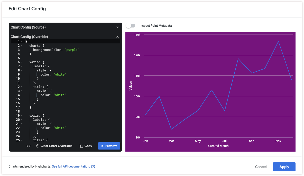
Change the background color and axis text color
To change the background color of a visualization, use the chart.backgroundColor attribute.
Similarly, to change the text color of the axes in a visualization, use the following attributes:
The following HighCharts JSON changes the background color of the visualization to purple, and the text of the axis titles and labels to white.
{
  chart: {
    backgroundColor: "purple"
  },

  xAxis: {
    labels: {
      style: {
        color: "white"
      }
    },
    title: {
      style: {
        color: "white"
      }
    }
  },

  yAxis: {
    labels: {
      style: {
        color: "white"
      }
    },
    title: {
      style: {
        color: "white"
      }
    }
  }
}
Customize tooltip color
To customize the color of the tooltip, use the following attributes:
The following HighCharts JSON changes the background color of the tooltip to cyan, and changes the color of the tooltip text to black.
{
  tooltip: {
    backgroundColor: "cyan",
    style: {
      color: "black"
    }
  }
}
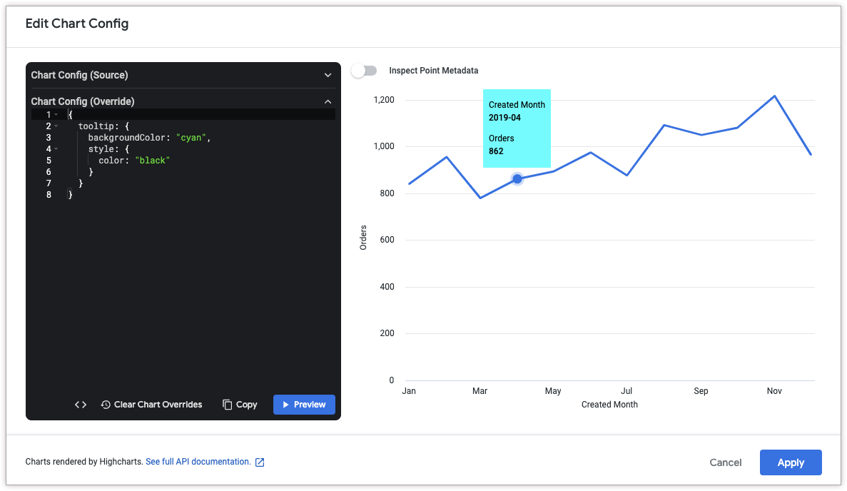
Customize tooltip content and styles
To customize the content of the tooltip, use the following attributes:
The following HighCharts JSON changes the tooltip format such that the x-axis value appears at the top of the tooltip in larger font, followed by a list of all series values at that point.
This example uses the following HighCharts functions and variables:
{key}is a variable that returns the x-axis value of the selected point. (in this example, the month and year).{#each points}{/each}is a function that repeats the enclosed code for each series in the chart.{series.name}is a variable that returns the name of the series.{y:.2f}is a variable that returns the y-axis value of the selected point, rounded to two decimal places.{y}is a variable that returns the y-axis value of the selected point.{variable:.2f}roundsvariableto two decimal places. See the Highcharts templating documentation for more examples of value formatting.
{
  tooltip: {
    format: '<span style="font-size: 1.8em">{key}</span><br/>{#each points}<span style="color:{color}; font-weight: bold;">\u25CF {series.name}: </span>{y:.2f}<br/>{/each}',
    shared: true
  },
}
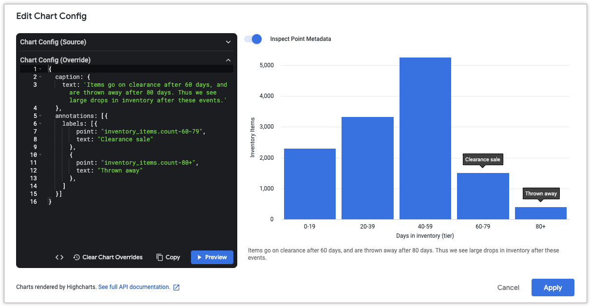
Add chart annotations and captions
To add an annotation, use the annotations attribute. To add a caption to the chart, use the caption attribute.
To get the coordinates for a point, click Inspect Point Metadata at the top of the Edit Chart Config dialog. Then, hold the pointer over the data point that you'd like to annotate. Looker displays a point ID, which you can use in the annotations.labels.point attribute.
The following HighCharts JSON adds two annotations to the chart to explain a decrease in inventory items after certain periods of time. It also adds a caption to the bottom of the chart to explain the annotations in more detail.
{
  caption: {
    text: 'Items go on clearance after 60 days, and are thrown away after 80 days. Thus we see large drops in inventory after these events.'
  },
  annotations: [{
    labels: [{
        point: "inventory_items.count-60-79",
        text: "Clearance sale"
      },
      {
        point: "inventory_items.count-80+",
        text: "Thrown away"
      },
    ]
  }]
}
Add dynamic annotations
You can also use the annotationsSource and annotationsTarget parameters to use data from a field as an annotation.
To get the field names, you can use the Field metadata drop-down. Note that the annotationsTarget field must be a measure.
The following HighCharts JSON uses the value from the orders.annotations field as an annotation on the orders.count field:
{
  annotations: [{
    labels: [{
      annotationsSource: 'orders.annotations',
      annotationsTarget: 'orders.count'
    }]
  }]
}

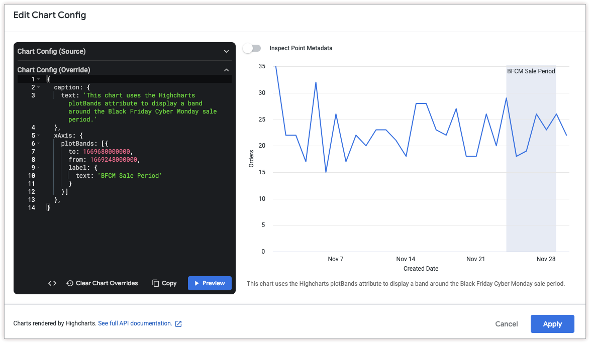
Add vertical reference bands
To add a vertical reference band, use the xAxis.plotBands attribute.
The following HighCharts JSON adds a vertical reference band between November 24, 2022 and November 29, 2022 to denote a sale period. It also adds a caption to the bottom of the chart to explain the significance of the band.
Note that the to and from attributes of xAxis.plotBands must correspond to data values in the chart. In this example, since the data is time-based, the attributes accept Unix timestamp values (1669680000000 for November 29, 2022 and 1669248000000 for November 24, 2022). String-based date formats like MM/DD/YYYY and DD-MM-YY are not supported in the to and from HighCharts attributes.
{
  caption: {
    text: 'This chart uses the HighCharts plotBands attribute to display a band around the Black Friday Cyber Monday sale period.'
  },
  xAxis: {
    plotBands: [{
      to: 1669680000000,
      from: 1669248000000,
      label: {
        text: 'BFCM Sale Period'
      }
    }]
  },
}
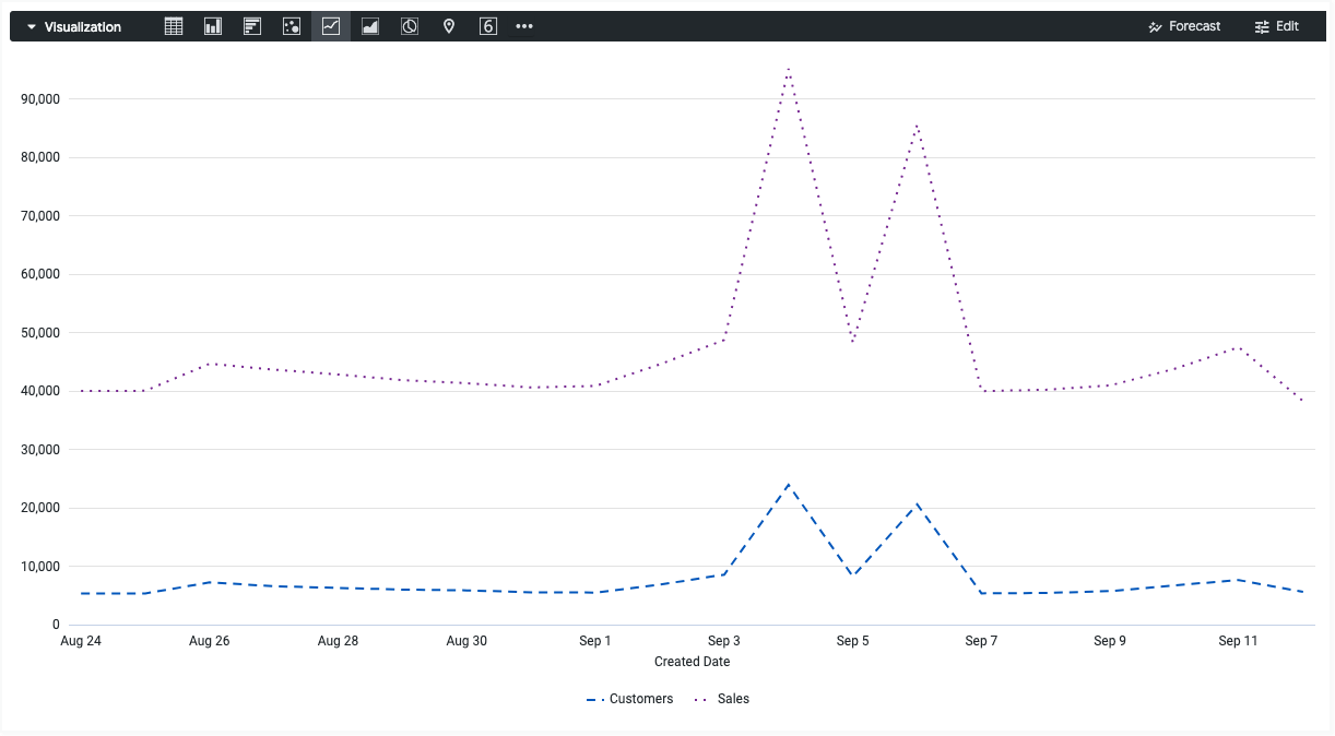
Add dotted and dashed lines
To change solid lines to dotted or dashed lines, use the series.dashStyle attribute.
The following HighCharts JSON changes the dashStyle attribute of the Customers series to a dashed line, and the dashStyle attribute of the Sales series to a dotted line.
{
  series: [{
    name: 'Customers',
    dashStyle: 'Dash'
  }, {
    name: 'Sales',
    dashStyle: 'Dot'
  }]
}
Color the maximum, minimum, and percentile values
See the Getting the most out of Looker visualizations cookbook: Conditional formatting customization in Cartesian charts page for an in-depth example about coloring the maximum, minimum, and percentile values of a Cartesian visualization.
Color series compared to other series values
Starting in Looker 25.0, the formatters.select parameter lets you compare the current data value to values from other series.
For example, consider a visualization that displays the average sale price and median sale price for several cities. The following HighCharts JSON changes the color of the average sale price to green when it's greater than or equal to the median sale price, and to maroon otherwise:
{
  chart: {},
  series: [{
    name: 'Average Sale Price',
    formatters: [{
        select: 'value >= order_items.median_sale_price',
        style: {
          color: 'green',
          dataLabels: {
            color: 'green'
          }
        }
      },
      {
        select: 'value < order_items.median_sale_price',
        style: {
          color: 'maroon',
          dataLabels: {
            color: 'maroon'
          }
        }
      }
    ]
  }, {
    name: 'Median Sale Price'
  }]
}
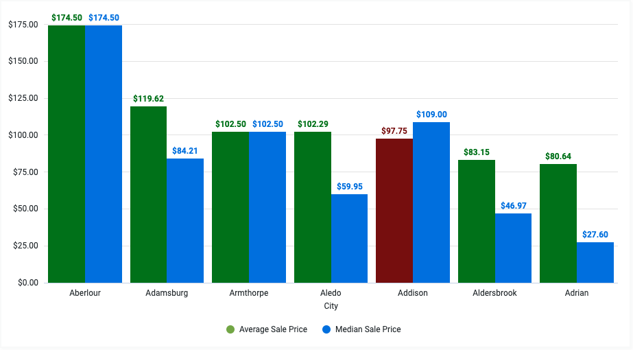
Note that the line select: 'value >= order_items.median_sale_price' references the Median Sale Price field in the format VIEW_NAME.FIELD_NAME. To copy this field value directly, click the Field metadata drop-down in the Edit Chart Config dialog, and select the field name.

Compare series values to the mean or median value
The formatters.select parameter supports the mean keyword in Looker 25.0+ and the median keyword in Looker 25.2+. These keywords let you compare the current data value to the arithmetic mean or median of the series.
For example, consider a visualization that displays the order profit for each month of last year. The following HighCharts JSON changes the color of each bar to grey (represented by the hex code #aaa) if the order profit is less than the mean order profit:
{
  chart: {},
  series: [{
    name: 'Order Profit',
    formatters: [{
      select: 'value < mean',
      style: {
        color: '#aaa'
      }
    }]
  }]
}
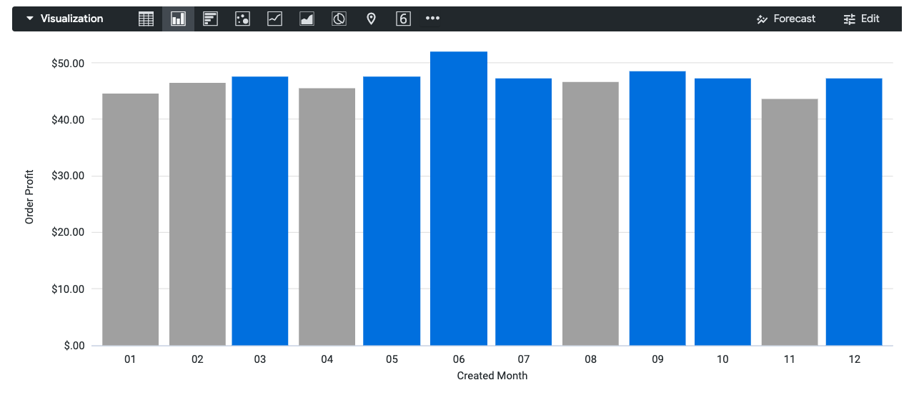
To compare the series value to the median instead of to the mean, change the line select: 'value < mean' to select: 'value < median'.
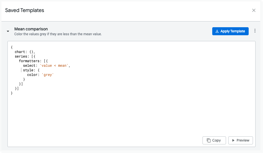
Using templates to save and share configurations
You can save a configuration as a template so that you can reuse it in other visualizations or share it as a starting point for other users.
Save a template
While editing HighCharts JSON in the Chart Config editor, you can save your code as a template by following these steps:
- In the Chart Config Editor dialog, click Save as template.
- Give your template a unique name.
- Enter a description that tells other users what your template does.
- Edit and preview your code as needed.
- Click Save to validate your code.
- Fix any validation errors.
- Click Save again to save the template.
Keep the following considerations in mind when you're creating a template:
- Embed users can't create, edit, or apply templates.
- All non-embed users on your instance who have access to the Chart Config Editor will be able to see your template.
- Not all templates work well for all visualization types. Consider specifying which visualization type your template should be used with in the Description field.
Apply a template
You can apply a template to your current visualization. Keep the following considerations in mind when you're applying a template:
- Applying a template overwrites any code that you've written in the Chart Config Editor.
- Not all templates work well for all visualization types. For example, if the author of a template wrote code for a bar chart, that code may have different effects on a line chart.
To apply a template, follow these steps:
- In the Chart Config Editor dialog, click Saved templates.
- Click a template, and then click Apply template.
- Click Continue.
Looker will apply the template, and you can continue making edits in the Chart Config Editor.
Delete a template
To delete a template, follow these steps:
- In the Chart Config Editor dialog, click Saved templates.
- Click the three-dot menu next to the template that you want to delete.
- Click Delete.
Once you are done making changes, click the X button in the Saved Templates dialog to return to the Chart Config Editor dialog.
Edit a template
To edit a template, follow these steps:
- In the Chart Config Editor dialog, click Saved templates.
- Click the three-dot menu next to the template that you want to edit.
- Click Edit.
- Once you are done making changes, click Save.
Creating new visualization types
You can use the Chart Config Editor to create visualization types that aren't included in Looker's default visualization types. The following articles provide examples of some of the visualizations that you can design with the Chart Config Editor:
- Creating a bullet chart with the Chart Config Editor
- Creating a solid gauge chart with the Chart Config Editor
- Creating a streamgraph chart with the Chart Config Editor
- Creating a treemap chart with the Chart Config Editor
- Creating a Sankey chart with the Chart Config Editor
- Creating a dependency wheel chart with the Chart Config Editor
- Creating a Venn diagram with the Chart Config Editor
- Creating a sunburst chart with the Chart Config Editor
- Creating an item chart with the Chart Config Editor