Bullet charts are useful for showing performance against a target, or progress on a goal.
Using the Chart Config Editor, you can create bullet charts by starting from a bar chart in Looker.
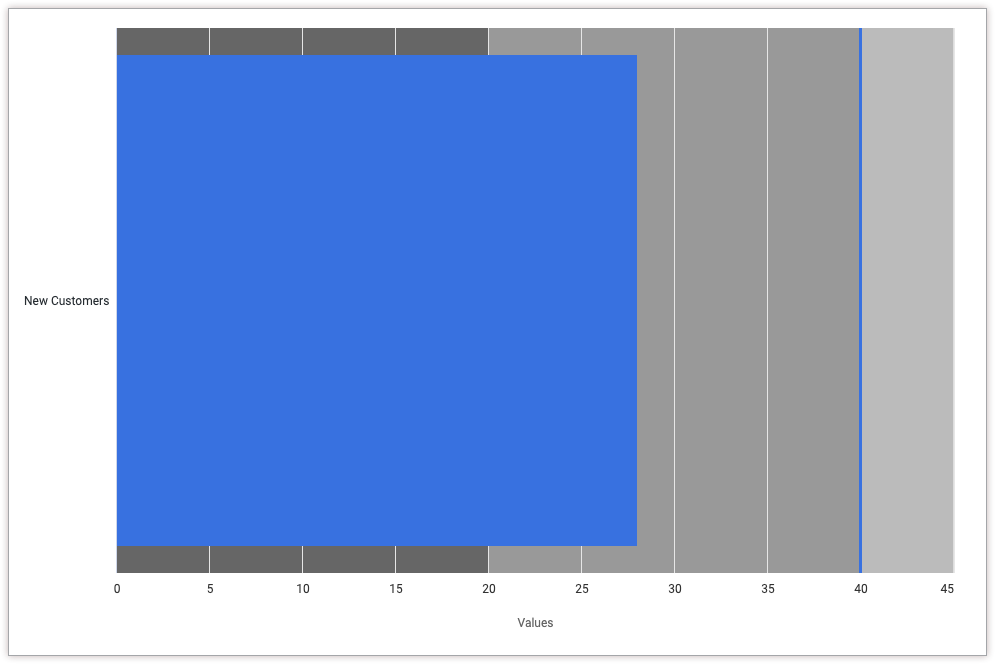
For example, the following bullet chart compares the New Customers Count measure, represented by a blue progress bar, to a target value of 40, represented by a blue vertical line. The chart also indicates progress buckets between 0 and 20, between 20 and 40, and between 40 and 80, each represented by a different shade of grey.
Prerequisites
To access the Chart Config Editor, you must have the can_override_vis_config permission.
Writing the JSON snippet
To create a bullet chart, start from the following JSON snippet:
{
  chart: {
    type: 'bullet'
  },
  xAxis: {
    categories: ['New Customers']
  },
  yAxis: {
    plotBands: [{
      from: 0,
      to: 20,
      color: '#666666'
    }, {
      from: 20,
      to: 40,
      color: '#999999'
    }, {
      from: 40,
      to: 80,
      color: '#bbbbbb'
    }],
  },
  series: [{
    data: [{
      target: 40
    }]
  }],
}
Change the following values to fit your use case:
- The
xAxis.categoriesattribute overwrites the label of the X-axis. In this example, the X-axis label should be the measure name New Customers. - The
yAxis.plotBandsattribute specifies the background color of the chart for certain values. In this example, the background color is dark grey (#666666) between 0 and 20, medium grey (#999999) between 20 and 40, and light grey (#bbbbbb) between 40 and 80. - The
series.data.targetattribute specifies the target value for the bullet chart, which will appear as a vertical line. In this example, the target is 40.
Creating a bullet chart
To create a bullet chart, follow these steps:
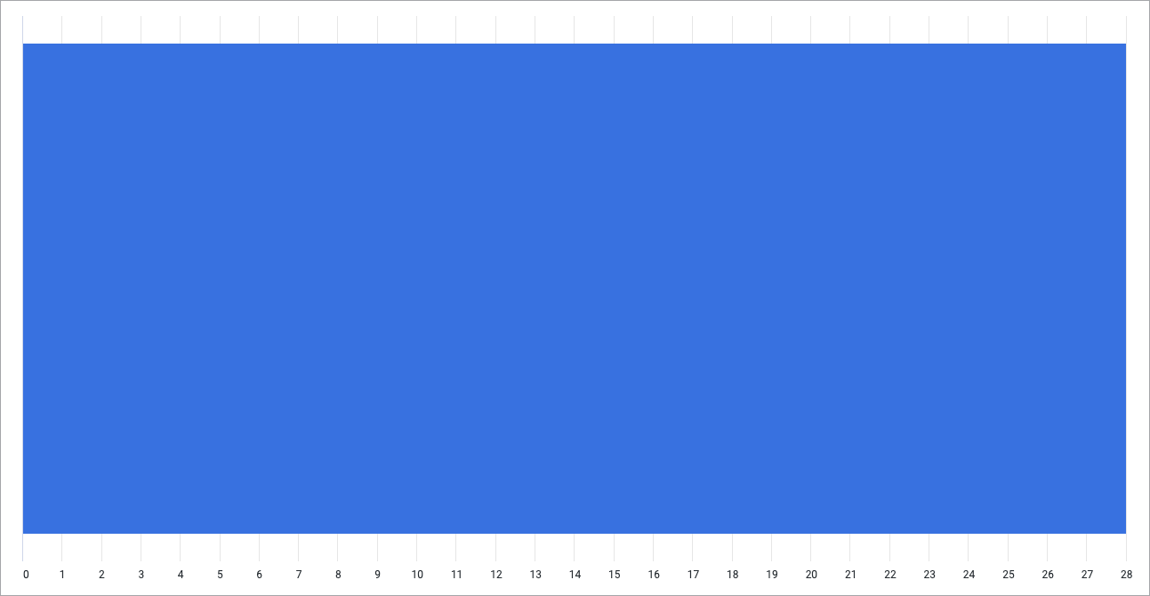
View a bar chart in an Explore, or edit a bar chart in a Look or dashboard.
For this example, we recommend starting from a bar chart with one dimension and one measure, with a limit of one row. Your starting chart might look something like this example:
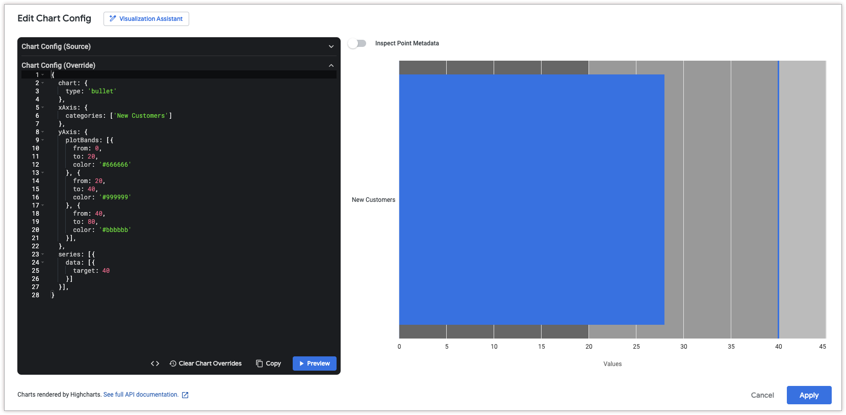
Open the Edit menu in the visualization.
In the Plot tab, click the Edit Chart Config button. Looker displays the Edit Chart Config dialog.
Select the Chart Config (Override) section, and enter the HighCharts JSON from the Writing the JSON snippet section of this page.
To allow Looker to properly format your JSON, click <> (Format code).
To test your changes, click Preview.
To apply your changes, click Apply. The visualization will be displayed using the custom JSON values.
Once you've customized your visualization, you can save it. If you viewed the visualization in an Explore, save the Explore. If you edited a Look or a dashboard, click Save.