Cross-filtering makes it easier and more intuitive for viewers of dashboards to interact with a dashboard's data and understand how one metric affects another. With cross-filtering, users can select a data point in one dashboard tile to have all dashboard tiles automatically filter on that value.
Multiple cross-filters can be created at one time, and cross-filters can be used in conjunction with standard dashboard filters.
Enabling cross-filtering on dashboards
For cross-filtering to be turned on successfully, all dashboard tiles must be created from the same Explore.
- Make sure you have the Manage Access, Edit access level for the dashboard.
- Enter the dashboard's edit mode by selecting Edit dashboard from the three-dot dashboard menu.
- Select Filters in the blue toolbar at the top of the dashboard, and enable the Cross-filtering switch.
- If the dashboard contains any unsupported visualization types, a pop-up window indicates that the dashboard contains tiles that cannot initiate cross-filtering. Select OK to continue.
Select Save in the dashboard toolbar.
LookML developers may be able to use aggregate awareness to optimize cross-filtering performance. To learn more about using aggregate awareness with dashboards, visit the Creating user-defined dashboards documentation page.
Creating cross-filters on dashboards
Once cross-filtering is enabled on an instance and a dashboard, you can create cross-filters.
Select a data point within a tile containing a supported visualization. For bar, column, line, area, scatterplot, and pie charts, you can also select the chart legend.

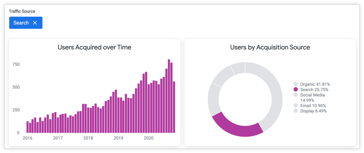
The tile creating the cross-filter highlights that data point and greys out all other data points. All other data tiles will be filtered by the value of that data point. The cross-filter field and value appear at the top of the dashboard for reference.

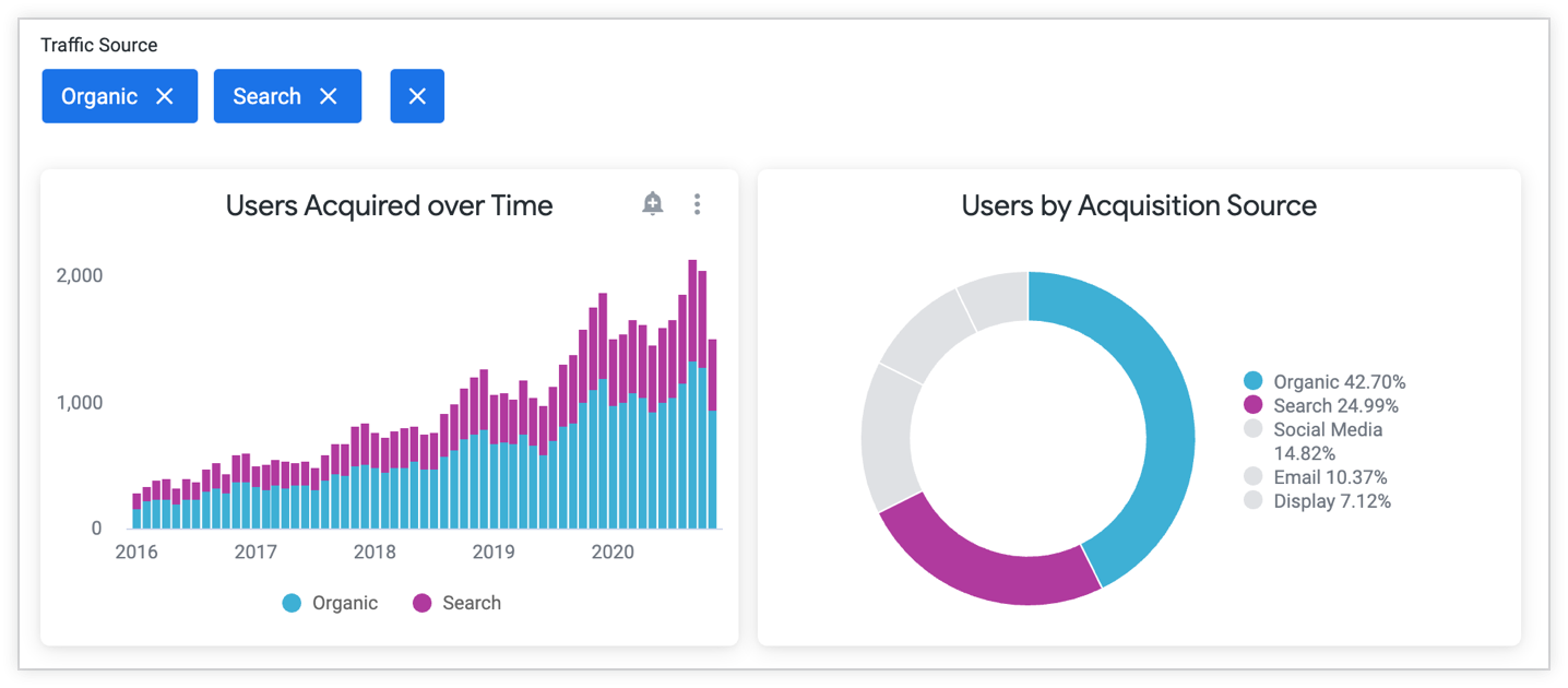
To add an additional value to an existing cross-filter, hold down the Command (Mac) or Control (Windows) key on your keyboard while selecting additional data points or legends.
The tiles filter on the additional value as well. The additional value for the cross-filter appears at the top of the dashboard.

To add a new cross-filter, select another data point on any tile containing a supported visualization type. All tiles filter by that cross-filter as well, and an additional field and value appears at the top of the dashboard.

Supported and unsupported visualization types
Each data tile on a dashboard contains a visualization, and the type of visualization determines whether or not you can use the data points on that tile to create cross-filters.
Supported visualization types
The following visualization types are supported and can create cross-filters:
- Table charts
- Table (legacy) charts
- Column charts
- Bar charts
- Line charts
- Area charts
- Scatterplot charts
- Pie charts
- Map charts that use the Points option for data of
type: locationand map charts that use data oftype: zipcode - Static map (regions) charts
- Static map (points) charts
- Word cloud charts
- Donut multiples charts
- Funnel charts
- Timeline charts
- Waterfall charts
- Boxplot charts
- Custom visualizations
For information on how to enable cross-filtering on custom visualizations, visit the API 2.0 Reference documentation in the custom_visualizations_v2 GitHub repo.
Unsupported visualization types
The following visualization types are not supported and cannot create cross-filters; however, they can be filtered by cross-filters:
- Single value charts
- Single record charts
- Map charts that use Plot options other than Points for data of
type: location, or map charts that use map layers - Visualizations that use grid layout
- Visualizations based on merged results when all queries in the merged results are from the same Explore as the rest of the dashboard tiles (if a dashboard contains a merged results tile with queries from different Explores, cross-filters cannot be enabled for that dashboard)
Regardless of visualization type, you cannot create cross-filters (or standard dashboard filters) on a custom field.
Using range selection
You can use range selection to cross-filter a dashboard on an entire range. To use range selection:
- A dashboard tile must use a line, area, or scatterplot visualization.
- The visualization must use continuous data in the x-axis, which is usually numeric data, data using timeframes, or data of a time-based type, although some timeframes and time types are not continuous.
- The visualization's x-axis Scale Type must not be Ordinal. If it is Ordinal, range selection creates separate cross-filters for each data point selected.
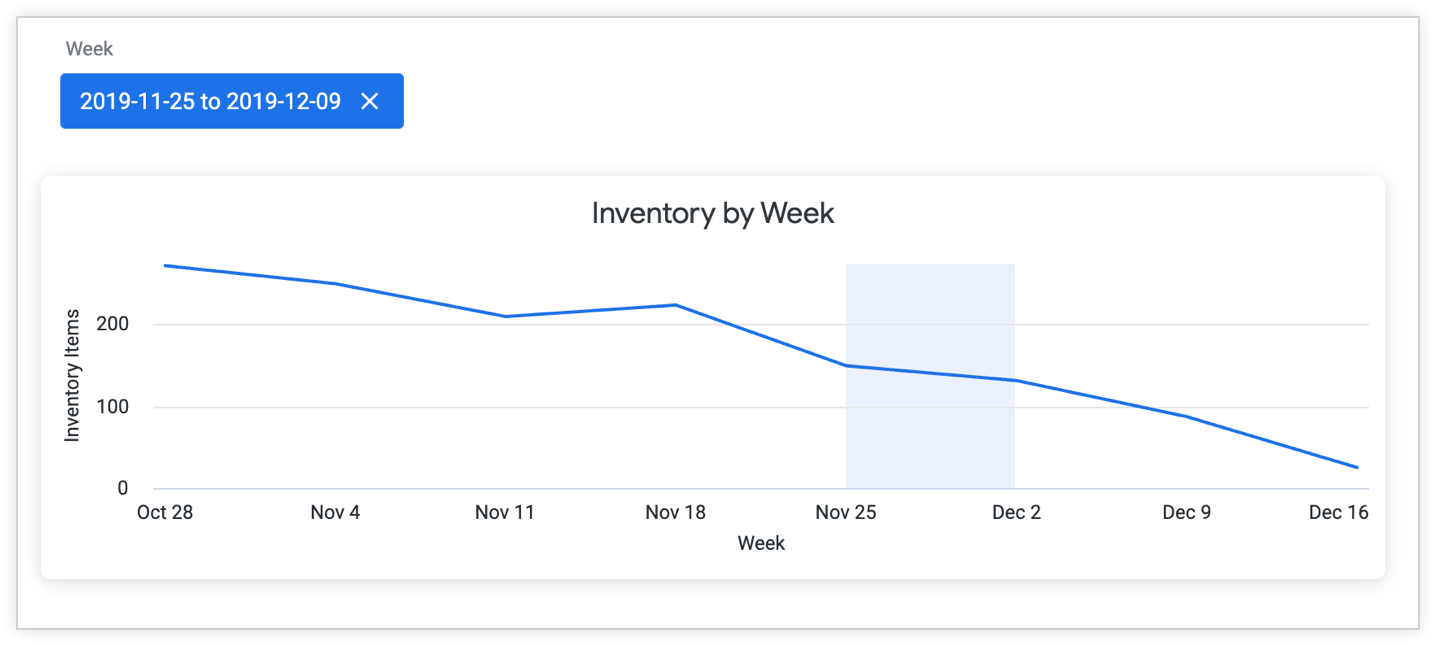
To use range selection, left select one end of the range, and hold and drag to the other end of the range. When you release your hold, the cross-filter will appear at the top of the dashboard and the other tiles will filter on that range. You cannot add additional values to range selection cross-filters.
For example, the dashboard viewer in the following image selected the weeks of November 25th and December 2nd. The range selected is shaded and the cross-filter appears at the top of the dashboard.

Each data point encompasses a week. While the shaded area appears to end on December 2nd, the cross-filter actually ends on December 9th, the last day of that week. The cross-filter at the top of the dashboard displays the full range, November 25th through December 9th.
Non-continuous time types
The timeframes and time-based types in the following list are not considered continuous. If you use range selection with them, a separate cross-filter is created for each data point that you select.
date_time_of_daydate_day_of_weekdate_month_namedate_quarter_of_yeardate_fiscal_quarter_of_year
Using cross-filters with standard dashboard filters
A dashboard can contain both cross-filters and standard dashboard filters. Cross-filters appear after standard filters at the top of the dashboard and are a darker blue. For example, in the following image, the filter on Status is a standard filter. The filters on Created Month and Traffic Source are cross-filters:

Cross-filters differ from standard dashboard filters in a few ways:
- Cross-filtering must be enabled separately for your Looker (Google Cloud core) instance and dashboard(s).
- You do not need edit access to a dashboard to create or change cross-filters (you do need edit access to turn on cross-filtering for a dashboard).
- Cross-filters cannot be configured with the same dashboard controls as standard filters.
- Specific cross-filters are not visible to other users unless the cross-filtered dashboard is shared through a link or embedded into a website.
- Cross-filters are not saved to the dashboard. Once you navigate away from a dashboard, cross-filters are cleared.
- Cross-filters are not applied to dashboard downloads, schedules, or alerts.
While using cross-filters, you can make temporary changes to a dashboard's filter values. However, if you create a cross-filter on the same field that a standard filter is using, the standard filter value cannot be changed until the cross-filter is removed.
If you have edit permissions for a dashboard, you can edit and create standard dashboard filters while cross-filters are enabled. However, entering edit mode to edit or add standard filters will clear any current cross-filters.
Sharing cross-filtered dashboards
Cross-filters are not saved to a dashboard. You can share them in the following ways:
- By sharing a link to the dashboard
- By embedding a dashboard that contains cross-filters
Drilling when cross-filtering is enabled
When cross-filtering is enabled on a dashboard, you can right-click to drill into the visualization's data.
Removing cross-filters
There are two options to remove an individual cross-filter:
- Select the data point being cross-filtered again.
- Select the X next to the cross-filter value at the top of the dashboard.

If there are multiple cross-filters, you can clear them all by selecting the X to the right of the filter values at the top of the dashboard.
Entering edit mode also clears all cross-filters.
Optimizing cross-filtering performance using aggregate awareness
LookML developers may be able to optimize query performance of cross-filtered dashboards by using aggregate awareness. With aggregate awareness, developers can create aggregate tables under LookML explore parameters, which can optimize queries for one or more tiles in a dashboard. The first step is to get the aggregate table LookML, which appears under the Get LookML option in the dashboard three-dot menu. For more information, see the aggregate_table parameter documentation page.
