Boxplot charts help you visualize the distribution and spread of values in your dataset. Boxplot charts can be especially useful for comparing values across categories.
Building a boxplot chart
To create a boxplot chart, your data should be separated into quartiles, or quarters. Your data values are organized from smallest to largest and then that list is divided into quarters.
The box portion of the chart represents the values between the first and third quartiles, where 50% of your data is contained. The "whisker" portions of the chart, which are the lines that extend vertically from the top and bottom of the box and end at the maximum and minimum values in your data, represent the remaining 50% of values. A horizontal line through the box represents the median value. Each row in the Data table for your query becomes one box in the chart.
To create a boxplot visualization, select the ellipsis (...) in an Explore Visualization bar and choose Boxplot. Next, select the Edit option on the visualization bar to edit your chart.
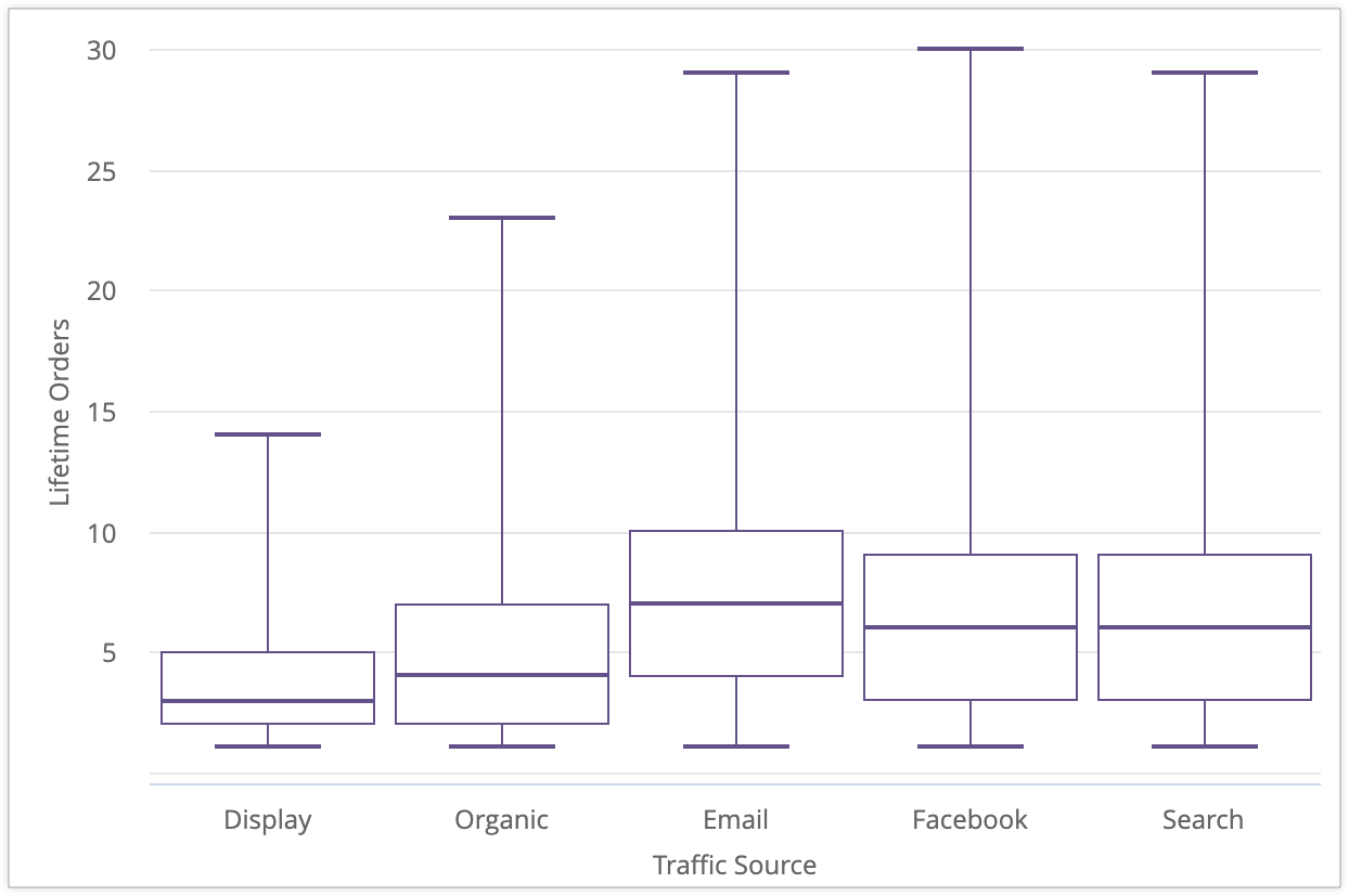
This example shows the values for the Lifetime Orders field based on the Traffic Source dimension:

Display has a median value of 3 lifetime orders per user, with minimum and maximum values of 1 and 14 lifetime orders per user, respectively. It also has a third quartile value of 5 lifetime orders, showing that three quarters of users from the Display traffic source have fewer than 5 lifetime purchases. Compared to other traffic sources like Email, which has a third quartile value of 10 lifetime purchases, users from the Display traffic source tend to make fewer lifetime purchases.
Building a boxplot with five measures
Boxplot visualizations require at least one dimension, and the following five types of measures (which must be in this order, from left to right):
| Users - Traffic Source | Items in Inventory - Minimum | Items in Inventory - 25th Percentile | Items in Inventory - Median | Items in Inventory - 75th Percentile | Items in Inventory - Maximum |
|---|---|---|---|---|---|
| Display | 1 | 2 | 3 | 5 | 14 |
| Organic | 1 | 2 | 4 | 7 | 23 |
| 1 | 4 | 7 | 10 | 29 | |
| 1 | 3 | 6 | 9 | 30 | |
| Search | 1 | 3 | 6 | 9 | 29 |
- Minimum: A measure representing the minimum data value. This can be defined in LookML as a measure of
type: min. - 25th percentile: A measure representing the 25th percentile, or the first quartile. One quarter of your data values are less than or equal to this value. This can be defined in LookML as a measure of
type: percentilewith the value forpercentileset to25. - Median: A measure representing the median or midpoint of the dataset, or the second quartile. Half of your data values are less than or equal to this value. This can be defined in LookML as a measure of
type: median. - 75th percentile: A measure representing the 75th percentile, or the third quartile. Three quarters of your data values are less than or equal to this value. This can be defined in LookML as a measure of
type: percentilewith the value forpercentileset to75. - Maximum: A measure representing the maximum value. This can be defined in LookML as a measure of
type: max.
Building a boxplot with fewer than five measures
You can also create a boxplot using minimum, median, and maximum measures, or only minimum and maximum measures, in order from left to right. If your query includes only two or three measures, your boxplot visualization will display only the box portion of the chart, not the whiskers.
For example, if you create a boxplot chart that is based on the Traffic Source dimension with three measures that represent the minimum, median, and maximum data values for the Lifetime Orders dimension, the visualization will display boxes without the whiskers.

Series menu options
Color configuration
You can define the color palette for a chart in the Color Configuration section.
Edit Chart Config

The Edit Chart Config button at the bottom of the visualization menu opens the Chart Config Editor. This editor lets you modify HighCharts visualizations by exposing certain JSON parameters of the visualization, enabling deep customization. These customizations will not dynamically interact with data.
The Edit Chart Config button is available if you have either the Looker Admin role or the can_override_vis_config permission.
See the Examples section of the Chart Config Editor article for examples of some common use cases, including the following examples:
- Changing the background color and axis text color
- Conditional formatting of values within a series
- Customizing tooltip color
- Adding vertical reference bands and captions
- Adding chart annotations
Collection
A collection lets you create themed visualizations and dashboards that look good together. All of Looker's built-in color collections appear on the Color collections documentation page. Your Looker admin may also create a custom color collection for your organization.
You can choose a color collection from the Collection drop-down menu. The Palette section will update with the first categorical palette from that collection.
Palette
The first color in the palette for the color collection that you have chosen is assigned to your visualization.
Specifying a custom color
To choose a custom color for your visualization, select the Custom tab on the palette picker. You can edit your palette in several ways:
- Click on the first color in the palette to edit it.
- Click EDIT ALL at the bottom right of the menu, then add the desired color to the beginning of the comma-separated list of color values for that palette.
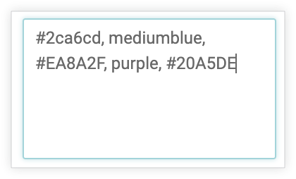
To change a selected color, or edit all colors in a palette at once, you can input hex strings, such as #2ca6cd, or CSS color names, such as mediumblue, into the color value box at the bottom of the picker.

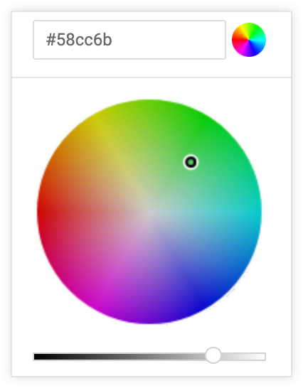
To bring up a color picker to select a color, click the color wheel to the right of the color value box. The corresponding hex value for that color appears in the color value box.

If you click EDIT ALL, the color value box populates with the hex codes of the color palette you've chosen or customized. Copying and pasting this list is the best way to copy custom color palettes from one chart to another.
Reverse colors
Select Reverse colors to apply the last color in the palette to your visualization.
Style menu options
Show full field name
You can determine whether to show the view name along with the field name for each axis title and series name. When Show Full Field Name is turned off, generally only the field name shows; however, measures of type count display only the view name instead.
X menu options
Show axis name
You can toggle the appearance of the x-axis name label.
Custom axis name
You can set the name for the x-axis using any string value. This option is only available when Show Axis Name is ON.
Axis value labels
Axis Value Labels toggles the appearance of value labels on the x-axis.
Gridlines
You can toggle the appearance of gridlines extending from the x-axis. Gridlines are spaced based on the scaling of the x-axis.
Allow Zoom
This option is available only for Cartesian charts (column, bar, scatterplot, line, area, waterfall, or boxplot charts).
This option defaults to enabled. When it's enabled, you can zoom on a visualization in a dashboard, a Look, or an Explore.
See the Viewing dashboards or Viewing Looks in Looker documentation page for information about how to use the zoom feature.
When this option is disabled, the Allow Zoom option on the Y menu is hidden and you cannot zoom on the visualization.
Y menu options
Show axis names
You can toggle the appearance of y-axis name labels.
Custom axis names
You can define the label for the y-axis. This option is only available when Show Axis Names is enabled.
Axis value labels
You can toggle the appearance of value labels on the y-axis.
Gridlines
You can toggle the appearance of gridlines extending from the y-axis. Gridlines are spaced based on the scaling of the y-axis.
Minimum values
You can define the minimum value for each y-axis. This parameter accepts a comma-separated list of integers. If there is more than one y-axis, minimum values are assigned to each y-axis in the order of the measures in your query.
Maximum values
You can define the maximum value for each y-axis. This parameter accepts a comma-separated list of integers. If there is more than one y-axis, maximum values will be assigned to each y-axis in the order of the measures in your query.
Tick density
You can set the density of tick marks on the y-axis as follows:
Default: Sets ticks to the default density.
Custom: Set ticks with a custom density. A slider bar lets you set the custom density.
Y axis format
You can specify the number format of the y-axis values, independent of the underlying dimension or measure. The parameter accepts Excel style formatting. If no formatting is specified, the value displays in the format of the underlying dimension or measure.
Excel's complete guide explains how to specify these formats in the Excel documentation. At this time, date formatting and color formatting are not supported in Looker.
Some of the most common formatting options are shown on the Adding custom formatting to numeric fields documentation page.
Allow Zoom
This option is available only for Cartesian charts (column, bar, scatterplot, line, area, waterfall, or boxplot charts).
This option is available only when the Allow Zoom option on the X menu is enabled. This option defaults to enabled. When it's enabled, you can zoom on a visualization in a dashboard, a Look, or an Explore.
See the Viewing dashboards or Viewing Looks documentation page for information about how to use the zoom feature.
If this option is disabled but the Allow Zoom option on the X menu is enabled, you cannot zoom into a tighter view of the y-axis; you can zoom only into a tighter view of the x-axis.
