Timeline charts help you visualize the relationship between groups of events and compare the timespans over which these events took place. A timeline visualization also works with numbers.
To use a timeline visualization, click the ellipsis (...) in the Visualization bar and choose Timeline. Click Edit in the upper right corner of the visualization tab to format your visualization.
For example, you can use a timeline chart to show the timespan between a customer's first order date and the customer's most recent order date. Each timespan can be colored to indicate the number of orders that the customer has placed.
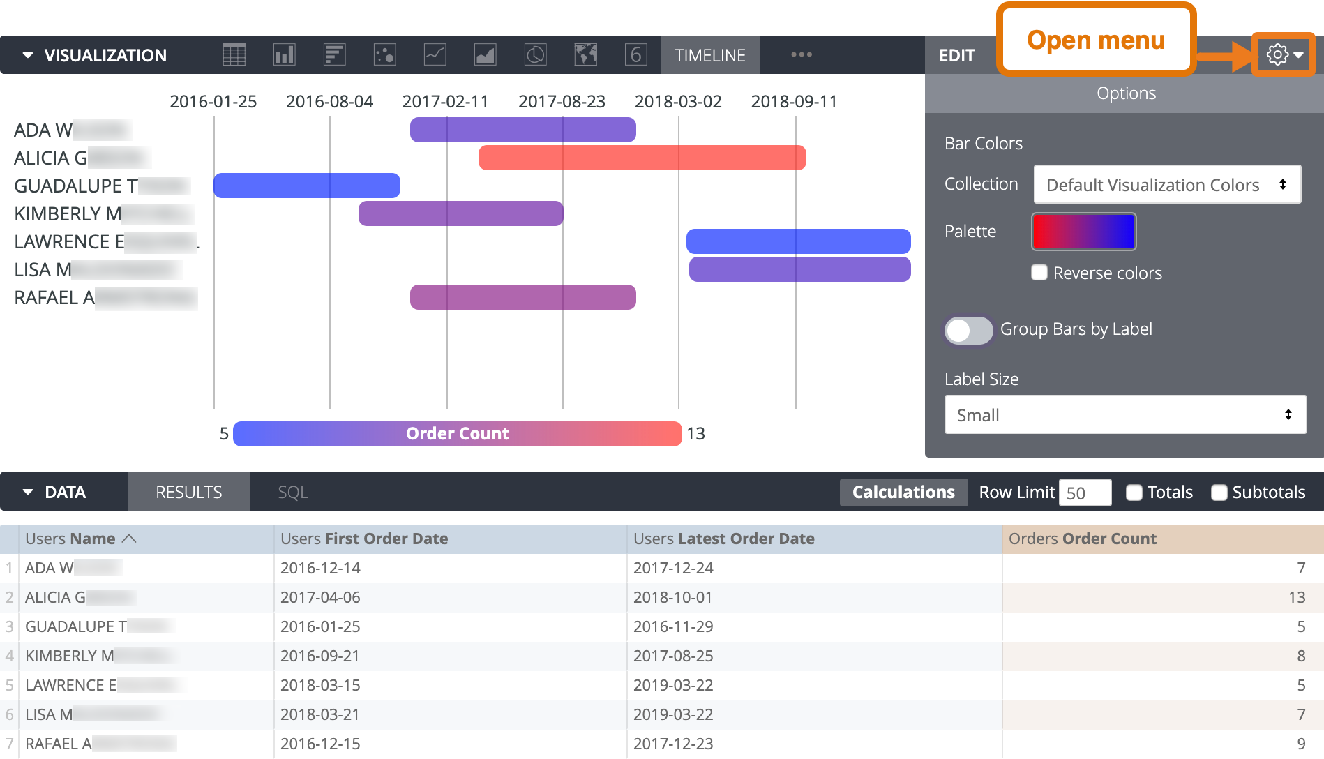
Timeline visualizations are based on fields in the Data section, and the fields must be in a particular order. Ignoring those fields that are hidden from the visualization, the timeline needs the following fields (in order from left to right):
- Label field: A string field, such as a name. This is a mandatory field.
- Detail field: A second, optional string field, which lets you combine each row of the timeline visualization into categories. See Displaying Individual or Multiple Bars per Row for more detail.
- Start field: A start date or number. This is a mandatory field.
- End field: An end date or number. This is a mandatory field.
- Magnitude field: An optional number field, which determines the bar color on a continuum between the two colors specified in the visualization options. See Using Colors for more information and other options using colors and labels.
Using timeline visualizations without dates
Timeline charts can be helpful for information other than dates. This example shows several airlines, each with a bar where:
- The bar starts at the airline's on-time flight count
- The bar ends at the airline's total flight count
- The bar's color indicates the airline's on-time percentage as a magnitude value
The magnitude coloring helps illustrate that although an airline may have a large difference between its on-time flight count and its total flight count, it may have a good on-time percentage. For example, Southwest has a wide bar but also has the best percentage of on-time flights, as shown by the purple bar showing its on-time percentage. You can hover over a bar to see the data that the bar represents, including:
- The beginning value of the bar
- The ending value of the bar
- The value represented by the color of the bar (if any)

Displaying individual or multiple bars per row
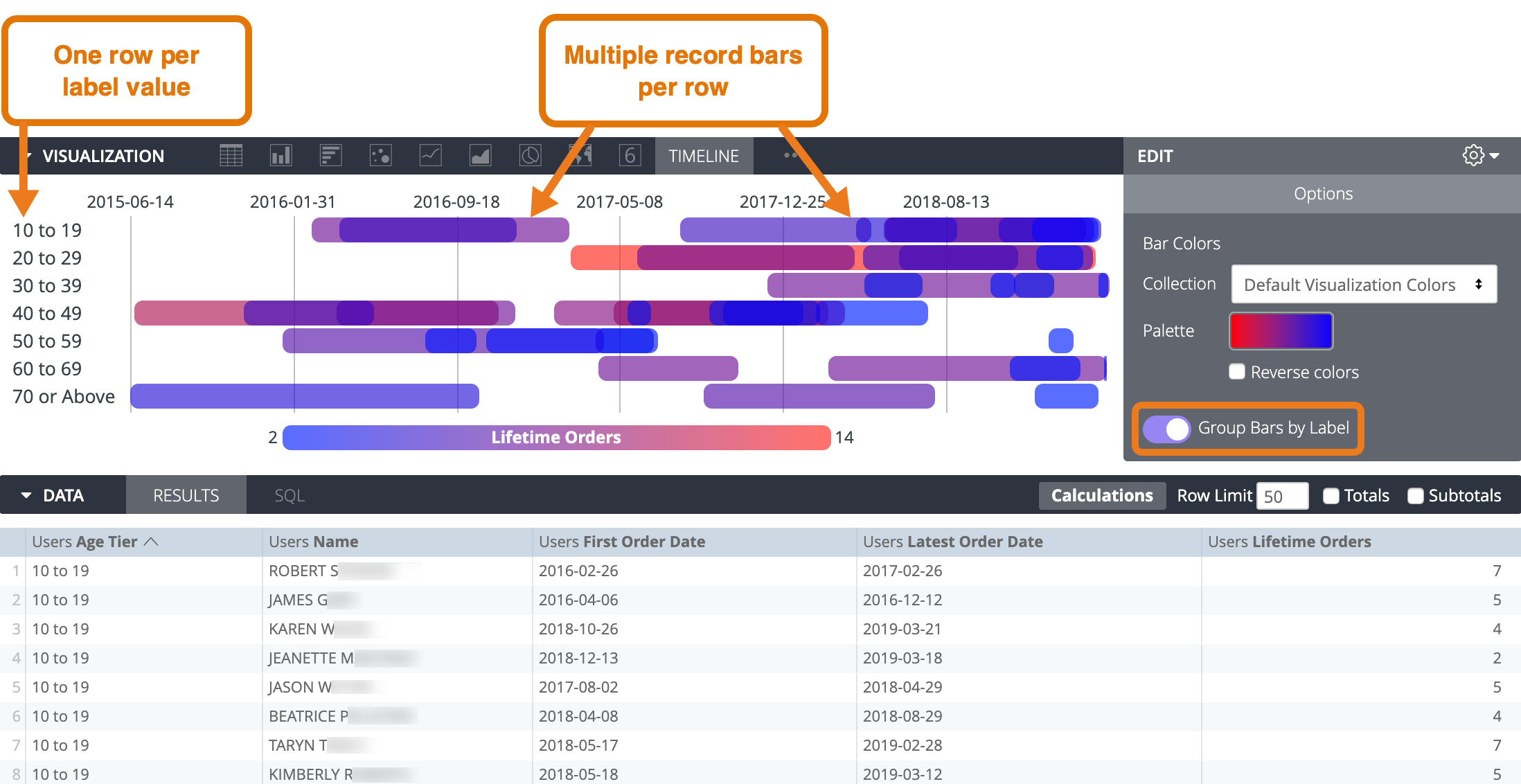
If you turn on Group Bars by Label, all records that share the same label value appear as individual bars on the same row in the visualization. For example, consider a set of user data, where each user belongs to an age tier. If the age tier is the label field and the user's name is the detail field, then the visualization displays one row per age tier, with one or more users' names displayed as bars on that age tier's row.
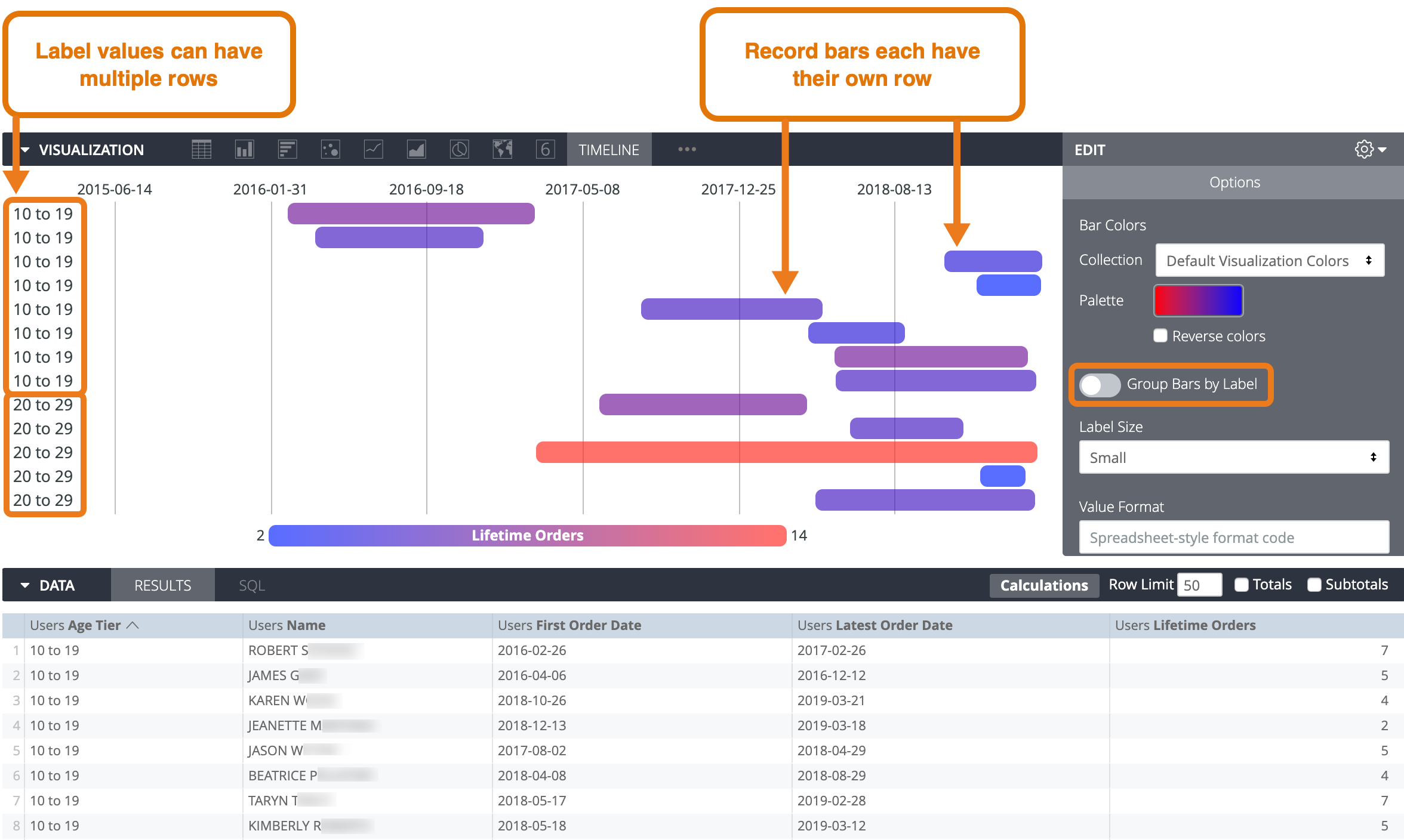
To instead display each record bar on its own row, turn off the Group Bars by Label option. In this example, the visualization would instead display one row per user name.
Using colors
For timeline visualizations, the color of a bar can mean different things, depending on your data:
- Magnitude value: Each bar's color is within a continuum and illustrates the magnitude value for the bar. To set this up, include a magnitude field in your query and specify a continuous palette (one that shades from one color to another, such as the sequential and diverging palettes in Looker's color collections) in the visualization options.
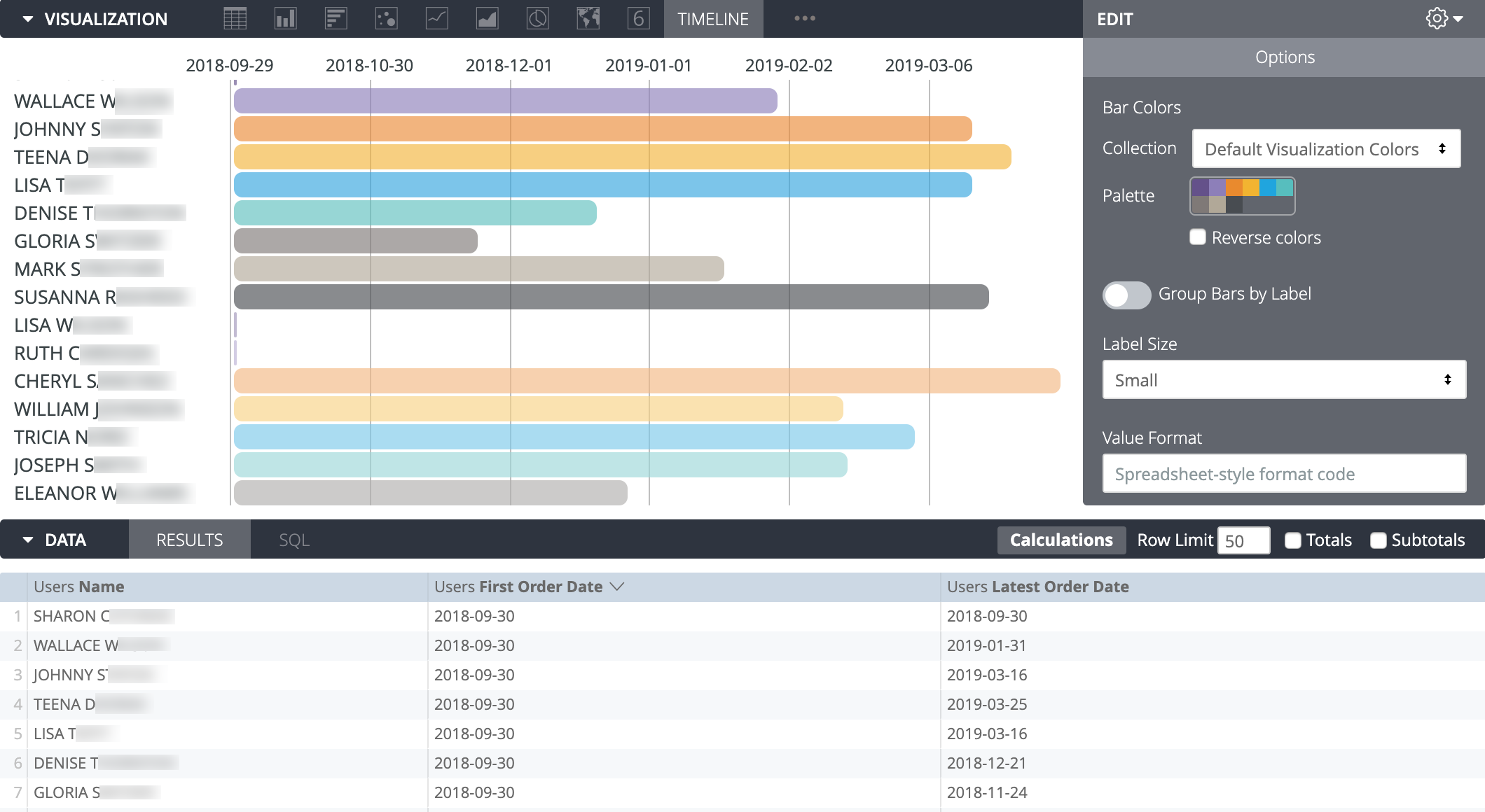
- Detail value: Each bar's color indicates its value in the detail field. To set this up, include a detail field in your data and choose a categorical palette (one that has multiple individual colors) in the visualization options. (If you don't have a magnitude field, you can select a continuous palette and the colors will refer to the values in the detail field. If you do have a magnitude field and select a continuous palette, the colors will always apply to the magnitude field.)
- In all other cases, the bar colors use a repeating pattern of the colors you select in the visualization options.
Consider an example data set with a detail field, Traffic Source, and a magnitude field, Lifetime Orders.
If you use a continuous palette, the color continuum will indicate the value of the magnitude field. In this example, the legend would show how many lifetime orders the colors on each end of the color continuum represent.

If you instead use a categorical palette, the color continuum indicates the values in the detail field. In this example, the legend would instead show which traffic source is represented by each color.

If you remove both the detail and the magnitude fields, the colors cycle through the palette that is chosen in the visualization options.
Options
Bar Colors
You can define the color palette for a chart.
Selecting a color collection and palette
A collection lets you create themed visualizations and dashboards that look good together. All of Looker's built-in color collections appear on the Color collections documentation page. Your Looker admin may also create a custom color collection for your organization.
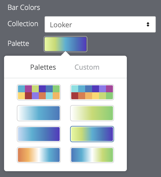
You can choose a color collection from the Collection drop-down menu. The Palette section will update with a palette from your chosen color collection. To change to a different palette in the color collection, click the color palette, which opens the palette picker. From there, you can view and select from all palettes in the collection.
Choosing the type of palettes
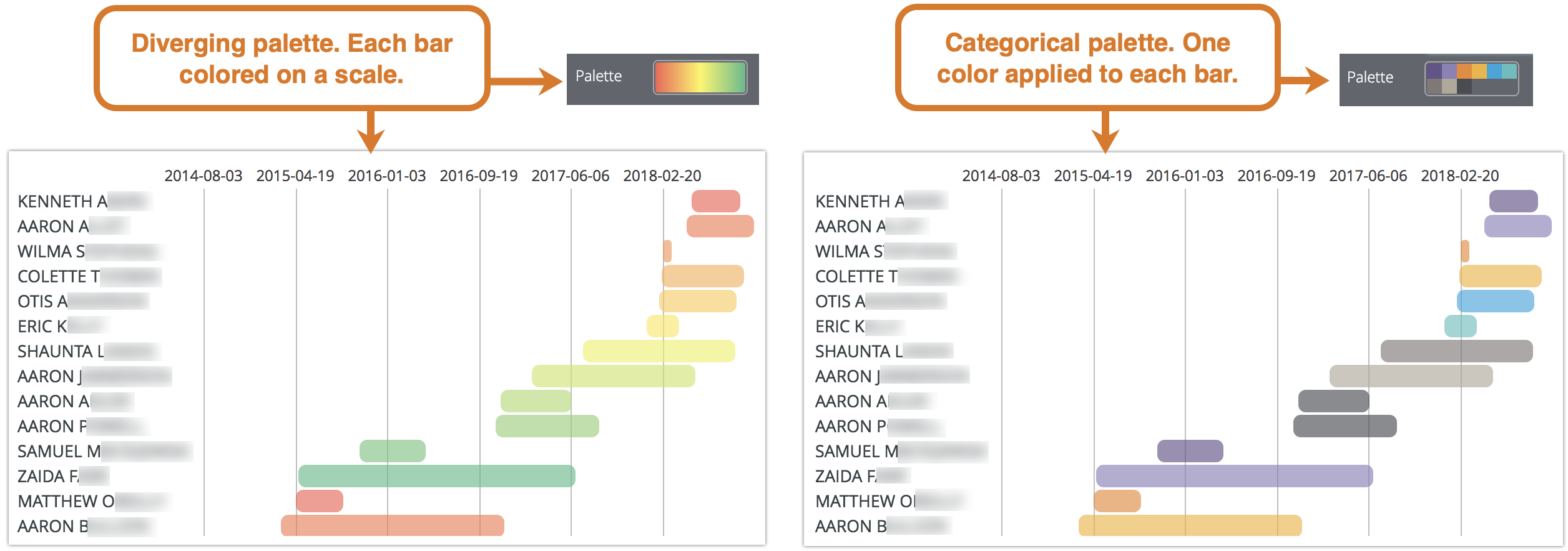
If you use a sequential or diverging palette, each bar is colored on a scale along the palette. If you change to a categorical palette (a palette composed of multiple individual colors), colors are assigned to each bar in order. The first bar is assigned the first color, and so on. If there are more bars than colors listed, the colors repeat from the beginning of the palette.
Creating a custom color palette
To create a custom color palette, first select the Custom tab on the palette picker. You can edit your palette in several ways:
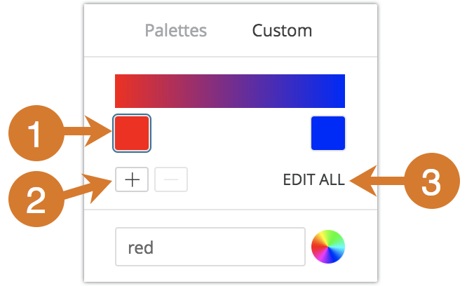
- Click on one of the colors present to edit it.
- Click the + or - buttons to add a color to the end of the palette or to remove a selected color. When you add a color to the end of a sequential or diverging palette, Looker automatically creates a scale between that color and the previous one.
- Click EDIT ALL at the bottom right of the menu to use a comma-separated list of color values.
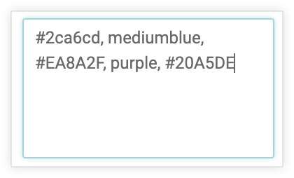
To change a selected color, or edit all colors at once, you can input hex strings, such as #2ca6cd, or CSS color names, such as mediumblue, into the color value box at the bottom of the menu.
You can also click the color wheel to the right of the color value box to bring up a color picker, which you can use to select a color. The corresponding hex value for that color appears in the color value box.
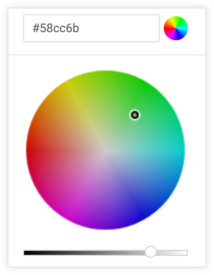
If you click EDIT ALL, the color value box populates with all hex codes of the color palette you've chosen or customized. Copying and pasting this list is the best way to copy custom color palettes from one chart to another.
Reverse Colors
You can reverse the colors used on a palette. For a sequential or diverging palette, each bar is colored on a scale along the palette in reverse order, starting with the color at the right end of the palette and moving to the left. For a categorical palette, this would apply the colors in the palette to each bar in reverse order, starting with the last color in the palette.
Group Bars by Label
You can determine whether a visualization should display each record bar in its own row, or if the record bars for each label value should all be in the same row. See Displaying Multiple Bars per Row.
Label Size
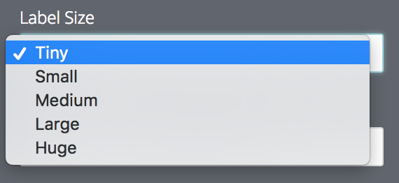
You can set the font size for labels. The following options are available:
- Tiny
- Small
- Medium
- Large
- Huge
Value Format
You can specify the number or date format of a value using Excel-style formatting. If no formatting is specified, the value displays in the format of the underlying dimension or measure.
MS Excel's complete guidedescribes how to specify these formats. However, color formatting is not currently supported in Looker.
The Adding custom formatting to numeric fields documentation page provides more information on how to use custom formatting.
You can specify the formatting of date values. The following are some common formatting options:
| Date Format | Meaning |
|---|---|
m |
Month as a number with no leading zero. May is shown as "5". |
mm |
Month as a number with a leading zero when appropriate. May is shown as "05". |
mmm |
Month as an abbreviation (Jan to Dec). |
mmmm |
Month as a full name (January to December). |
mmmmm |
Month as a single letter (J to D). |
d |
Day as a number without a leading zero. |
dd |
Day as a number with a leading zero when appropriate. |
ddd |
Day as an abbreviation (Sun to Sat). |
dddd |
Day as a full name (Sunday to Saturday). |
yy |
Year as a two-digit number. |
yyyy |
Year as a four-digit number. |
h |
Hour as a number without a leading zero. |
hh |
Hour as a number with a leading zero when appropriate. If the format contains AM or PM, the hour is based on the 12-hour clock. Otherwise, the hour is based on the 24-hour clock. |
m |
Minute as a number without a leading zero. NOTE: The m must appear immediately after the h or hh element or immediately before the s or ss element (otherwise, it will be interpreted as month instead of minutes). |
mm |
Minute as a number with a leading zero when appropriate. NOTE: The mm must appear immediately after the h or hh element or immediately before the s or ss element (otherwise, it will be interpreted as month instead of minutes). |
s |
Second as a number without a leading zero. |
ss |
Second as a number with a leading zero when appropriate. If you want to display fractions of a second, use a number format that resembles h:mm:ss.00. |
am/pm, a/p |
Hour using a 12-hour clock. Excel displays "AM" or "A" for times from midnight until noon and "PM" or "P" for times from noon until midnight. |
Show Legend
You can display or hide a legend at the bottom of the visualization.
Edit Chart Config
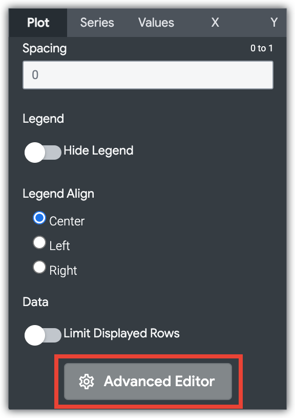
The Edit Chart Config button at the bottom of the visualization menu opens the Chart Config Editor. This editor lets you modify HighCharts visualizations by exposing certain JSON parameters of the visualization, enabling deep customization. These customizations will not dynamically interact with data.
The Edit Chart Config button is available if you have either the Looker Admin role or the can_override_vis_config permission.
See the Examples section of the Chart Config Editor article for examples of some common use cases, including the following examples:
- Changing the background color and axis text color
- Conditional formatting of values within a series
- Customizing tooltip color
- Adding vertical reference bands and captions
- Adding chart annotations
