This page describes the options for editing scatterplot charts in the visualization menu. Select the Edit option in the upper right corner of the Visualization bar to format your visualization.
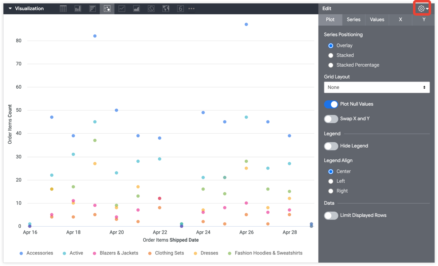
Some options listed on this documentation page may be grayed out or hidden in situations where they conflict with other settings that you have chosen.
Plot menu options
Series Positioning
You can specify how series are clustered visually on a chart. Not all of the following options apply to all chart types:
- Grouped: For column and bar charts. Series are clustered side-by-side.
- Overlay: For scatterplot, line, and area charts. Series are overlaid on the chart.
- Stacked: Series values are added on the y-axis, so that each consecutive series appears above the last. Be sure that the units of all series match.
- Stacked Percentage: Series values are presented as percentages stacked on the y-axis, where all values add up to between 99% and 101%. For additional precision, increase the Value Format decimal places.
Grid Layout
You can separate, or trellis, a chart into several smaller charts, each representing a single row or pivot from the results table.
You can separate a chart into a maximum of 12 smaller charts. If you have more than 12 rows or pivots, limit your data by using the Row Limit, Column Limit, or Limit Displayed Rows options.

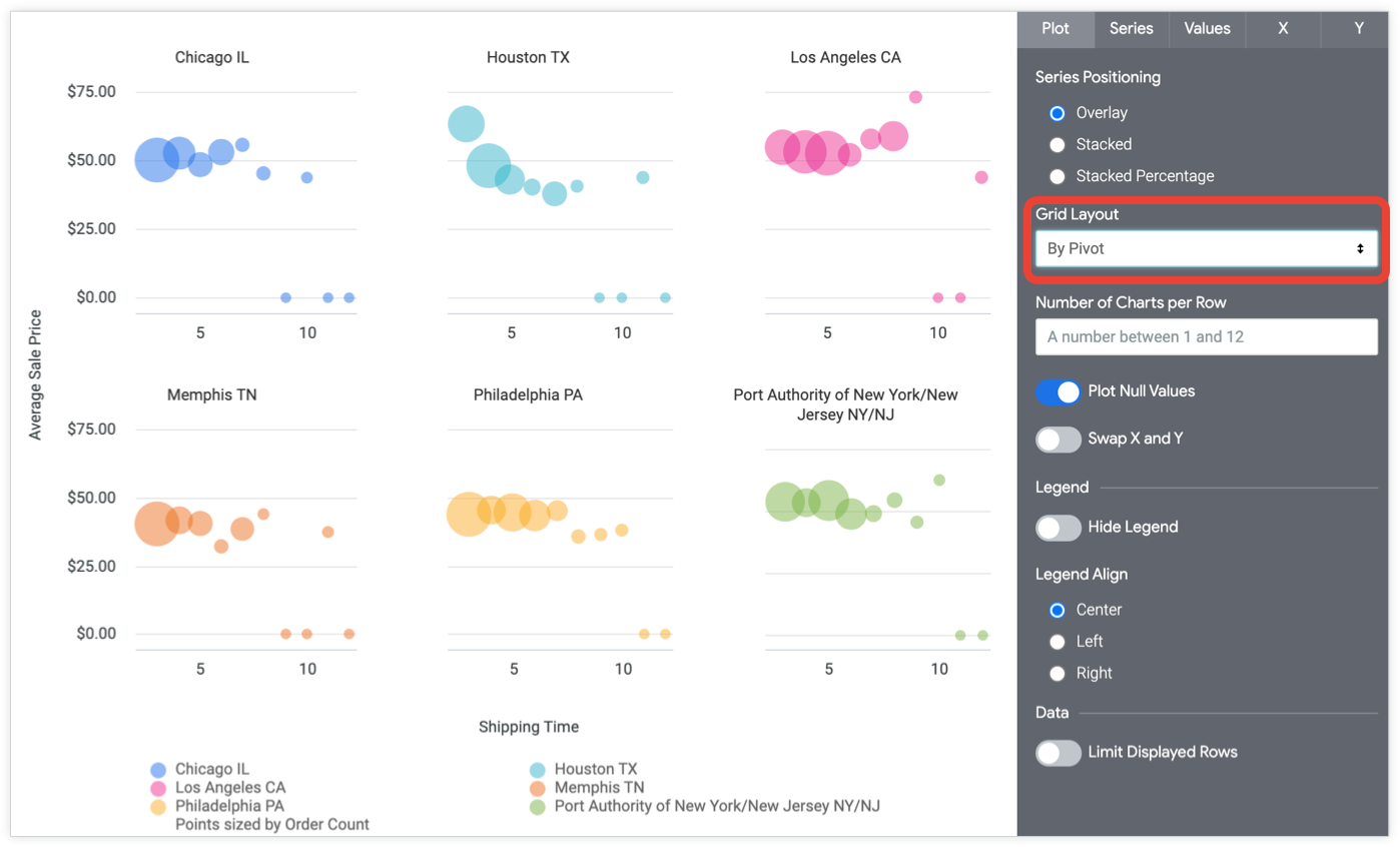
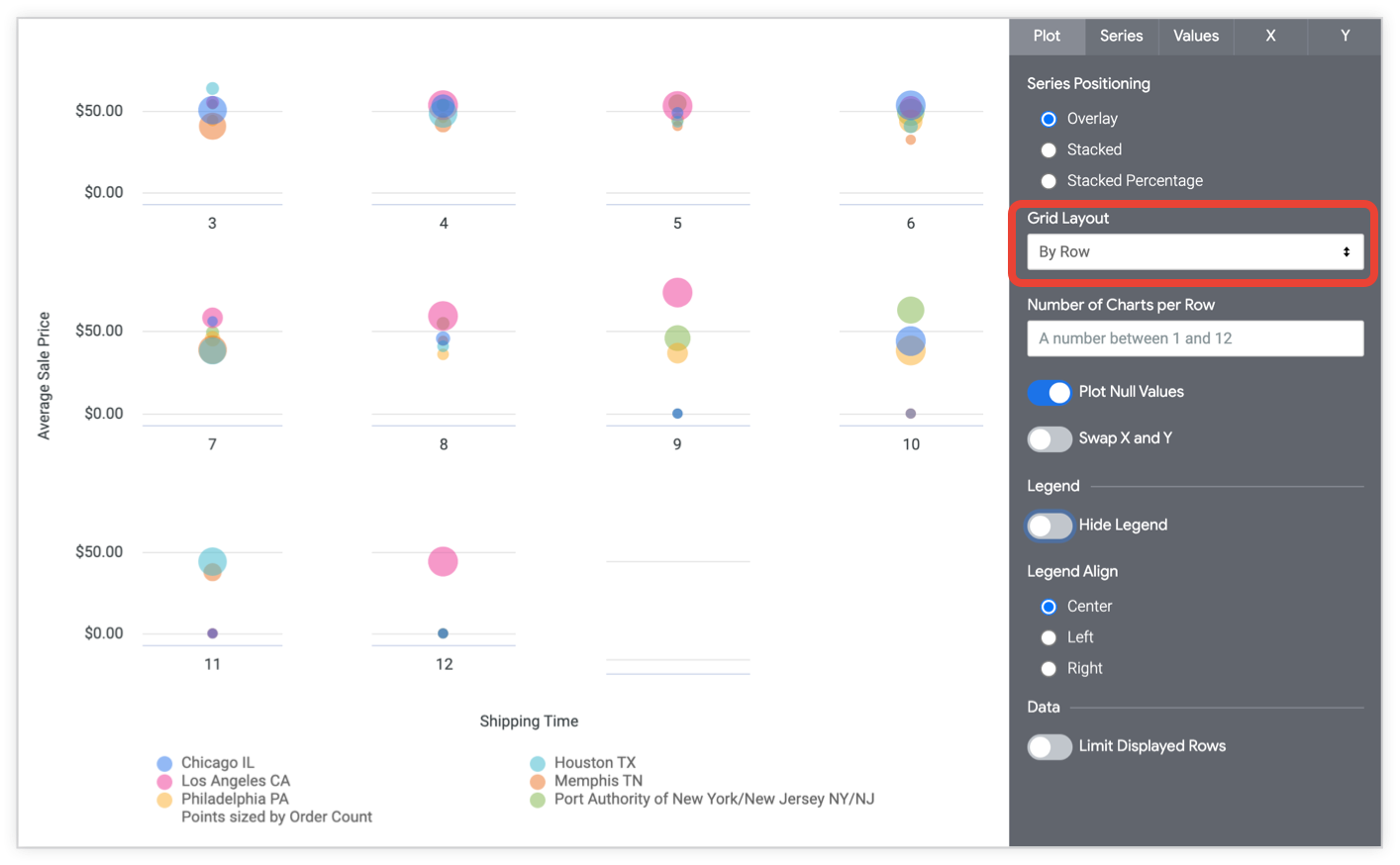
When you select By Pivot or By Row from the drop-down menu, the Number of Charts per Row option appears. You can input a number between 1 and 12. If you do not input a number, Looker arranges the charts as evenly as possible.
When used with dashboards, grid layout becomes responsive to the dashboard tile size and shape, if Number of Charts per Row is not set.
Plot Null Values
You can toggle the appearance of null values on the chart. When toggled on, null values are plotted at zero. When toggled off, sections of line and area charts may show gaps. This parameter is only available when Series Positioning is Overlay.
Swap X and Y
You can toggle whether the x and y axes swap from the normal configuration. When swapped, dimensions are plotted on the y-axis, and measures are plotted on the x-axis.
Cluster Points
The Cluster Points option lets you group many data values into blocks. This can help improve the readability of your visualization when your data appears in high-density groupings. The number displayed for each cluster represents the number of individual data points that cluster contains, and the sizes of the individual clusters vary based on the size of the visualization in your browser or on a dashboard.
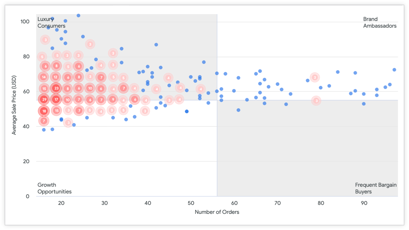
To zoom in and view all the individual data points that are included within a cluster, select the circle for that cluster in the visualization. When you select a cluster, the scatterplot visualization zooms in to show the individual data points that comprise that cluster.

To return to viewing the entire visualization, select the Reset zoom option on the visualization.
Hide Legend
You can toggle the appearance of the series legend on a chart. This option is available only when there is more than one series (except in the case of a pie chart).
Legend Align
You can specify whether the series legend appears to the left, center, or right of the chart. This option is available only when Hide Legend is off and when there is more than one series.
Limit Displayed Rows
You can show or hide rows in a visualization, based on their position in the results. For example, if your visualization displays a seven-day rolling average, you may want to hide the first six rows.
Click Limit Displayed Rows to enable or disable this feature. When this feature is enabled, you can specify the following options:
- Hide or Show: Choose Hide to exclude certain rows from the visualization. Choose Show to display only a limited number of rows in the visualization.
- First or Last: Choose if the rows to hide or show are the first or last rows in the result set.
- Number: Specify the number of rows to hide or show.
In the Data section of the Look or Explore, excluded rows are shaded in a darker color.

This option is dependent on the row order. Changing the query's sort order or adding a row limit can change the rows that are shown or hidden in the visualization.
Plot Quadrants
The Plot Quadrants option lets you divide a scatterplot chart into four quadrants. When you enable the Plot Quadrants option for a scatterplot visualization, you can customize the boundaries of each quadrant, as well as the background color and label for each quadrant. In the following example of a scatterplot chart, users are segmented based on the Number of Orders and Average Sale Price (USD) fields into the categories Luxury Consumers for the first quadrant, Brand Ambassadors for the second quadrant, Growth Opportunities for the third quadrant, and Frequent Bargain Buyers for the fourth quadrant.
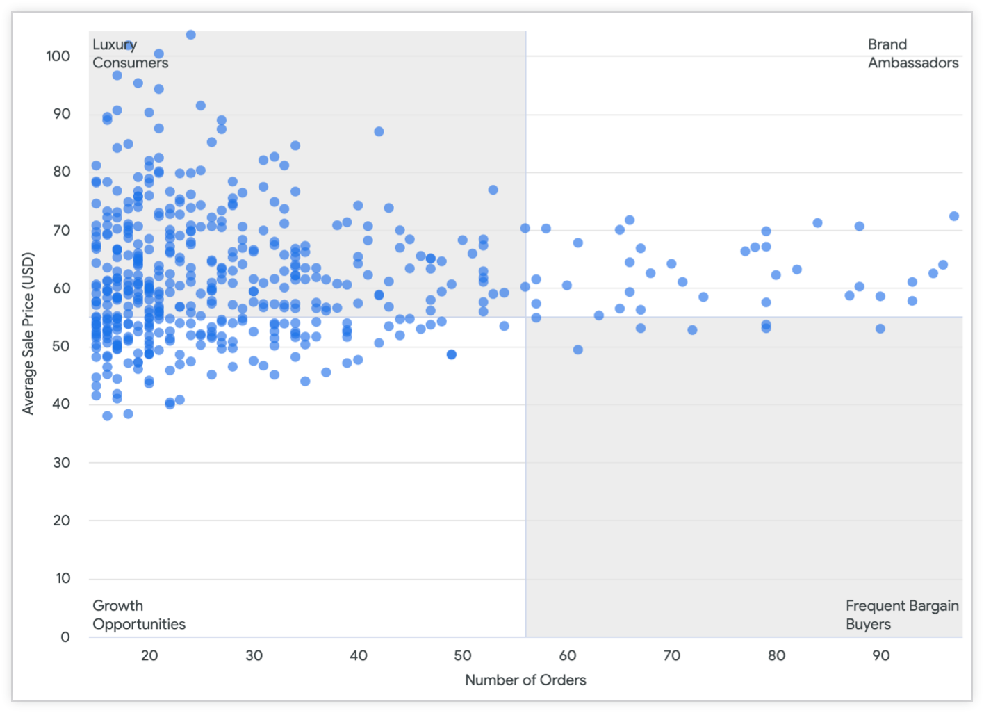
You can specify the following settings for a scatterplot chart that has Plot Quadrants enabled:
- Custom Quadrant Point X: Use the slider to define the location of the vertical boundary line. Alternatively, you can enter a numeric value from the field that is plotted on the x-axis in the Value field to set the vertical boundary line to the location of a specific point on the x-axis. The default location for the boundary line is the center of the x-axis.
- Custom Quadrant Point Y: Use the slider to define the location of the horizontal boundary line. Alternatively, you can enter a numeric value from the field that is plotted on the y-axis in the Value field to set the vertical boundary line to the location of a specific point on the y-axis. The default location for the boundary line is the center of the y-axis.
You can customize the color and label for each quadrant as follows:
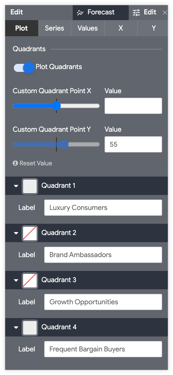
- Select the arrow next to the quadrant you want to customize to expand its customization options.
- Select the color swatch to choose a background color for the quadrant.
- In the Label field, enter a custom label for the quadrant, if desired.
Edit Chart Config

The Edit Chart Config button at the bottom of the visualization menu opens the Chart Config Editor. This editor lets you modify HighCharts visualizations by exposing certain JSON parameters of the visualization, enabling deep customization. These customizations will not dynamically interact with data.
The Edit Chart Config button is available if you have either the Looker Admin role or the can_override_vis_config permission.
See the Examples section of the Chart Config Editor article for examples of some common use cases, including the following examples:
- Changing the background color and axis text color
- Conditional formatting of values within a series
- Customizing tooltip color
- Adding vertical reference bands and captions
- Adding chart annotations
Series menu options
The series menu controls how your chart shows each data series.
Colors
You can define the color palette for a chart in the Colors section.
Collection
A collection lets you create themed visualizations and dashboards that look good together. All of Looker's built-in color collections appear on the Color collections documentation page. Your Looker admin may also create a custom color collection for your organization.
You can choose a color collection from the Collection drop-down menu. The Palette section will update with a palette from your chosen color collection.
Palette
Once you've selected a color collection, you can choose a different palette from the collection, or customize your palette, by clicking the color palette itself. This opens the palette picker and displays all of the palettes from the collection.
Colors are assigned to each series in order. For a categorical palette, the first color in the palette is assigned to the first series, and so on. For a sequential or diverging palette, the color at the left end of the palette is assigned to the first series and the colors for each remaining series move to the right on the palette. If your query returns more data series than colors listed, the colors repeat from the beginning of the palette, first as a lighter version of each color, then as a darker version of each color.
Creating a custom color palette
To create a custom color palette, select the Custom tab on the palette picker. You can edit your palette in several ways:
- Click on one of the colors present to edit it.
- Click the + or - buttons to add a color to the end of the palette or to remove a selected color.
- Click EDIT ALL at the bottom right of the menu to use a comma-separated list of color values.
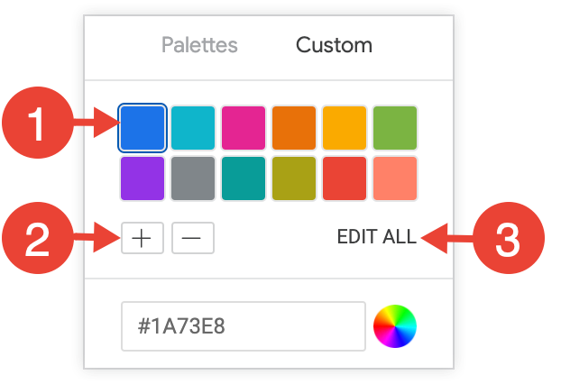
To change a selected color, or edit all colors at once, input hex strings, such as #2ca6cd, or CSS color names, such as mediumblue, into the color value box at the bottom of the picker.

To bring up a color picker to select a color, click the color wheel to the right of the color value box. The corresponding hex value for that color appears in the color value box.
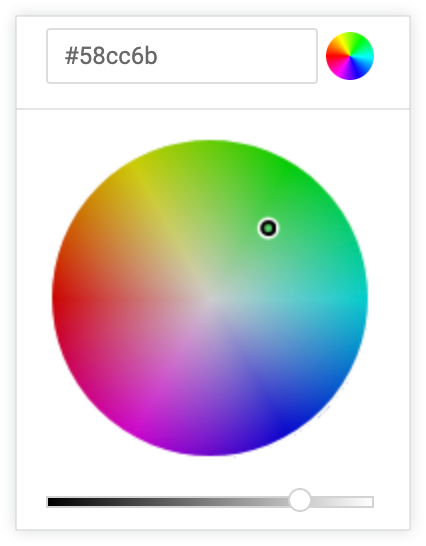
If you click EDIT ALL, the color value box populates with the hex codes of the color palette you've chosen or customized. Copying and pasting this list is the best way to copy custom color palettes from one chart to another.
Reverse colors
You can reverse the colors used on a palette. For a categorical palette, this applies the last color in the palette to the first series, the second-to-last color in the palette to the second series, and so on. For a sequential or diverging palette, this applies the color at the right end of the palette to the first series and move left on the palette for the remaining series.
Show Full Field Name
You can determine whether to show the view name along with the field name for each axis title and series name. When Show Full Field Name is turned off, generally only the field name shows; however, measures of type count display only the view name instead.
Point Style
You can specify how data points appear on a chart:
- None: Points do not display. For line and area charts.
- Circle (filled): Filled circles display.
- Circle (outline): Outlined circles display.
Size Points by Field
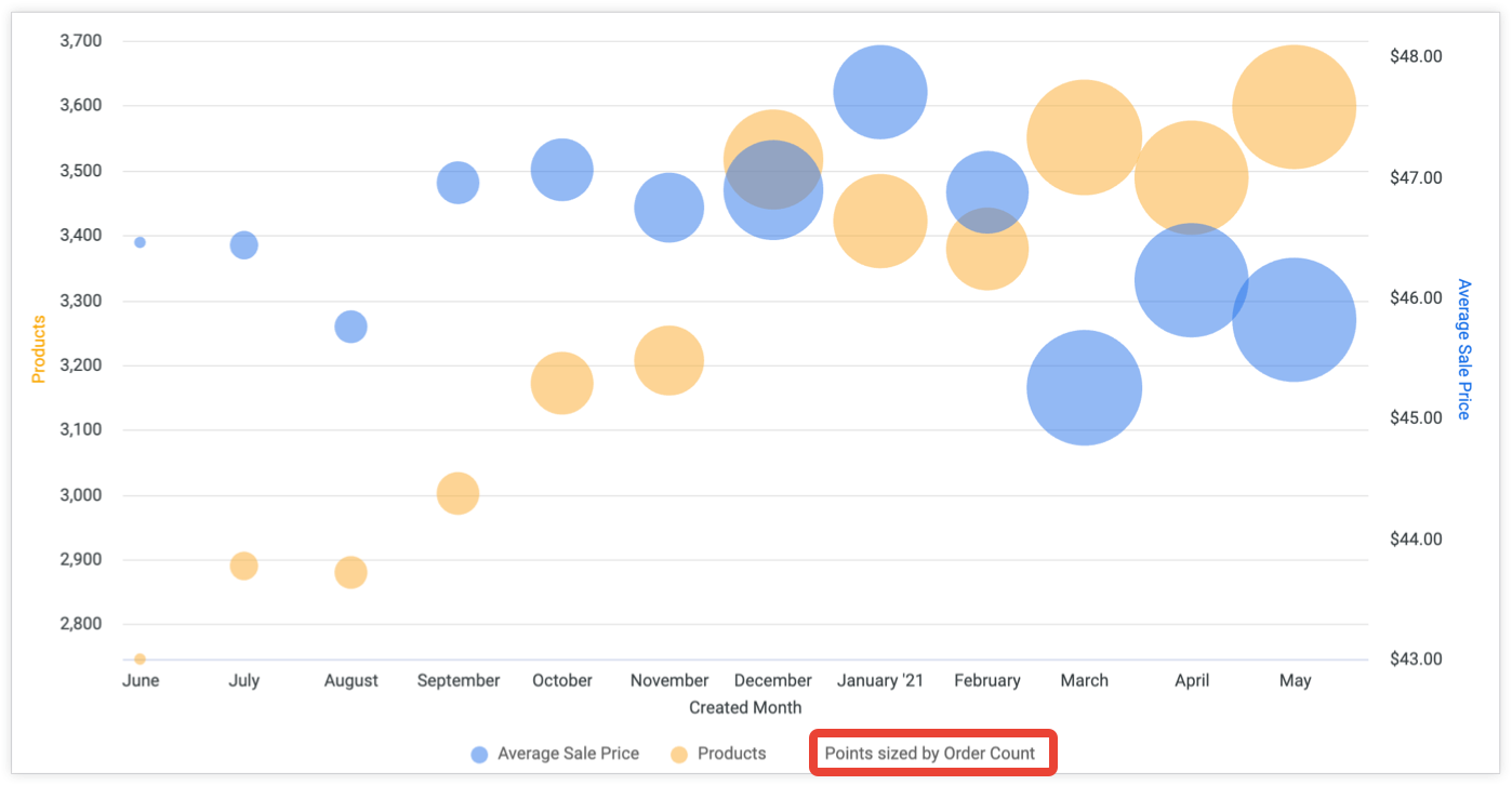
Selecting a field in the Size Points by Field drop-down sizes all points on the chart by the selected field. That field will no longer be plotted separately on the chart, unless Plot Size-By Field is turned on. When points are sized by a field, a key appears in the legend indicating which field the points are sized by.
The Size Points by Field option is disabled when a data table contains a pivot and also contains a measure that falls outside of the pivot. For example, if your table includes a table calculation that uses a pivot_index function, Size Points by Field is not available.
Plot Size-By Field
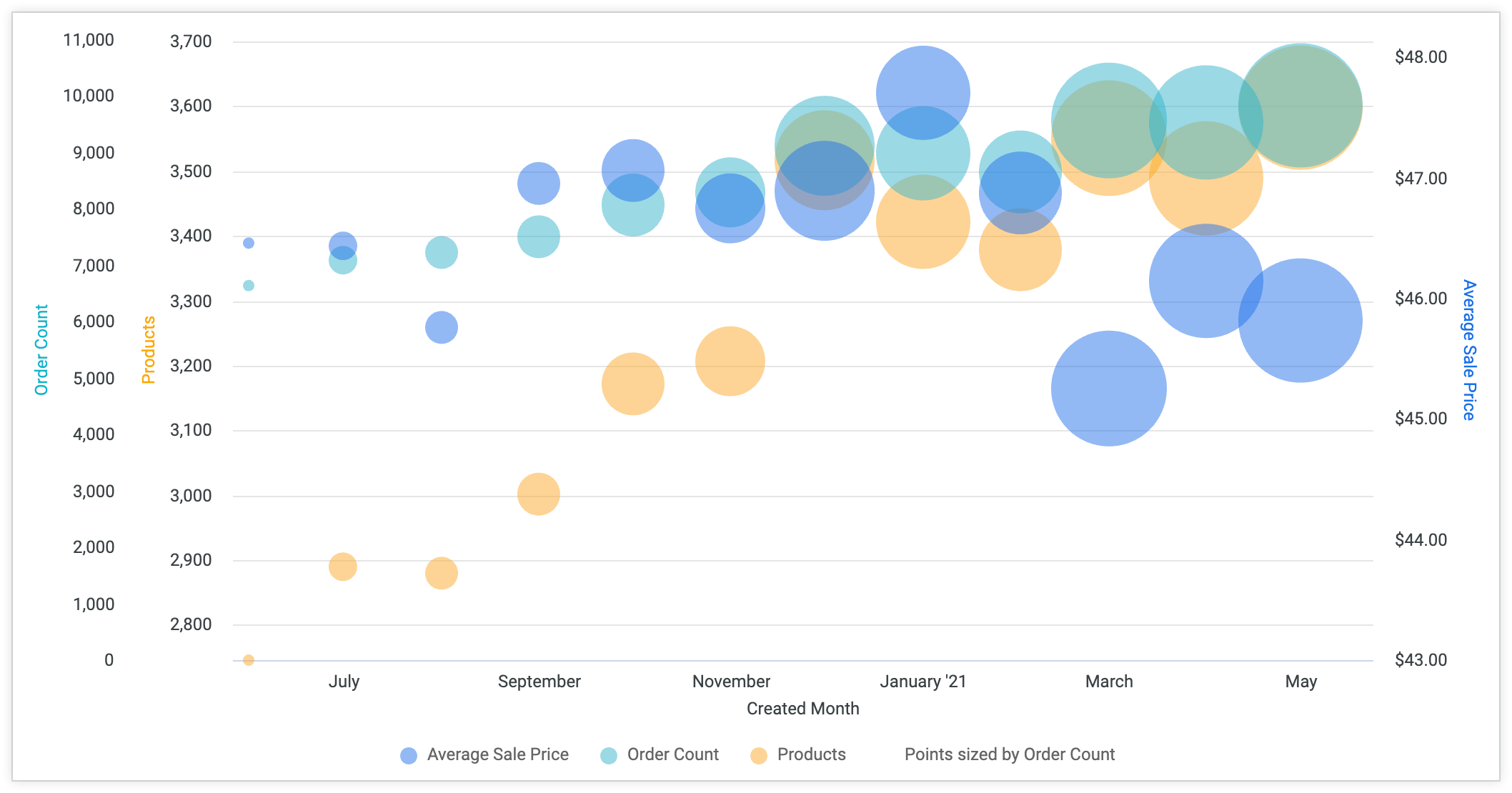
The Plot Size-By Field switch appears when a field is selected in the Size Points by Field drop-down, and at least two measures are unhidden on your data. This switch determines whether the field used to size the points is also plotted separately. When it is off, which is the default setting, the field is not plotted. When it is on, additional points appear on the chart representing that field.
Axes Selection
Specify which fields are assigned to the x-axis and the y-axis of the chart.
- X Axis Input: From the drop-down menu, choose the field that will be displayed on the x-axis of the chart. Select All visible dimensions to include all dimensions in the current query on the x-axis.
- Y Axis Input: From the drop-down menu, choose the field that will be displayed on the y-axis of the chart.
Customizations
You can customize each series in the chart in several ways:

- Click the arrow next to a series to expand its options.
- Click on the color swatch to select a custom color for the series. This overrides the color palette defined by the Colors option.
- In the Label section, enter a custom series label, if desired. This impacts the chart legend and tooltips.
- In the Type section, select a different visualization type for the series, if desired. This is useful to combine different visualization types on the same chart, such as showing one series as columns and another series as a line.
- In the Points section, for line, area, or scatter series types, select the shape of the chart points.
Values menu options
Value Labels
You can toggle the appearance of value labels for each data point on a chart.
Select Field for Value Label
When the Value Labels option is enabled, the Select Field for Value Label drop-down menu appears.
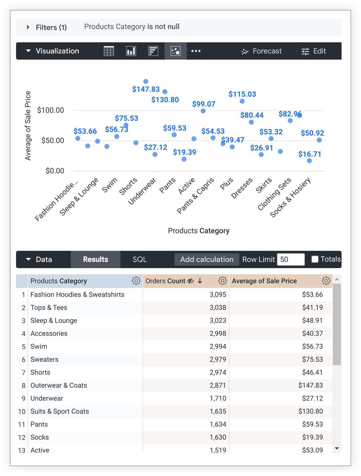
You can select a field from the drop-down menu that will be used as the value label for the data points in the visualization. The drop-down menu is populated with the dimensions in the query that are not hidden from the visualization. The default value for the value labels is the measure value that is being plotted in the chart.
For example, the following visualization uses the default setting for the value label, which is the measure Average of Sale Price.
However, you can change the Select Field for Value Label option to the dimension Products Category and then disable the Show Axis Name and Axis Value Labels settings in the X menu options to produce the following visualization:
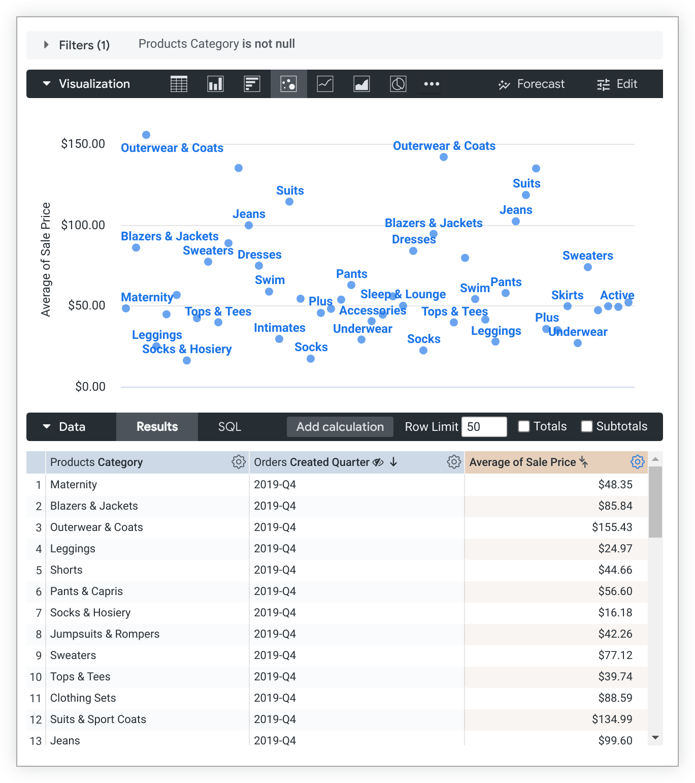
The query also contains a dimension that is hidden from the visualization, Orders Created Quarter. Because of its hidden status, that dimension is not available in the Select Field for Value Label drop-down.
Label Null Columns
You can toggle the appearance of labels for null data points.
Value Colors
You can define the colors of the value labels. This field takes a comma-separated list of one or more color values. The color values can be formatted as RGB hex strings, such as #2ca6cd, or as CSS color names, such as mediumblue.
If set to multiple colors, colors are assigned to each series in order. The first series in the underlying table is assigned the first color, and so on. If the query returns more data series than colors listed, Looker will assign the series color to the value label after it runs out of your custom colors.
If no color values are provided, Looker assigns the series color to the value label.
Font Size
You can set the font size of value labels using any valid CSS size. For example, you can specify a number of pixels, such as 10px or 12px.
Value Rotation
You can set the rotation of the value labels. This parameter accepts values between -360 and 360, denoting the number of degrees to rotate the labels. Value Rotation is only available with Series Positioning Grouped or Overlay.
Value Format
You can specify the format of the value, independent of the underlying dimension or measure. The field accepts Excel-style formatting. If no formatting is specified, the value displays in the format of the underlying dimension or measure.
MS Excel's complete guide details how to specify these formats in their documentation. However, color formatting is not currently supported in Looker.
For Looker developers: The formatting used in the Value Format field is the same as formatting that is used with the
value_formatLookML parameter, except that thevalue_formatparameter requires the formatting string to be enclosed in double quotes. In the Value Format field, the formatting string is not enclosed in quotes.
The Adding custom formatting to numeric fields documentation page provides more information on how to use custom formatting.
X menu options
Scale Type
You can specify how the x-axis scale is calculated and displayed.
- Automatic Based on Data: The scale is inferred from the underlying data. This is the default setting.
- Ordinal: Data is plotted along the x-axis as evenly spaced, discrete entries, regardless of relative distance between data points.
- Linear: Data is plotted as linear numeric values. This option only applies when the underlying data can be converted to numbers.
- Time: Data is plotted as time values. The x-axis is labeled with appropriate time increments.
Reverse Axis
You can toggle the direction of the x-axis. When this is off, values increase from left to right. When this is on, values decrease from left to right.
Allow Zoom
This option is available only for Cartesian charts (column, bar, scatterplot, line, area, waterfall, or boxplot charts).
This option defaults to enabled. When it's enabled, you can zoom on a visualization in a dashboard, a Look, or an Explore.
See the Viewing dashboards or Viewing Looks in Looker documentation page for information about how to use the zoom feature.
When this option is disabled, the Allow Zoom option on the Y menu is hidden and you cannot zoom on the visualization.
Show Axis Name
You can toggle the appearance of the x-axis name label.
Custom Axis Name
You can set the name for the x-axis using any string value. This option is only available when Show Axis Name is ON.
Axis Value Labels
Axis Value Labels toggles the appearance of value labels on the x-axis.
Gridlines
You can toggle the appearance of gridlines extending from the x-axis. Gridlines are spaced based on the scaling of the x-axis.
Label Rotation
You can set the rotation of the x-axis value labels. This parameter accepts values between -360 and 360, denoting the number of degrees to rotate the labels.
Time Label Format
You can specify how x-axis value labels appear for charts with a time dimension on the x-axis. This parameter accepts time formatting syntax, as shown in the following list. See Time Formatting for Looker Charts for all formatting options.
%b '%y, %H:%MdisplaysAug '14, 22:31%B %Y, %I:%M %pdisplaysAugust 2014, 10:31 PM%x %Xdisplays12/15/2014 10:31:00%I:%M:%S %pdisplays10:31:00 PM
Y menu options
Gridlines
You can toggle the appearance of gridlines extending from the y-axis. Gridlines are spaced based on the scaling of the y-axis.
Reverse Axis
You can toggle the direction of the y-axis. When off, values increase going up the axis. When on, values decrease going up the axis.
Allow Zoom
This option is available only for Cartesian charts (column, bar, scatterplot, line, area, waterfall, or boxplot charts).
This option is available only when the Allow Zoom option on the X menu is enabled. This option defaults to enabled. When it's enabled, you can zoom on a visualization in a dashboard, a Look, or an Explore.
See the Viewing dashboards or Viewing Looks documentation page for information about how to use the zoom feature.
If this option is disabled but the Allow Zoom option on the X menu is enabled, you cannot zoom into a tighter view of the y-axis; you can zoom only into a tighter view of the x-axis.
Left Axes and Right Axes
You can configure a chart's y-axes. For example, if a chart has three measures with very different value scales, you can put one y-axis on the right and two on the left.

On the left and right side of the chart, you can have one or more y-axes, each associated with one or more data series. Each data series is based on a measure, even if the measure has been pivoted. Table calculations that use a measure are listed as a data series and can be moved to another axis.
Benefits of specifying axes
Using this functionality, any chart can do the following:
- Combine arbitrary series in any number of axes
- Split pivoted series across various axes by measure
- Render top and bottom axes in rotated charts
- Render charts with various measure types so long as they are not combined (such as linear and log)
- Render log charts with values between 0 and 1
Each y-axis has its own set of configuration options and displays one or more data series on a scale relative to that y-axis.
Special cases for specifying axes
Each measure goes on one axis. If you have a measure pivoted, all of its pivoted values go on the same axis. To specify the axis for a particular measure for each pivot, use filtered measures instead. Create a filtered measure for each possible value (and maybe one more for any unanticipated values). Then you can specify which axis to use for each of your new measures.
Charts with the Series Positioning option set to Grouped or Overlay can have multiple y-axes. Any Stacked or Stacked Percentage charts will have one stacked data series and one y-axis.
Assigning, removing, and changing axes
To assign a data series to a y-axis, click and drag the data series to the desired Left or Right Axes area. You can create a new axis or add the data series to an existing y-axis.
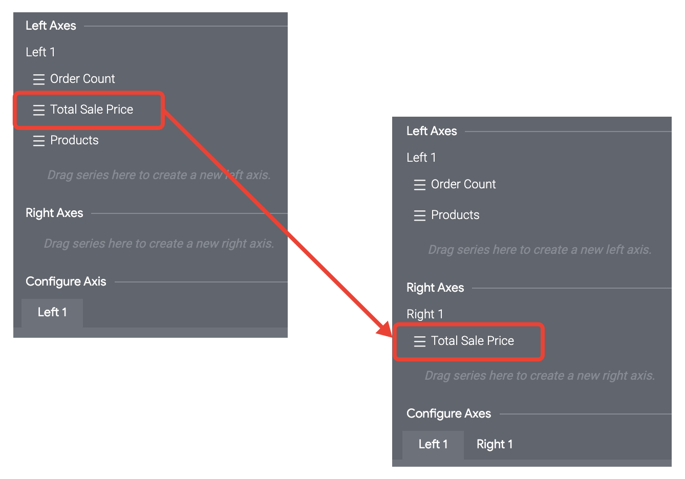
You can also remove an axis by dragging each of its data series to another y-axis.
When moving a data series to a different axis, the following conditions apply:
- If a data series is the only series associated with an axis, and you move that series to a new axis, all its settings are preserved, including the Axis Name.
- If a data series is one of multiple series that are associated with an axis, and you move that series to a new axis, almost all its settings are preserved, except for the Axis Name.
- If you move a data series to an existing axis, it will inherit the settings of the destination axis.
Configure Axis
The Configure Axis section displays a tab for each y-axis that is configured in the Left Axes and Right Axes sections. Click on the tab for an axis to configure that y-axis. You configure each y-axis separately using its own set of configuration options.
Scale Type
You can specify how the y-axis scale is calculated and displayed. Not all of the following options apply to all chart types.
Linear: Data is plotted along the y-axis as evenly spaced, discrete entries, regardless of relative distance between data points. This is the default setting. Most data is best displayed on a linear scale.
Logarithmic: Data is plotted along the y-axis using a logarithmic scale, which is based on orders of magnitude. If the data has a cluster of very small and very large values, this setting lets you see variation in the small values while also showing the larger values. The logarithmic scale type can only be used for data with positive values and is only available when you have set Series Positioning to Grouped or Overlay on the Plot tab.
Show Axis Names
You can toggle the appearance of y-axis name labels.
Show Axis Values
You can toggle the appearance of y-axis values.
Unpin Axis From Zero
You can toggle the chart focus on the area for which data exists, rather than showing the full scale starting at zero.
Axis Name
You can enter the label for the selected y-axis.
Y Axis Format
You can specify the number format of the y-axis values, independent of the underlying dimension or measure. The parameter accepts Excel style formatting. If no formatting is specified, the value displays in the format of the underlying dimension or measure.
Excel's complete guide explains how to specify these formats in the Excel documentation. At this time, date formatting and color formatting are not supported in Looker.
Some of the most common formatting options are shown on the Adding custom formatting to numeric fields documentation page.
Tick Density
You can set the density of tick marks on the y-axis as follows:
Default: Sets ticks to the default density.
Custom: Set ticks with a custom density. A slider bar lets you set the custom density.
Minimum Value
You can define the minimum value for the selected y-axis.
Maximum Value
You can define the maximum value for the selected y-axis.
Add Reference Line
Reference lines are applied to the first series in your query results and ignore any hidden series. You can reorder the columns in the data table to change the series the reference line is applied to.
The Add Reference Line button enables the creation of reference lines in a chart. Click it as many times as you like to add any number of reference lines and reveal the settings for those reference lines. To delete a reference line, click the X in the upper right of its settings.

Type (for a reference line)
You can specify the type of reference line to apply to the chart:
- Line: A horizontal line is plotted at the y-axis value entered in the Value setting.
- Range: A shaded range is plotted including and between the y-axis values entered in the Start Value and End Value settings.
- Line with Margins: A horizontal line is plotted at the y-axis value entered in the Value setting. Shaded ranges are plotted above and below the horizontal line, based on the values entered in the Margin Above and Margin Below settings.
Value, Start Value, and End Value (for a reference line)
You can specify the point on the axis to plot the reference line. You can set the value to the median, average (mean), maximum, or minimum for the data returned in your query results. You can also select Custom to enter a specific value from the axis.
When Type is set to Range, the Start Value and End Value settings replace the Value setting; they accept the same types of values as Value.
Margin Above and Margin Below (for a reference line)
Margin Above and Margin Below specify the shaded ranges to plot on either side of a reference line when Type is set to Line with Margins.
You can set the margin values to the population standard deviation or population variance for your query results. You can also select Custom to enter a specific value or "min", "max", "mean", or "median" to use those calculations from your query results.
Label (for a reference line)
You can specify the label to appear on the reference line in the Label field. You can also use the following calculations, embedded in double curly brackets {{ }}, in the Label field:
- median
- mean
- max
- min
- deviation (for population standard deviation)
- variance (for population variance)
For example, enter "Average: \{{mean}}" to show something like Average: 123.4.
If you leave the Label field blank, the value of the line appears on the reference line.
Label Position (for a reference line)
You can position the reference line label at the left of the chart, the right of the chart, or in the center, by selecting one of those options under Label Position.
Color (for a reference line)
You can specify the color of the reference line in a chart.
Click the color box to reveal a palette picker that you can scroll through to choose a color. To choose a custom color, select the Custom tab on the palette picker and use the color picker that appears, or enter a hex string or CSS named color string into the color value box.
Value Format (for a reference line)
You can add custom formatting to the value shown in the reference line label.
You can use Excel-style formatting to format the label value. The Adding custom formatting to numeric fields documentation page provides more information on how to use custom formatting.
Add Trend Line
Trend lines show the prevailing direction of the data in a chart. If your chart can support a trend line, you will see the Add Trend Line button in the Y menu options.
Trend lines are not supported for the following use cases:
- Charts with a Stacked or Stacked Percentage series positioning type
- Charts with a By Row grid layout
- Charts with an Ordinal x-axis scale type
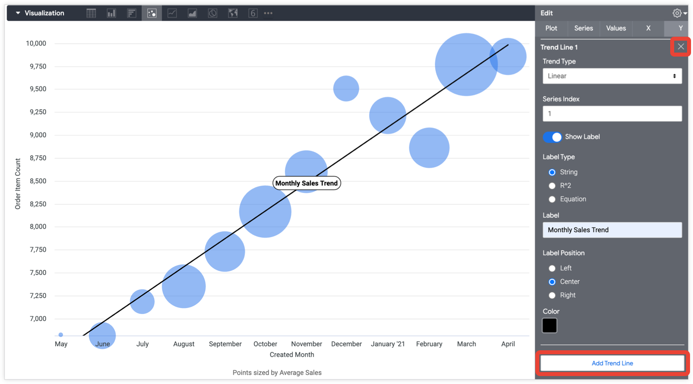
Click the Add Trend Line button to add trend lines in your chart. Click it as many times as you like to add any number of trend lines and reveal the settings for those trend lines. To delete a trend line, click the X in the upper right of its settings.
Trend Type
You can specify the type of trend line to apply to the chart:
Linear: A linear trend line plots a straight line that best fits the data. It is often used when the values are increasing or decreasing at a fairly steady rate. Your data can have negative and/or positive values.
The equation that governs a linear trend line is
y = a + bx.Exponential: An exponential trend line treats the y-variable as an exponential function of the x-variable. It is typically used when y-values exponentially rise or fall. You cannot use this option if your y-variable includes zero or negative values.
The equation that governs an exponential trend line is y = aebx.
Logarithmic: A logarithmic trend line plots the y-variable as a logarithmic function of the x-variable (which is based on orders of magnitude). It is typically used when the rate of change in the y-variable increases or decreases quickly and then levels out. The line will be curved on a linear scale and a straight line on a logarithmic scale. You set the type of scale using the Scale Type option. You cannot use this option if your x-variable includes zero or negative values.
The equation that governs a logarithmic trend line is
y = a + b * ln(x).Power: A power trend line is typically used with datasets that compare measurements that increase at a specific rate. You cannot use this option if your data includes zero or negative values. The y-variable is plotted as a power function of the x-variable.
The equation used to create the power trend line is
y = a * x^bwherebis slope (gradient) andais the y-intercept (the x value where the line crosses the y-axis).Polynomial: A polynomial trend line plots the y-variable as a polynomial function of the given order and x-value. Polynomial trend lines require you to enter the desired order of the polynomial to compute. Looker defaults to an order of 3.
The equation that governs a polynomial trend line, given order,
o, isy = a + b * x + ... + k * x^o.Moving Average: The data is plotted along the y-axis as a moving average, also called a rolling average. It is typically used to smooth out minor fluctuations and show an overall trend more clearly. Each point on the moving average trend line is the average value of the previous data points. The number of previous data points to include can be specified with the Period setting. For example, if you apply a trend line to Daily Sales, and the period is set to 7, then, for a given date, the Moving Average plots the average sales for the 7-day period ending on that date. If the number of previous data points is less than the period setting, the Moving Average is calculated over the partial periods, but is rebased to the number of available data points.
Period (for a trend line)
You can specify the number of data points to include when calculating a moving average. Choose a Trend Type of Moving Average to reveal this setting.
Moving averages are typically used for date-based data; the choices are 7 (for a week), 14 (for 2 weeks) and 28 (for 4 weeks).
Series Index (for a trend line)
You can specify which chart series should have a trend line added to it.
This option defaults to 1, the first defined series. Each series is numbered according to the order it appears in your data table.
Order (for a trend line)
You can specify the order of the polynomial calculated by the polynomial regression. The default value is 3.
Choose a Trend Type of Polynomial to reveal this setting.
Show Label (for a trend line)
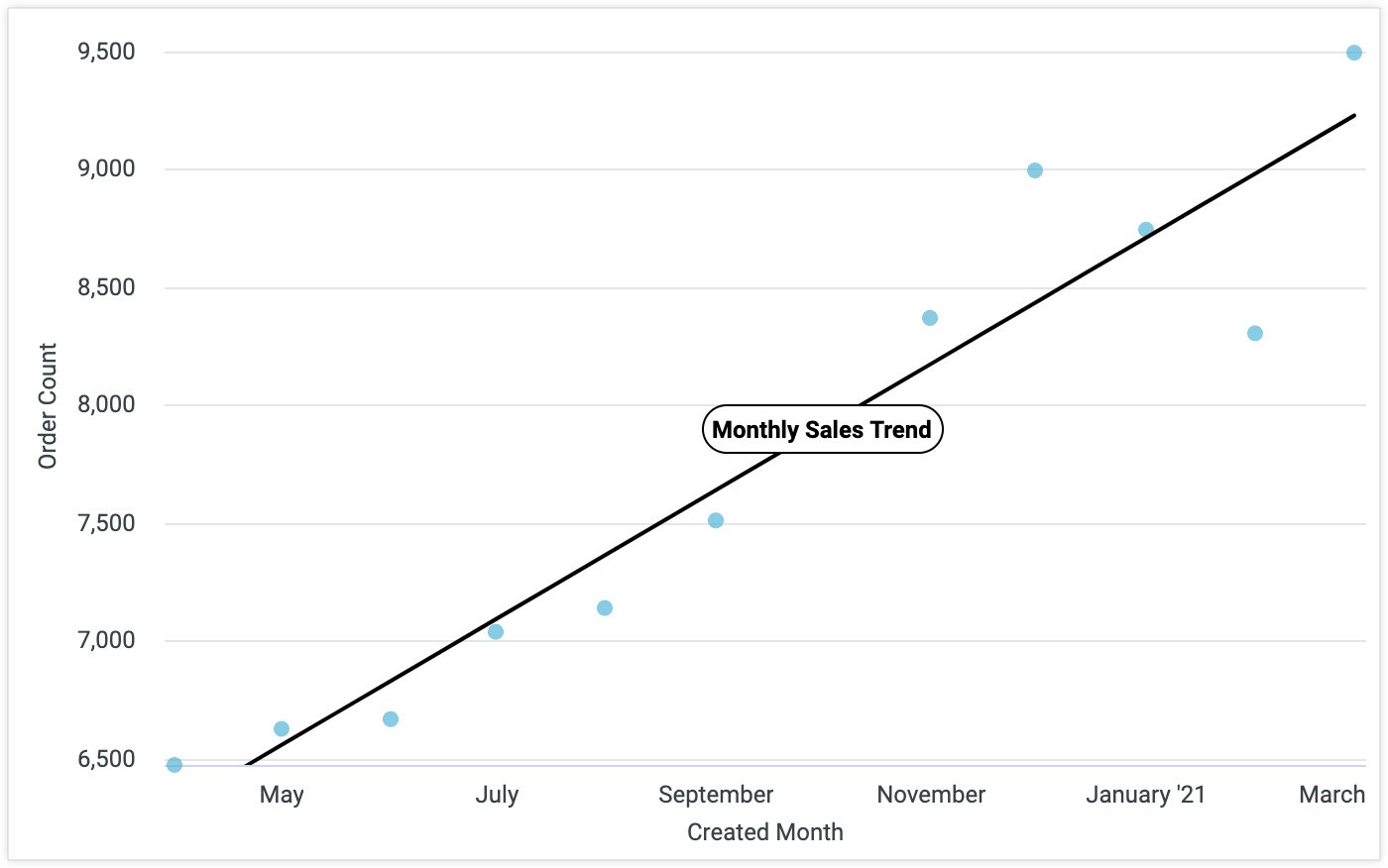
You can toggle adding a descriptive label to the trend line.
Label (for a trend line)
You can specify the label text.
Label Position (for a trend line)
You can specify whether the trend line label appears at the left edge of the trend line, the center of the trend line, or at the right edge of the trend line.
Label Type (for a trend line)
You can specify the type of label to apply to the trend line:
String: Applies the text specified in the Label box to the trend line.
R^2: Applies a coefficient of determination label — also known as R squared — to the trend line. The R^2 label indicates the proportion of the variance in the Series Index data. It helps you understand how well the trend line matches the data, with 0 meaning no fit, 1 meaning perfect fit, and values in between indicating partial fit. This option will only work when Trend Type is set to Linear.
Equation: Applies a label to the trend line that shows the equation used to determine the trend line.
Color (for a trend line)
You can specify the color of the trend line in a chart.
Click the color box to reveal a palette picker that you can scroll through to choose a color. To choose a custom color, select the Custom tab on the palette picker and use the color picker that appears, or enter a hex string or CSS named color string into the color value box.
