Pie charts are useful for illustrating the proportions that several components contribute to a whole.
Building a pie chart
Ignoring fields that are hidden from the visualization, pie chart visualizations require one dimension and one measure in the Data section. More dimensions or measures prevent a pie chart from rendering.
Pie charts can visualize a maximum of 50 rows of data. You can use filters or the Row Limit option to limit your data if needed.
You can edit pie charts in the visualization menu. Click Edit in the upper right corner of the visualization tab.

Some options listed on this documentation page may be grayed out or hidden if they conflict with other settings that you have chosen.
Plot menu options
Value Labels
You can change how individual sections of the pie chart are labeled:
- None: Labels and legend are not displayed.
- Legend: Displays the legend to the right of the visualization. This is the default option.
- Labels: Displays lines marking the individual sections of the pie chart. You can customize the information that is displayed next to these lines. See the Label Type section for details.
Label Type
When Value Labels is set to Labels, you can customize the format of those labels:
- Label: Displays the series name.
- Value: Displays the numeric value associated with the pie slice.
- Label — Value: Displays the series name in bold first, then the numeric value.
- Percent: Displays the percentage of the pie slice as a portion of the total pie.
- Label — Percent: Displays the series name in bold first, then the percentage.
Inner Radius
You can format a pie chart as a donut chart, by setting the radius for the "donut hole." This field accepts integers between 0 and 100, representing the percentage of the pie chart's total width (i.e., diameter) that will make up the hole. If no value is set the chart appears as a normal pie chart.
Start Angle and End Angle
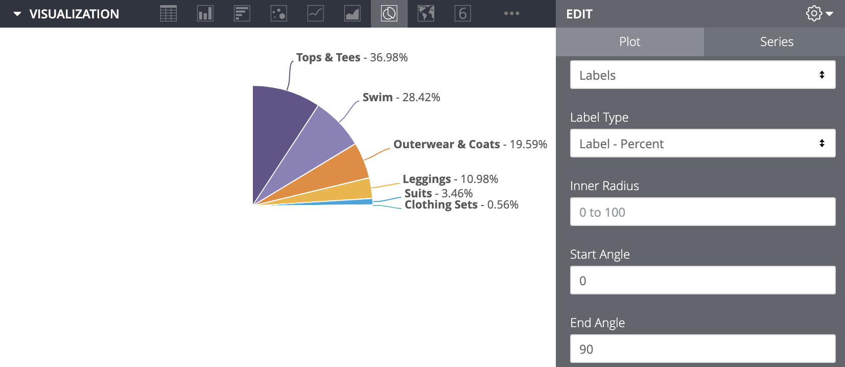
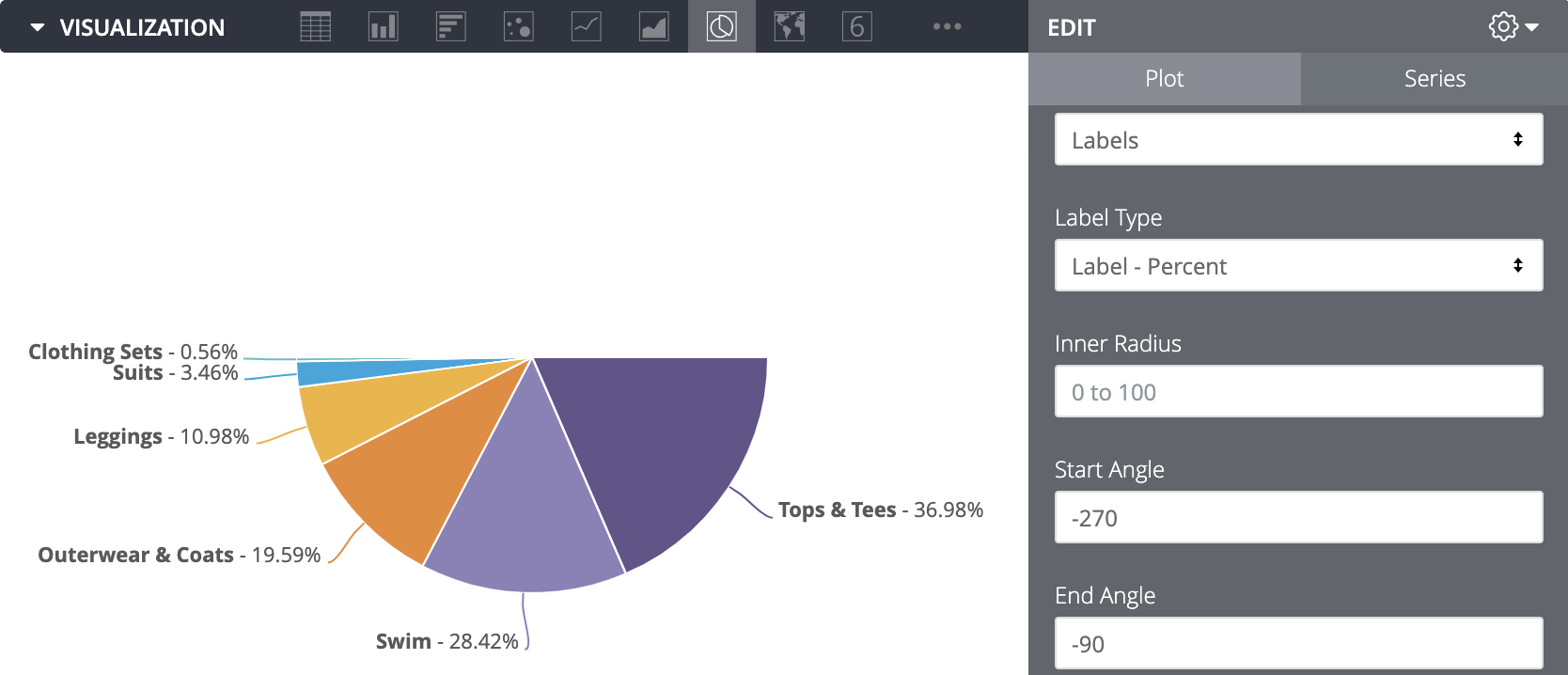
You can control whether a pie chart appears as a full circle or as a portion of a circle. These fields use the 360-degree angles of a circle, and numbers between -360 and 360 can be entered. The End Angle must be a more positive number than the Start Angle; if it's not, the visualization defaults to a full circle. If no values are entered in Start Angle and End Angle, the chart also defaults to a full circle. Your full data results appear within that portion of the circle, adjusted to fit that space.
For example, if you enter a Start Angle of 0 and an End Angle of 90, your data appears within the upper right quarter of a circle.

As another example, if you enter a Start Angle of -270 and an End Angle of -90, your data appears as the bottom half of a circle.

Edit Chart Config

The Edit Chart Config button at the bottom of the visualization menu opens the Chart Config Editor. This editor lets you modify HighCharts visualizations by exposing certain JSON parameters of the visualization, enabling deep customization. These customizations will not dynamically interact with data.
The Edit Chart Config button is available if you have either the Looker Admin role or the can_override_vis_config permission.
See the Examples section of the Chart Config Editor article for examples of some common use cases, including the following examples:
- Changing the background color and axis text color
- Conditional formatting of values within a series
- Customizing tooltip color
- Adding vertical reference bands and captions
- Adding chart annotations
Series menu options
Reverse colors
You can reverse the colors used on a palette. For a categorical palette, this applies the last color in the palette to the first series, the second-to-last color in the palette to the second series, and so on. For a sequential or diverging palette, this applies the color at the right end of the palette to the first series and move left on the palette for the remaining series.
Customizations
You can customize each series in the chart in several ways:

- Click the arrow next to a series to expand its options.
- Click on the color swatch to select a custom color for the series. This overrides the color palette defined by the Colors option.
- Enter a custom series label if desired. This impacts the chart legend and tooltips.
