Table (legacy) charts provide direct views of your data.
Building a table (legacy) chart
Table (legacy) charts accept dimensions, measures, pivots, table calculations, custom fields, and row or column totals. Table (legacy) charts support up to 5,000 rows; 50 or fewer columns are recommended.
To use a table (legacy) chart, run a query, click the ellipsis (...) in the Visualization bar, and choose Table (Legacy).
To edit your table (legacy) visualization, click Edit in the upper right corner of the Visualization bar.
Some of the options that are listed on this documentation page may be grayed out or hidden when they conflict with other settings that you have chosen.
Data bar options
Several options on the Data bar can affect both your visualization and the data table.
Row Totals
If your chart contains pivots, you can add row totals to your chart by checking the Row Totals checkbox in the Data bar. See the Exploring data in Looker documentation page for more information.
The arrow to the right of the Row Totals checkbox lets you toggle the placement of the totals column between the far right default placement and a placement further to the left, after dimensions and dimension table calculations.

Totals
You can add column totals for measures and table calculations by selecting Totals in the Data bar. See the Exploring data in Looker documentation page for more information.

Column Limit
If your data table contains pivots, you can add a column limit to your chart by entering any number between 1 and 200 in the Column Limit box. Dimensions, dimension table calculations, row total columns, and measure table calculations outside of pivots are not counted toward the column limit. Pivoted groups each count as one column toward the column limit. See the Filtering and limiting data documentation page for more information.

Row Limit
You can add a row limit to your chart by entering any number between 1 and 5,000 into the Row Limit box on the Data tab. If your query exceeds the row limit you have set, you cannot sort row total or table calculation columns.

Calculations
You can add table calculations to your chart by clicking Add calculation button on the Data tab. See the Using table calculations documentation page for more information.

Plot menu options
Table Theme
The default theme for table (legacy) visualizations is Classic. You can change the theme with the Table Theme setting.
You can choose table coloring options:
- Classic: The table appears as it does in the Data section, with blue dimensions, orange measures, and green table calculations.
- White: The table header is white, the data rows alternate between white and gray, and the text is black.
- Gray: The table header is gray, the data rows alternate between white and light gray, and the text is dark gray.
- Transparent: The table header is totally transparent, the data rows alternate between totally transparent and translucent gray, and the text adjusts itself in color. This can be useful when using a customized, embedded dashboard so that the tile background color shows through the visualization. On such a dashboard, the text color adapts to the background color, changing from black to white as needed. On the Explore page or in an embedded Look, the background is always white under the transparent visualization.
- Unstyled: The entire table is white, the data rows are separated by gray lines, and the text is black.
Show Row Numbers
You can toggle whether to show a row number at the beginning of each table row.
Hide Totals
If your Explore includes column totals, you can toggle whether to show the totals in the visualization.
Hide Row Totals
If your Explore includes row totals, you can toggle whether to show the row totals in the visualization.
Limit Displayed Rows
You can show or hide rows in a visualization, based on their position in the results. For example, if your visualization displays a seven-day rolling average, you may want to hide the first six rows.
Click Limit Displayed Rows to enable or disable this feature. When this feature is enabled, you can specify the following options:
- Hide or Show: Choose Hide to exclude certain rows from the visualization. Choose Show to display only a limited number of rows in the visualization.
- First or Last: Choose if the rows to hide or show are the first or last rows in the result set.
- Number: Specify the number of rows to hide or show.
In the Data section of the Look or Explore, excluded rows are shaded in a darker color.

This option is dependent on the row order. Changing the query's sort order or adding a row limit can change the rows that are shown or hidden in the visualization.
Series menu options
The series menu controls how your chart shows each data series.
In a table (legacy) chart, each column is listed in the series menu for customization.
Truncate Column Names
Truncate Column Names determines whether column headers should be shortened with an ellipsis (...). If you need to shorten column names, you can also turn off the Show Full Field Name option.
Show Full Field Name
You can toggle whether to show the view name along with the field name for each column header. When Show Full Field Name is off, generally only the field name shows; however, measures of type count display only the view name instead.
Customizations
The Customizations section lists each column in the visualization and lets you create a custom label for that column in the Label box.
Tooltips for Table Columns
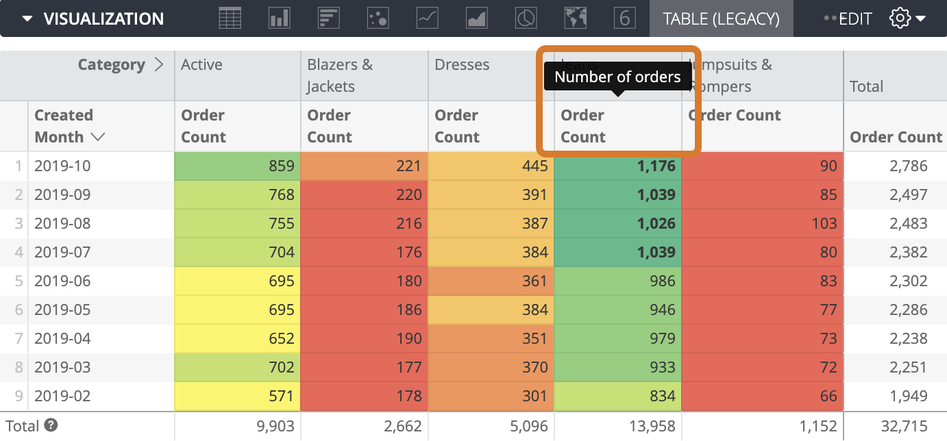
If the underlying data model defines a description for a field or measure, that description displays when you hover over the column name in a table (legacy) chart visualization.
Formatting menu options
Enable Conditional Formatting
Turn on Enable Conditional Formatting to define rules that color code your visualization, either on a scale or by specifying values that are of interest.
For example, you can color values on a scale of red to yellow to green as the values scale from low to medium to high.

You could also format values over 5,000 with yellow cell backgrounds and bold text.

Selecting a color collection
A collection lets you create themed visualizations and dashboards that look good together. All of Looker's built-in color collections appear on the Color collections documentation page. Your Looker admin may also create a custom color collection for your organization.
You can choose a color collection from the Collection drop-down menu. The Palette section will update with a palette from your chosen color collection.
Defining formatting rules
You specify how to color code your visualization in the Rules section.
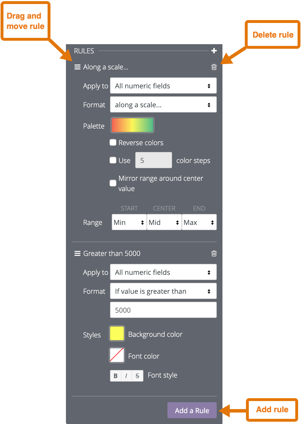
When you first enable conditional formatting, there will be one rule, set to the default of color coding on a scale.
- To add an additional rule, click Add Rule.
- To delete a rule, click on the trash can icon in the top right corner of that rule section.
- To rearrange rules, click and hold on the icon with the three parallel lines and drag the rule up or down.
You can apply the rule to all numeric fields in the visualization, or apply the rule to one or more fields using the Apply to box.
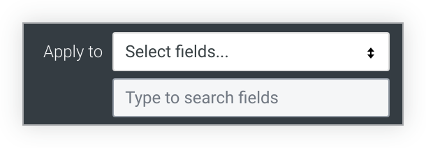
If you choose All numeric fields, the conditional formatting rule will be applied to every value in all the numeric fields in the visualization. If you are color coding values on a scale, the scale will include all numeric values, even if the values in different columns are unrelated.
If you create multiple rules using All numeric fields, the rules higher on the list have precedence over rules lower on the list. To change the precedence of a rule, click on the three horizontal bars at the top left of that rule and drag the rule higher or lower in the list.
If you choose Select fields, Looker displays a box that lets you select the fields where you want to apply the rule. If you enter text in the box, Looker lists only the fields that include that text.
Select the field or fields where you want to apply the rule, and the conditional formatting will be applied only to the values in those fields.
If you create multiple rules on the same field, only the rule highest on the list applies to the visualization and the other rules are inactive. To move a rule higher or lower on the list, click on the three horizontal bars at the top left of that rule and drag the rule higher or lower in the list.
In the Format box, choose whether to color code values along a scale or based on a logical condition.

If you choose to format based on a logical condition, when you enter a value in the Format box, do not use thousands separators.
Color coding on a scale
If you are color coding values on a scale, click the color palette to choose your colors.

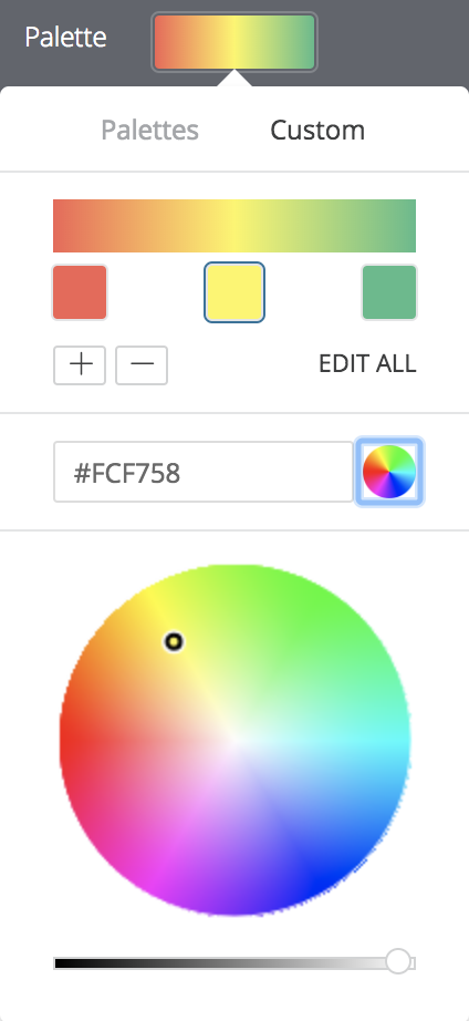
Choose an existing palette or create a custom palette. To create a custom palette, click on the Custom tab of the palette picker:
- To add or remove colors from the scale, click the + or - buttons. You can have a maximum of 5 and a minimum of 2 colors on your scale.
- To edit all colors of the scale, click Edit All and enter RGB hex strings, such as
#2ca6cd, or CSS color names, such asmediumblue. - To choose a custom color for the highlighted part of your color scale, use the color wheel.
Use the following options to modify the color coding:
- Select Reverse colors to apply the colors at the left end of the palette to values in the higher end of the data range and colors at the right end of the palette to values in the lower end of the data range.
- Select Use X color steps to limit the number of colors used to the specified step value. When this option is not enabled, the data is colored on a gradient covering the entire palette spectrum. When this option is enabled, the data is then grouped and colored according to the number of color steps. For example, if you specify 5 color steps, the data is grouped into 5 equal buckets and the 5 colors applied, one color to each bucket of data. Valid color step numbers are from 2 to 100, inclusive.
- Select Mirror range around center value to make equal color shifts on either side of the color palette. For example, on a scale from -100 to 0 to 100, values of -20 and 20 will be the same color distance (10%) from the center color definition — 40% and 60% of the palette gradient respectively.
- Use the Range fields to specify the values that determine the palette gradient start (0%), center (50%), and end (100%) colors. For the start and end colors, you can specify the minimum and maximum values in your data, specific numeric values, or percentile values. For the center value, you can specify the midpoint of the minimum and maximum data values, the data average, the data median, a specific numeric value, or a percentile value. For example, specifying start and end percentile values of 1% and 99% respectively, with a center value of 75%, causes the bottom half of the color gradient to apply to the lower 75% of your data values, and the upper half of the color gradient to apply to the top 25% of your data values.
Color coding based on a logical condition
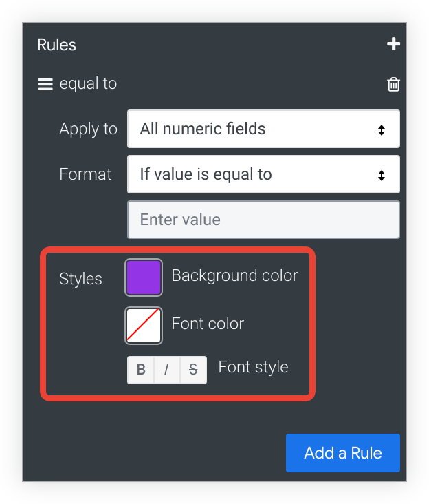
If you are color coding values based on a logical condition (in other words, using one of the Format options beginning with If value is), choose the Background Color, Font Color, and Font Style for values that meet the condition. By default, the background color is set to the first color of the categorical palette you have chosen for your conditional formatting rule.
Include Totals
If conditional formatting is enabled, you can toggle whether totals are included in the color coding scheme.
Include Null Values as Zero
If conditional formatting is enabled, you can toggle whether null values should be represented as a zero.
