Donut multiples charts are good for visualizing proportional values across multiple components. Each series's value is represented as a percentage of the total value across all series.
To create a donut multiples chart for your query, click the ellipses (...) on the Visualization tab and select Donut Multiples.
Building a donut multiples chart
Donut multiples charts can be built from queries that contain one of the following:
Using at least one measure and at least one pivot
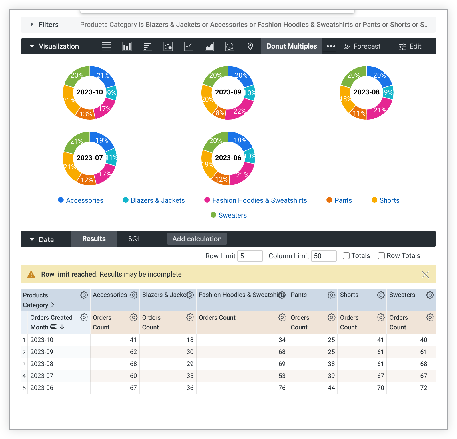
When building a donut multiples chart with at least one measure and at least one pivot but no unpivoted dimension, the chart renders but the individual donut multiples are unlabeled. Adding an unpivoted dimension to the query provides a label for each of the individual donut multiples. The following is an example of a donut multiples chart with one measure, one pivot, and an unpivoted dimension and its data table:

Adding additional pivots or additional measures adds additional slices to each donut multiple.
Using a dimension, multiple measures, and no pivots
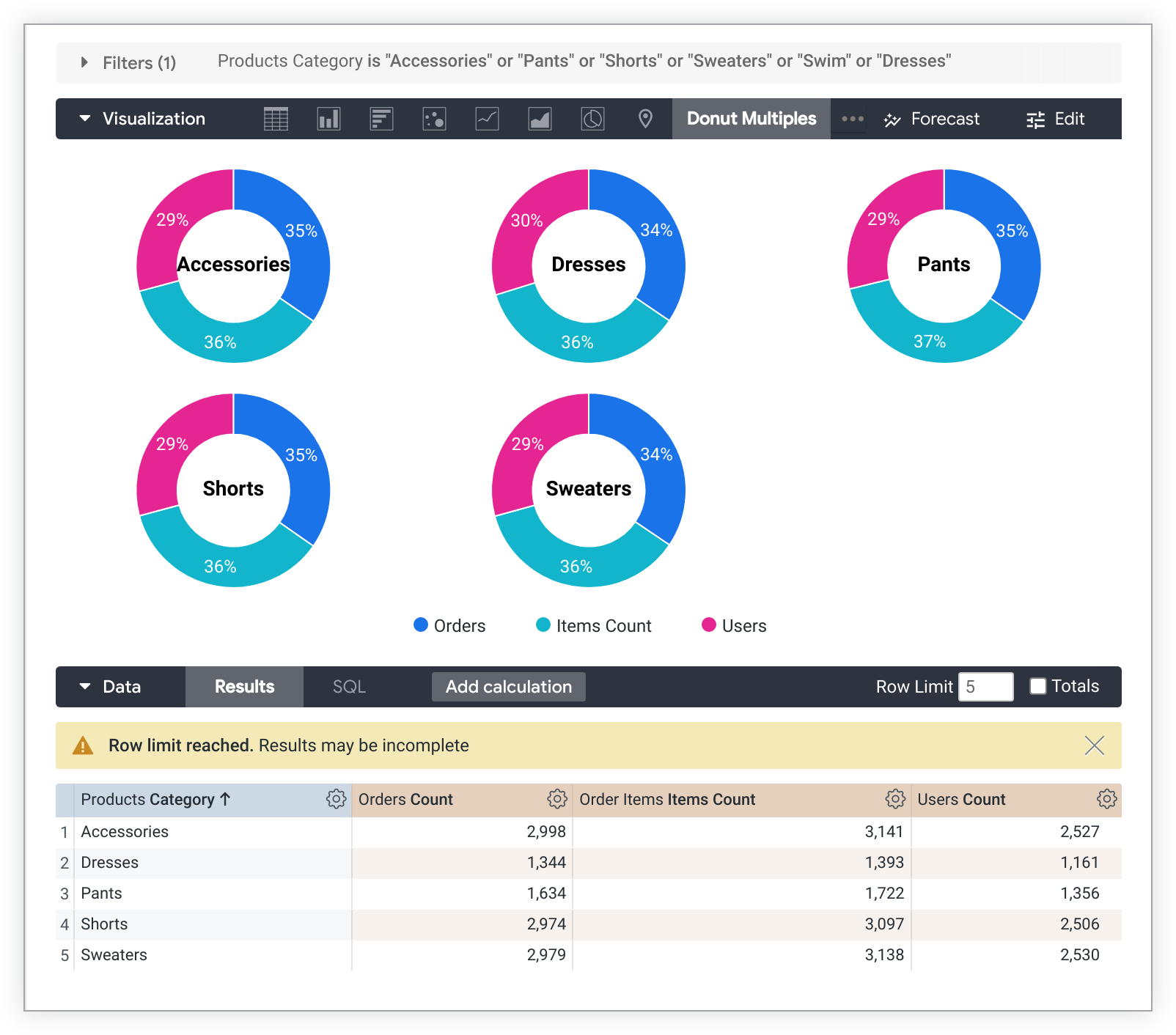
To build a donut multiples chart with multiple measures and no pivots, each measure will be a slice on each chart, and the dimension will label each individual chart. Only one dimension may be shown in the visualization. The following is an example of this kind of chart and its data table:

Customizing your donut multiples chart
To customize your chart, click Edit in the upper right corner of the Visualization tab.
Options may be grayed out or hidden in situations where they conflict with other settings that you have chosen.
Plot menu options
Value Labels
You can toggle the appearance of value labels for each data point on a chart.
Series Label Size
You can change the font size of the labels that appear in the middle of each donut multiple.
Number of Charts per Row
You can define the maximum number of donuts that appear in a single row of the donut multiple chart. The default value is 3.
Hide Legend
You can toggle the appearance of the series legend on a chart. This option is available only when there is more than one series (except in the case of a pie chart).
Series menu options
The series menu controls how your chart shows each data series.
Colors
You can define the color palette for a chart in the Colors section.
Collection
A collection lets you create themed visualizations and dashboards that look good together. All of Looker's built-in color collections appear on the Color collections documentation page. Your Looker admin may also create a custom color collection for your organization.
You can choose a color collection from the Collection drop-down menu. The Palette section will update with a palette from your chosen color collection.
Palette
Once you've selected a color collection, you can choose a different palette from the collection, or customize your palette, by clicking the color palette itself. This opens the palette picker and displays all of the palettes from the collection.
Colors are assigned to each series in order. For a categorical palette, the first color in the palette is assigned to the first series, and so on. For a sequential or diverging palette, the color at the left end of the palette is assigned to the first series and the colors for each remaining series move to the right on the palette. If your query returns more data series than colors listed, the colors repeat from the beginning of the palette, first as a lighter version of each color, then as a darker version of each color.
Creating a custom color palette
To create a custom color palette, select the Custom tab on the palette picker. You can edit your palette in several ways:
- Click on one of the colors present to edit it.
- Click the + or - buttons to add a color to the end of the palette or to remove a selected color.
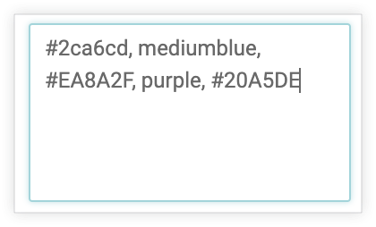
- Click EDIT ALL at the bottom right of the menu to use a comma-separated list of color values.

To change a selected color, or edit all colors at once, input hex strings, such as #2ca6cd, or CSS color names, such as mediumblue, into the color value box at the bottom of the picker.

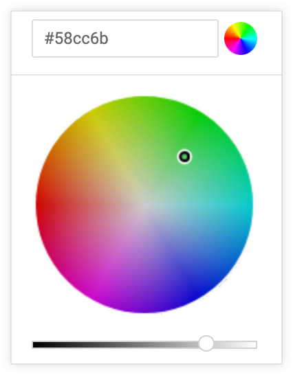
To bring up a color picker to select a color, click the color wheel to the right of the color value box. The corresponding hex value for that color appears in the color value box.

If you click EDIT ALL, the color value box populates with the hex codes of the color palette you've chosen or customized. Copying and pasting this list is the best way to copy custom color palettes from one chart to another.
Reverse colors
You can reverse the colors used on a palette. For a categorical palette, this applies the last color in the palette to the first series, the second-to-last color in the palette to the second series, and so on. For a sequential or diverging palette, this applies the color at the right end of the palette to the first series and move left on the palette for the remaining series.
Customizations
You can customize each series in the chart in several ways:

- Click the arrow next to a series to expand its options.
- Click on the color swatch to select a custom color for the series. This overrides the color palette defined by the Colors option.
- Enter a custom series label if desired. This impacts the chart legend and tooltips.
