BigQuery DataFrames を使用してグラフを可視化する
このドキュメントでは、BigQuery DataFrames 可視化ライブラリを使用してさまざまな種類のグラフをプロットする方法について説明します。
bigframes.pandas API は、Python 用のツールの完全なエコシステムを提供します。この API は高度な統計オペレーションをサポートし、BigQuery DataFrames から生成された集計を可視化できます。また、組み込みのサンプリング オペレーションを使用して、BigQuery DataFrames から pandas DataFrame に切り替えることもできます。
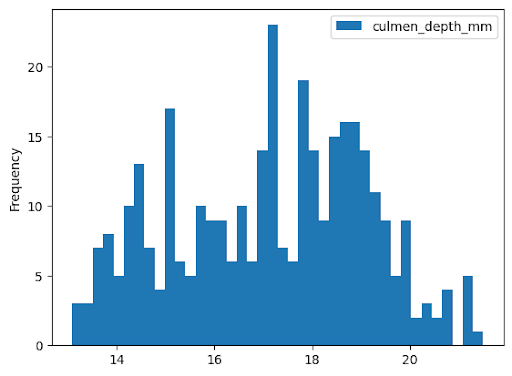
ヒストグラム
次の例では、bigquery-public-data.ml_datasets.penguins テーブルからデータを読み取り、ペンギンのくちばしの深さの分布に関するヒストグラムをプロットします。
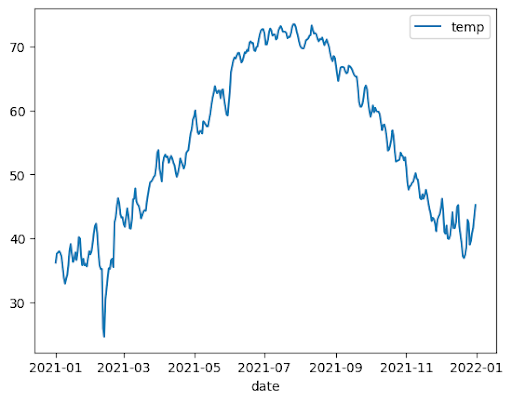
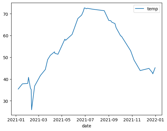
折れ線グラフ
次の例では、bigquery-public-data.noaa_gsod.gsod2021 テーブルのデータを使用して、年間の気温変化の中央値を折れ線グラフでプロットします。
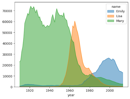
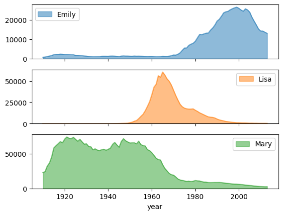
面グラフ
次の例では、bigquery-public-data.usa_names.usa_1910_2013 テーブルを使用して、これまでに米国で人気のあった名前を追跡し、Mary、Emily、Lisa という名前の結果をグラフにしています。
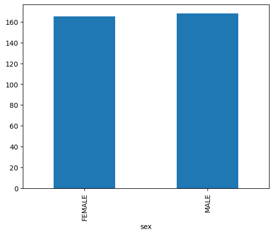
棒グラフ
次の例では、bigquery-public-data.ml_datasets.penguins テーブルを使用してペンギンの性別の分布を可視化します。
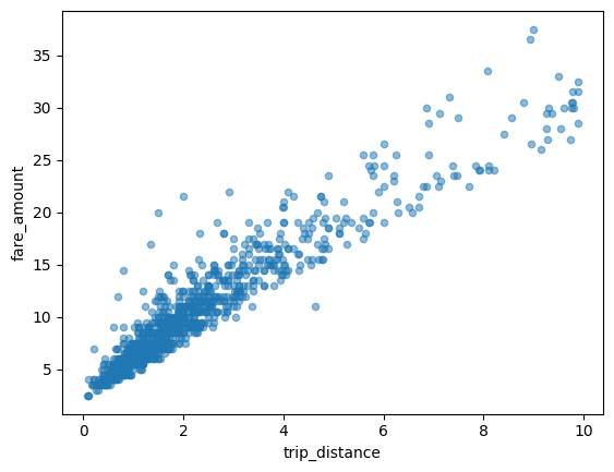
散布図
次の例では、bigquery-public-data.new_york_taxi_trips.tlc_yellow_trips_2021 テーブルを使用して、タクシー料金と乗車距離の関係を調べます。
大規模なデータセットを可視化する
BigQuery DataFrames は、可視化のためにデータをローカルマシンにダウンロードします。ダウンロードするデータポイントの数は、デフォルトで 1,000 個に制限されています。データポイントの数が上限を超えると、BigQuery DataFrames は上限と同じ数のデータポイントをランダムにサンプリングします。
次の例に示すように、グラフをプロットするときに sampling_n パラメータを設定することで、この上限をオーバーライドできます。
pandas と Matplotlib のパラメータを使用した高度なプロット
BigQuery DataFrames のプロット ライブラリは pandas と Matplotlib を基盤としているため、pandas と同様に、グラフを微調整するためのパラメータを渡すことができます。以降のセクションでは、その例について説明します。
サブプロットによる名前の人気度の傾向
次の例では、面グラフの例の名前データを使用して、plot.area() 関数呼び出しで subplots=True を設定し、名前ごとに個別のグラフを作成します。
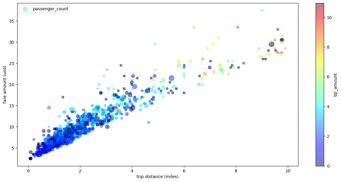
複数のディメンションを含むタクシー乗車数の散布図
次の例では、散布図の例のデータを使用して、x 軸と y 軸のラベルの名前を変更します。ポイントサイズには passenger_count パラメータを使用します。tip_amount パラメータを使用して色付きの点を設定し、図のサイズを変更します。
次のステップ
- BigQuery DataFrames の使用方法について確認する。
- dbt で BigQuery DataFrames を使用する方法を確認する。
- BigQuery DataFrames API リファレンスを確認する。