Analyze data with Looker Studio
You can use BigQuery to explore data with Looker Studio, a self-service business intelligence platform that lets you build and consume data visualizations, dashboards, and reports. With Looker Studio, you can connect to your BigQuery data, create visualizations, and share your insights with others.
Looker Studio offers a premium version, Looker Studio Pro, which includes enhanced enterprise capabilities, including permissions management with Identity and Access Management, team workspaces for collaboration, a mobile app, and technical support.
You can use BigQuery BI Engine to improve report performance while reducing compute costs. To learn about BI Engine, see Introduction to BI Engine.
These examples use Looker Studio to visualize data in the
BigQuery
austin_bikeshare
dataset. For more information about public data sets, see
BigQuery public datasets.
Explore query results
You can construct an arbitrary SQL query and visualize the data in Looker Studio. This is useful if you want to modify the data in BigQuery before working with it in Looker Studio, or if you only need a subset of the fields in the table. Dashboards are based on temporary tables based on query results. Temporary tables are stored for up to 24 hours.
In the Google Cloud console, go to the BigQuery page.
Select your billing project.
In the Explorer pane, enter
bikeshare_tripsin the Type to search field.Go to bigquery-public-data > austin_bikeshare > bikeshare_trips.
Click View actions, and then click Query.
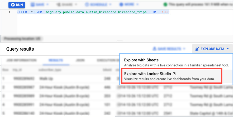
In the query editor, construct your query. For example:
SELECT
  *
FROM
  `bigquery-public-data.austin_bikeshare.bikeshare_trips`
LIMIT
  1000;
Click Run.
In the Query results section, click Explore data, and then click Explore with Looker Studio.
On the Welcome to Looker Studio page, click Get Started if you agree to the Google Looker Studio and Google Terms of Service.
On the Authorize Looker Studio access page, click Authorize to authorize the connection if you agree to the terms of service, and then select your marketing preferences. Only you can view data in your report unless you grant others permission to view the data.
The report editor displays your query results as Looker Studio charts.
The following image shows some features of a Looker Studio report:
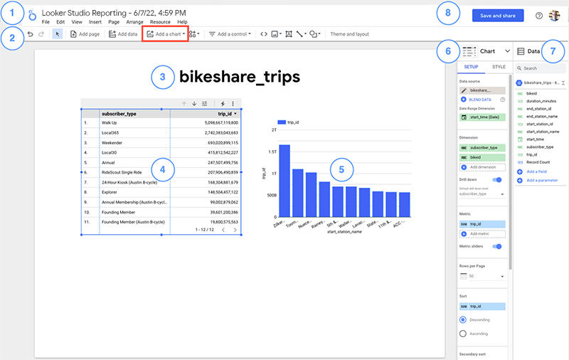
Legend:
- Looker Studio logo and report name.
- To go to the Looker Studio page, click the logo.
- To edit the report name, click the name.
- Looker Studio toolbar. The Add a chart tool is highlighted.
- Report title. To edit the text, click the text box.
- Table (selected). You can interact with a selected chart by using the options in the chart header.
- Bar chart (not selected).
- Chart properties pane. For a selected chart, you can configure its data properties and appearance on the Setup and Style tabs.
- Data pane. In this pane, you can access the
fields and data sources to use in your report.
- To add data to a chart, drag fields from the Data pane onto the chart.
- To create a chart, drag a field from the Data pane onto the canvas.
- Save and share. Save this report so you can view, edit, and share it with others later. Before you save the report, review the data source settings and the credentials that the data sources use.
Users who are data source credential owners can click a resource to view its job statistics, result tables, and BI Engine details.
Interact with charts
Looker Studio charts are interactive. Now that your data is displayed in Looker Studio, here are some things to try:
- Scroll and page through the table.
- In the Bar chart, hold the pointer over a bar to see details about the data.
- Select a bar in the bar chart to cross-filter the table by that dimension.
Add charts
Looker Studio supports many different visualization types. To add more charts to the report, follow these steps:
- In the toolbar, click Add a chart.
- Select the chart you want to add.
- Click the canvas to add the chart to the report.
- Use the Chart properties pane to configure the chart.
For more information about adding charts to a report, see Add charts to your report.
Explore table schema
You can export table schema to see the metadata of your data in Looker Studio. This is useful if you don't want to modify the data in BigQuery before working with it in Looker Studio.
In the Google Cloud console, go to the BigQuery page.
Select your billing project.
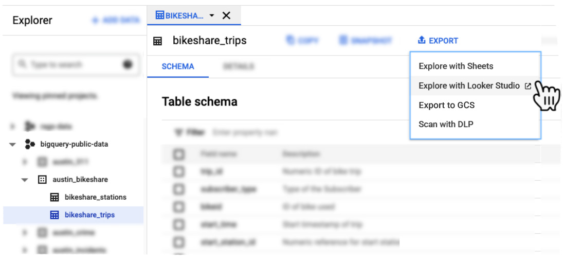
In the Explorer pane, enter
bigquery-public-datain the Type to search field.Go to bigquery-public-data > austin_bikeshare > bikeshare_trips.
In the toolbar, click Export. If Export is not visible, select More actions, and then click Export.
Click Explore with Looker Studio.
Share reports
You can share reports with others by sending them an email invitation to visit Looker Studio. You can invite specific people or Google Groups. To share more broadly, you can also create a link that lets anyone access your Looker Studio reports.
To share a report with another person, follow these steps:
- In the Looker Studio page header, click Share.
- In the Sharing with others dialog, type the recipient's email address. You can enter multiple email addresses or Google Group addresses.
- Specify whether recipients can view or edit the report.
- Click Send.
Learn more about sharing reports.
Deleting your project prevents Looker Studio from querying the data because the data source is associated with your project. If you don't want to delete your Google Cloud project, you can delete the Looker Studio report and data source.
View BigQuery job details
When data source credentials are set to the current user, the user is called datasource credential owner. When viewed by a data source credential owner, most dashboard elements display a BigQuery icon. To navigate to Job details in BigQuery, click the BigQuery icon.
View Looker Studio information schema details
You can track which Looker Studio reports and data sources are
used by BigQuery by viewing the
INFORMATION_SCHEMA.JOBS view.
Every
Looker Studio job has looker_studio_report_id and
looker_studio_datasource_id labels. Those IDs appear at the end of the Looker Studio URLs when opening a report or data source page.
For example, a report with the
URL of https://lookerstudio.google.com/navigation/reporting/XXXX-YYY-ZZ
has a report ID of "XXXX-YYY-ZZ".
The following examples show how to view reports and data sources:
View jobs report and data source URLs for Looker Studio BigQuery
To view the report and data source URL for each Looker Studio BigQuery job by running the following query:
-- Standard labels used by Looker Studio.
DECLARE requestor_key STRING DEFAULT 'requestor';
DECLARE requestor_value STRING DEFAULT 'looker_studio';

CREATE TEMP FUNCTION GetLabel(labels ANY TYPE, label_key STRING)
AS (
  (SELECT l.value FROM UNNEST(labels) l WHERE l.key = label_key)
);

CREATE TEMP FUNCTION GetDatasourceUrl(labels ANY TYPE)
AS (
  CONCAT("https://lookerstudio.google.com/datasources/", GetLabel(labels, 'looker_studio_datasource_id'))
);

CREATE TEMP FUNCTION GetReportUrl(labels ANY TYPE)
AS (
  CONCAT("https://lookerstudio.google.com/reporting/", GetLabel(labels, 'looker_studio_report_id'))
);

SELECT
  job_id,
  GetDatasourceUrl(labels) AS datasource_url,
  GetReportUrl(labels) AS report_url,
FROM
  `region-us`.INFORMATION_SCHEMA.JOBS jobs
WHERE
  creation_time > TIMESTAMP_SUB(CURRENT_TIMESTAMP(), INTERVAL 7 DAY)
  AND GetLabel(labels, requestor_key) = requestor_value
LIMIT
  100;
View jobs produced by using a report and data source
To view the jobs produced, you run the following query:
-- Specify report and data source id, which can be found in the end of Looker Studio URLs.
DECLARE user_report_id STRING DEFAULT '*report id here*';
DECLARE user_datasource_id STRING DEFAULT '*datasource id here*';

-- Looker Studio labels for BigQuery jobs.
DECLARE requestor_key STRING DEFAULT 'requestor';
DECLARE requestor_value STRING DEFAULT 'looker_studio';
DECLARE datasource_key STRING DEFAULT 'looker_studio_datasource_id';
DECLARE report_key STRING DEFAULT 'looker_studio_report_id';

CREATE TEMP FUNCTION GetLabel(labels ANY TYPE, label_key STRING)
AS (
  (SELECT l.value FROM UNNEST(labels) l WHERE l.key = label_key)
);

SELECT
  creation_time,
  job_id,
FROM
  `region-us`.INFORMATION_SCHEMA.JOBS jobs
WHERE
  creation_time > TIMESTAMP_SUB(CURRENT_TIMESTAMP(), INTERVAL 7 DAY)
  AND GetLabel(labels, requestor_key) = requestor_value
  AND GetLabel(labels, datasource_key) = user_datasource_id
  AND GetLabel(labels, report_key) = user_report_id
ORDER BY 1
LIMIT 100;
What's next
- To learn more about reserving capacity for BI Engine, see Reserve BI Engine capacity.
- To learn more about writing queries for BigQuery, see Overview of BigQuery analytics. This document explains tasks such as how to run queries or create user-defined functions (UDFs).
- To explore BigQuery syntax, see Introduction to SQL in BigQuery. In BigQuery, the preferred dialect for SQL queries is standard SQL. BigQuery's older SQL-like syntax is described in Legacy SQL functions and operators.