이 문서에서는 BigQuery DataFrames 시각화 라이브러리를 사용하여 다양한 유형의 그래프를 그리는 방법을 보여줍니다.
bigframes.pandas API는 Python을 위한 전체 도구 생태계를 제공합니다. 이 API는 고급 통계 작업을 지원하며, BigQuery DataFrames에서 생성된 집계를 시각화할 수 있습니다. BigQuery DataFrames에서 내장 샘플링 작업이 있는 pandas DataFrame으로 전환할 수도 있습니다.
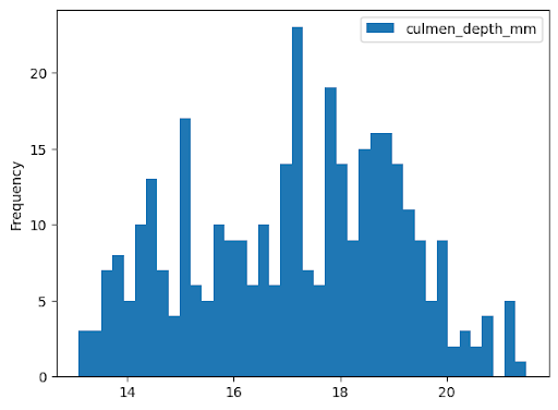
히스토그램
다음 예시에서는 bigquery-public-data.ml_datasets.penguins 테이블에서 데이터를 읽어 펭귄 부리 깊이 분포에 대한 히스토그램을 플롯합니다.
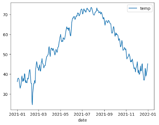
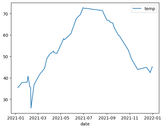
다음 예에서는 bigquery-public-data.noaa_gsod.gsod2021 테이블의 데이터를 사용하여 연중 중앙값 온도 변화의 선 차트를 플롯합니다.
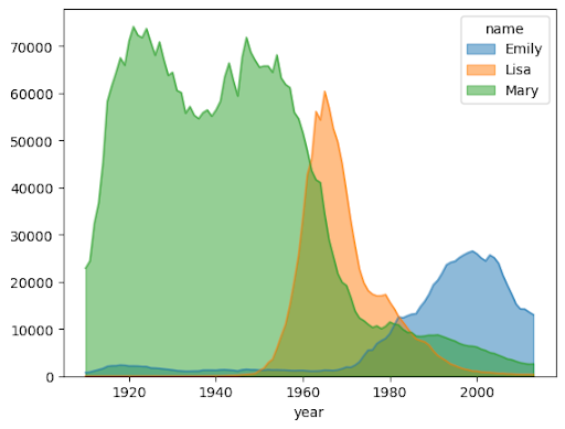
importbigframes.pandasasbpdnoaa_surface=bpd.read_gbq("bigquery-public-data.noaa_gsod.gsod2021")# Calculate median temperature for each daynoaa_surface_median_temps=noaa_surface[["date","temp"]].groupby("date").median()noaa_surface_median_temps.plot.line()
영역 차트
다음 예에서는 bigquery-public-data.usa_names.usa_1910_2013 테이블을 사용하여 미국 역사상 이름의 인기를 추적하고 Mary, Emily, Lisa 이름에 중점을 둡니다.
importbigframes.pandasasbpdusa_names=bpd.read_gbq("bigquery-public-data.usa_names.usa_1910_2013")# Count the occurences of the target names each year. The result is a dataframe with a multi-index.name_counts=(usa_names[usa_names["name"].isin(("Mary","Emily","Lisa"))].groupby(("year","name"))["number"].sum())# Flatten the index of the dataframe so that the counts for each name has their own columns.name_counts=name_counts.unstack(level=1).fillna(0)name_counts.plot.area(stacked=False,alpha=0.5)
막대 차트
다음 예에서는 bigquery-public-data.ml_datasets.penguins 테이블을 사용하여 펭귄 성별의 분포를 시각화합니다.
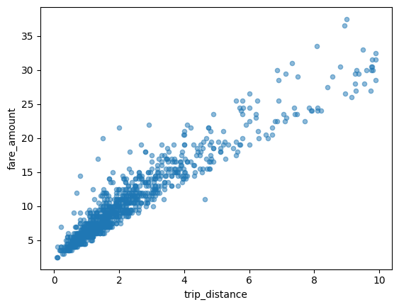
다음 예에서는 bigquery-public-data.new_york_taxi_trips.tlc_yellow_trips_2021 테이블을 사용하여 택시 요금과 이동 거리 간의 관계를 살펴봅니다.
importbigframes.pandasasbpdtaxi_trips=bpd.read_gbq("bigquery-public-data.new_york_taxi_trips.tlc_yellow_trips_2021").dropna()# Data Cleaningtaxi_trips=taxi_trips[taxi_trips["trip_distance"].between(0,10,inclusive="right")]taxi_trips=taxi_trips[taxi_trips["fare_amount"].between(0,50,inclusive="right")]# If you are using partial ordering mode, you will also need to assign an order to your dataset.# Otherwise, the next line can be skipped.taxi_trips=taxi_trips.sort_values("pickup_datetime")taxi_trips.plot.scatter(x="trip_distance",y="fare_amount",alpha=0.5)
대규모 데이터 세트 시각화
BigQuery DataFrames는 시각화를 위해 데이터를 로컬 머신에 다운로드합니다. 다운로드할 데이터 포인트 수는 기본적으로 1,000개로 제한됩니다. 데이터 포인트 수가 상한을 초과하면 BigQuery DataFrames는 상한과 동일한 수의 데이터 포인트를 무작위로 샘플링합니다.
다음 예와 같이 그래프를 플롯할 때 sampling_n 매개변수를 설정하여 이 상한을 재정의할 수 있습니다.
importbigframes.pandasasbpdnoaa_surface=bpd.read_gbq("bigquery-public-data.noaa_gsod.gsod2021")# Calculate median temperature for each daynoaa_surface_median_temps=noaa_surface[["date","temp"]].groupby("date").median()noaa_surface_median_temps.plot.line(sampling_n=40)
Pandas 및 Matplotlib 매개변수를 사용한 고급 플로팅
BigQuery DataFrames의 플로팅 라이브러리는 Pandas와 Matplotlib로 구동되므로 Pandas에서와 마찬가지로 더 많은 매개변수를 전달하여 그래프를 미세 조정할 수 있습니다. 다음 섹션에서는 예를 설명합니다.
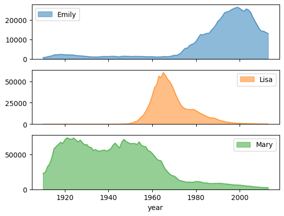
subplots를 사용한 이름 인기 추세
영역 차트 예시의 이름 기록 데이터를 사용하여 다음 예시에서는 plot.area() 함수 호출에서 subplots=True를 설정하여 각 이름에 대한 개별 그래프를 만듭니다.
importbigframes.pandasasbpdusa_names=bpd.read_gbq("bigquery-public-data.usa_names.usa_1910_2013")# Count the occurences of the target names each year. The result is a dataframe with a multi-index.name_counts=(usa_names[usa_names["name"].isin(("Mary","Emily","Lisa"))].groupby(("year","name"))["number"].sum())# Flatten the index of the dataframe so that the counts for each name has their own columns.name_counts=name_counts.unstack(level=1).fillna(0)name_counts.plot.area(subplots=True,alpha=0.5)
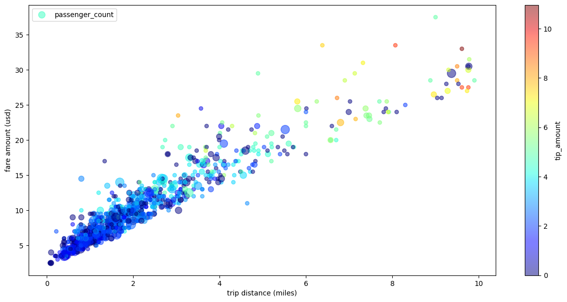
여러 측정기준이 있는 택시 운행 분산형 차트
분산형 차트 예시의 데이터를 사용하여 다음 예에서는 x축과 y축의 라벨 이름을 바꾸고, 점 크기에 passenger_count 매개변수를 사용하고, tip_amount 매개변수로 색상 점을 사용하고, 그림 크기를 조정합니다.
importbigframes.pandasasbpdtaxi_trips=bpd.read_gbq("bigquery-public-data.new_york_taxi_trips.tlc_yellow_trips_2021").dropna()# Data Cleaningtaxi_trips=taxi_trips[taxi_trips["trip_distance"].between(0,10,inclusive="right")]taxi_trips=taxi_trips[taxi_trips["fare_amount"].between(0,50,inclusive="right")]# If you are using partial ordering mode, you also need to assign an order to your dataset.# Otherwise, the next line can be skipped.taxi_trips=taxi_trips.sort_values("pickup_datetime")taxi_trips["passenger_count_scaled"]=taxi_trips["passenger_count"]*30taxi_trips.plot.scatter(x="trip_distance",xlabel="trip distance (miles)",y="fare_amount",ylabel="fare amount (usd)",alpha=0.5,s="passenger_count_scaled",label="passenger_count",c="tip_amount",cmap="jet",colorbar=True,legend=True,figsize=(15,7),sampling_n=1000,)
[[["이해하기 쉬움","easyToUnderstand","thumb-up"],["문제가 해결됨","solvedMyProblem","thumb-up"],["기타","otherUp","thumb-up"]],[["이해하기 어려움","hardToUnderstand","thumb-down"],["잘못된 정보 또는 샘플 코드","incorrectInformationOrSampleCode","thumb-down"],["필요한 정보/샘플이 없음","missingTheInformationSamplesINeed","thumb-down"],["번역 문제","translationIssue","thumb-down"],["기타","otherDown","thumb-down"]],["최종 업데이트: 2025-09-04(UTC)"],[],[],null,["# Visualize graphs using BigQuery DataFrames\n==========================================\n\nThis document demonstrates how to plot various types of graphs by using the\nBigQuery DataFrames visualization library.\n\nThe [`bigframes.pandas` API](/python/docs/reference/bigframes/latest/bigframes.pandas)\nprovides a full ecosystem of tools for Python. The API supports advanced\nstatistical operations, and you can visualize the aggregations generated from\nBigQuery DataFrames. You can also switch from\nBigQuery DataFrames to a `pandas` DataFrame with built-in sampling operations.\n\nHistogram\n---------\n\nThe following example reads data from the `bigquery-public-data.ml_datasets.penguins`\ntable to plot a histogram on the distribution of penguin culmen depths: \n\n import bigframes.pandas as bpd\n\n penguins = bpd.read_gbq(\"bigquery-public-data.ml_datasets.penguins\")\n penguins[\"culmen_depth_mm\"].plot.hist(bins=40)\n\nLine chart\n----------\n\nThe following example uses data from the `bigquery-public-data.noaa_gsod.gsod2021` table\nto plot a line chart of median temperature changes throughout the year: \n\n import bigframes.pandas as bpd\n\n noaa_surface = bpd.read_gbq(\"bigquery-public-data.noaa_gsod.gsod2021\")\n\n # Calculate median temperature for each day\n noaa_surface_median_temps = noaa_surface[[\"date\", \"temp\"]].groupby(\"date\").median()\n\n noaa_surface_median_temps.plot.line()\n\nArea chart\n----------\n\nThe following example uses the `bigquery-public-data.usa_names.usa_1910_2013` table to\ntrack name popularity in US history and focuses on the names `Mary`, `Emily`,\nand `Lisa`: \n\n import bigframes.pandas as bpd\n\n usa_names = bpd.read_gbq(\"bigquery-public-data.usa_names.usa_1910_2013\")\n\n # Count the occurences of the target names each year. The result is a dataframe with a multi-index.\n name_counts = (\n usa_names[usa_names[\"name\"].isin((\"Mary\", \"Emily\", \"Lisa\"))]\n .groupby((\"year\", \"name\"))[\"number\"]\n .sum()\n )\n\n # Flatten the index of the dataframe so that the counts for each name has their own columns.\n name_counts = name_counts.unstack(level=1).fillna(0)\n\n name_counts.plot.area(stacked=False, alpha=0.5)\n\nBar chart\n---------\n\nThe following example uses the `bigquery-public-data.ml_datasets.penguins` table to\nvisualize the distribution of penguin sexes: \n\n import bigframes.pandas as bpd\n\n penguins = bpd.read_gbq(\"bigquery-public-data.ml_datasets.penguins\")\n\n penguin_count_by_sex = (\n penguins[penguins[\"sex\"].isin((\"MALE\", \"FEMALE\"))]\n .groupby(\"sex\")[\"species\"]\n .count()\n )\n penguin_count_by_sex.plot.bar()\n\nScatter plot\n------------\n\nThe following example uses the\n`bigquery-public-data.new_york_taxi_trips.tlc_yellow_trips_2021` table to\nexplore the relationship between taxi fare amounts and trip distances: \n\n import bigframes.pandas as bpd\n\n taxi_trips = bpd.read_gbq(\n \"bigquery-public-data.new_york_taxi_trips.tlc_yellow_trips_2021\"\n ).dropna()\n\n # Data Cleaning\n taxi_trips = taxi_trips[\n taxi_trips[\"trip_distance\"].between(0, 10, inclusive=\"right\")\n ]\n taxi_trips = taxi_trips[taxi_trips[\"fare_amount\"].between(0, 50, inclusive=\"right\")]\n\n # If you are using partial ordering mode, you will also need to assign an order to your dataset.\n # Otherwise, the next line can be skipped.\n taxi_trips = taxi_trips.sort_values(\"pickup_datetime\")\n\n taxi_trips.plot.scatter(x=\"trip_distance\", y=\"fare_amount\", alpha=0.5)\n\nVisualizing a large dataset\n---------------------------\n\nBigQuery DataFrames downloads data to your local machine for\nvisualization. The number of data points to be downloaded is capped at 1,000 by\ndefault. If the number of data points exceeds the cap, BigQuery DataFrames\nrandomly samples the number of data points equal to the cap.\n\nYou can override this cap by setting the `sampling_n` parameter when plotting\na graph, as shown in the following example: \n\n import bigframes.pandas as bpd\n\n noaa_surface = bpd.read_gbq(\"bigquery-public-data.noaa_gsod.gsod2021\")\n\n # Calculate median temperature for each day\n noaa_surface_median_temps = noaa_surface[[\"date\", \"temp\"]].groupby(\"date\").median()\n\n noaa_surface_median_temps.plot.line(sampling_n=40)\n\n| **Note:** The `sampling_n` parameter has no effect on histograms because BigQuery DataFrames bucketizes the data on the server side for histograms.\n\nAdvanced plotting with pandas and Matplotlib parameters\n-------------------------------------------------------\n\nYou can pass in more parameters to fine tune your graph like you can with\npandas, because the plotting library of BigQuery DataFrames is powered\nby pandas and Matplotlib. The following sections describe examples.\n\n### Name popularity trend with subplots\n\nUsing the name history data from the [area chart example](#area-chart), the\nfollowing example creates individual graphs for each name by setting\n`subplots=True` in the `plot.area()` function call: \n\n import bigframes.pandas as bpd\n\n usa_names = bpd.read_gbq(\"bigquery-public-data.usa_names.usa_1910_2013\")\n\n # Count the occurences of the target names each year. The result is a dataframe with a multi-index.\n name_counts = (\n usa_names[usa_names[\"name\"].isin((\"Mary\", \"Emily\", \"Lisa\"))]\n .groupby((\"year\", \"name\"))[\"number\"]\n .sum()\n )\n\n # Flatten the index of the dataframe so that the counts for each name has their own columns.\n name_counts = name_counts.unstack(level=1).fillna(0)\n\n name_counts.plot.area(subplots=True, alpha=0.5)\n\n### Taxi trip scatter plot with multiple dimensions\n\nUsing data from the [scatter plot example](#scatter-plot), the following example\nrenames the labels for the x-axis and y-axis, uses the `passenger_count`\nparameter for point sizes, uses color points with the `tip_amount` parameter,\nand resizes the figure: \n\n import bigframes.pandas as bpd\n\n taxi_trips = bpd.read_gbq(\n \"bigquery-public-data.new_york_taxi_trips.tlc_yellow_trips_2021\"\n ).dropna()\n\n # Data Cleaning\n taxi_trips = taxi_trips[\n taxi_trips[\"trip_distance\"].between(0, 10, inclusive=\"right\")\n ]\n taxi_trips = taxi_trips[taxi_trips[\"fare_amount\"].between(0, 50, inclusive=\"right\")]\n\n # If you are using partial ordering mode, you also need to assign an order to your dataset.\n # Otherwise, the next line can be skipped.\n taxi_trips = taxi_trips.sort_values(\"pickup_datetime\")\n\n taxi_trips[\"passenger_count_scaled\"] = taxi_trips[\"passenger_count\"] * 30\n\n taxi_trips.plot.scatter(\n x=\"trip_distance\",\n xlabel=\"trip distance (miles)\",\n y=\"fare_amount\",\n ylabel=\"fare amount (usd)\",\n alpha=0.5,\n s=\"passenger_count_scaled\",\n label=\"passenger_count\",\n c=\"tip_amount\",\n cmap=\"jet\",\n colorbar=True,\n legend=True,\n figsize=(15, 7),\n sampling_n=1000,\n )\n\nWhat's next\n-----------\n\n- Learn how to [use BigQuery DataFrames](/bigquery/docs/use-bigquery-dataframes).\n- Learn how to [use BigQuery DataFrames in dbt](/bigquery/docs/dataframes-dbt).\n- Explore the [BigQuery DataFrames API reference](/python/docs/reference/bigframes/latest/summary_overview)."]]