Mantenha tudo organizado com as coleções
Salve e categorize o conteúdo com base nas suas preferências.
Visualizar gráficos usando DataFrames do BigQuery
Este documento demonstra como criar vários tipos de gráficos usando a biblioteca de visualização de DataFrames do BigQuery.
A API bigframes.pandas
oferece um ecossistema completo de ferramentas para Python. A API permite operações estatísticas avançadas, e é possível ver as agregações geradas pelo BigQuery DataFrames. Também é possível alternar do BigQuery DataFrames para um DataFrame pandas com operações de amostragem integradas.
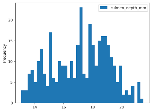
Histograma
O exemplo a seguir lê dados da tabela bigquery-public-data.ml_datasets.penguins para criar um histograma sobre a distribuição das profundidades do bico dos pinguins:
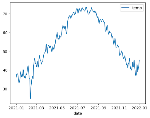
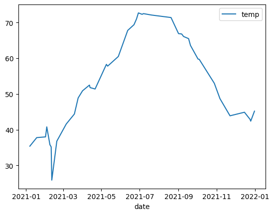
O exemplo a seguir usa dados da tabela bigquery-public-data.noaa_gsod.gsod2021 para criar um gráfico de linhas das mudanças na temperatura mediana ao longo do ano:
importbigframes.pandasasbpdnoaa_surface=bpd.read_gbq("bigquery-public-data.noaa_gsod.gsod2021")# Calculate median temperature for each daynoaa_surface_median_temps=noaa_surface[["date","temp"]].groupby("date").median()noaa_surface_median_temps.plot.line()
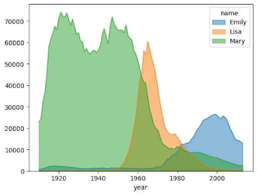
Gráfico de área
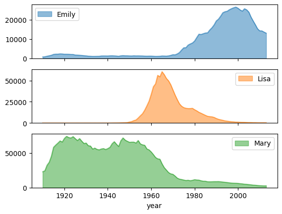
O exemplo a seguir usa a tabela bigquery-public-data.usa_names.usa_1910_2013 para
acompanhar a popularidade dos nomes na história dos EUA e se concentra nos nomes Mary, Emily
e Lisa:
importbigframes.pandasasbpdusa_names=bpd.read_gbq("bigquery-public-data.usa_names.usa_1910_2013")# Count the occurences of the target names each year. The result is a dataframe with a multi-index.name_counts=(usa_names[usa_names["name"].isin(("Mary","Emily","Lisa"))].groupby(("year","name"))["number"].sum())# Flatten the index of the dataframe so that the counts for each name has their own columns.name_counts=name_counts.unstack(level=1).fillna(0)name_counts.plot.area(stacked=False,alpha=0.5)
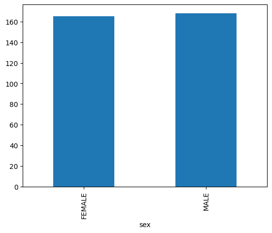
Gráfico de barras
O exemplo a seguir usa a tabela bigquery-public-data.ml_datasets.penguins para visualizar a distribuição de sexos de pinguins:
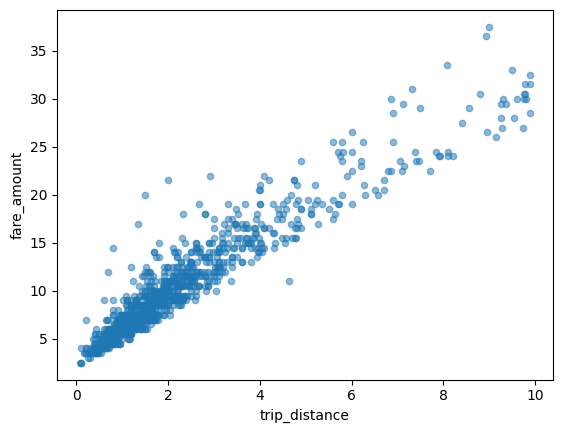
O exemplo a seguir usa a tabela bigquery-public-data.new_york_taxi_trips.tlc_yellow_trips_2021 para analisar a relação entre os valores das tarifas de táxi e as distâncias percorridas:
importbigframes.pandasasbpdtaxi_trips=bpd.read_gbq("bigquery-public-data.new_york_taxi_trips.tlc_yellow_trips_2021").dropna()# Data Cleaningtaxi_trips=taxi_trips[taxi_trips["trip_distance"].between(0,10,inclusive="right")]taxi_trips=taxi_trips[taxi_trips["fare_amount"].between(0,50,inclusive="right")]# If you are using partial ordering mode, you will also need to assign an order to your dataset.# Otherwise, the next line can be skipped.taxi_trips=taxi_trips.sort_values("pickup_datetime")taxi_trips.plot.scatter(x="trip_distance",y="fare_amount",alpha=0.5)
Como visualizar um conjunto de dados grande
O BigQuery DataFrames baixa dados para sua máquina local para visualização. Por padrão,o número de pontos de dados a serem baixados é limitado a 1.000. Se o número de pontos de dados exceder o limite, os DataFrames do BigQuery vão amostrar aleatoriamente o número de pontos de dados igual ao limite.
É possível substituir esse limite definindo o parâmetro sampling_n ao criar um gráfico, conforme mostrado no exemplo a seguir:
importbigframes.pandasasbpdnoaa_surface=bpd.read_gbq("bigquery-public-data.noaa_gsod.gsod2021")# Calculate median temperature for each daynoaa_surface_median_temps=noaa_surface[["date","temp"]].groupby("date").median()noaa_surface_median_temps.plot.line(sampling_n=40)
Plotagem avançada com parâmetros do pandas e do Matplotlib
É possível transmitir mais parâmetros para ajustar o gráfico, assim como no pandas, porque a biblioteca de geração de gráficos do BigQuery DataFrames é alimentada pelo pandas e pelo Matplotlib. As seções a seguir descrevem exemplos.
Tendência de popularidade de nomes com subgráficos
Usando os dados do histórico de nomes do exemplo de gráfico de área, o exemplo a seguir cria gráficos individuais para cada nome definindo subplots=True na chamada da função plot.area():
importbigframes.pandasasbpdusa_names=bpd.read_gbq("bigquery-public-data.usa_names.usa_1910_2013")# Count the occurences of the target names each year. The result is a dataframe with a multi-index.name_counts=(usa_names[usa_names["name"].isin(("Mary","Emily","Lisa"))].groupby(("year","name"))["number"].sum())# Flatten the index of the dataframe so that the counts for each name has their own columns.name_counts=name_counts.unstack(level=1).fillna(0)name_counts.plot.area(subplots=True,alpha=0.5)
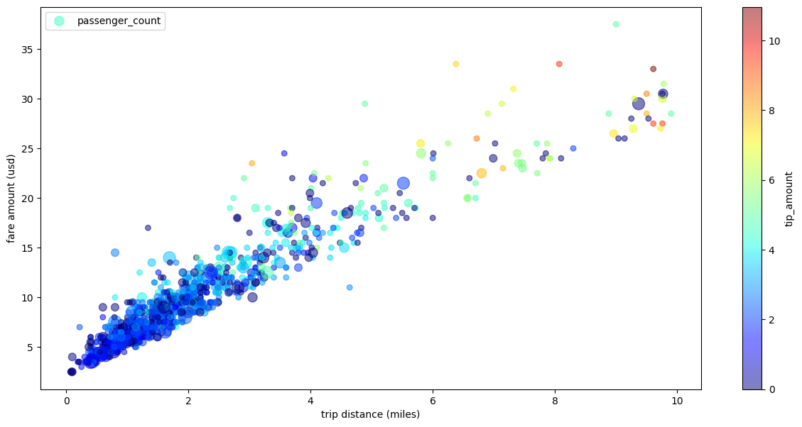
Diagrama de dispersão de viagens de táxi com várias dimensões
Usando dados do exemplo de diagrama de dispersão, o exemplo a seguir renomeia os rótulos dos eixos x e y, usa o parâmetro passenger_count para tamanhos de pontos, usa pontos de cor com o parâmetro tip_amount e redimensiona a figura:
importbigframes.pandasasbpdtaxi_trips=bpd.read_gbq("bigquery-public-data.new_york_taxi_trips.tlc_yellow_trips_2021").dropna()# Data Cleaningtaxi_trips=taxi_trips[taxi_trips["trip_distance"].between(0,10,inclusive="right")]taxi_trips=taxi_trips[taxi_trips["fare_amount"].between(0,50,inclusive="right")]# If you are using partial ordering mode, you also need to assign an order to your dataset.# Otherwise, the next line can be skipped.taxi_trips=taxi_trips.sort_values("pickup_datetime")taxi_trips["passenger_count_scaled"]=taxi_trips["passenger_count"]*30taxi_trips.plot.scatter(x="trip_distance",xlabel="trip distance (miles)",y="fare_amount",ylabel="fare amount (usd)",alpha=0.5,s="passenger_count_scaled",label="passenger_count",c="tip_amount",cmap="jet",colorbar=True,legend=True,figsize=(15,7),sampling_n=1000,)
[[["Fácil de entender","easyToUnderstand","thumb-up"],["Meu problema foi resolvido","solvedMyProblem","thumb-up"],["Outro","otherUp","thumb-up"]],[["Difícil de entender","hardToUnderstand","thumb-down"],["Informações incorretas ou exemplo de código","incorrectInformationOrSampleCode","thumb-down"],["Não contém as informações/amostras de que eu preciso","missingTheInformationSamplesINeed","thumb-down"],["Problema na tradução","translationIssue","thumb-down"],["Outro","otherDown","thumb-down"]],["Última atualização 2025-09-04 UTC."],[],[],null,["# Visualize graphs using BigQuery DataFrames\n==========================================\n\nThis document demonstrates how to plot various types of graphs by using the\nBigQuery DataFrames visualization library.\n\nThe [`bigframes.pandas` API](/python/docs/reference/bigframes/latest/bigframes.pandas)\nprovides a full ecosystem of tools for Python. The API supports advanced\nstatistical operations, and you can visualize the aggregations generated from\nBigQuery DataFrames. You can also switch from\nBigQuery DataFrames to a `pandas` DataFrame with built-in sampling operations.\n\nHistogram\n---------\n\nThe following example reads data from the `bigquery-public-data.ml_datasets.penguins`\ntable to plot a histogram on the distribution of penguin culmen depths: \n\n import bigframes.pandas as bpd\n\n penguins = bpd.read_gbq(\"bigquery-public-data.ml_datasets.penguins\")\n penguins[\"culmen_depth_mm\"].plot.hist(bins=40)\n\nLine chart\n----------\n\nThe following example uses data from the `bigquery-public-data.noaa_gsod.gsod2021` table\nto plot a line chart of median temperature changes throughout the year: \n\n import bigframes.pandas as bpd\n\n noaa_surface = bpd.read_gbq(\"bigquery-public-data.noaa_gsod.gsod2021\")\n\n # Calculate median temperature for each day\n noaa_surface_median_temps = noaa_surface[[\"date\", \"temp\"]].groupby(\"date\").median()\n\n noaa_surface_median_temps.plot.line()\n\nArea chart\n----------\n\nThe following example uses the `bigquery-public-data.usa_names.usa_1910_2013` table to\ntrack name popularity in US history and focuses on the names `Mary`, `Emily`,\nand `Lisa`: \n\n import bigframes.pandas as bpd\n\n usa_names = bpd.read_gbq(\"bigquery-public-data.usa_names.usa_1910_2013\")\n\n # Count the occurences of the target names each year. The result is a dataframe with a multi-index.\n name_counts = (\n usa_names[usa_names[\"name\"].isin((\"Mary\", \"Emily\", \"Lisa\"))]\n .groupby((\"year\", \"name\"))[\"number\"]\n .sum()\n )\n\n # Flatten the index of the dataframe so that the counts for each name has their own columns.\n name_counts = name_counts.unstack(level=1).fillna(0)\n\n name_counts.plot.area(stacked=False, alpha=0.5)\n\nBar chart\n---------\n\nThe following example uses the `bigquery-public-data.ml_datasets.penguins` table to\nvisualize the distribution of penguin sexes: \n\n import bigframes.pandas as bpd\n\n penguins = bpd.read_gbq(\"bigquery-public-data.ml_datasets.penguins\")\n\n penguin_count_by_sex = (\n penguins[penguins[\"sex\"].isin((\"MALE\", \"FEMALE\"))]\n .groupby(\"sex\")[\"species\"]\n .count()\n )\n penguin_count_by_sex.plot.bar()\n\nScatter plot\n------------\n\nThe following example uses the\n`bigquery-public-data.new_york_taxi_trips.tlc_yellow_trips_2021` table to\nexplore the relationship between taxi fare amounts and trip distances: \n\n import bigframes.pandas as bpd\n\n taxi_trips = bpd.read_gbq(\n \"bigquery-public-data.new_york_taxi_trips.tlc_yellow_trips_2021\"\n ).dropna()\n\n # Data Cleaning\n taxi_trips = taxi_trips[\n taxi_trips[\"trip_distance\"].between(0, 10, inclusive=\"right\")\n ]\n taxi_trips = taxi_trips[taxi_trips[\"fare_amount\"].between(0, 50, inclusive=\"right\")]\n\n # If you are using partial ordering mode, you will also need to assign an order to your dataset.\n # Otherwise, the next line can be skipped.\n taxi_trips = taxi_trips.sort_values(\"pickup_datetime\")\n\n taxi_trips.plot.scatter(x=\"trip_distance\", y=\"fare_amount\", alpha=0.5)\n\nVisualizing a large dataset\n---------------------------\n\nBigQuery DataFrames downloads data to your local machine for\nvisualization. The number of data points to be downloaded is capped at 1,000 by\ndefault. If the number of data points exceeds the cap, BigQuery DataFrames\nrandomly samples the number of data points equal to the cap.\n\nYou can override this cap by setting the `sampling_n` parameter when plotting\na graph, as shown in the following example: \n\n import bigframes.pandas as bpd\n\n noaa_surface = bpd.read_gbq(\"bigquery-public-data.noaa_gsod.gsod2021\")\n\n # Calculate median temperature for each day\n noaa_surface_median_temps = noaa_surface[[\"date\", \"temp\"]].groupby(\"date\").median()\n\n noaa_surface_median_temps.plot.line(sampling_n=40)\n\n| **Note:** The `sampling_n` parameter has no effect on histograms because BigQuery DataFrames bucketizes the data on the server side for histograms.\n\nAdvanced plotting with pandas and Matplotlib parameters\n-------------------------------------------------------\n\nYou can pass in more parameters to fine tune your graph like you can with\npandas, because the plotting library of BigQuery DataFrames is powered\nby pandas and Matplotlib. The following sections describe examples.\n\n### Name popularity trend with subplots\n\nUsing the name history data from the [area chart example](#area-chart), the\nfollowing example creates individual graphs for each name by setting\n`subplots=True` in the `plot.area()` function call: \n\n import bigframes.pandas as bpd\n\n usa_names = bpd.read_gbq(\"bigquery-public-data.usa_names.usa_1910_2013\")\n\n # Count the occurences of the target names each year. The result is a dataframe with a multi-index.\n name_counts = (\n usa_names[usa_names[\"name\"].isin((\"Mary\", \"Emily\", \"Lisa\"))]\n .groupby((\"year\", \"name\"))[\"number\"]\n .sum()\n )\n\n # Flatten the index of the dataframe so that the counts for each name has their own columns.\n name_counts = name_counts.unstack(level=1).fillna(0)\n\n name_counts.plot.area(subplots=True, alpha=0.5)\n\n### Taxi trip scatter plot with multiple dimensions\n\nUsing data from the [scatter plot example](#scatter-plot), the following example\nrenames the labels for the x-axis and y-axis, uses the `passenger_count`\nparameter for point sizes, uses color points with the `tip_amount` parameter,\nand resizes the figure: \n\n import bigframes.pandas as bpd\n\n taxi_trips = bpd.read_gbq(\n \"bigquery-public-data.new_york_taxi_trips.tlc_yellow_trips_2021\"\n ).dropna()\n\n # Data Cleaning\n taxi_trips = taxi_trips[\n taxi_trips[\"trip_distance\"].between(0, 10, inclusive=\"right\")\n ]\n taxi_trips = taxi_trips[taxi_trips[\"fare_amount\"].between(0, 50, inclusive=\"right\")]\n\n # If you are using partial ordering mode, you also need to assign an order to your dataset.\n # Otherwise, the next line can be skipped.\n taxi_trips = taxi_trips.sort_values(\"pickup_datetime\")\n\n taxi_trips[\"passenger_count_scaled\"] = taxi_trips[\"passenger_count\"] * 30\n\n taxi_trips.plot.scatter(\n x=\"trip_distance\",\n xlabel=\"trip distance (miles)\",\n y=\"fare_amount\",\n ylabel=\"fare amount (usd)\",\n alpha=0.5,\n s=\"passenger_count_scaled\",\n label=\"passenger_count\",\n c=\"tip_amount\",\n cmap=\"jet\",\n colorbar=True,\n legend=True,\n figsize=(15, 7),\n sampling_n=1000,\n )\n\nWhat's next\n-----------\n\n- Learn how to [use BigQuery DataFrames](/bigquery/docs/use-bigquery-dataframes).\n- Learn how to [use BigQuery DataFrames in dbt](/bigquery/docs/dataframes-dbt).\n- Explore the [BigQuery DataFrames API reference](/python/docs/reference/bigframes/latest/summary_overview)."]]