使用 BigQuery DataFrames 直观呈现图表
本文档演示了如何使用 BigQuery DataFrames 可视化库绘制各种类型的图表。
bigframes.pandas API 为 Python 提供了一个完整的工具生态系统。此 API 支持高级统计操作,您可以直观呈现从 BigQuery DataFrames 生成的聚合。您还可以使用内置的采样操作从 BigQuery DataFrames 切换到 pandas DataFrame。
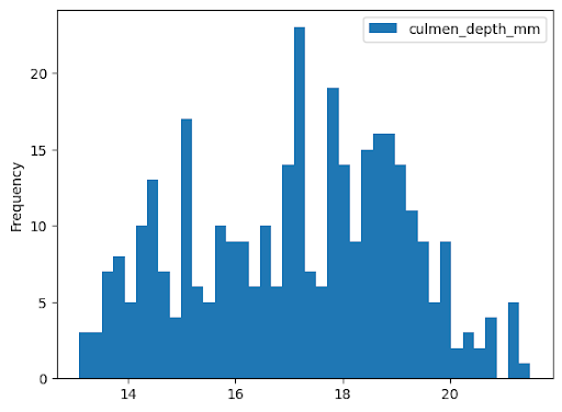
直方图
以下示例从 bigquery-public-data.ml_datasets.penguins 表中读取数据,以绘制有关企鹅喙深度分布的直方图:
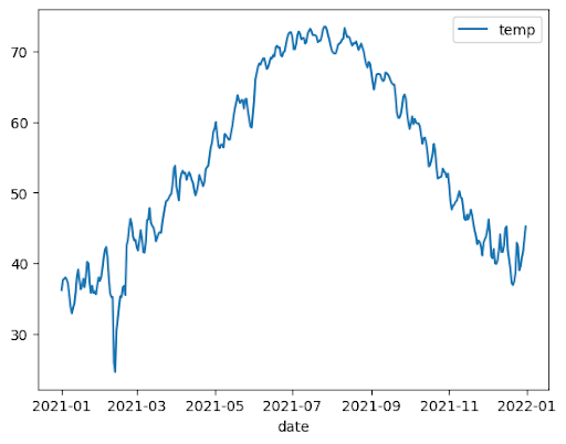
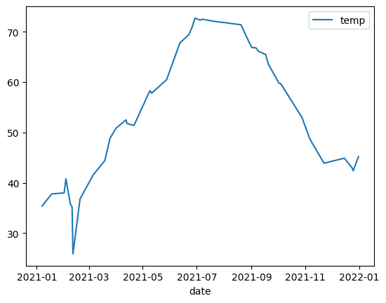
折线图
以下示例使用 bigquery-public-data.noaa_gsod.gsod2021 表中的数据绘制一年中平均温度变化的折线图:
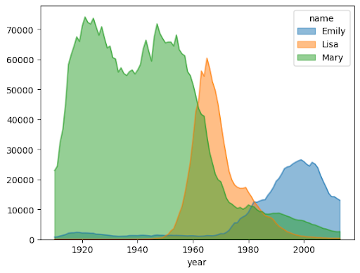
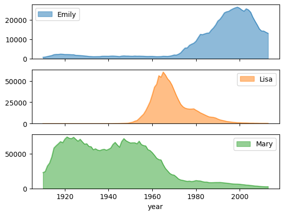
面积图
以下示例使用 bigquery-public-data.usa_names.usa_1910_2013 表来跟踪美国历史上的名字受欢迎程度,并重点关注 Mary、Emily 和 Lisa 这三个名字:
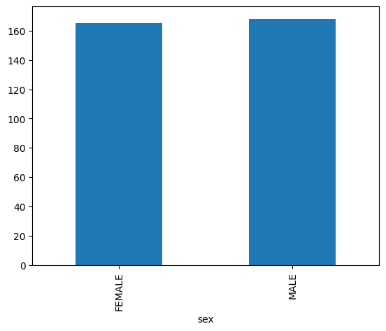
条形图
以下示例使用 bigquery-public-data.ml_datasets.penguins 表直观呈现企鹅性别的分布情况:
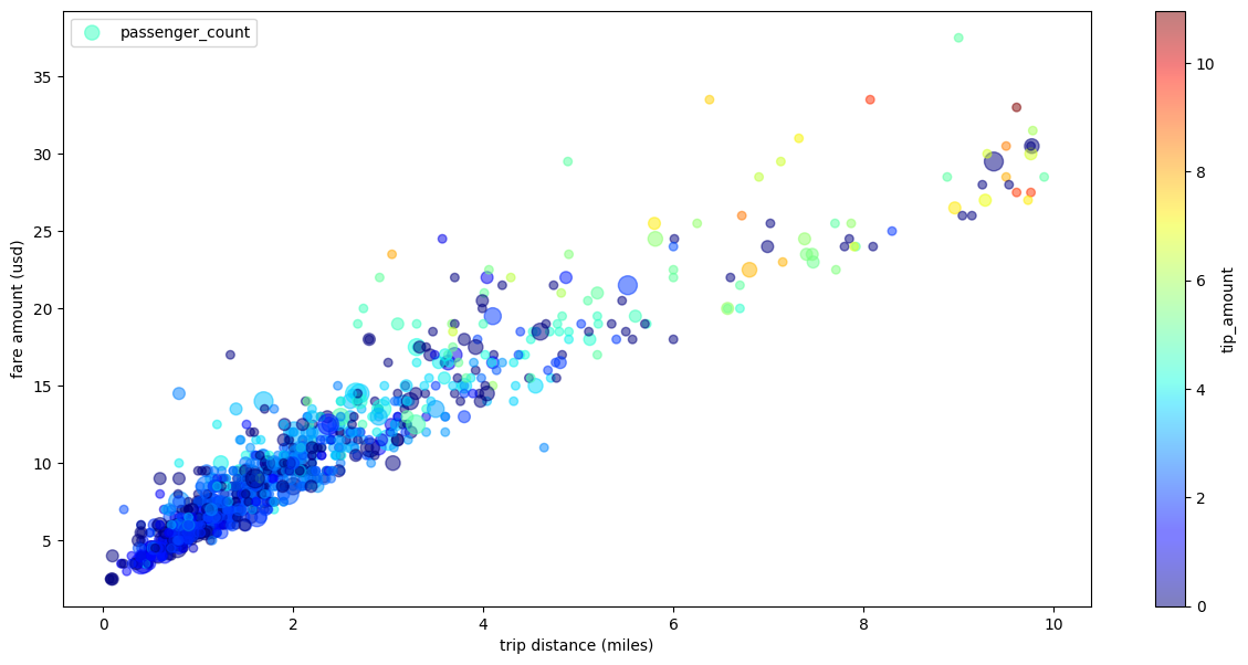
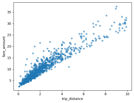
散点图
以下示例使用 bigquery-public-data.new_york_taxi_trips.tlc_yellow_trips_2021 表来探索出租车车费金额与行程距离之间的关系:
直观呈现大型数据集
BigQuery DataFrames 会将数据下载到本地计算机以直观呈现数据。默认情况下,要下载的数据点数量上限为 1,000。如果数据点数量超过上限,BigQuery DataFrames 会随机抽样与上限数量相等的数据点。
您可以在绘制图表时设置 sampling_n 参数来替换此上限,如以下示例所示:
使用 Pandas 和 Matplotlib 参数进行高级绘图
您可以传入更多参数来微调图表,就像使用 Pandas 一样,因为 BigQuery DataFrames 的绘图库由 Pandas 和 Matplotlib 提供支持。以下部分介绍了相关示例。
带有子图的姓名热门程度趋势
使用面积图示例中的名称历史数据,以下示例通过在 plot.area() 函数调用中设置 subplots=True,为每个名称创建单独的图表:
具有多个维度的出租车行程散点图
以下示例使用散点图示例中的数据,重命名了 x 轴和 y 轴的标签,使用 passenger_count 参数设置点大小,使用 tip_amount 参数设置彩色点,并调整了图形大小: