使用 BigQuery DataFrames 繪製圖表
本文將示範如何使用 BigQuery DataFrames 視覺化程式庫,繪製各種圖表。
bigframes.pandas API 提供完整的 Python 工具生態系統。這項 API 支援進階統計作業,您可以將 BigQuery DataFrame 產生的匯總資料以視覺化方式呈現。您也可以從 BigQuery DataFrames 切換至 pandas DataFrame,並使用內建的取樣作業。
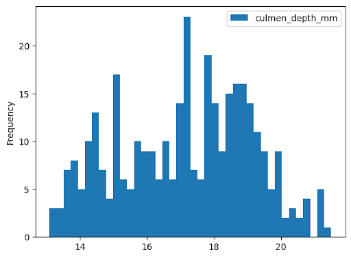
直方圖
以下範例會從 bigquery-public-data.ml_datasets.penguins 資料表讀取資料,繪製企鵝鳥喙深度的分布直方圖:
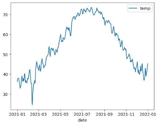
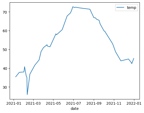
折線圖
以下範例使用 bigquery-public-data.noaa_gsod.gsod2021 資料表中的資料,繪製一年內中位數溫度變化的折線圖:
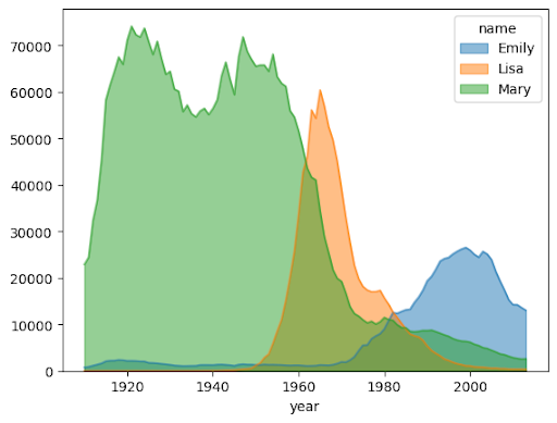
面積圖
以下範例使用 bigquery-public-data.usa_names.usa_1910_2013 資料表追蹤美國歷史上名字的熱門程度,並著重於 Mary、Emily 和 Lisa 這幾個名字:
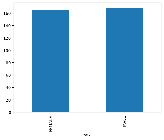
長條圖
以下範例使用 bigquery-public-data.ml_datasets.penguins 資料表,以視覺化方式呈現企鵝性別分布:
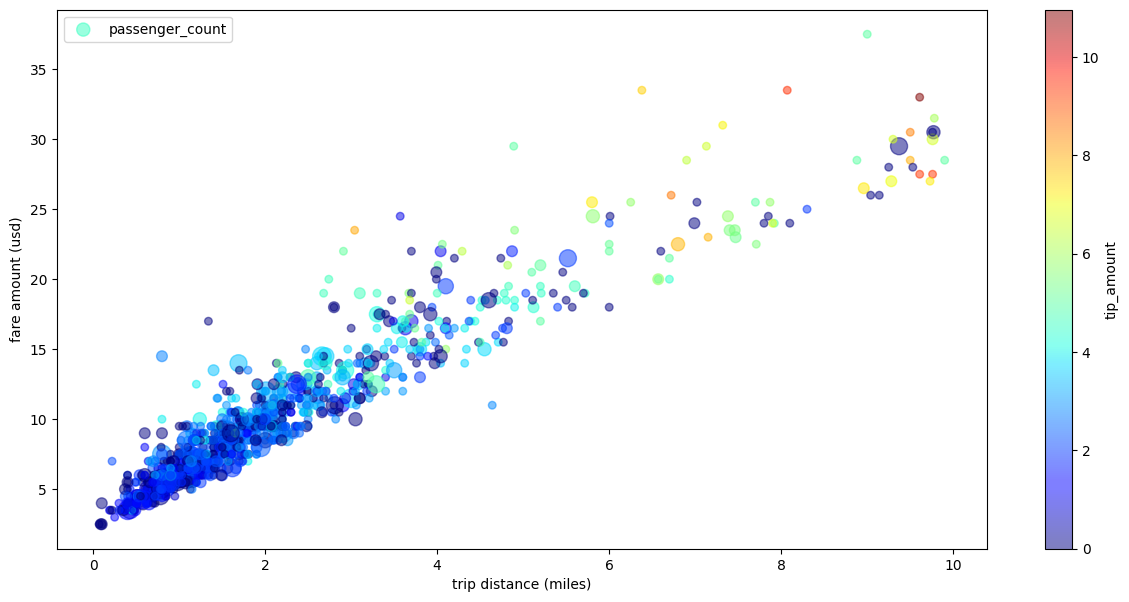
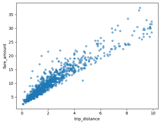
散布圖
以下範例使用 bigquery-public-data.new_york_taxi_trips.tlc_yellow_trips_2021 資料表,探討計程車車資金額與行程距離之間的關係:
將大型資料集視覺化
BigQuery DataFrames 會將資料下載至本機,以供視覺化。根據預設,可下載的資料點數量上限為 1,000 個。如果資料點數量超過上限,BigQuery DataFrame 會隨機取樣,資料點數量等於上限。
如要覆寫這項上限,請在繪製圖表時設定 sampling_n 參數,如下列範例所示:
使用 pandas 和 Matplotlib 參數繪製進階圖表
您可以傳入更多參數來微調圖表,就像使用 pandas 一樣,因為 BigQuery DataFrames 的繪圖程式庫是由 pandas 和 Matplotlib 支援。以下各節說明相關範例。
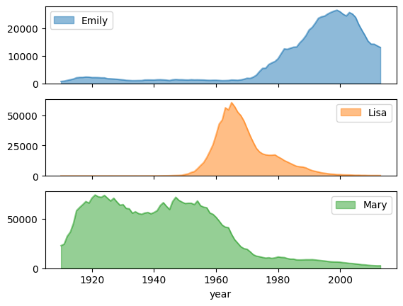
附有子圖的姓名熱門趨勢
使用面積圖範例中的名稱記錄資料,下列範例會在 plot.area() 函式呼叫中設定 subplots=True,為每個名稱建立個別圖表:
計程車行程的散佈圖,包含多個維度
使用散布圖範例中的資料,以下範例會重新命名 X 軸和 Y 軸的標籤、使用 passenger_count 參數設定點大小、使用 tip_amount 參數設定點顏色,以及調整圖表大小: