Restez organisé à l'aide des collections
Enregistrez et classez les contenus selon vos préférences.
Visualiser des graphiques à l'aide de BigQuery DataFrames
Ce document explique comment tracer différents types de graphiques à l'aide de la bibliothèque de visualisation BigQuery DataFrames.
L'API bigframes.pandas fournit un écosystème complet d'outils pour Python. L'API accepte les opérations statistiques avancées et vous pouvez visualiser les agrégations générées à partir de BigQuery DataFrames. Vous pouvez également passer de BigQuery DataFrames à un DataFrame pandas avec des opérations d'échantillonnage intégrées.
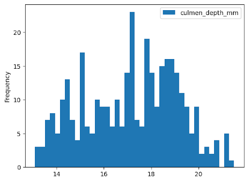
Histogramme
L'exemple suivant lit les données de la table bigquery-public-data.ml_datasets.penguins pour représenter un histogramme de la distribution des profondeurs de bec des manchots :
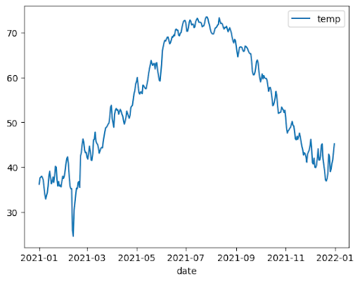
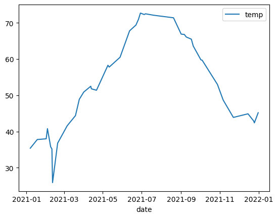
L'exemple suivant utilise les données de la table bigquery-public-data.noaa_gsod.gsod2021 pour représenter un graphique en courbes des variations de température médiane tout au long de l'année :
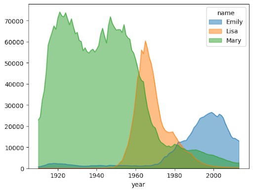
importbigframes.pandasasbpdnoaa_surface=bpd.read_gbq("bigquery-public-data.noaa_gsod.gsod2021")# Calculate median temperature for each daynoaa_surface_median_temps=noaa_surface[["date","temp"]].groupby("date").median()noaa_surface_median_temps.plot.line()
Graphique en aires
L'exemple suivant utilise la table bigquery-public-data.usa_names.usa_1910_2013 pour suivre la popularité des prénoms dans l'histoire des États-Unis et se concentre sur les prénoms Mary, Emily et Lisa :
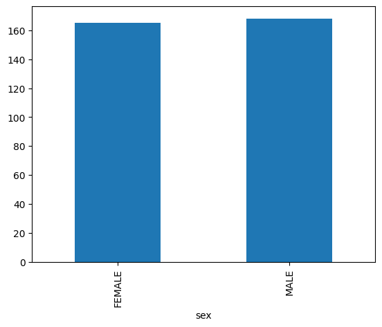
importbigframes.pandasasbpdusa_names=bpd.read_gbq("bigquery-public-data.usa_names.usa_1910_2013")# Count the occurences of the target names each year. The result is a dataframe with a multi-index.name_counts=(usa_names[usa_names["name"].isin(("Mary","Emily","Lisa"))].groupby(("year","name"))["number"].sum())# Flatten the index of the dataframe so that the counts for each name has their own columns.name_counts=name_counts.unstack(level=1).fillna(0)name_counts.plot.area(stacked=False,alpha=0.5)
Graphique à barres
L'exemple suivant utilise la table bigquery-public-data.ml_datasets.penguins pour visualiser la répartition des sexes des manchots :
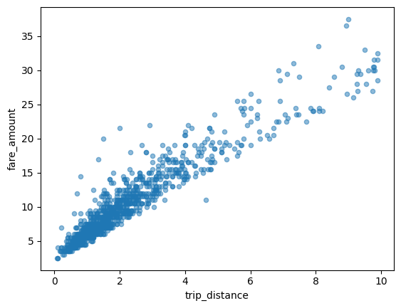
L'exemple suivant utilise la table bigquery-public-data.new_york_taxi_trips.tlc_yellow_trips_2021 pour explorer la relation entre les montants des courses en taxi et les distances parcourues :
importbigframes.pandasasbpdtaxi_trips=bpd.read_gbq("bigquery-public-data.new_york_taxi_trips.tlc_yellow_trips_2021").dropna()# Data Cleaningtaxi_trips=taxi_trips[taxi_trips["trip_distance"].between(0,10,inclusive="right")]taxi_trips=taxi_trips[taxi_trips["fare_amount"].between(0,50,inclusive="right")]# If you are using partial ordering mode, you will also need to assign an order to your dataset.# Otherwise, the next line can be skipped.taxi_trips=taxi_trips.sort_values("pickup_datetime")taxi_trips.plot.scatter(x="trip_distance",y="fare_amount",alpha=0.5)
Visualiser un grand ensemble de données
BigQuery DataFrames télécharge les données sur votre ordinateur local pour les visualiser. Par défaut,le nombre de points de données à télécharger est limité à 1 000. Si le nombre de points de données dépasse la limite, les DataFrames BigQuery échantillonnent aléatoirement le nombre de points de données égal à la limite.
Vous pouvez remplacer cette limite en définissant le paramètre sampling_n lorsque vous tracez un graphique, comme indiqué dans l'exemple suivant :
importbigframes.pandasasbpdnoaa_surface=bpd.read_gbq("bigquery-public-data.noaa_gsod.gsod2021")# Calculate median temperature for each daynoaa_surface_median_temps=noaa_surface[["date","temp"]].groupby("date").median()noaa_surface_median_temps.plot.line(sampling_n=40)
Représentation graphique avancée avec les paramètres pandas et Matplotlib
Vous pouvez transmettre d'autres paramètres pour affiner votre graphique, comme vous le feriez avec pandas, car la bibliothèque de graphiques de BigQuery DataFrames est optimisée par pandas et Matplotlib. Les sections suivantes décrivent des exemples.
Tendance de popularité des noms avec des sous-graphiques
En utilisant les données de l'historique des noms de l'exemple de graphique en aires, l'exemple suivant crée des graphiques individuels pour chaque nom en définissant subplots=True dans l'appel de la fonction plot.area() :
importbigframes.pandasasbpdusa_names=bpd.read_gbq("bigquery-public-data.usa_names.usa_1910_2013")# Count the occurences of the target names each year. The result is a dataframe with a multi-index.name_counts=(usa_names[usa_names["name"].isin(("Mary","Emily","Lisa"))].groupby(("year","name"))["number"].sum())# Flatten the index of the dataframe so that the counts for each name has their own columns.name_counts=name_counts.unstack(level=1).fillna(0)name_counts.plot.area(subplots=True,alpha=0.5)
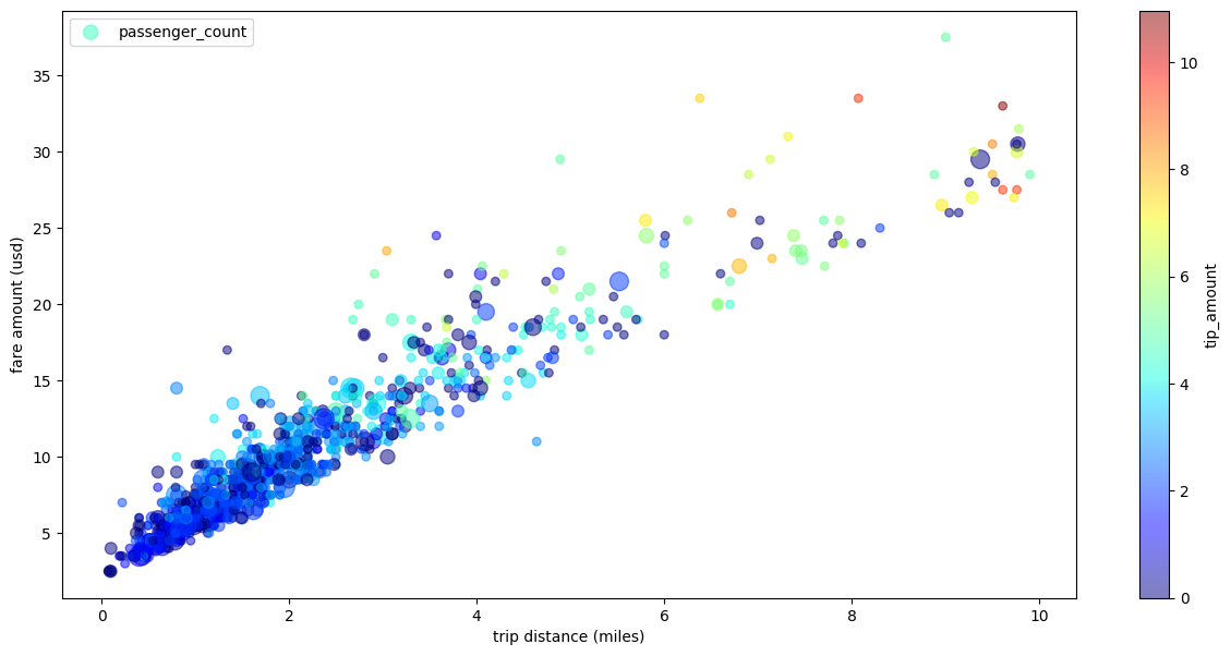
Graphique de dispersion des trajets en taxi avec plusieurs dimensions
En utilisant les données de l'exemple de nuage de points, l'exemple suivant renomme les libellés des axes X et Y, utilise le paramètre passenger_count pour la taille des points, utilise des points de couleur avec le paramètre tip_amount et redimensionne la figure :
importbigframes.pandasasbpdtaxi_trips=bpd.read_gbq("bigquery-public-data.new_york_taxi_trips.tlc_yellow_trips_2021").dropna()# Data Cleaningtaxi_trips=taxi_trips[taxi_trips["trip_distance"].between(0,10,inclusive="right")]taxi_trips=taxi_trips[taxi_trips["fare_amount"].between(0,50,inclusive="right")]# If you are using partial ordering mode, you also need to assign an order to your dataset.# Otherwise, the next line can be skipped.taxi_trips=taxi_trips.sort_values("pickup_datetime")taxi_trips["passenger_count_scaled"]=taxi_trips["passenger_count"]*30taxi_trips.plot.scatter(x="trip_distance",xlabel="trip distance (miles)",y="fare_amount",ylabel="fare amount (usd)",alpha=0.5,s="passenger_count_scaled",label="passenger_count",c="tip_amount",cmap="jet",colorbar=True,legend=True,figsize=(15,7),sampling_n=1000,)
Sauf indication contraire, le contenu de cette page est régi par une licence Creative Commons Attribution 4.0, et les échantillons de code sont régis par une licence Apache 2.0. Pour en savoir plus, consultez les Règles du site Google Developers. Java est une marque déposée d'Oracle et/ou de ses sociétés affiliées.
Dernière mise à jour le 2025/09/04 (UTC).
[[["Facile à comprendre","easyToUnderstand","thumb-up"],["J'ai pu résoudre mon problème","solvedMyProblem","thumb-up"],["Autre","otherUp","thumb-up"]],[["Difficile à comprendre","hardToUnderstand","thumb-down"],["Informations ou exemple de code incorrects","incorrectInformationOrSampleCode","thumb-down"],["Il n'y a pas l'information/les exemples dont j'ai besoin","missingTheInformationSamplesINeed","thumb-down"],["Problème de traduction","translationIssue","thumb-down"],["Autre","otherDown","thumb-down"]],["Dernière mise à jour le 2025/09/04 (UTC)."],[],[],null,["# Visualize graphs using BigQuery DataFrames\n==========================================\n\nThis document demonstrates how to plot various types of graphs by using the\nBigQuery DataFrames visualization library.\n\nThe [`bigframes.pandas` API](/python/docs/reference/bigframes/latest/bigframes.pandas)\nprovides a full ecosystem of tools for Python. The API supports advanced\nstatistical operations, and you can visualize the aggregations generated from\nBigQuery DataFrames. You can also switch from\nBigQuery DataFrames to a `pandas` DataFrame with built-in sampling operations.\n\nHistogram\n---------\n\nThe following example reads data from the `bigquery-public-data.ml_datasets.penguins`\ntable to plot a histogram on the distribution of penguin culmen depths: \n\n import bigframes.pandas as bpd\n\n penguins = bpd.read_gbq(\"bigquery-public-data.ml_datasets.penguins\")\n penguins[\"culmen_depth_mm\"].plot.hist(bins=40)\n\nLine chart\n----------\n\nThe following example uses data from the `bigquery-public-data.noaa_gsod.gsod2021` table\nto plot a line chart of median temperature changes throughout the year: \n\n import bigframes.pandas as bpd\n\n noaa_surface = bpd.read_gbq(\"bigquery-public-data.noaa_gsod.gsod2021\")\n\n # Calculate median temperature for each day\n noaa_surface_median_temps = noaa_surface[[\"date\", \"temp\"]].groupby(\"date\").median()\n\n noaa_surface_median_temps.plot.line()\n\nArea chart\n----------\n\nThe following example uses the `bigquery-public-data.usa_names.usa_1910_2013` table to\ntrack name popularity in US history and focuses on the names `Mary`, `Emily`,\nand `Lisa`: \n\n import bigframes.pandas as bpd\n\n usa_names = bpd.read_gbq(\"bigquery-public-data.usa_names.usa_1910_2013\")\n\n # Count the occurences of the target names each year. The result is a dataframe with a multi-index.\n name_counts = (\n usa_names[usa_names[\"name\"].isin((\"Mary\", \"Emily\", \"Lisa\"))]\n .groupby((\"year\", \"name\"))[\"number\"]\n .sum()\n )\n\n # Flatten the index of the dataframe so that the counts for each name has their own columns.\n name_counts = name_counts.unstack(level=1).fillna(0)\n\n name_counts.plot.area(stacked=False, alpha=0.5)\n\nBar chart\n---------\n\nThe following example uses the `bigquery-public-data.ml_datasets.penguins` table to\nvisualize the distribution of penguin sexes: \n\n import bigframes.pandas as bpd\n\n penguins = bpd.read_gbq(\"bigquery-public-data.ml_datasets.penguins\")\n\n penguin_count_by_sex = (\n penguins[penguins[\"sex\"].isin((\"MALE\", \"FEMALE\"))]\n .groupby(\"sex\")[\"species\"]\n .count()\n )\n penguin_count_by_sex.plot.bar()\n\nScatter plot\n------------\n\nThe following example uses the\n`bigquery-public-data.new_york_taxi_trips.tlc_yellow_trips_2021` table to\nexplore the relationship between taxi fare amounts and trip distances: \n\n import bigframes.pandas as bpd\n\n taxi_trips = bpd.read_gbq(\n \"bigquery-public-data.new_york_taxi_trips.tlc_yellow_trips_2021\"\n ).dropna()\n\n # Data Cleaning\n taxi_trips = taxi_trips[\n taxi_trips[\"trip_distance\"].between(0, 10, inclusive=\"right\")\n ]\n taxi_trips = taxi_trips[taxi_trips[\"fare_amount\"].between(0, 50, inclusive=\"right\")]\n\n # If you are using partial ordering mode, you will also need to assign an order to your dataset.\n # Otherwise, the next line can be skipped.\n taxi_trips = taxi_trips.sort_values(\"pickup_datetime\")\n\n taxi_trips.plot.scatter(x=\"trip_distance\", y=\"fare_amount\", alpha=0.5)\n\nVisualizing a large dataset\n---------------------------\n\nBigQuery DataFrames downloads data to your local machine for\nvisualization. The number of data points to be downloaded is capped at 1,000 by\ndefault. If the number of data points exceeds the cap, BigQuery DataFrames\nrandomly samples the number of data points equal to the cap.\n\nYou can override this cap by setting the `sampling_n` parameter when plotting\na graph, as shown in the following example: \n\n import bigframes.pandas as bpd\n\n noaa_surface = bpd.read_gbq(\"bigquery-public-data.noaa_gsod.gsod2021\")\n\n # Calculate median temperature for each day\n noaa_surface_median_temps = noaa_surface[[\"date\", \"temp\"]].groupby(\"date\").median()\n\n noaa_surface_median_temps.plot.line(sampling_n=40)\n\n| **Note:** The `sampling_n` parameter has no effect on histograms because BigQuery DataFrames bucketizes the data on the server side for histograms.\n\nAdvanced plotting with pandas and Matplotlib parameters\n-------------------------------------------------------\n\nYou can pass in more parameters to fine tune your graph like you can with\npandas, because the plotting library of BigQuery DataFrames is powered\nby pandas and Matplotlib. The following sections describe examples.\n\n### Name popularity trend with subplots\n\nUsing the name history data from the [area chart example](#area-chart), the\nfollowing example creates individual graphs for each name by setting\n`subplots=True` in the `plot.area()` function call: \n\n import bigframes.pandas as bpd\n\n usa_names = bpd.read_gbq(\"bigquery-public-data.usa_names.usa_1910_2013\")\n\n # Count the occurences of the target names each year. The result is a dataframe with a multi-index.\n name_counts = (\n usa_names[usa_names[\"name\"].isin((\"Mary\", \"Emily\", \"Lisa\"))]\n .groupby((\"year\", \"name\"))[\"number\"]\n .sum()\n )\n\n # Flatten the index of the dataframe so that the counts for each name has their own columns.\n name_counts = name_counts.unstack(level=1).fillna(0)\n\n name_counts.plot.area(subplots=True, alpha=0.5)\n\n### Taxi trip scatter plot with multiple dimensions\n\nUsing data from the [scatter plot example](#scatter-plot), the following example\nrenames the labels for the x-axis and y-axis, uses the `passenger_count`\nparameter for point sizes, uses color points with the `tip_amount` parameter,\nand resizes the figure: \n\n import bigframes.pandas as bpd\n\n taxi_trips = bpd.read_gbq(\n \"bigquery-public-data.new_york_taxi_trips.tlc_yellow_trips_2021\"\n ).dropna()\n\n # Data Cleaning\n taxi_trips = taxi_trips[\n taxi_trips[\"trip_distance\"].between(0, 10, inclusive=\"right\")\n ]\n taxi_trips = taxi_trips[taxi_trips[\"fare_amount\"].between(0, 50, inclusive=\"right\")]\n\n # If you are using partial ordering mode, you also need to assign an order to your dataset.\n # Otherwise, the next line can be skipped.\n taxi_trips = taxi_trips.sort_values(\"pickup_datetime\")\n\n taxi_trips[\"passenger_count_scaled\"] = taxi_trips[\"passenger_count\"] * 30\n\n taxi_trips.plot.scatter(\n x=\"trip_distance\",\n xlabel=\"trip distance (miles)\",\n y=\"fare_amount\",\n ylabel=\"fare amount (usd)\",\n alpha=0.5,\n s=\"passenger_count_scaled\",\n label=\"passenger_count\",\n c=\"tip_amount\",\n cmap=\"jet\",\n colorbar=True,\n legend=True,\n figsize=(15, 7),\n sampling_n=1000,\n )\n\nWhat's next\n-----------\n\n- Learn how to [use BigQuery DataFrames](/bigquery/docs/use-bigquery-dataframes).\n- Learn how to [use BigQuery DataFrames in dbt](/bigquery/docs/dataframes-dbt).\n- Explore the [BigQuery DataFrames API reference](/python/docs/reference/bigframes/latest/summary_overview)."]]