Mantieni tutto organizzato con le raccolte
Salva e classifica i contenuti in base alle tue preferenze.
Visualizzare i grafici utilizzando BigQuery DataFrames
Questo documento mostra come tracciare vari tipi di grafici utilizzando la
libreria di visualizzazione BigQuery DataFrames.
L'API bigframes.pandas
fornisce un ecosistema completo di strumenti per Python. L'API supporta operazioni statistiche avanzate e puoi visualizzare gli aggregati generati da BigQuery DataFrames. Puoi anche passare da
BigQuery DataFrames a un DataFrame pandas con operazioni di campionamento integrate.
Istogramma
L'esempio seguente legge i dati dalla tabella bigquery-public-data.ml_datasets.penguins
per tracciare un istogramma sulla distribuzione delle profondità del culmen dei pinguini:
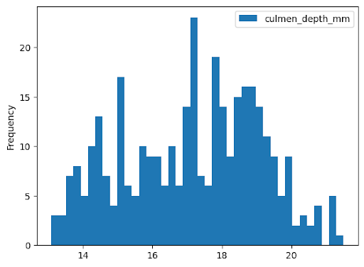
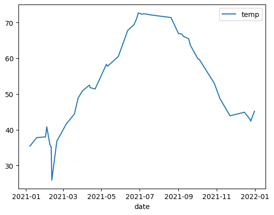
L'esempio seguente utilizza i dati della tabella bigquery-public-data.noaa_gsod.gsod2021
per tracciare un grafico a linee delle variazioni della temperatura media durante l'anno:
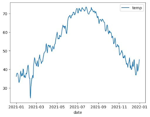
importbigframes.pandasasbpdnoaa_surface=bpd.read_gbq("bigquery-public-data.noaa_gsod.gsod2021")# Calculate median temperature for each daynoaa_surface_median_temps=noaa_surface[["date","temp"]].groupby("date").median()noaa_surface_median_temps.plot.line()
Grafico ad area
L'esempio seguente utilizza la tabella bigquery-public-data.usa_names.usa_1910_2013 per
monitorare la popolarità dei nomi nella storia degli Stati Uniti e si concentra sui nomi Mary, Emily
e Lisa:
importbigframes.pandasasbpdusa_names=bpd.read_gbq("bigquery-public-data.usa_names.usa_1910_2013")# Count the occurences of the target names each year. The result is a dataframe with a multi-index.name_counts=(usa_names[usa_names["name"].isin(("Mary","Emily","Lisa"))].groupby(("year","name"))["number"].sum())# Flatten the index of the dataframe so that the counts for each name has their own columns.name_counts=name_counts.unstack(level=1).fillna(0)name_counts.plot.area(stacked=False,alpha=0.5)
Grafico a barre
L'esempio seguente utilizza la tabella bigquery-public-data.ml_datasets.penguins per visualizzare la distribuzione dei sessi dei pinguini:
L'esempio seguente utilizza la tabella
bigquery-public-data.new_york_taxi_trips.tlc_yellow_trips_2021 per
esplorare la relazione tra gli importi delle tariffe dei taxi e le distanze dei viaggi:
importbigframes.pandasasbpdtaxi_trips=bpd.read_gbq("bigquery-public-data.new_york_taxi_trips.tlc_yellow_trips_2021").dropna()# Data Cleaningtaxi_trips=taxi_trips[taxi_trips["trip_distance"].between(0,10,inclusive="right")]taxi_trips=taxi_trips[taxi_trips["fare_amount"].between(0,50,inclusive="right")]# If you are using partial ordering mode, you will also need to assign an order to your dataset.# Otherwise, the next line can be skipped.taxi_trips=taxi_trips.sort_values("pickup_datetime")taxi_trips.plot.scatter(x="trip_distance",y="fare_amount",alpha=0.5)
Visualizzare un set di dati di grandi dimensioni
BigQuery DataFrames scarica i dati sulla tua macchina locale per la visualizzazione. Per impostazione predefinita,il numero di punti dati da scaricare è limitato a 1000. Se il numero di punti dati supera il limite, BigQuery DataFrames
campiona in modo casuale il numero di punti dati pari al limite.
Puoi eseguire l'override di questo limite impostando il parametro sampling_n durante la creazione
di un grafico, come mostrato nell'esempio seguente:
importbigframes.pandasasbpdnoaa_surface=bpd.read_gbq("bigquery-public-data.noaa_gsod.gsod2021")# Calculate median temperature for each daynoaa_surface_median_temps=noaa_surface[["date","temp"]].groupby("date").median()noaa_surface_median_temps.plot.line(sampling_n=40)
Grafici avanzati con i parametri di pandas e Matplotlib
Puoi passare più parametri per perfezionare il grafico come con pandas, perché la libreria di tracciamento di BigQuery DataFrames è basata su pandas e Matplotlib. Nelle sezioni seguenti vengono descritti alcuni esempi.
Tendenza di popolarità dei nomi con grafici secondari
Utilizzando i dati della cronologia dei nomi dell'esempio di grafico ad area, l'esempio seguente crea grafici individuali per ogni nome impostando subplots=True nella chiamata alla funzione plot.area():
importbigframes.pandasasbpdusa_names=bpd.read_gbq("bigquery-public-data.usa_names.usa_1910_2013")# Count the occurences of the target names each year. The result is a dataframe with a multi-index.name_counts=(usa_names[usa_names["name"].isin(("Mary","Emily","Lisa"))].groupby(("year","name"))["number"].sum())# Flatten the index of the dataframe so that the counts for each name has their own columns.name_counts=name_counts.unstack(level=1).fillna(0)name_counts.plot.area(subplots=True,alpha=0.5)
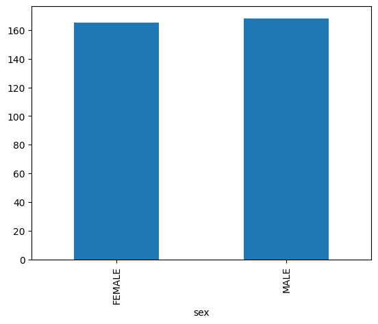
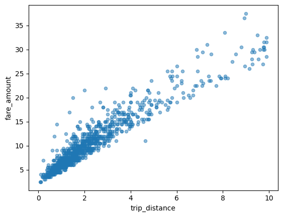
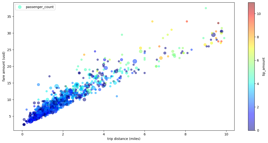
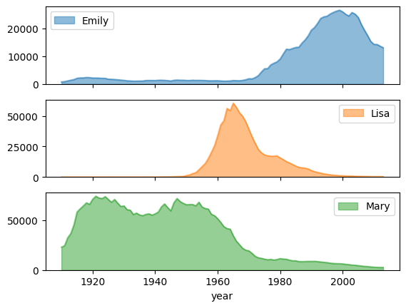
Grafico a dispersione dei viaggi in taxi con più dimensioni
Utilizzando i dati dell'esempio di grafico a dispersione, l'esempio seguente
rinomina le etichette per l'asse x e l'asse y, utilizza il parametro passenger_count
per le dimensioni dei punti, utilizza i punti colorati con il parametro tip_amount
e ridimensiona la figura:
importbigframes.pandasasbpdtaxi_trips=bpd.read_gbq("bigquery-public-data.new_york_taxi_trips.tlc_yellow_trips_2021").dropna()# Data Cleaningtaxi_trips=taxi_trips[taxi_trips["trip_distance"].between(0,10,inclusive="right")]taxi_trips=taxi_trips[taxi_trips["fare_amount"].between(0,50,inclusive="right")]# If you are using partial ordering mode, you also need to assign an order to your dataset.# Otherwise, the next line can be skipped.taxi_trips=taxi_trips.sort_values("pickup_datetime")taxi_trips["passenger_count_scaled"]=taxi_trips["passenger_count"]*30taxi_trips.plot.scatter(x="trip_distance",xlabel="trip distance (miles)",y="fare_amount",ylabel="fare amount (usd)",alpha=0.5,s="passenger_count_scaled",label="passenger_count",c="tip_amount",cmap="jet",colorbar=True,legend=True,figsize=(15,7),sampling_n=1000,)
[[["Facile da capire","easyToUnderstand","thumb-up"],["Il problema è stato risolto","solvedMyProblem","thumb-up"],["Altra","otherUp","thumb-up"]],[["Difficile da capire","hardToUnderstand","thumb-down"],["Informazioni o codice di esempio errati","incorrectInformationOrSampleCode","thumb-down"],["Mancano le informazioni o gli esempi di cui ho bisogno","missingTheInformationSamplesINeed","thumb-down"],["Problema di traduzione","translationIssue","thumb-down"],["Altra","otherDown","thumb-down"]],["Ultimo aggiornamento 2025-09-04 UTC."],[],[],null,["# Visualize graphs using BigQuery DataFrames\n==========================================\n\nThis document demonstrates how to plot various types of graphs by using the\nBigQuery DataFrames visualization library.\n\nThe [`bigframes.pandas` API](/python/docs/reference/bigframes/latest/bigframes.pandas)\nprovides a full ecosystem of tools for Python. The API supports advanced\nstatistical operations, and you can visualize the aggregations generated from\nBigQuery DataFrames. You can also switch from\nBigQuery DataFrames to a `pandas` DataFrame with built-in sampling operations.\n\nHistogram\n---------\n\nThe following example reads data from the `bigquery-public-data.ml_datasets.penguins`\ntable to plot a histogram on the distribution of penguin culmen depths: \n\n import bigframes.pandas as bpd\n\n penguins = bpd.read_gbq(\"bigquery-public-data.ml_datasets.penguins\")\n penguins[\"culmen_depth_mm\"].plot.hist(bins=40)\n\nLine chart\n----------\n\nThe following example uses data from the `bigquery-public-data.noaa_gsod.gsod2021` table\nto plot a line chart of median temperature changes throughout the year: \n\n import bigframes.pandas as bpd\n\n noaa_surface = bpd.read_gbq(\"bigquery-public-data.noaa_gsod.gsod2021\")\n\n # Calculate median temperature for each day\n noaa_surface_median_temps = noaa_surface[[\"date\", \"temp\"]].groupby(\"date\").median()\n\n noaa_surface_median_temps.plot.line()\n\nArea chart\n----------\n\nThe following example uses the `bigquery-public-data.usa_names.usa_1910_2013` table to\ntrack name popularity in US history and focuses on the names `Mary`, `Emily`,\nand `Lisa`: \n\n import bigframes.pandas as bpd\n\n usa_names = bpd.read_gbq(\"bigquery-public-data.usa_names.usa_1910_2013\")\n\n # Count the occurences of the target names each year. The result is a dataframe with a multi-index.\n name_counts = (\n usa_names[usa_names[\"name\"].isin((\"Mary\", \"Emily\", \"Lisa\"))]\n .groupby((\"year\", \"name\"))[\"number\"]\n .sum()\n )\n\n # Flatten the index of the dataframe so that the counts for each name has their own columns.\n name_counts = name_counts.unstack(level=1).fillna(0)\n\n name_counts.plot.area(stacked=False, alpha=0.5)\n\nBar chart\n---------\n\nThe following example uses the `bigquery-public-data.ml_datasets.penguins` table to\nvisualize the distribution of penguin sexes: \n\n import bigframes.pandas as bpd\n\n penguins = bpd.read_gbq(\"bigquery-public-data.ml_datasets.penguins\")\n\n penguin_count_by_sex = (\n penguins[penguins[\"sex\"].isin((\"MALE\", \"FEMALE\"))]\n .groupby(\"sex\")[\"species\"]\n .count()\n )\n penguin_count_by_sex.plot.bar()\n\nScatter plot\n------------\n\nThe following example uses the\n`bigquery-public-data.new_york_taxi_trips.tlc_yellow_trips_2021` table to\nexplore the relationship between taxi fare amounts and trip distances: \n\n import bigframes.pandas as bpd\n\n taxi_trips = bpd.read_gbq(\n \"bigquery-public-data.new_york_taxi_trips.tlc_yellow_trips_2021\"\n ).dropna()\n\n # Data Cleaning\n taxi_trips = taxi_trips[\n taxi_trips[\"trip_distance\"].between(0, 10, inclusive=\"right\")\n ]\n taxi_trips = taxi_trips[taxi_trips[\"fare_amount\"].between(0, 50, inclusive=\"right\")]\n\n # If you are using partial ordering mode, you will also need to assign an order to your dataset.\n # Otherwise, the next line can be skipped.\n taxi_trips = taxi_trips.sort_values(\"pickup_datetime\")\n\n taxi_trips.plot.scatter(x=\"trip_distance\", y=\"fare_amount\", alpha=0.5)\n\nVisualizing a large dataset\n---------------------------\n\nBigQuery DataFrames downloads data to your local machine for\nvisualization. The number of data points to be downloaded is capped at 1,000 by\ndefault. If the number of data points exceeds the cap, BigQuery DataFrames\nrandomly samples the number of data points equal to the cap.\n\nYou can override this cap by setting the `sampling_n` parameter when plotting\na graph, as shown in the following example: \n\n import bigframes.pandas as bpd\n\n noaa_surface = bpd.read_gbq(\"bigquery-public-data.noaa_gsod.gsod2021\")\n\n # Calculate median temperature for each day\n noaa_surface_median_temps = noaa_surface[[\"date\", \"temp\"]].groupby(\"date\").median()\n\n noaa_surface_median_temps.plot.line(sampling_n=40)\n\n| **Note:** The `sampling_n` parameter has no effect on histograms because BigQuery DataFrames bucketizes the data on the server side for histograms.\n\nAdvanced plotting with pandas and Matplotlib parameters\n-------------------------------------------------------\n\nYou can pass in more parameters to fine tune your graph like you can with\npandas, because the plotting library of BigQuery DataFrames is powered\nby pandas and Matplotlib. The following sections describe examples.\n\n### Name popularity trend with subplots\n\nUsing the name history data from the [area chart example](#area-chart), the\nfollowing example creates individual graphs for each name by setting\n`subplots=True` in the `plot.area()` function call: \n\n import bigframes.pandas as bpd\n\n usa_names = bpd.read_gbq(\"bigquery-public-data.usa_names.usa_1910_2013\")\n\n # Count the occurences of the target names each year. The result is a dataframe with a multi-index.\n name_counts = (\n usa_names[usa_names[\"name\"].isin((\"Mary\", \"Emily\", \"Lisa\"))]\n .groupby((\"year\", \"name\"))[\"number\"]\n .sum()\n )\n\n # Flatten the index of the dataframe so that the counts for each name has their own columns.\n name_counts = name_counts.unstack(level=1).fillna(0)\n\n name_counts.plot.area(subplots=True, alpha=0.5)\n\n### Taxi trip scatter plot with multiple dimensions\n\nUsing data from the [scatter plot example](#scatter-plot), the following example\nrenames the labels for the x-axis and y-axis, uses the `passenger_count`\nparameter for point sizes, uses color points with the `tip_amount` parameter,\nand resizes the figure: \n\n import bigframes.pandas as bpd\n\n taxi_trips = bpd.read_gbq(\n \"bigquery-public-data.new_york_taxi_trips.tlc_yellow_trips_2021\"\n ).dropna()\n\n # Data Cleaning\n taxi_trips = taxi_trips[\n taxi_trips[\"trip_distance\"].between(0, 10, inclusive=\"right\")\n ]\n taxi_trips = taxi_trips[taxi_trips[\"fare_amount\"].between(0, 50, inclusive=\"right\")]\n\n # If you are using partial ordering mode, you also need to assign an order to your dataset.\n # Otherwise, the next line can be skipped.\n taxi_trips = taxi_trips.sort_values(\"pickup_datetime\")\n\n taxi_trips[\"passenger_count_scaled\"] = taxi_trips[\"passenger_count\"] * 30\n\n taxi_trips.plot.scatter(\n x=\"trip_distance\",\n xlabel=\"trip distance (miles)\",\n y=\"fare_amount\",\n ylabel=\"fare amount (usd)\",\n alpha=0.5,\n s=\"passenger_count_scaled\",\n label=\"passenger_count\",\n c=\"tip_amount\",\n cmap=\"jet\",\n colorbar=True,\n legend=True,\n figsize=(15, 7),\n sampling_n=1000,\n )\n\nWhat's next\n-----------\n\n- Learn how to [use BigQuery DataFrames](/bigquery/docs/use-bigquery-dataframes).\n- Learn how to [use BigQuery DataFrames in dbt](/bigquery/docs/dataframes-dbt).\n- Explore the [BigQuery DataFrames API reference](/python/docs/reference/bigframes/latest/summary_overview)."]]