Tetap teratur dengan koleksi
Simpan dan kategorikan konten berdasarkan preferensi Anda.
Memvisualisasikan grafik menggunakan BigQuery DataFrames
Dokumen ini menunjukkan cara memetakan berbagai jenis grafik menggunakan
library visualisasi BigQuery DataFrames.
bigframes.pandas API
menyediakan ekosistem alat lengkap untuk Python. API ini mendukung operasi statistik lanjutan, dan Anda dapat memvisualisasikan agregasi yang dihasilkan dari DataFrame BigQuery. Anda juga dapat beralih dari
DataFrame BigQuery ke DataFrame pandas dengan operasi pengambilan sampel bawaan.
Histogram
Contoh berikut membaca data dari tabel bigquery-public-data.ml_datasets.penguins untuk memetakan histogram pada distribusi kedalaman culmen penguin:
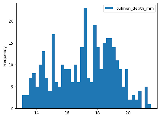
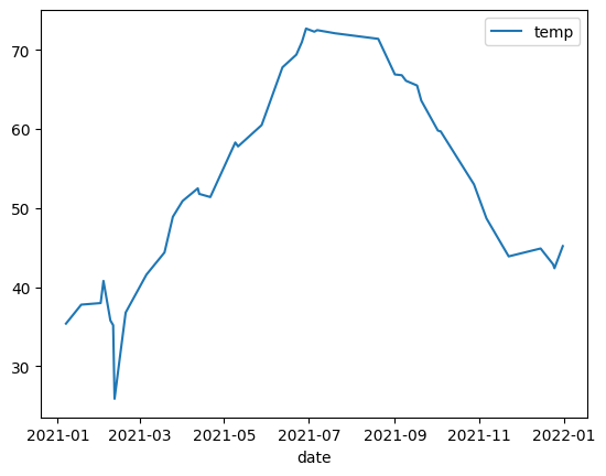
Contoh berikut menggunakan data dari tabel bigquery-public-data.noaa_gsod.gsod2021
untuk memetakan diagram garis perubahan suhu median sepanjang tahun:
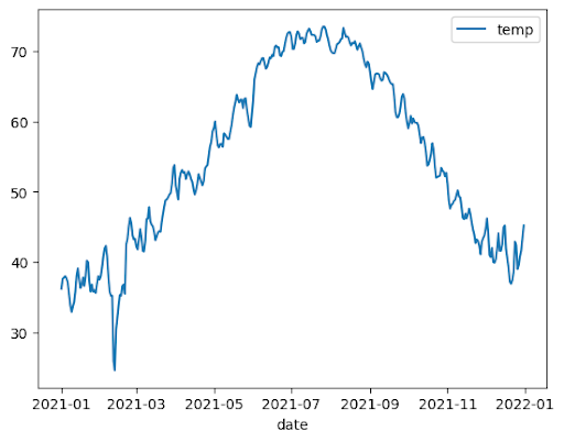
importbigframes.pandasasbpdnoaa_surface=bpd.read_gbq("bigquery-public-data.noaa_gsod.gsod2021")# Calculate median temperature for each daynoaa_surface_median_temps=noaa_surface[["date","temp"]].groupby("date").median()noaa_surface_median_temps.plot.line()
Diagram area
Contoh berikut menggunakan tabel bigquery-public-data.usa_names.usa_1910_2013 untuk melacak popularitas nama dalam sejarah AS dan berfokus pada nama Mary, Emily, dan Lisa:
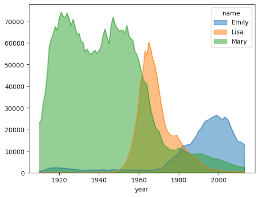
importbigframes.pandasasbpdusa_names=bpd.read_gbq("bigquery-public-data.usa_names.usa_1910_2013")# Count the occurences of the target names each year. The result is a dataframe with a multi-index.name_counts=(usa_names[usa_names["name"].isin(("Mary","Emily","Lisa"))].groupby(("year","name"))["number"].sum())# Flatten the index of the dataframe so that the counts for each name has their own columns.name_counts=name_counts.unstack(level=1).fillna(0)name_counts.plot.area(stacked=False,alpha=0.5)
Diagram batang
Contoh berikut menggunakan tabel bigquery-public-data.ml_datasets.penguins untuk memvisualisasikan distribusi jenis kelamin penguin:
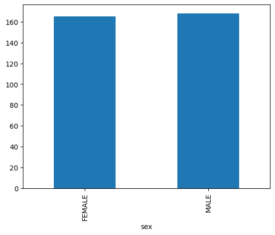
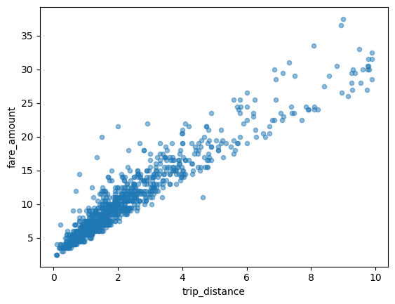
Contoh berikut menggunakan
tabel bigquery-public-data.new_york_taxi_trips.tlc_yellow_trips_2021 untuk
menjelajahi hubungan antara jumlah tarif taksi dan jarak perjalanan:
importbigframes.pandasasbpdtaxi_trips=bpd.read_gbq("bigquery-public-data.new_york_taxi_trips.tlc_yellow_trips_2021").dropna()# Data Cleaningtaxi_trips=taxi_trips[taxi_trips["trip_distance"].between(0,10,inclusive="right")]taxi_trips=taxi_trips[taxi_trips["fare_amount"].between(0,50,inclusive="right")]# If you are using partial ordering mode, you will also need to assign an order to your dataset.# Otherwise, the next line can be skipped.taxi_trips=taxi_trips.sort_values("pickup_datetime")taxi_trips.plot.scatter(x="trip_distance",y="fare_amount",alpha=0.5)
Memvisualisasikan set data besar
BigQuery DataFrame mendownload data ke mesin lokal Anda untuk visualisasi. Jumlah titik data yang akan didownload dibatasi hingga 1.000 secara default. Jika jumlah titik data melebihi batas, BigQuery DataFrames akan mengambil sampel secara acak sejumlah titik data yang sama dengan batas.
Anda dapat mengganti batas ini dengan menyetel parameter sampling_n saat memetakan
grafik, seperti yang ditunjukkan pada contoh berikut:
importbigframes.pandasasbpdnoaa_surface=bpd.read_gbq("bigquery-public-data.noaa_gsod.gsod2021")# Calculate median temperature for each daynoaa_surface_median_temps=noaa_surface[["date","temp"]].groupby("date").median()noaa_surface_median_temps.plot.line(sampling_n=40)
Plotting lanjutan dengan parameter pandas dan Matplotlib
Anda dapat meneruskan lebih banyak parameter untuk menyesuaikan grafik seperti yang dapat Anda lakukan dengan pandas, karena library pembuatan grafik BigQuery DataFrames didukung oleh pandas dan Matplotlib. Bagian berikut menjelaskan contohnya.
Tren popularitas nama dengan sub-plot
Dengan menggunakan data histori nama dari contoh diagram area, contoh berikut membuat grafik individual untuk setiap nama dengan menetapkan
subplots=True dalam panggilan fungsi plot.area():
importbigframes.pandasasbpdusa_names=bpd.read_gbq("bigquery-public-data.usa_names.usa_1910_2013")# Count the occurences of the target names each year. The result is a dataframe with a multi-index.name_counts=(usa_names[usa_names["name"].isin(("Mary","Emily","Lisa"))].groupby(("year","name"))["number"].sum())# Flatten the index of the dataframe so that the counts for each name has their own columns.name_counts=name_counts.unstack(level=1).fillna(0)name_counts.plot.area(subplots=True,alpha=0.5)
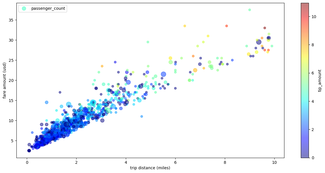
Diagram sebar perjalanan taksi dengan beberapa dimensi
Dengan menggunakan data dari contoh diagram pencar, contoh berikut mengganti nama label untuk sumbu x dan sumbu y, menggunakan parameter passenger_count untuk ukuran titik, menggunakan titik warna dengan parameter tip_amount, dan mengubah ukuran gambar:
importbigframes.pandasasbpdtaxi_trips=bpd.read_gbq("bigquery-public-data.new_york_taxi_trips.tlc_yellow_trips_2021").dropna()# Data Cleaningtaxi_trips=taxi_trips[taxi_trips["trip_distance"].between(0,10,inclusive="right")]taxi_trips=taxi_trips[taxi_trips["fare_amount"].between(0,50,inclusive="right")]# If you are using partial ordering mode, you also need to assign an order to your dataset.# Otherwise, the next line can be skipped.taxi_trips=taxi_trips.sort_values("pickup_datetime")taxi_trips["passenger_count_scaled"]=taxi_trips["passenger_count"]*30taxi_trips.plot.scatter(x="trip_distance",xlabel="trip distance (miles)",y="fare_amount",ylabel="fare amount (usd)",alpha=0.5,s="passenger_count_scaled",label="passenger_count",c="tip_amount",cmap="jet",colorbar=True,legend=True,figsize=(15,7),sampling_n=1000,)
[[["Mudah dipahami","easyToUnderstand","thumb-up"],["Memecahkan masalah saya","solvedMyProblem","thumb-up"],["Lainnya","otherUp","thumb-up"]],[["Sulit dipahami","hardToUnderstand","thumb-down"],["Informasi atau kode contoh salah","incorrectInformationOrSampleCode","thumb-down"],["Informasi/contoh yang saya butuhkan tidak ada","missingTheInformationSamplesINeed","thumb-down"],["Masalah terjemahan","translationIssue","thumb-down"],["Lainnya","otherDown","thumb-down"]],["Terakhir diperbarui pada 2025-09-04 UTC."],[],[],null,["# Visualize graphs using BigQuery DataFrames\n==========================================\n\nThis document demonstrates how to plot various types of graphs by using the\nBigQuery DataFrames visualization library.\n\nThe [`bigframes.pandas` API](/python/docs/reference/bigframes/latest/bigframes.pandas)\nprovides a full ecosystem of tools for Python. The API supports advanced\nstatistical operations, and you can visualize the aggregations generated from\nBigQuery DataFrames. You can also switch from\nBigQuery DataFrames to a `pandas` DataFrame with built-in sampling operations.\n\nHistogram\n---------\n\nThe following example reads data from the `bigquery-public-data.ml_datasets.penguins`\ntable to plot a histogram on the distribution of penguin culmen depths: \n\n import bigframes.pandas as bpd\n\n penguins = bpd.read_gbq(\"bigquery-public-data.ml_datasets.penguins\")\n penguins[\"culmen_depth_mm\"].plot.hist(bins=40)\n\nLine chart\n----------\n\nThe following example uses data from the `bigquery-public-data.noaa_gsod.gsod2021` table\nto plot a line chart of median temperature changes throughout the year: \n\n import bigframes.pandas as bpd\n\n noaa_surface = bpd.read_gbq(\"bigquery-public-data.noaa_gsod.gsod2021\")\n\n # Calculate median temperature for each day\n noaa_surface_median_temps = noaa_surface[[\"date\", \"temp\"]].groupby(\"date\").median()\n\n noaa_surface_median_temps.plot.line()\n\nArea chart\n----------\n\nThe following example uses the `bigquery-public-data.usa_names.usa_1910_2013` table to\ntrack name popularity in US history and focuses on the names `Mary`, `Emily`,\nand `Lisa`: \n\n import bigframes.pandas as bpd\n\n usa_names = bpd.read_gbq(\"bigquery-public-data.usa_names.usa_1910_2013\")\n\n # Count the occurences of the target names each year. The result is a dataframe with a multi-index.\n name_counts = (\n usa_names[usa_names[\"name\"].isin((\"Mary\", \"Emily\", \"Lisa\"))]\n .groupby((\"year\", \"name\"))[\"number\"]\n .sum()\n )\n\n # Flatten the index of the dataframe so that the counts for each name has their own columns.\n name_counts = name_counts.unstack(level=1).fillna(0)\n\n name_counts.plot.area(stacked=False, alpha=0.5)\n\nBar chart\n---------\n\nThe following example uses the `bigquery-public-data.ml_datasets.penguins` table to\nvisualize the distribution of penguin sexes: \n\n import bigframes.pandas as bpd\n\n penguins = bpd.read_gbq(\"bigquery-public-data.ml_datasets.penguins\")\n\n penguin_count_by_sex = (\n penguins[penguins[\"sex\"].isin((\"MALE\", \"FEMALE\"))]\n .groupby(\"sex\")[\"species\"]\n .count()\n )\n penguin_count_by_sex.plot.bar()\n\nScatter plot\n------------\n\nThe following example uses the\n`bigquery-public-data.new_york_taxi_trips.tlc_yellow_trips_2021` table to\nexplore the relationship between taxi fare amounts and trip distances: \n\n import bigframes.pandas as bpd\n\n taxi_trips = bpd.read_gbq(\n \"bigquery-public-data.new_york_taxi_trips.tlc_yellow_trips_2021\"\n ).dropna()\n\n # Data Cleaning\n taxi_trips = taxi_trips[\n taxi_trips[\"trip_distance\"].between(0, 10, inclusive=\"right\")\n ]\n taxi_trips = taxi_trips[taxi_trips[\"fare_amount\"].between(0, 50, inclusive=\"right\")]\n\n # If you are using partial ordering mode, you will also need to assign an order to your dataset.\n # Otherwise, the next line can be skipped.\n taxi_trips = taxi_trips.sort_values(\"pickup_datetime\")\n\n taxi_trips.plot.scatter(x=\"trip_distance\", y=\"fare_amount\", alpha=0.5)\n\nVisualizing a large dataset\n---------------------------\n\nBigQuery DataFrames downloads data to your local machine for\nvisualization. The number of data points to be downloaded is capped at 1,000 by\ndefault. If the number of data points exceeds the cap, BigQuery DataFrames\nrandomly samples the number of data points equal to the cap.\n\nYou can override this cap by setting the `sampling_n` parameter when plotting\na graph, as shown in the following example: \n\n import bigframes.pandas as bpd\n\n noaa_surface = bpd.read_gbq(\"bigquery-public-data.noaa_gsod.gsod2021\")\n\n # Calculate median temperature for each day\n noaa_surface_median_temps = noaa_surface[[\"date\", \"temp\"]].groupby(\"date\").median()\n\n noaa_surface_median_temps.plot.line(sampling_n=40)\n\n| **Note:** The `sampling_n` parameter has no effect on histograms because BigQuery DataFrames bucketizes the data on the server side for histograms.\n\nAdvanced plotting with pandas and Matplotlib parameters\n-------------------------------------------------------\n\nYou can pass in more parameters to fine tune your graph like you can with\npandas, because the plotting library of BigQuery DataFrames is powered\nby pandas and Matplotlib. The following sections describe examples.\n\n### Name popularity trend with subplots\n\nUsing the name history data from the [area chart example](#area-chart), the\nfollowing example creates individual graphs for each name by setting\n`subplots=True` in the `plot.area()` function call: \n\n import bigframes.pandas as bpd\n\n usa_names = bpd.read_gbq(\"bigquery-public-data.usa_names.usa_1910_2013\")\n\n # Count the occurences of the target names each year. The result is a dataframe with a multi-index.\n name_counts = (\n usa_names[usa_names[\"name\"].isin((\"Mary\", \"Emily\", \"Lisa\"))]\n .groupby((\"year\", \"name\"))[\"number\"]\n .sum()\n )\n\n # Flatten the index of the dataframe so that the counts for each name has their own columns.\n name_counts = name_counts.unstack(level=1).fillna(0)\n\n name_counts.plot.area(subplots=True, alpha=0.5)\n\n### Taxi trip scatter plot with multiple dimensions\n\nUsing data from the [scatter plot example](#scatter-plot), the following example\nrenames the labels for the x-axis and y-axis, uses the `passenger_count`\nparameter for point sizes, uses color points with the `tip_amount` parameter,\nand resizes the figure: \n\n import bigframes.pandas as bpd\n\n taxi_trips = bpd.read_gbq(\n \"bigquery-public-data.new_york_taxi_trips.tlc_yellow_trips_2021\"\n ).dropna()\n\n # Data Cleaning\n taxi_trips = taxi_trips[\n taxi_trips[\"trip_distance\"].between(0, 10, inclusive=\"right\")\n ]\n taxi_trips = taxi_trips[taxi_trips[\"fare_amount\"].between(0, 50, inclusive=\"right\")]\n\n # If you are using partial ordering mode, you also need to assign an order to your dataset.\n # Otherwise, the next line can be skipped.\n taxi_trips = taxi_trips.sort_values(\"pickup_datetime\")\n\n taxi_trips[\"passenger_count_scaled\"] = taxi_trips[\"passenger_count\"] * 30\n\n taxi_trips.plot.scatter(\n x=\"trip_distance\",\n xlabel=\"trip distance (miles)\",\n y=\"fare_amount\",\n ylabel=\"fare amount (usd)\",\n alpha=0.5,\n s=\"passenger_count_scaled\",\n label=\"passenger_count\",\n c=\"tip_amount\",\n cmap=\"jet\",\n colorbar=True,\n legend=True,\n figsize=(15, 7),\n sampling_n=1000,\n )\n\nWhat's next\n-----------\n\n- Learn how to [use BigQuery DataFrames](/bigquery/docs/use-bigquery-dataframes).\n- Learn how to [use BigQuery DataFrames in dbt](/bigquery/docs/dataframes-dbt).\n- Explore the [BigQuery DataFrames API reference](/python/docs/reference/bigframes/latest/summary_overview)."]]