Explore and visualize data in BigQuery from within JupyterLab
This page shows you some examples of how to explore and visualize data that is stored in BigQuery from within the JupyterLab interface of your Vertex AI Workbench instance.
Before you begin
If you haven't already, create a Vertex AI Workbench instance.
Required roles
To ensure that your instance's service account has the necessary
permissions to query data in BigQuery,
ask your administrator to grant your instance's service account the
Service Usage Consumer (roles/serviceusage.serviceUsageConsumer)
IAM role on the project.
For more information about granting roles, see Manage access to projects, folders, and organizations.
Your administrator might also be able to give your instance's service account the required permissions through custom roles or other predefined roles.
Open JupyterLab
In the Google Cloud console, go to the Instances page.
Next to your Vertex AI Workbench instance's name, click Open JupyterLab.
Your Vertex AI Workbench instance opens JupyterLab.
Read data from BigQuery
In the next two sections, you read data from BigQuery that you will use to visualize later. These steps are identical to those in Query data in BigQuery from within JupyterLab, so if you've completed them already, you can skip to Get a summary of data in a BigQuery table.
Query data by using the %%bigquery magic command
In this section, you write SQL directly in notebook cells and read data from BigQuery into the Python notebook.
Magic commands that use a single or double percentage character (% or %%)
let you use minimal syntax to interact with BigQuery within the
notebook. The BigQuery client library for Python is automatically
installed in a Vertex AI Workbench instance. Behind the scenes, the %%bigquery magic
command uses the BigQuery client library for Python to run the
given query, convert the results to a pandas DataFrame, optionally save the
results to a variable, and then display the results.
Note: As of version 1.26.0 of the google-cloud-bigquery Python package,
the BigQuery Storage API
is used by default to download results from the %%bigquery magics.
To open a notebook file, select File > New > Notebook.
In the Select Kernel dialog, select Python 3, and then click Select.
Your new IPYNB file opens.
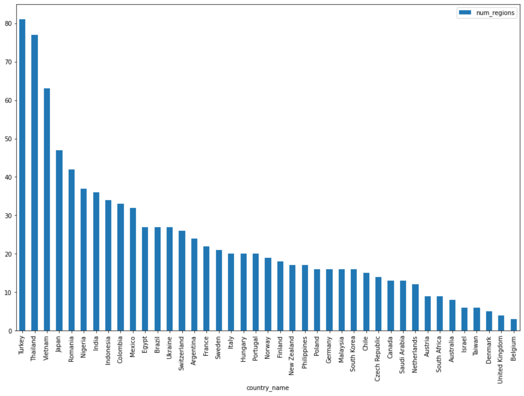
To get the number of regions by country in the
international_top_termsdataset, enter the following statement:%%bigquery SELECT country_code, country_name, COUNT(DISTINCT region_code) AS num_regions FROM `bigquery-public-data.google_trends.international_top_terms` WHERE refresh_date = DATE_SUB(CURRENT_DATE, INTERVAL 1 DAY) GROUP BY country_code, country_name ORDER BY num_regions DESC;
Click Run cell.
The output is similar to the following:
Query complete after 0.07s: 100%|██████████| 4/4 [00:00<00:00, 1440.60query/s]
Downloading: 100%|██████████| 41/41 [00:02<00:00, 20.21rows/s]
country_code      country_name    num_regions
0   TR  Turkey         81
1   TH  Thailand       77
2   VN  Vietnam        63
3   JP  Japan          47
4   RO  Romania        42
5   NG  Nigeria        37
6   IN  India          36
7   ID  Indonesia      34
8   CO  Colombia       33
9   MX  Mexico         32
10  BR  Brazil         27
11  EG  Egypt          27
12  UA  Ukraine        27
13  CH  Switzerland    26
14  AR  Argentina      24
15  FR  France         22
16  SE  Sweden         21
17  HU  Hungary        20
18  IT  Italy          20
19  PT  Portugal       20
20  NO  Norway         19
21  FI  Finland        18
22  NZ  New Zealand    17
23  PH  Philippines    17
...
In the next cell (below the output from the previous cell), enter the following command to run the same query, but this time save the results to a new pandas DataFrame that's named
regions_by_country. You provide that name by using an argument with the%%bigquerymagic command.%%bigquery regions_by_country SELECT country_code, country_name, COUNT(DISTINCT region_code) AS num_regions FROM `bigquery-public-data.google_trends.international_top_terms` WHERE refresh_date = DATE_SUB(CURRENT_DATE, INTERVAL 1 DAY) GROUP BY country_code, country_name ORDER BY num_regions DESC;
Note: For more information about available arguments for the
%%bigquerycommand, see the client library magics documentation.Click Run cell.
In the next cell, enter the following command to look at the first few rows of the query results that you just read in:
regions_by_country.head()Click Run cell.
The pandas DataFrame
regions_by_countryis ready to plot.
Query data by using the BigQuery client library directly
In this section, you use the BigQuery client library for Python directly to read data into the Python notebook.
The client library gives you more control over your queries and lets you use more complex configurations for queries and jobs. The library's integrations with pandas enable you to combine the power of declarative SQL with imperative code (Python) to help you analyze, visualize, and transform your data.
Note: You can use a number of Python data analysis, data wrangling, and
visualization libraries, such as numpy, pandas, matplotlib, and many
others. Several of these libraries are built on top of a DataFrame object.
In the next cell, enter the following Python code to import the BigQuery client library for Python and initialize a client:
from google.cloud import bigquery

client = bigquery.Client()
The BigQuery client is used to send and receive messages from the BigQuery API.
Click Run cell.
In the next cell, enter the following code to retrieve the percentage of daily top terms in the US
top_termsthat overlap across time by number of days apart. The idea here is to look at each day's top terms and see what percentage of them overlap with the top terms from the day before, 2 days prior, 3 days prior, and so on (for all pairs of dates over about a month span).sql = """ WITH TopTermsByDate AS ( SELECT DISTINCT refresh_date AS date, term FROM `bigquery-public-data.google_trends.top_terms` ), DistinctDates AS ( SELECT DISTINCT date FROM TopTermsByDate ) SELECT DATE_DIFF(Dates2.date, Date1Terms.date, DAY) AS days_apart, COUNT(DISTINCT (Dates2.date || Date1Terms.date)) AS num_date_pairs, COUNT(Date1Terms.term) AS num_date1_terms, SUM(IF(Date2Terms.term IS NOT NULL, 1, 0)) AS overlap_terms, SAFE_DIVIDE( SUM(IF(Date2Terms.term IS NOT NULL, 1, 0)), COUNT(Date1Terms.term) ) AS pct_overlap_terms FROM TopTermsByDate AS Date1Terms CROSS JOIN DistinctDates AS Dates2 LEFT JOIN TopTermsByDate AS Date2Terms ON Dates2.date = Date2Terms.date AND Date1Terms.term = Date2Terms.term WHERE Date1Terms.date <= Dates2.date GROUP BY days_apart ORDER BY days_apart; """ pct_overlap_terms_by_days_apart = client.query(sql).to_dataframe() pct_overlap_terms_by_days_apart.head()
The SQL being used is encapsulated in a Python string and then passed to the
query()method to run a query. Theto_dataframemethod waits for the query to finish and downloads the results to a pandas DataFrame by using the BigQuery Storage API.Click Run cell.
The first few rows of query results appear below the code cell.
   days_apart   num_date_pairs  num_date1_terms overlap_terms   pct_overlap_terms
 0          0             32               800            800            1.000000
 1          1             31               775            203            0.261935
 2          2             30               750             73            0.097333
 3          3             29               725             31            0.042759
 4          4             28               700             23            0.032857
For more information about using BigQuery client libraries, see the quickstart Using client libraries.
Get a summary of data in a BigQuery table
In this section, you use a notebook shortcut to get summary statistics and visualizations for all fields of a BigQuery table. This can be a fast way to profile your data before exploring further.
The BigQuery client library provides a magic command,
%bigquery_stats, that you can call with a specific table name to provide an
overview of the table and detailed statistics on each of the table's
columns.
In the next cell, enter the following code to run that analysis on the US
top_termstable:%bigquery_stats bigquery-public-data.google_trends.top_termsClick Run cell.
After running for some time, an image appears with various statistics on each of the 7 variables in the
top_termstable. The following image shows part of some example output: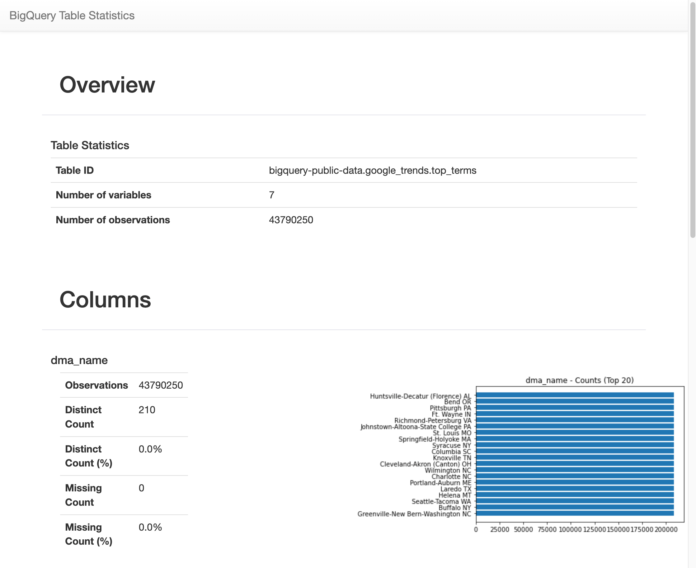
Visualize BigQuery data
In this section, you use plotting capabilities to visualize the results from the queries that you previously ran in your Jupyter notebook.
In the next cell, enter the following code to use the pandas
DataFrame.plot()method to create a bar chart that visualizes the results of the query that returns the number of regions by country:regions_by_country.plot(kind="bar", x="country_name", y="num_regions", figsize=(15, 10))Click Run cell.
The chart is similar to the following:
In the next cell, enter the following code to use the pandas
DataFrame.plot()method to create a scatter plot that visualizes the results from the query for the percentage of overlap in the top search terms by days apart:pct_overlap_terms_by_days_apart.plot( kind="scatter", x="days_apart", y="pct_overlap_terms", s=len(pct_overlap_terms_by_days_apart["num_date_pairs"]) * 20, figsize=(15, 10) )Click Run cell.
The chart is similar to the following. The size of each point reflects the number of date pairs that are that many days apart in the data. For example, there are more pairs that are 1 day apart than 30 days apart because the top search terms are surfaced daily over about a month's time.

For more information about data visualization, see the pandas documentation.