Vertex Explainable AI는 이미지 데이터를 위한 시각화 기능을 기본적으로 제공합니다.
AutoML 이미지 분류 모델의 시각화를 구성할 수 있습니다.
이미지 분류 모델에 대한 설명을 요청하면 예측에 기여한 픽셀(적분 경사) 또는 리전(적분 경사 또는 XRAI)을 나타내는 이미지 오버레이와 함께 예측 클래스가 생성됩니다.
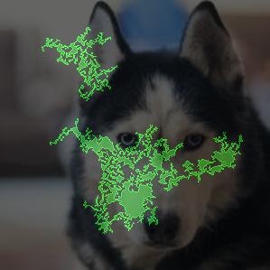
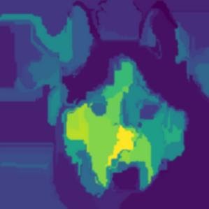
다음 이미지는 허스키 이미지의 시각화를 보여줍니다. 왼쪽 시각화는 통합 그래디언트 메서드를 사용하고 포지티브 기여 분석 영역을 강조표시합니다. 오른쪽 시각화는 포지티브 예측을 할 때 더 적은 영역(파란색) 및 더 큰 영역(노란색)을 나타내는 색상 그라디언트와 함께 XRAI 메서드를 사용합니다.
작업 중인 데이터 유형은 통합 그래디언트 또는 XRAI 접근방식을 사용하여 설명을 시각화하는 데 영향을 줄 수 있습니다.
XRAI는 기본 이미지에 더 효과적이며 포지티브 기여 분석이 개 얼굴 모양과 관련이 있음을 보여주는 등 높은 수준의 통계 요약을 제공합니다.
통합 그래디언트(IG)는 픽셀 수준에서 세부정보를 제공하는 경향이 있으며 보다 세부적인 기여 분석에 유용합니다.
Vertex Explainable AI 개요 페이지에서 기여 분석 메서드에 대해 자세히 알아보세요.
기본 설정과 권장 설정은 기여 분석 메서드(통합 그래디언트 또는 XRAI)에 따라 다릅니다. 다음 목록은 구성 옵션 및 사용 방법을 설명합니다. 전체 옵션 목록은 Visualization 메시지에 대한 API 참조를 확인하세요.
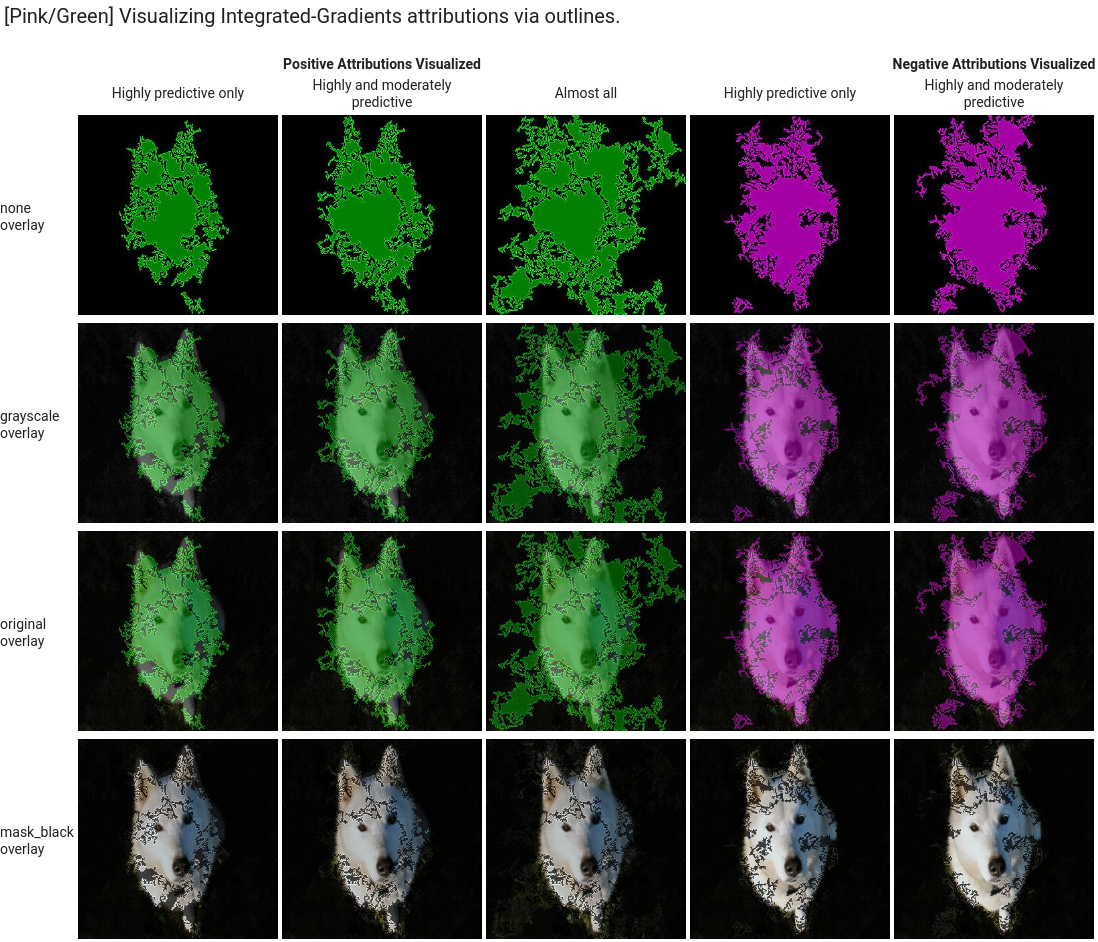
type: 사용된 시각화 유형(OUTLINES 또는 PIXELS)입니다. 통합 그래디언트를 사용하는 경우에만 이 필드를 지정합니다. XRAI를 사용하는 경우에는 이를 지정할 수 없습니다.
통합 그래디언트의 경우 필드가 기본적으로 
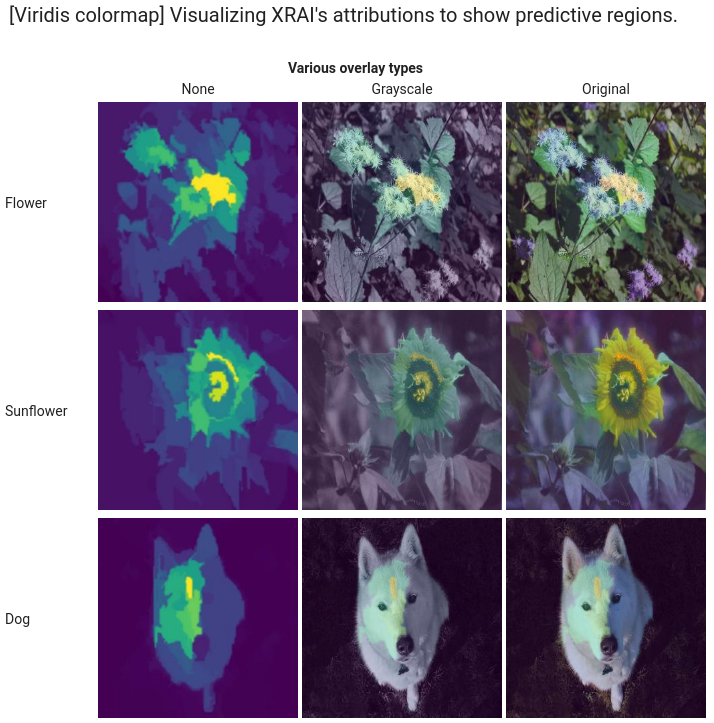
OUTLINES로 설정되어 기여 분석 리전이 표시됩니다. 픽셀당 기여 분석을 표시하려면 필드를 PIXELS로 설정합니다.
polarity: 강조표시된 기여 분석의 방향입니다. 기본적으로 positive가 설정되어 포지티브 기여 분석이 가장 높은 영역을 강조표시합니다. 즉, 모델의 포지티브 예측에 가장 영향력 있는 픽셀을 강조표시합니다.
Polarity를 negative로 설정하면 모델이 포지티브 클래스를 예측하지 않도록 하는 영역을 강조표시합니다. 네거티브 polarity를 사용하면 잘못된 거짓음성 리전을 식별하여 모델을 디버깅하는 데 유용합니다. 또한 포지티브 및 네거티브 기여 분석을 모두 나타내는 both로 polarity을 설정할 수도 있습니다.
clip_percent_upperbound: 강조표시된 영역에서 지정된 백분위수 위의 기여 분석을 제외합니다. 클립 매개변수를 함께 사용하면 노이즈를 필터링하고 강력한 기여 분석 영역을 더 쉽게 볼 수 있습니다.
clip_percent_lowerbound: 강조표시된 영역에서 지정된 백분위수 아래의 기여 분석을 제외합니다.
color_map: 강조표시된 영역에 사용된 색 구성표입니다. 통합 그래디언트의 경우 기본값은 pink_green으로, 포지티브 기여 분석은 녹색으로 표시되고 네거티브 기여 분석은 핑크색으로 표시됩니다. XRAI 시각화의 경우 색상 척도는 그라디언트입니다. XRAI 기본값은 viridis으로, 가장 영향력이 큰 리전은 노란색으로, 가장 영향력이 적은 리전은 파란색으로 강조표시됩니다.
다음은 outlines 및 pixels 유형을 모두 사용하는 시각화입니다. "Highly predictive only", "Moderately predictive", "Almost all"로 라벨이 지정된 열은 다른 수준의 클리핑 예시로 시각화에 집중하는 데 도움이 될 수 있습니다.
XRAI
XRAI 시각화의 경우 오버레이가 기여 분석이 높은 영역과 낮은 영역을 표시하기 위해 경사를 사용하므로 XRAI의 클립 값 없이 시작하는 것이 좋습니다.
[[["이해하기 쉬움","easyToUnderstand","thumb-up"],["문제가 해결됨","solvedMyProblem","thumb-up"],["기타","otherUp","thumb-up"]],[["이해하기 어려움","hardToUnderstand","thumb-down"],["잘못된 정보 또는 샘플 코드","incorrectInformationOrSampleCode","thumb-down"],["필요한 정보/샘플이 없음","missingTheInformationSamplesINeed","thumb-down"],["번역 문제","translationIssue","thumb-down"],["기타","otherDown","thumb-down"]],["최종 업데이트: 2025-07-24(UTC)"],[],[],null,["# Configure visualization settings for AutoML image classification\n\n| **Preview**\n|\n|\n| This feature is subject to the \"Pre-GA Offerings Terms\" in the General Service Terms section\n| of the [Service Specific Terms](/terms/service-terms#1).\n|\n| Pre-GA features are available \"as is\" and might have limited support.\n|\n| For more information, see the\n| [launch stage descriptions](/products#product-launch-stages).\n\nVertex Explainable AI provides built-in visualization capabilities for your image data.\nYou can configure visualizations for AutoML image classification\nmodels.\n\nWhen you request an explanation on an image classification model, you get the\npredicted class along with an image overlay showing which pixels\n(integrated gradients) or regions (integrated gradients or XRAI) contributed to\nthe prediction.\n\nThe following images show visualizations on a husky image. The left\nvisualization uses the integrated gradients method and highlights areas of\npositive attribution. The right visualization uses an XRAI method with a color\ngradient indicating areas of lesser (blue) and greater (yellow) influence in\nmaking a positive prediction. \n\nThe type of data you're working with can influence whether you use an\nintegrated gradients or XRAI approach to visualizing your explanations.\n\n- XRAI tends to be better with natural images and provides a better high-level summary of insights, like showing that positive attribution is related to the shape of a dog's face.\n- Integrated gradients (IG) tends to provide details at the pixel level and is useful for uncovering more granular attributions.\n\nLearn more about the attribution methods in the Vertex Explainable AI\n[Overview page](/vertex-ai/docs/explainable-ai/overview).\n\nGetting started\n---------------\n\nConfigure visualization when you\n[train an AutoML model that supports Vertex Explainable AI](/vertex-ai/docs/training/automl-console)\nand\n[enable explanations when you deploy the model](/vertex-ai/docs/predictions/deploy-model-console).\n\nVisualization options\n---------------------\n\nThe default and recommended settings depend on the attribution method\n(integrated gradients or XRAI). The following list describes configuration\noptions and how you might use them. For a full list of options, see the\n[API reference for the `Visualization` message](/vertex-ai/docs/reference/rest/v1/ExplanationSpec#visualization).\n\n- `type`: The type of visualization used: `OUTLINES` or `PIXELS`. Only specify\n this field if you are using integrated gradients; you can't specify it if you\n are using XRAI.\n\n For integrated gradients, the field defaults to `OUTLINES`, which shows\n regions of attribution. To show per-pixel attribution, set the field to\n `PIXELS`.\n- `polarity`: The directionality of the highlighted attributions. `positive` is\n set by default, which highlights areas with the highest positive\n attributions. This means highlighting pixels that\n were most influential to the model's positive prediction.\n Setting polarity to `negative` highlights areas that lead the model to not\n predicting the positive class. Using a negative polarity can be useful for\n debugging your model by identifying false negative regions. You can also set\n polarity to `both` which shows positive and negative attributions.\n\n- `clip_percent_upperbound`: Excludes attributions above the specified\n percentile\n from the highlighted areas. Using the clip parameters together can be useful\n for filtering out noise and making it easier to see areas of strong\n attribution.\n\n- `clip_percent_lowerbound`: Excludes attributions below the specified\n percentile\n from the highlighted areas.\n\n- `color_map`: The color scheme used for the highlighted areas. Default is\n `pink_green` for integrated gradients, which shows positive attributions in\n green and negative in pink. For XRAI visualizations, the color map is a\n gradient. The XRAI default is `viridis` which highlights the most influential\n regions in yellow and the least influential in blue.\n\n For a full list of possible values, see the [API reference for the\n `Visualization` message](/vertex-ai/docs/reference/rest/v1/ExplanationSpec#visualization).\n- `overlay_type`: How the original image is displayed in the visualization.\n Adjusting the overlay can help increase visual clarity if the original image\n makes it difficult to view the visualization.\n\n For a full list of possible values, see the [API reference for the\n `Visualization` message](/vertex-ai/docs/reference/rest/v1/ExplanationSpec#visualization).\n\nExample configurations\n----------------------\n\nTo get started, here are sample `Visualization` configurations that you can use\nas a starting point and images that show a range of settings applied.\n\n### Integrated gradients\n\nFor integrated gradients, you may need to adjust the clip values if the\nattribution areas are too noisy. \n\n visualization: {\n \"type\": \"OUTLINES\",\n \"polarity\": \"positive\",\n \"clip_percent_lowerbound\": 70,\n \"clip_percent_upperbound\": 99.9,\n \"color_map\": \"pink_green\",\n \"overlay_type\": \"grayscale\"\n }\n\nThe following are two visualizations using both the `outlines` and `pixels`\ntypes. The columns labeled \"Highly predictive only,\" \"Moderately predictive,\"\nand \"Almost all\" are examples of clipping at different levels that can help\nfocus your visualization.\n\n### XRAI\n\nFor XRAI visualizations, we recommend starting with no clip values for\nXRAI because the overlay uses a gradient to show areas of high and low\nattribution. \n\n visualization: {\n \"clip_percent_lowerbound\": 0,\n \"clip_percent_upperbound\": 100,\n \"color_map\": \"viridis\",\n \"overlay_type\": \"grayscale\"\n }\n\nThe following image is an XRAI visualization using the default viridis color map\nand a range of overlay types. The areas in yellow indicate the most\ninfluential regions that contributed positively to the prediction.\n\nWhat's next\n-----------\n\n- Use [Getting explanations](/vertex-ai/docs/explainable-ai/getting-explanations) to get predictions with explanations from your model.\n- For details about improving Vertex Explainable AI results for AutoML image classification models, read [Improving explanations](/vertex-ai/docs/explainable-ai/improve-explanations-automl-icn)."]]