Vertex Explainable AI provides built-in visualization capabilities for your image data. You can configure visualizations for AutoML image classification models.
When you request an explanation on an image classification model, you get the predicted class along with an image overlay showing which pixels (integrated gradients) or regions (integrated gradients or XRAI) contributed to the prediction.
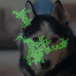
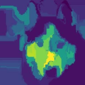
The following images show visualizations on a husky image. The left visualization uses the integrated gradients method and highlights areas of positive attribution. The right visualization uses an XRAI method with a color gradient indicating areas of lesser (blue) and greater (yellow) influence in making a positive prediction.
The type of data you're working with can influence whether you use an integrated gradients or XRAI approach to visualizing your explanations.
- XRAI tends to be better with natural images and provides a better high-level summary of insights, like showing that positive attribution is related to the shape of a dog's face.
- Integrated gradients (IG) tends to provide details at the pixel level and is useful for uncovering more granular attributions.
Learn more about the attribution methods in the Vertex Explainable AI Overview page.
Getting started
Configure visualization when you train an AutoML model that supports Vertex Explainable AI and enable explanations when you deploy the model.
Visualization options
The default and recommended settings depend on the attribution method
(integrated gradients or XRAI). The following list describes configuration
options and how you might use them. For a full list of options, see the
API reference for the Visualization message.
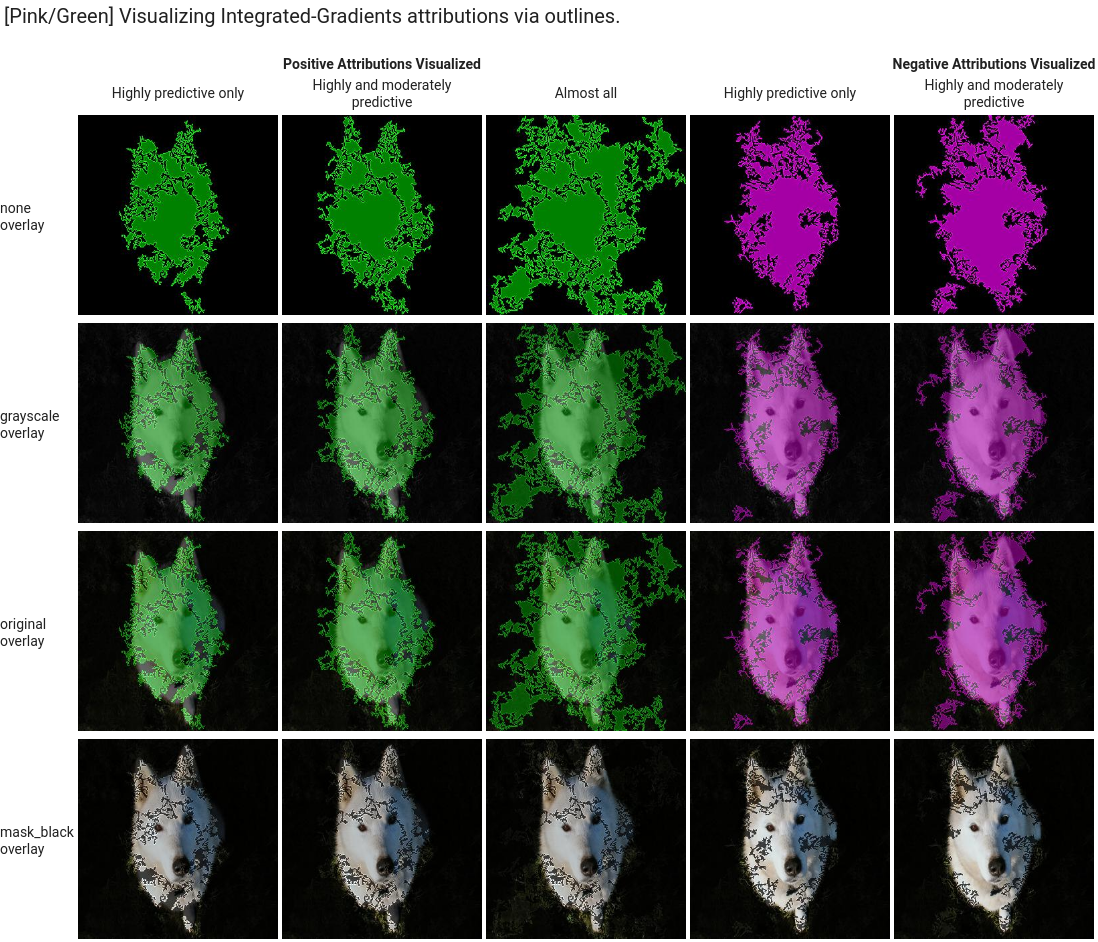
type: The type of visualization used:OUTLINESorPIXELS. Only specify this field if you are using integrated gradients; you can't specify it if you are using XRAI.For integrated gradients, the field defaults to
OUTLINES, which shows regions of attribution. To show per-pixel attribution, set the field toPIXELS.polarity: The directionality of the highlighted attributions.positiveis set by default, which highlights areas with the highest positive attributions. This means highlighting pixels that were most influential to the model's positive prediction. Setting polarity tonegativehighlights areas that lead the model to not predicting the positive class. Using a negative polarity can be useful for debugging your model by identifying false negative regions. You can also set polarity tobothwhich shows positive and negative attributions.clip_percent_upperbound: Excludes attributions above the specified percentile from the highlighted areas. Using the clip parameters together can be useful for filtering out noise and making it easier to see areas of strong attribution.clip_percent_lowerbound: Excludes attributions below the specified percentile from the highlighted areas.color_map: The color scheme used for the highlighted areas. Default ispink_greenfor integrated gradients, which shows positive attributions in green and negative in pink. For XRAI visualizations, the color map is a gradient. The XRAI default isviridiswhich highlights the most influential regions in yellow and the least influential in blue.For a full list of possible values, see the API reference for the
Visualizationmessage.overlay_type: How the original image is displayed in the visualization. Adjusting the overlay can help increase visual clarity if the original image makes it difficult to view the visualization.For a full list of possible values, see the API reference for the
Visualizationmessage.
Example configurations
To get started, here are sample Visualization configurations that you can use
as a starting point and images that show a range of settings applied.
Integrated gradients
For integrated gradients, you may need to adjust the clip values if the attribution areas are too noisy.
visualization: {
  "type": "OUTLINES",
  "polarity": "positive",
  "clip_percent_lowerbound": 70,
  "clip_percent_upperbound": 99.9,
  "color_map": "pink_green",
  "overlay_type": "grayscale"
}
The following are two visualizations using both the outlines and pixels
types. The columns labeled "Highly predictive only," "Moderately predictive,"
and "Almost all" are examples of clipping at different levels that can help
focus your visualization.
![]()
XRAI
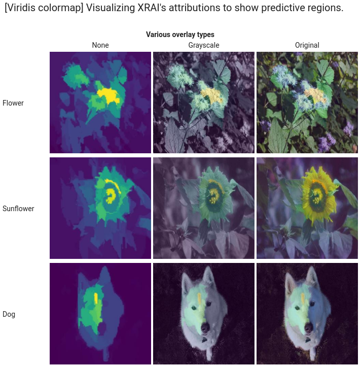
For XRAI visualizations, we recommend starting with no clip values for XRAI because the overlay uses a gradient to show areas of high and low attribution.
visualization: {
  "clip_percent_lowerbound": 0,
  "clip_percent_upperbound": 100,
  "color_map": "viridis",
  "overlay_type": "grayscale"
}
The following image is an XRAI visualization using the default viridis color map and a range of overlay types. The areas in yellow indicate the most influential regions that contributed positively to the prediction.
What's next
- Use Getting explanations to get predictions with explanations from your model.
- For details about improving Vertex Explainable AI results for AutoML image classification models, read Improving explanations.