Esplora e visualizza i dati in BigQuery da JupyterLab
Questa pagina mostra alcuni esempi di come esplorare e visualizzare i dati archiviati in BigQuery dall'interfaccia JupyterLab dell'istanza di notebook gestiti di Vertex AI Workbench.
Apri JupyterLab
Nella console Google Cloud , vai alla pagina Blocchi note gestiti.
Fai clic su Apri JupyterLab accanto al nome dell'istanza di blocchi note gestiti.
L'istanza di blocco note gestita apre JupyterLab.
Leggere i dati da BigQuery
Nelle due sezioni successive, leggerai i dati da BigQuery che utilizzerai per la visualizzazione in un secondo momento. Questi passaggi sono identici a quelli descritti in Esegui query sui dati in BigQuery da JupyterLab, quindi se li hai già completati, puoi passare a Ottenere un riepilogo dei dati in una tabella BigQuery.
Esegui query sui dati utilizzando il comando magico %%bigquery
In questa sezione, scrivi SQL direttamente nelle celle del blocco note e leggi i dati da BigQuery nel blocco note Python.
I comandi magici che utilizzano un carattere percentuale singolo o doppio (% o %%)
consentono di utilizzare una sintassi minima per interagire con BigQuery all'interno del
notebook. La libreria client di BigQuery per Python viene installata
automaticamente in un'istanza di notebook gestiti. Dietro le quinte, il comando magico %%bigquery utilizza la libreria client BigQuery per Python per eseguire la query specificata, convertire i risultati in un DataFrame Pandas, salvare facoltativamente i risultati in una variabile e poi visualizzarli.
Nota: a partire dalla versione 1.26.0 del pacchetto Python google-cloud-bigquery,
l'API BigQuery Storage
viene utilizzata per impostazione predefinita per scaricare i risultati dai comandi magici %%bigquery.
Per aprire un file del blocco note, seleziona File > Nuovo > Blocco note.
Nella finestra di dialogo Seleziona kernel, seleziona Python (locale) e poi fai clic su Seleziona.
Si apre il nuovo file IPYNB.
Per ottenere il numero di regioni per paese nel set di dati
international_top_terms, inserisci la seguente istruzione:%%bigquery SELECT country_code, country_name, COUNT(DISTINCT region_code) AS num_regions FROM `bigquery-public-data.google_trends.international_top_terms` WHERE refresh_date = DATE_SUB(CURRENT_DATE, INTERVAL 1 DAY) GROUP BY country_code, country_name ORDER BY num_regions DESC;
Fai clic su Esegui cella.
L'output è simile al seguente:
Query complete after 0.07s: 100%|██████████| 4/4 [00:00<00:00, 1440.60query/s]
Downloading: 100%|██████████| 41/41 [00:02<00:00, 20.21rows/s]
country_code      country_name    num_regions
0   TR  Turkey         81
1   TH  Thailand       77
2   VN  Vietnam        63
3   JP  Japan          47
4   RO  Romania        42
5   NG  Nigeria        37
6   IN  India          36
7   ID  Indonesia      34
8   CO  Colombia       33
9   MX  Mexico         32
10  BR  Brazil         27
11  EG  Egypt          27
12  UA  Ukraine        27
13  CH  Switzerland    26
14  AR  Argentina      24
15  FR  France         22
16  SE  Sweden         21
17  HU  Hungary        20
18  IT  Italy          20
19  PT  Portugal       20
20  NO  Norway         19
21  FI  Finland        18
22  NZ  New Zealand    17
23  PH  Philippines    17
...
Nella cella successiva (sotto l'output della cella precedente), inserisci il seguente comando per eseguire la stessa query, ma questa volta salva i risultati in un nuovo DataFrame Pandas denominato
regions_by_country. Fornisci questo nome utilizzando un argomento con il comando magico%%bigquery.%%bigquery regions_by_country SELECT country_code, country_name, COUNT(DISTINCT region_code) AS num_regions FROM `bigquery-public-data.google_trends.international_top_terms` WHERE refresh_date = DATE_SUB(CURRENT_DATE, INTERVAL 1 DAY) GROUP BY country_code, country_name ORDER BY num_regions DESC;
Nota:per ulteriori informazioni sugli argomenti disponibili per il comando
%%bigquery, consulta la documentazione sui comandi magici della libreria client.Fai clic su Esegui cella.
Nella cella successiva, inserisci il seguente comando per esaminare le prime righe dei risultati della query appena letti:
regions_by_country.head()Fai clic su Esegui cella.
Il DataFrame pandas
regions_by_countryè pronto per essere tracciato.
Esegui query sui dati utilizzando direttamente la libreria client BigQuery
<
Ottenere un riepilogo dei dati in una tabella BigQuery
In questa sezione, utilizzi una scorciatoia del blocco note per ottenere statistiche riepilogative e visualizzazioni per tutti i campi di una tabella BigQuery. Questo può essere un modo rapido per profilare i dati prima di esplorarli ulteriormente.
La libreria client BigQuery fornisce un comando magico,
%bigquery_stats, che puoi chiamare con un nome di tabella specifico per fornire una
panoramica della tabella e statistiche dettagliate su ciascuna delle colonne
della tabella.
Nella cella successiva, inserisci il seguente codice per eseguire l'analisi sulla tabella
top_terms:%bigquery_stats bigquery-public-data.google_trends.top_termsFai clic su Esegui cella.
Dopo un po' di tempo, viene visualizzata un'immagine con varie statistiche su ciascuna delle 7 variabili nella tabella
top_terms. L'immagine seguente mostra parte di un output di esempio: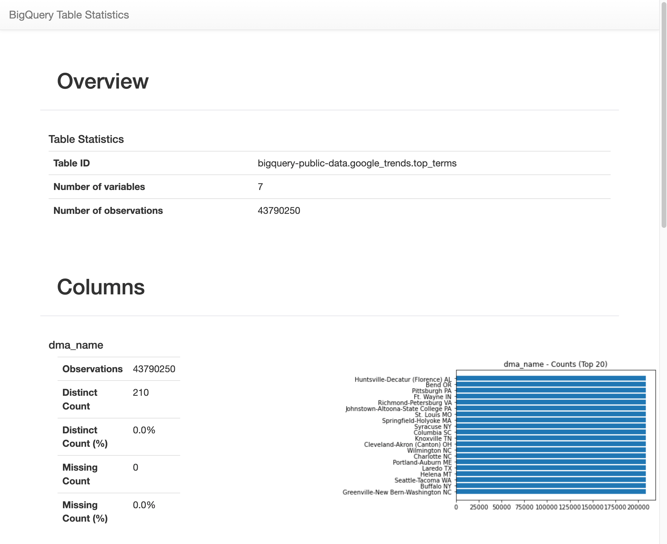
Visualizzare i dati BigQuery
In questa sezione utilizzerai le funzionalità di tracciamento per visualizzare i risultati delle query eseguite in precedenza nel blocco note Jupyter.
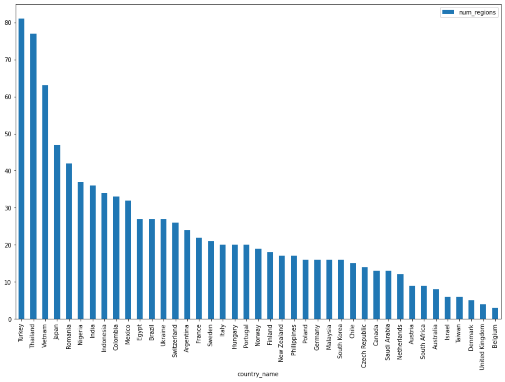
Nella cella successiva, inserisci il seguente codice per utilizzare il metodo pandas
DataFrame.plot()per creare un grafico a barre che visualizza i risultati della query che restituisce il numero di regioni per paese:regions_by_country.plot(kind="bar", x="country_name", y="num_regions", figsize=(15, 10))Fai clic su Esegui cella.
Il grafico è simile al seguente:
Nella cella successiva, inserisci il seguente codice per utilizzare il metodo pandas
DataFrame.plot()per creare un grafico a dispersione che visualizzi i risultati della query per la percentuale di sovrapposizione nei termini di ricerca principali in base ai giorni di distanza:pct_overlap_terms_by_days_apart.plot( kind="scatter", x="days_apart", y="pct_overlap_terms", s=len(pct_overlap_terms_by_days_apart["num_date_pairs"]) * 20, figsize=(15, 10) )Fai clic su Esegui cella.
Il grafico è simile al seguente. Le dimensioni di ogni punto riflettono il numero di coppie di date che distano di quel numero di giorni nei dati. Ad esempio, ci sono più coppie distanti 1 giorno che 30 giorni perché i termini di ricerca più cercati vengono visualizzati quotidianamente per circa un mese.

Per saperne di più sulla visualizzazione dei dati, consulta la documentazione di pandas.