The visualization tooltip displays the value of the selected dimensions and measures by default and can help users understand the significance of a single point of data.
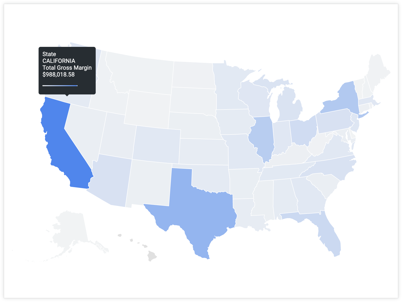
For example, a tooltip for a map visualization that is based on Total Gross Margin grouped by State will display values for both fields when a user hovers over the state of California.
However, what if you want to include fields other than the default in the tooltip so that users can get more information or context about a datapoint without needing to look elsewhere?
You can customize the tooltip to display values from multiple specified fields — including fields that are not in the Explore query.
Ingredients
- Liquid variables — Liquid variables render the values of other fields in conjunction with the existing Explore query.
htmlparameter — The fields that are defined in thehtmlparameter of a measure will render in the tooltip when a user hovers over a visualization.- Visualization — The tooltip will appear when a user hovers their cursor over a datapoint in certain visualization types.
Prerequisites
Customizing the tooltip requires the following:
- Permissions to create Explores and permissions to develop LookML.
- Knowledge of SQL and LookML development.
- A basic knowledge of using Liquid in Looker and HTML coding. Visit the Using Liquid variables in the
htmlparameter section of thehtmldocumentation page for necessary background information. - Permissions to save content (if you want to save the visualization as a Look or a dashboard)
Considerations for tooltip customization
It is important to consider the following when you're customizing a tooltip:
- The values in the
htmlparameter become the y-axis of a visualization. - The value that you want to display on the y-axis should be the value in the
sqlparameter of the measure. - When you're using any formatted measure (a measure of
type: percent_of_totalor a measure with avalue_format_nameorvalue_formatparameter), make sure to use the Liquid syntax for the rendered value{{ field_name._rendered_value }}(wherefield_nameis the actual name of the measure or dimension).
Example
By default, the tooltip for the visualization data points will include the values for Total Gross Margin and State. However, what if you wanted to provide users with additional information that is not indicated on the map or included in the Explore query? What if you wanted to include the value for a field called Percent of Total Gross Margin instead of State? Including Percent of Total Gross Margin will help users understand how the Total Gross Margin value for an individual data point compares to the total gross margin across the data set.
To customize the tooltip, follow these steps:
measure: total_gross_margin {
  type: sum
  value_format_name: decimal_2
  sql: ${gross_margin} ;;
  html: {{ rendered_value }} | {{percent_of_gross_margin._rendered_value }} of total ;;
}
In Development Mode, navigate to the LookML definition for the field that you want to customize.
You can navigate directly to a field's LookML definition from an Explore.
Determine the fields and values that you want to include in the tooltip in addition to the original field. For example, Percent of Total Gross Margin.
Add an
htmlparameter to the original measure that is referenced in the Explore query and displayed in the tooltip. In this case, the measure that is currently in the Explore query and displayed in the tooltip is Total Gross Margin.In the
htmlparameter, create an expression with Liquid variables that appends the additional fields to the existing measure's value.- This example uses the Liquid variable
_rendered_valueto display Looker formatted values. For example,total_gross_marginuses Looker formatting for two decimals, andpercent_of_total_gross_marginuses Looker formatting for percentage with two decimals. - You can use a pipe character,
|, to separate the values for different fields. - You can also append other words that might clarify the meaning of the other values that are rendered in the tooltip. In this case,
of totalis added to clarify what the percentage value means.
- This example uses the Liquid variable
Save, validate, and push your code to production after verifying that it works as expected.
The tooltip will now display two values when a user hovers over a data point with the tooltip: the total_gross_margin value of the data point, and the corresponding percent_of_total_gross_margin value.

Next steps
Once you have created your visualization with a customized tooltip, you can share it with others: