Visually highlighting values that meet certain conditions lets users quickly identify data trends. This pattern is often referred to as conditional formatting.
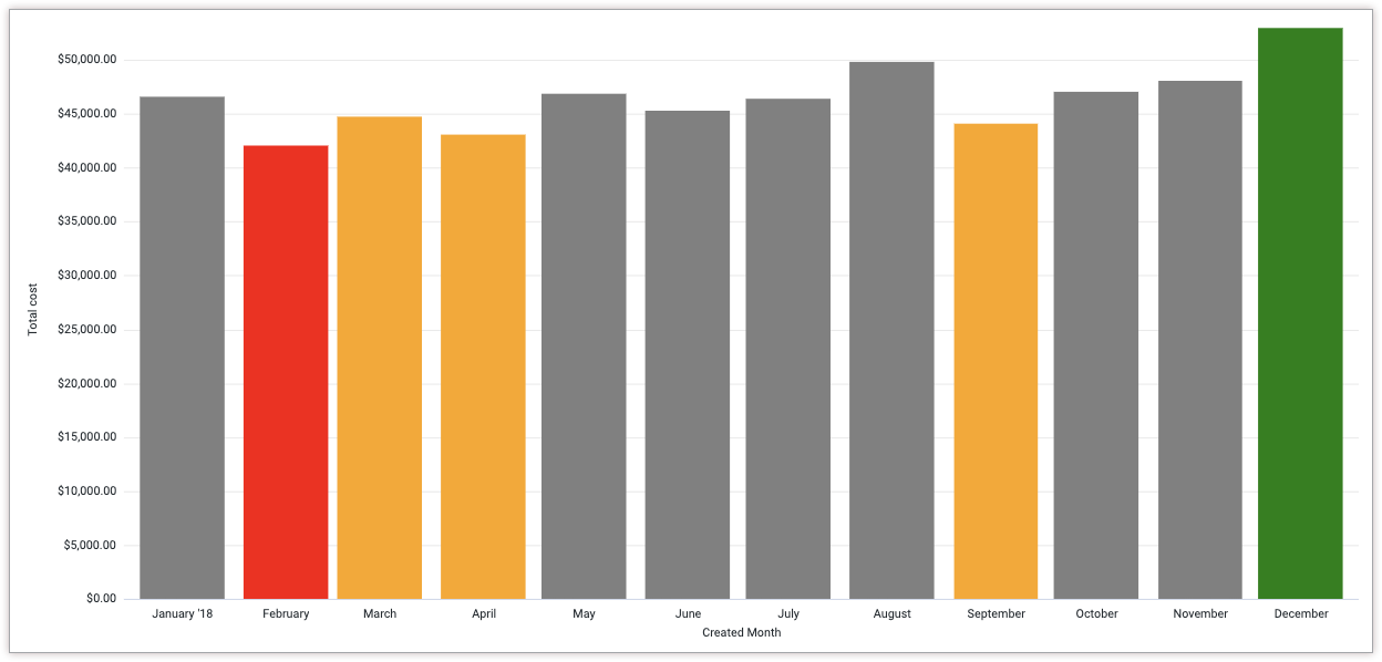
For example, this visualization from the Color the maximum, minimum, and percentile values example on this page helps user quickly identify the lowest and highest sales months:
In Looker, you can use built-in options that are in text and table chart visualization settings to apply conditional formatting to text and table charts. For Cartesian charts, you can use the Chart Config Editor to conditionally format data values.
In the Chart Config Editor, you can use the series formatters attribute to apply conditional formatting to values that meet specific criteria. These are some of the conditional formatting rules that you can apply:
The value is greater than, less than, or equal to a specified value.
For example, to apply conditional formatting to numeric values greater than 100, use
select: 'value > 100'.The value is the minimum or maximum value in the series.
For example, to apply conditional formatting to the maximum value, use
select: 'max'.The value is within a specified percentile rank.
For example, to apply conditional formatting to values in the top tenth percentile, use
select: 'percent_rank >= 0.9'.The x-axis value matches a specified value.
For example, to apply conditional formatting to series where the x-axis value is "Columbia", use
select: name = Columbia.
This cookbook provides the following tutorials:
Color the maximum, minimum, and percentile values
You can use the select and style attributes to specify the color of the maximum and minimum data values in a Cartesian chart, as well as any values that fall under a specified percentile.
Ingredients
- Explore query
- Cartesian visualization
- Chart Config Editor
Prerequisites
Creating a Cartesian visualization with conditional formatting requires the following:
- Permissions to create Explores and familiarity with Exploring data
- The
can_override_vis_configpermission, which grants access to the Chart Config Editor - Permissions to save content (if you would like to save the visualization as a Look or a dashboard)
- Some familiarity with JSON
Example: Column visualization
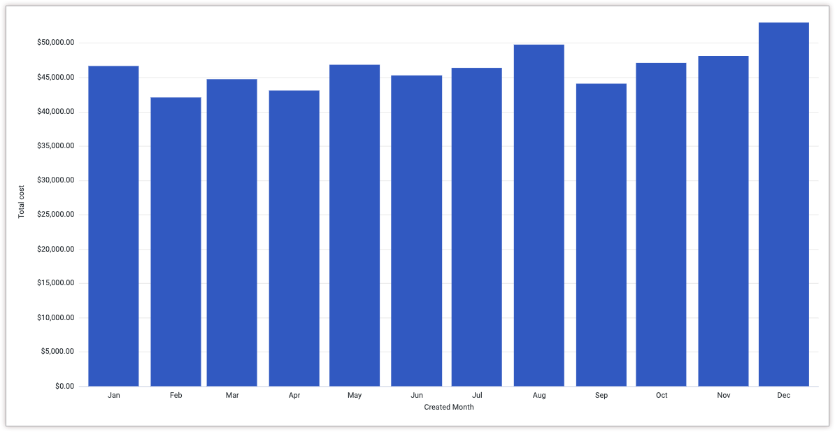
A Sales team wants to be able to quickly identify monthly sales trends across a year. They have a visualization that displays the Total Cost grouped by Month.
You can use conditional formatting to highlight values that meet certain goals, which helps make the data clearer for users to understand.
For this example, the Sales team wants to highlight the following values:
- The column with the minimum Total Cost value will be red.
- The column with the maximum Total Cost value will be green.
- Any columns in the bottom thirtieth percentile Total Cost will be orange.
- All other columns will be gray.
To apply this conditional formatting to a Cartesian chart, follow these steps:
- View a Cartesian visualization in an Explore, or edit a Cartesian visualization in a Look or dashboard.
- Open the Edit menu in the visualization.
- Click the Edit Chart Config button in the Plot tab. Looker displays the Edit Chart Config dialog.
Select the Chart Config (Override) section, and enter the following JSON:
{ series: [{ color: 'gray', formatters: [{ select: 'max', style: { color: 'green', } }, { select: 'percent_rank <= 0.3', style: { color: 'orange' } }, { select: 'min', style: { color: 'red' } }, ] }] }To apply your changes, click Apply.
Now the Sales team can quickly see which months were underperforming, and can investigate those months to determine what happened.
Once you've customized your visualization, you can save it. If you viewed the visualization in an Explore, save the Explore. If you edited a Look or a dashboard, click Save.
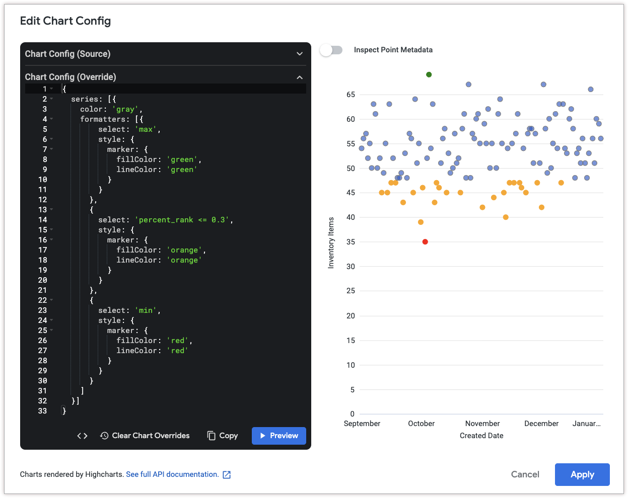
Example: Scatterplot visualization
To apply conditional formatting to scatterplot visualizations, you can specify a color for the style.marker.fillColor and style.marker.lineColor attributes instead of thestyle.color attribute.
The lineColor attribute sets the color of the outline of each point in the scatterplot. The fillColor attribute sets the inner color of each point in the scatterplot.
You can modify the previous example by following these steps:
- View a scatterplot visualization in an Explore, or edit a scatterplot visualization in a Look or dashboard.
- Open the Edit menu in the visualization.
- Click the Edit Chart Config button in the Plot tab. Looker displays the Edit Chart Config dialog.
Select the Chart Config (Override) section, and enter the following JSON:
{
  series: [{
    color: 'gray',
    formatters: [{
        select: 'max',
        style: {
          marker: {
            fillColor: 'green',
            lineColor: 'green'
          }
        }
      },
      {
        select: 'percent_rank <= 0.3',
        style: {
          marker: {
            fillColor: 'orange',
            lineColor: 'orange'
          }
        }
      },
      {
        select: 'min',
        style: {
          marker: {
            fillColor: 'red',
            lineColor: 'red'
          }
        }
      }
    ]
  }]
}
Click Apply to apply your changes.
In the resulting visualization, the minimum value, maximum value, and values in the bottom 30 percent are colored according to the formatting rules.
Once you've customized your visualization, you can save it. If you viewed the visualization in an Explore, save the Explore. If you edited a Look or a dashboard, click Save.
Combine conditional formatting conditions
You can use AND and OR in the select attribute to combine logical expressions in conditional formatting rules.
Ingredients
- Explore query
- Cartesian visualization
- Chart Config Editor
Prerequisites
Creating a Cartesian visualization with conditional formatting requires the following:
- Permissions to create Explores and familiarity with Exploring data
- The
can_override_vis_configpermission, which grants access to the Chart Config Editor - Permissions to save content (if you would like to save the visualization as a Look or a dashboard)
- Some familiarity with JSON
Example
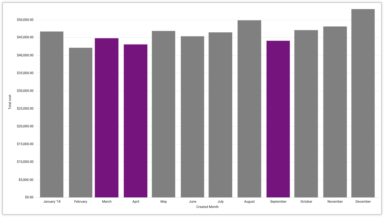
A Sales team wants to be able to quickly identify which months meet certain criteria. They have a visualization that displays the Total Cost grouped by Month.
You can use conditional formatting to highlight values that meet certain goals, which helps make the data clearer for users to understand.
For this example, the Sales team wants to highlight the following values:
- Any columns with Total Cost values between $43,000 and $45,000 (inclusive) will be purple.
- All other columns will be gray.
To apply this conditional formatting to a Cartesian chart, follow these steps:
- View a Cartesian visualization in an Explore, or edit a Cartesian visualization in a Look or dashboard.
- Open the Edit menu in the visualization.
- Click the Edit Chart Config button in the Plot tab. Looker displays the Edit Chart Config dialog.
Select the Chart Config (Override) section, and enter the following JSON:
{
  series: [{
    color: 'gray',
    formatters: [{
        select: 'value >= 43000 AND value <= 45000',
        style: {
          color: 'purple',
        }
      },
    ]
  }]
}
To apply your changes, click Apply.
Now the Sales team can quickly see that March, April, and September revenue is between $43,000 and $45,000 and take further action to find out what happened in those months.
Once you've customized your visualization, you can save it. If you viewed the visualization in an Explore, save the Explore. If you edited a Look or a dashboard, click Save.