Visually highlighting values that meet (or that don't meet) certain conditions lets users quickly identify data trends. This pattern is often referred to as conditional formatting in Excel or other spreadsheet applications.
For example, this table visualization from the Using conditional formatting directly in the visualization settings section on this page helps users identify where user growth may be positive or negative:

Looker supports conditional formatting in visualizations in several different ways:
- With table calculations and emojis. This approach is ideal when the conditions that determine the formatting need to be created directly within a Looker Explore. Reference the Conditional formatting using table calculations Best Practices page to learn how to apply custom formatting to visualizations with table calculations.
- With built-in options that are in text and table chart visualization settings.
- With the
htmlLookML parameter. This is ideal for formatting values when the conditions that drive the formatting are consistent across analysis for a given field.
This cookbook provides tutorials for the last two options:
- Using conditional formatting directly in the visualization settings
- Using conditional formatting with the
htmlLookML parameter
Conditional formatting with visualization settings
You can use visualization settings to apply conditional formatting in table charts, single value visualizations, and single record visualizations.
This section provides a guide for using conditional formatting in table charts using the visualization settings available in the visualization Edit menu.
Reference the Presenting a lot of information with a single value visualization recipe of the Getting the most out of visualizations in Looker Cookbook for a step-by step guide to conditional formatting in single value visualizations.
Ingredients
- Explore query
- Table visualization
Prerequisites
Creating a table visualization with conditional formatting requires the following:
- Permissions to create Explores and familiarity with Exploring data
- Permissions to create table calculations or custom fields, if necessary for your use case
- Familiarity with table visualization settings
- Permissions to save content (if you would like to save the visualization as a Look or a dashboard)
Example
A Marketing team wants to see the number of new users each month, segmented by age tiers, to better understand the response to their marketing appeals that are launched each month.
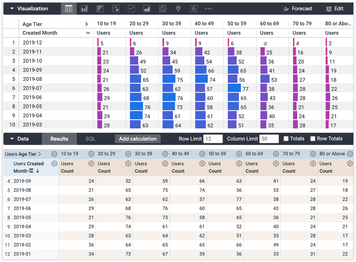
The default table visualization may be difficult for some users to parse. You can use conditional formatting in the visualization settings to compare and contrast values against goals or set rules, which will help make the data clearer for users to understand.
For this example, the Marketing team wants to compare the values in the table against the following conditions:
- Positive growth (Green) — Months and age tiers with 50 or more new users
- Average growth (Yellow) — Months and age tiers with 25 to 50 new users
- Poor growth (Red) — Months and age tiers with 24 or fewer new users
Complete the following steps to apply conditional formatting to a table visualization with the settings in the visualization's Edit menu:
- Open the Edit menu on the Visualization bar.
- Select any table style options from the Plot tab as desired, including choosing the table theme with the Table Theme drop-down menu or choosing whether or not to display row numbers by selecting or deselecting the Show Row Numbers toggle.
- On the Plot tab, select the Cell Visualization option to disable it. The Cell Visualization must be disabled to apply conditional formatting to the table values.
- On the Formatting tab, select the Enable Conditional Formatting toggle to enable conditional formatting and access conditional formatting settings.
- You can also choose a color palette from the Collection drop-down menu in the Colors section of the Formatting tab, as well as customize the row size in pixels in the Row field and column header text alignment, font size, and color in the Header field in the Customizations section.
- In this example, the option for Include Null Values as Zero is selected to any include nulls as 0s.
- Create your conditional formatting rules. You can select the Add a Rule button to add as many conditional formatting rules as you would like.
- From the Apply to drop-down, select the desired values to apply to the rule.
From the Format drop-down, select the desired format to apply to the rule. * You can choose to use leave the default along the scale format. Values will be highlighted on a gradient based on the color palette and value settings of your choosing. Read more about the color coding on a scale in the Conditional formatting section of the Table chart options documentation page.
- Specify values for Background color, Font color, and Font style for each rule as desired. Make sure to consider color contrast for the accessibility of your content.
For this example, three rules are created:
- Format option If value is greater than 49, with a green Background color option selected.
- Format option If value is between 24 and 50, with a yellow Background color option selected.
- Format option If value is less than 25, with a red Background color option selected.
The resulting visualization displays the count of users in each age tier column based on the criteria that is specified by the Marketing team:
- Positive growth (Green) — Months and age tiers with 50 or more new users
- Average growth (Yellow) — Months and age tiers with 25 to 50 new users
- Poor growth (Red) — Months and age tiers with 24 or fewer new users
Conditional formatting in LookML with the html parameter
In addition to using visualization Edit menu settings, you can hardcode conditional formatting directly into a field's LookML. This is beneficial for conditional formatting that is consistent across analysis for a given field, as it avoids the need to re-configure visualization settings for individual queries.
Ingredients
- Liquid variables — Liquid variables render the values of fields in conjunction with specified HTML formatting.
htmlparameter — The HTML styling coded into thehtmlparameter of a field will render in the Explore's data table and in the visualization.- Table visualization — The conditional formatting will appear to users in the visualization.
Prerequisites
Hardcoding conditional formatting in the html parameter requires the following:
- Permissions to create Explores.
- Permissions to develop LookML and familiarity with SQL and LookML development.
- A basic knowledge of using Liquid in Looker and HTML coding. Visit the Using Liquid variables in the
htmlparameter section of thehtmldocumentation page for necessary background information. - Permissions to save content (if you would like to save the visualization as a Look or a dashboard)
Example
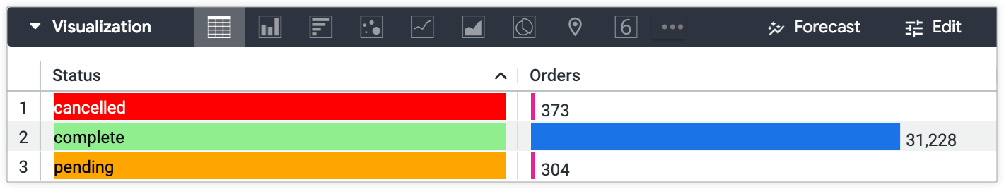
Imagine you have a field in your data called status, which gives the status of each order. These are the possible values for status:
- "cancelled"
- "complete"
- "pending"
To highlight the order status to users who are viewing query results that include the Status field, you can add a unique background color to highlight each status.
To code conditional formatting into a LookML field:
dimension: status {
  type: string
  sql: ${TABLE}.status ;;
  html:
    {% if value == 'complete' %}
      <p style="color: black; background-color: lightgreen;">{{ value }}</p>
    {% elsif value == 'pending' %}
      <p style="color: black; background-color: orange;">{{ value }}</p>
    {% else %}
      <p style="color: white; background-color: red;">{{ value }}</p>
    {% endif %}
  ;;
  description: "The current status of an existing order."
}
- In Development Mode, navigate to the LookML field to which you would like to add conditional formatting.
- You can navigate directly to a field's LookML definition from an Explore.
- Add an
htmlparameter to the field. In this case, the field isstatus. - In the
htmlparameter, create an expression with Liquid Tag Syntax that sets conditions for specific values of the field.- This example uses the Liquid variable
valueto output the field value. Make sure to use_rendered_valueto display any values for fields that use Looker value formatting. - Make sure to consider color contrast for the accessibility of your content.
- You can add any other Looker-supported HTML styling that you would like. Reference the
htmlparameter documentation page for additional examples.
- This example uses the Liquid variable
- Save, validate, and push your code to production after verifying that it works as expected.
The result is Status values highlighted in red, green, or orange — depending on the status — in any Looker query result that includes the field.
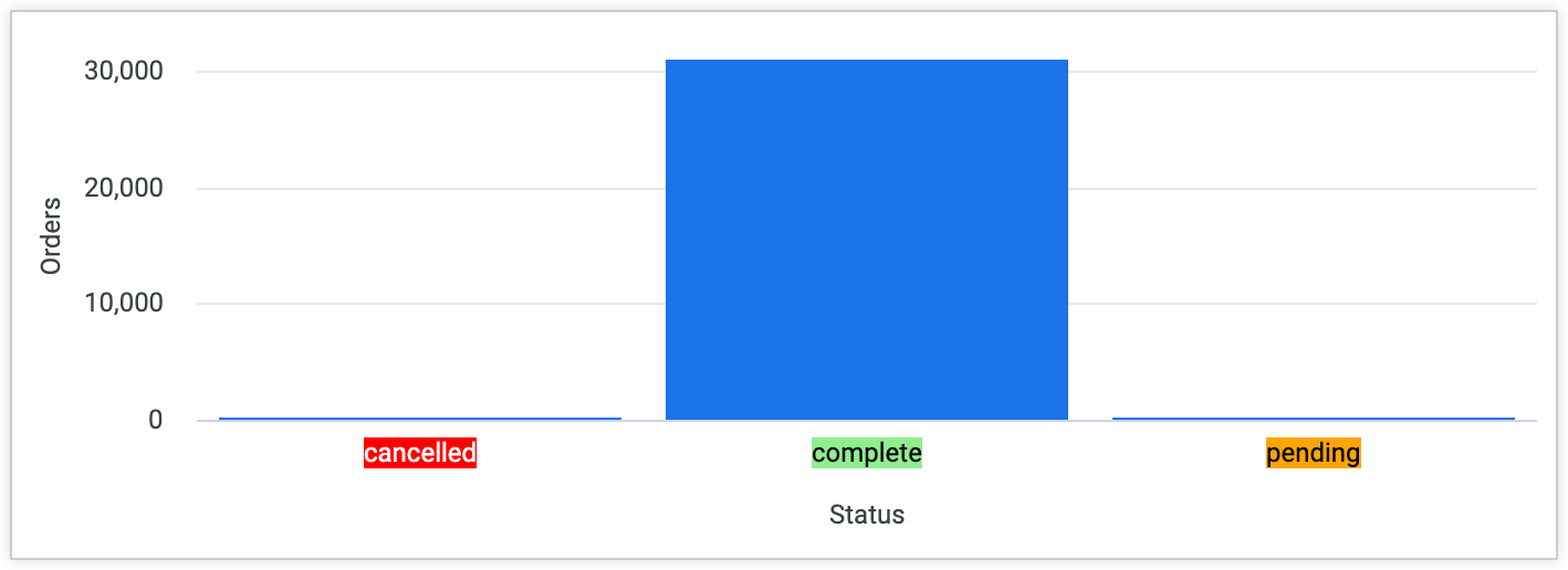
The background colors will also appear for other charts. For example, a column chart for a query that groups Orders Count by Orders Status will display the coded background colors for each Orders Status value.
Additional styling
You can use the same syntax as the previous example to add icons or images based on field values. The following example adds a red 'x' checkmark icon for an Orders Status of "cancelled", a green checkmark icon for an Orders Status of "complete", and a clock icon for an Orders Status of "pending":
    dimension: status {
      type: string
      sql: ${TABLE}.status ;;
      html:
        {% if value == 'complete' %}
          <p><img src="https://findicons.com/files/icons/573/must_have/48/check.png" height=20 width=20>{{ rvalue }}</p>
        {% elsif value == 'pending' %}
          <p><img src="https://findicons.com/files/icons/1681/siena/128/clock_blue.png" height=20 width=20>{{ value }}</p>
        {% else %}
           <p><img src="https://findicons.com/files/icons/719/crystal_clear_actions/64/cancel.png" height=20 width=20>{{ value }}</p>
        {% endif %}
      ;;
      description: "The current status of an existing order."
    }
The result is Status values with a red x icon, green checkmark icon, or clock icon next to the value — depending on the status — in any Looker query result that includes the field.
![]()
Next steps
Once you have created your table visualization with conditional formatting, you can share it with others: