本页面中显示的所有用户数据均为示例数据。
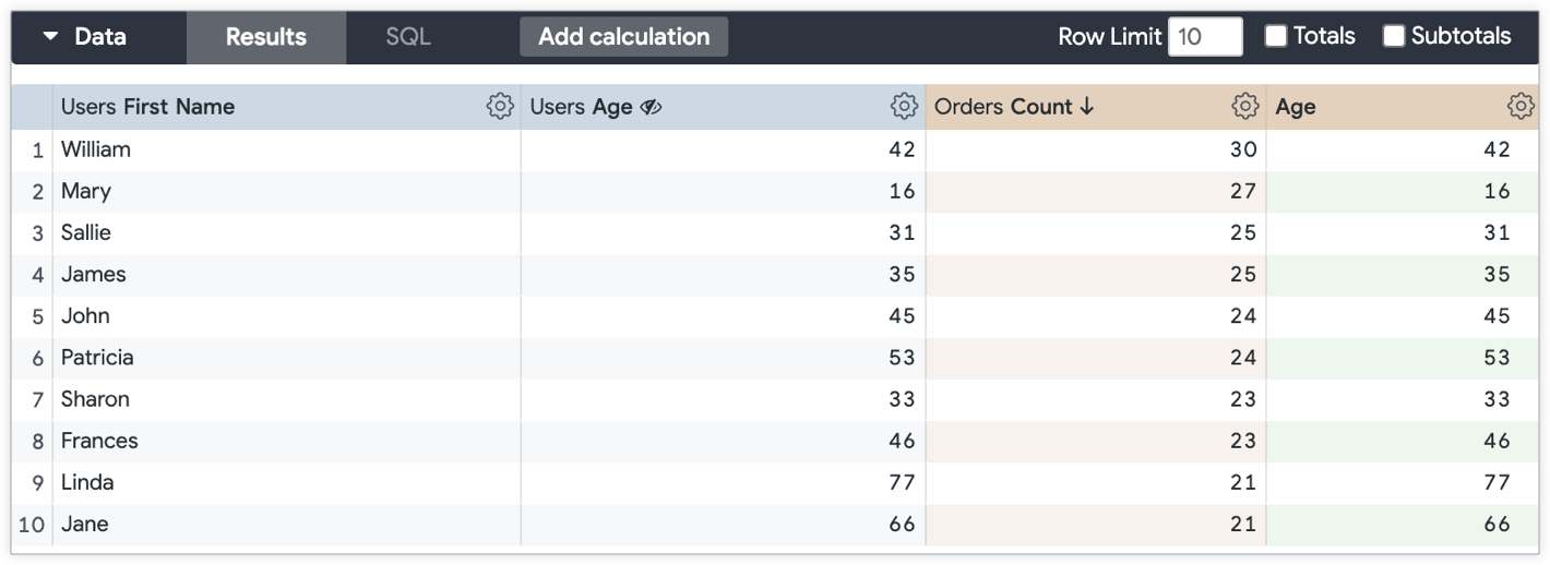
Looker 可视化图表会根据查询中存在的字段类型,自动确定要在 y 轴上绘制哪些值。例如,如果“探索”摘要卡以柱状图的形式显示订单数量排名前 10 的用户的用户姓氏和用户年龄,则 x 轴上会自动串联 用户姓氏和用户年龄的 10 个维度值,并以短划线 (–) 分隔。
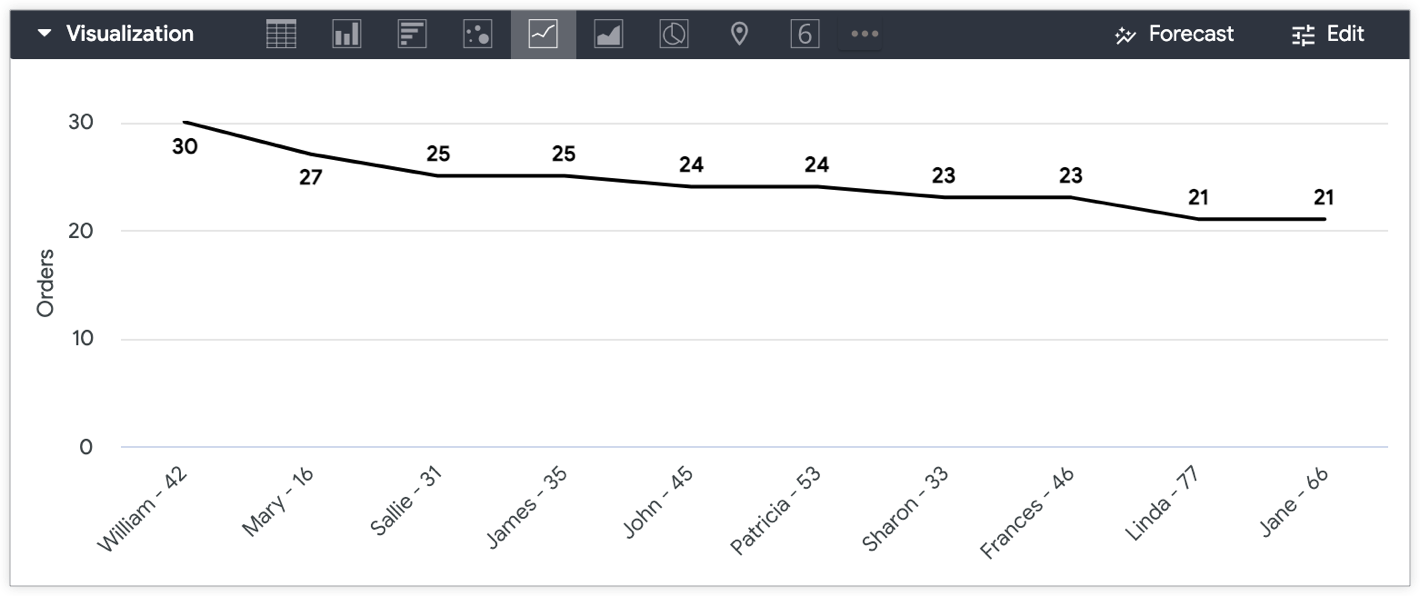
如果您想将“用户年龄”和“用户名字”分开,以便将“用户年龄”绘制在 y 轴上,并将“用户名字”和“订单数量”显示在 x 轴上,该怎么办?
以下两个解决方案概述了如何将维度(例如“用户年龄”)转换为指标,以便在 y 轴上直观呈现:
使用表计算
表格计算是将维度绘制在 y 轴上最快捷、最简单的方式。如果表达式中不涉及任何测量,计算结果通常会以维度形式绘制。您可以通过在计算表达式中添加测量来使表格计算按测量的行为方式运作。关键是确保该测量不会影响原始维度的值。
如需使用表格计算在 y 轴上绘制某个测量值,请执行以下步骤:
- 如果“探索”查询中没有任何指标,请添加任何指标(例如计数),然后从可视化图表中隐藏该指标。如果您的查询中已有您想在可视化中包含的测量,则无需将其隐藏。
-
接下来,创建表计算:
- 对于数值字段,计算方式如下:
${mydimension} + (0 * ${mymeasure}) -
对于字符串字段,计算将涉及两个逻辑函数
if()和is_null():if(is_null(${mymeasure}),${string_dimension},${string_dimension})
- 对于数值字段,计算方式如下:
- 从可视化中隐藏原始维度(在本例中为“用户年龄”),因为表格计算(“年龄”测量值)现在在可视化中代表该维度的值。
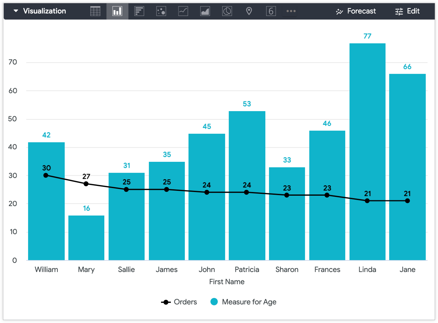
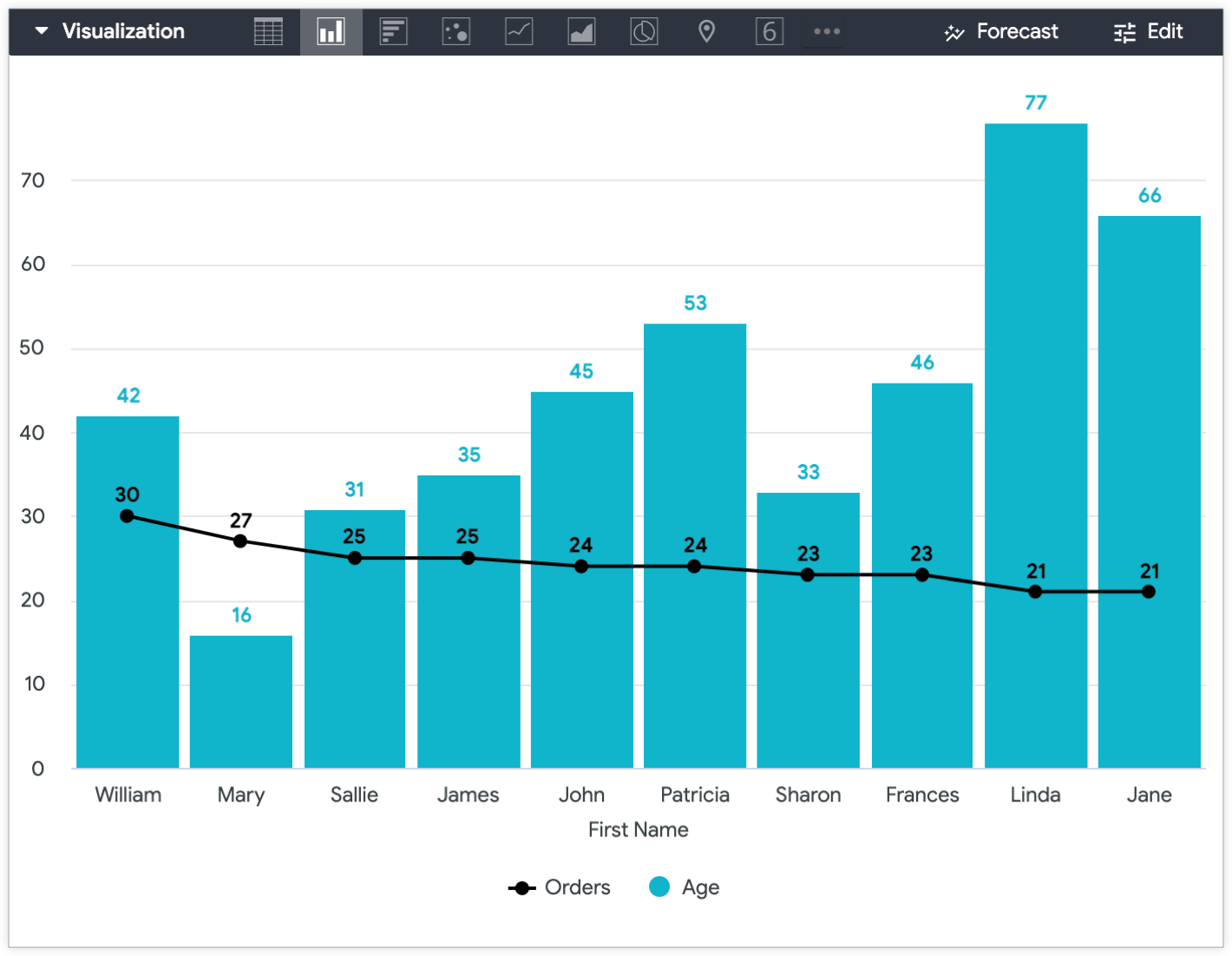
如需区分可视化图表中的值(在此示例中,是年龄测量表计算结果和订单数量测量结果),您可以在一个图表中使用多种可视化图表类型。
例如,您可以将订单数量值可视化为线条,将用户年龄值可视化为列,以便在用户年龄在 y 轴上绘制后将其与其他值区分开来。
在 LookML 中创建测量
如果您日后打算再次在 y 轴上绘制特定维度,更可持续的做法是在 LookML 中创建 sum 测量值或 number 测量值,将您要绘制的维度转换为测量值。您可以从字段选择器中将该字段添加到查询中,而不必在“探索”中多次重新创建相同的表格计算。
该测量结果将如下所示:
    measure: measure_for_age { ## replace with a new name
        description: "Use this age field for displaying age on the y-axis"
        type: number ## or sum
        sql: ${age} ;; ## replace with your dimension
    }
向测量指标添加 description 有助于用户了解字段的预期用途。
在本例中,measure_for_age 是 number 类型的测量值,因为 number 类型的测量值不会执行任何实际汇总。这意味着,“年龄衡量指标”将显示与“用户年龄”相同的值,因为它是一种不会执行任何汇总的 number 类型衡量指标。
创建该衡量指标后,请在“探索”查询中同时添加该维度和新衡量指标。在本示例中,请添加“用户姓氏”和“用户年龄”维度,以及“订单数量”和“用户年龄衡量指标”测量项。最后,隐藏该测量结果所依据的维度。
将用户年龄维度从“探索”可视化图表中隐藏,并应用自定义可视化图表设置后,生成的“探索”可视化图表会在 y 轴上显示用户年龄衡量指标,在 x 轴上显示用户名字,并以线条的形式显示订单数量值。