Add a chart visualization to a dashboard
To add a chart, or other visualization, to a dashboard, use a visualization tile. The visualization tile displays data from the associated LookML view, called an Explore, that you select when creating the tile. This document describes the following:
- How to create charts and other visualizations using the visualization tile.
- How to create data visualizations that satisfy specific use cases.
Overview of the process
At a high level, you perform the following actions to create a visualization in a dashboard:
- Add a visualization tile to the dashboard.
- Select the Explore. An Explore is a starting point for the new tile and represents a specific data model.
- Select data fields for the visualization. Predefined fields are grouped into one of
the following types:
- Dimensions: attributes of the data that describe data. Example: The square footage and building material of a museum are different dimensions within a museum dataset.
- Measures: numeric representation of one or more dimensions, or unique attribute of the data, such as count or average.
- Filter-only fields: predefined fields that can be used only in a filter.
- Optionally, create and add custom fields to the tile that support a specific use case.
- Configure the tile by selecting the following:
- Visualization: displays the fields you selected visually. For example, a line chart can show trends over time.
- Filters: restrict the visualization to show only data of interest. Any field in an Explore can be used to create a filter.
- Run the visualization to preview the results.
- Save the visualization tile.
The following sections of this document provide more detailed information about configuring each component in a visualization tile.
Example: Create a data table
The following steps give more detail about how to create a data table using a visualization tile, and show the configuration options in the Edit Tile dialog.
- From Personal Dashboards or Shared Dashboards, select a dashboard, and then click Dashboard actions > Edit dashboard.
- Click Add > Visualization.
- Select an Explore data model. The Edit Tile dialog appears.
- Enter a unique tile name.
- From All Fields, select the predefined fields: Dimensions and Measures. You typically need to choose at least two fields to create a visualization. The fields you select appear in the Data section.
- Optionally, create and add any custom fields needed for the visualization. They will appear in the Data section.
- In the Visualization section, select Table as the visualization type. The visualization displays the selected data fields in the table.
- In the Filters section, define filters that restrict the visualization to show only the data of interest. Any field in an Explore can be used to create a filter.
- In the Data section, do the following:
- Click Explore field header to sort the fields in ascending or descending order.
- Set Row Limit to limit the number of rows that appear in the visualization.
- Click Run to preview the visualization using Google Security Operations SIEM data.
- Click Save. The Dashboard displays with the newly added tile.
The following image identifies the location in the Edit Tile dialog where you perform these steps.
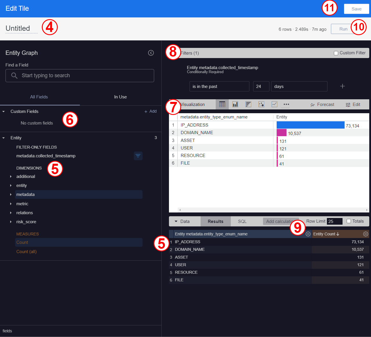
Edit tile dialog with configuration
Choose an Explore data model
Google Security Operations SIEM provides multiple data models that you can use to build a dashboard. Each data model is a Looker Explore that defines a subset of UDM fields.
An Explore is a starting point when creating a new visualization tile. It is designed to explore a particular data model. You select one data model Explore for each visualization tile.
Google Security Operations SIEM provides the following data model Explores:
- Entity Graph
- IOC Matches
- Ingestion Metric with Ingestion Stats
- Ingestion Metrics
- Ingestion Stats
- Rule Detections
- Rulesets with Detections
- UDM Events
- UDM Events Aggregates
You can optionally create custom fields to be used with only the tile where they are created.
Select fields for the chart visualization
After you select the Explore for a tile, the predefined UDM fields appear under the All Fields tab in the Explore dialog.
After you select fields from the All Fields tab, they appear in both the In Use tab and the Data section. The following subsections describe the types of fields you can choose to create a chart visualization.
Predefined fields
Each Explore includes a different set of predefined UDM fields. The predefined fields available in the tile are specific to the data model you select from the Choose an Explore dialog.
Predefined fields are grouped into the following types:
- Dimensions
- Measures
- Filter-only fields
The icons next to each field show more information and indicate available options, such as Filter by field, Pivot data, Aggregate, Bin, or Group. Click the Info icon to view help text for the field. These icons are visible when you hold the pointer over a field. To learn more, see Field-specific information and actions.
You can use predefined fields to create custom dimensions, create custom measures, create table calculations, and apply filters to the tile.
An Explore may include deprecated fields that are no longer supported. Deprecated fields are identified by a field name followed by [D].
Certain data models include predefined Filter-Only fields that can only be used in a filter. The filter-only fields in a data model may include one or more of the following field types:
Some Explore data models, such as UDM Events, include more granular measures for
fields that store a timestamp (for example, principal.artifact.first_seen_time
and security_result.about.file.last_modification_time).
These measures separate the timestamp into more granular increments, such as hour, day, week, or year. The model also provides a minimum and maximum measure for each increment. This lets you create more detailed charts that aggregate event counts based on time and time increments.
Custom fields
Custom fields are fields that you create using the predefined fields available in the data model for the tile. The custom fields can be used in that tile only.
You can create any of the following types of custom fields:
To access the custom fields menu in the Edit Tile dialog, click + Add under the All Fields > Custom Fields section. The following image shows the menu location.
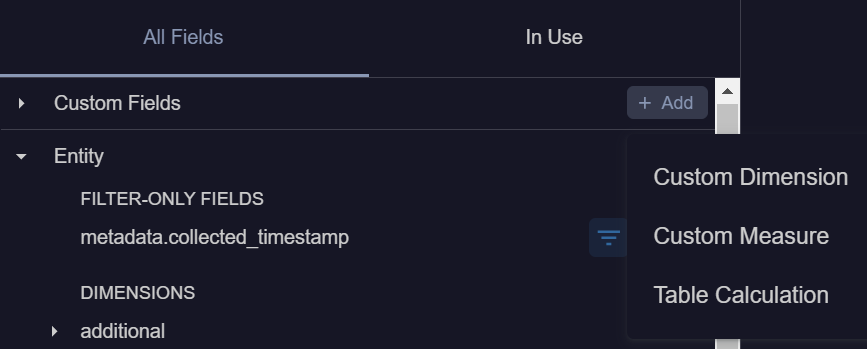
Create a custom dimension
Custom dimensions are unique attributes that help you to describe data. For example, the concatenation of a user's first name and last name may be custom dimension.
Complete the following steps to add a custom dimensions to a tile:
- Open an existing dashboard to edit or create a new dashboard.
- Open a tile to edit.
- In the Custom Fields section of the Edit Tile dialog, click + Add > Custom Dimension. The Create custom dimension dialog appears.
- In the Create custom dimension dialog, do the following:
- In the Expression field, enter a Looker expression that
defines the value using any Looker function and operator.
The Looker expression editor suggests field names and displays
syntax help for any functions you use.
The following are example expressions:
- Concatenates IOC feed name and IOC value.
You can use this example only in the IOC Matches Explore.
concat( ${ioc_matches.feed_name}, " | ", ${ioc_matches.ioc_value} ) - Returns the first value that is not empty.
The order is hostname, and then IP address. If neither of those exist, it
displays
_. You can use this example only in the Entity Graph Explore.coalesce(${entity_graph.entity__asset__hostname}, ${entity_graph__entity__asset__ip.entity_graph__entity__asset__ip},"-")
- Concatenates IOC feed name and IOC value.
You can use this example only in the IOC Matches Explore.
- Select a format from the Format menu.
- Specify the custom dimension name in the Name field. This value will appear in the All Fields tab and in the Data table.
- Select + Add description to add a description in the Description field.
- Click Save.
- In the Expression field, enter a Looker expression that
defines the value using any Looker function and operator.
The Looker expression editor suggests field names and displays
syntax help for any functions you use.
The following are example expressions:
The All Fields tab displays the field in the Custom Fields section. As with other fields, you can select a custom dimension to add or remove it from the tile.
Create custom measures
Measures are a numeric representation of one or more dimensions (or unique attributes of the data), such as a count or average. Measures let you calculate key performance indicators (KPIs) and help users analyze data using different aggregated attributes.
Custom measures allow you to define a specific numeric calculation for a field. Depending on the field type, only certain types of measures are available.
Complete the following steps to add a custom measure to a tile:
- Open an existing dashboard to edit or create a new dashboard.
- Open a tile to edit.
- In the Custom Fields section of the Edit Tile dialog, click + Add, and select Custom Measure. The Create custom measure dialog appears.
In the Create custom measure dialog, do the following:
- Select a field from the Field to measure menu.
- Select a measure type from the Measure type menu.
- Specify a name in the Name field. The name appears in the field picker and in the data table.
In the Filters tab, do the following:
- To add a filter condition, select a field from the Filter name menu. You can add or remove filter conditions using the and Filter value buttons, respectively.
- You can select the arrow next to Custom filter to create a
custom filter expression using any
Looker function and operator that can be used in
custom filters. The Looker expression editor suggests
field names and displays syntax help for any functions you use.
The following are example expressions:
- Measures IOC feed logs for a unique values.
You can use this example only in the IOC Matches Explore.
${ioc_matches.feed_log_type} != "" - Measures IOC day bucket seconds:
${ioc_matches.day_bucket_seconds}
- Measures IOC feed logs for a unique values.
You can use this example only in the IOC Matches Explore.
In the Field details tab, do the following:
- Select a format from the Format menu.
- Optionally, add a description of up to 255 characters in the Description field to give other users additional details about the custom field.
Click Save.
The All Fields tab displays the field in the Custom Fields section. As with other fields, you can select the custom field to add to the tile.
Create a custom table calculation
Table calculations enable you to create ad hoc metrics. They are comparable to formulas that are found in spreadsheet tools, such as Google Sheets.
Google SecOps gives you the option to add custom calculations to a tile. These custom table calculations are built using Looker expressions. You can only create table calculations using fields in the Explore.
Complete the following steps to create a table calculation and add it to a tile:
- Open an existing dashboard to edit or create a new dashboard.
- Open a tile to edit.
- In the Custom Fields section of the Edit Tile dialog, click + Add > Table Calculation. The Create table calculation dialog appears.
- In the Create table calculation dialog, do the following:
- Select a calculation type from the Calculation menu. The options for a Custom expression display by default.
- Enter a Looker expression in the field
to define a calculation.
The following are example table calculations expressions:
- The following expression uses the
diff hoursfunction to show the difference between two timestamps. You can use this example only in the Rule Detections Explore.diff_hours( ${rule_detections.detection__detection_timestamp_date}, ${rule_detections.detection__commit_timestamp_date} ) - The following expression counts the IOC values. You can use this example
only in the IOC Matches Explore.
count(${ioc_matches.ioc_value})
- The following expression uses the
- Select a format from the Format menu.
- Enter a calculation name in the Name field.
- Select + Add description to add an optional description to give other users more context about the table calculation.
- Click Save.
The All Fields tab displays the field in the Custom Fields section. As with other fields, you can select the custom calculation field to add or remove it from the tile.
Select the visualization chart type
Visualizations display the data visually to help you spot anomalies and trends. The Google Security Operations SIEM dashboard is based on Looker technology, including Looker visualizations.
The following are the visualization types that you can use in Google Security Operations SIEM dashboards:
- Column chart options
- Bar chart options
- Scatter plot chart options
- Line chart options
- Area chart options
- Boxplot chart options
- Waterfall chart options
- Pie chart options
- Donut multiples chart options
- Funnel chart options
- Timeline chart options
- Single value chart options
- Single Record chart options
- Table chart options
- Table (legacy) chart options
- Word cloud chart options
- Google Maps chart options
- Map chart options
- Static Map (Regions) chart options
- Static Map (Points) chart options
Using the Run button in the Edit Tile dialog, you can display a preview using the selected fields and visualization type. Refresh preview after adjusting and modifying the tile configuration by clicking Run.
Select fields to use as filters
Filters let you restrict the data displayed in the visualization to only show items of interest. You create filters using fields in the Explore data model.
The Google Security Operations SIEM dashboard is based on Looker technology, including Looker filters. You can create the following types of filters in a tile:
- Standard filters create filters using predefined or custom fields. Define these filters using the Filters section of the Edit Tile dialog.
- Custom filters with
Looker expressions: specify detailed business logic, combine both
ANDandORlogic, or use Looker functions. Click the Custom Expression button in the Filters section of the Edit Tile dialog.
Certain predefined fields are available for use in a filter. These fields appear under the All Fields section only when the data model includes predefined Filter-only fields.
Complete the following steps to add a filter to a tile:
- Open an existing dashboard to edit or create a new dashboard.
- Open a tile to edit.
- Under the All Fields section, select the fields you want to use as filters by clicking Filter by field that is next to each field name.
In the Filters section, you can either:
- Define the filter conditions for each field listed in the Filters section.
- Click Custom Expression and add values in the Custom Filter field.
Click Run to update the visualization preview.
Examples that solve specific use cases
The following sections describe how to create visualizations that support specific use cases.
Create a tile that displays IOC types
Follow these steps to add a tile to dashboard to monitor IOC types:
- Open an existing dashboard to edit or create a new dashboard.
- Click Add > Visualization.
- From the Choose an Explore dialog, select IOC Matches.
- Enter a tile name.
- Select the following Dimensions: Ioc Type and Event Timestamp Date > Date.
- Select the following Measures: Count.
- In the In Use tab, hold the pointer over the Date Event Timestamp Date field, and then select Filter by field. This adds the field to the Filters section.
- In the Filters section, apply the filter conditions that you want to use.
- In the Visualization section, select the Column icon.
In the Data section, do the following:
- Click the Ioc Matches Count header to sort the fields in ascending or descending order.
- Set the Row Limit to a value, such as 50, to limit the rows that appear in the visualization.
After you configure the tile, click Run to preview the visualization using Google SecOps data. The preview is displayed with the IOC types by IOC matches against the event timestamp date.
The following image shows an example of the chart created using these steps.
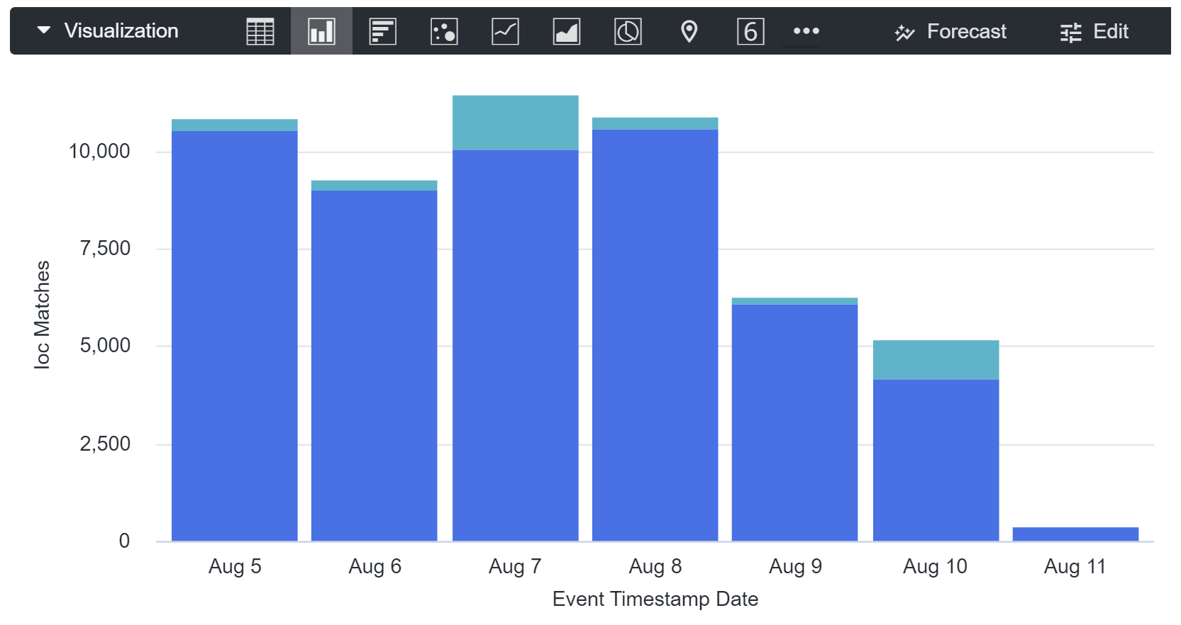
Click Save.
The Dashboards page displays with the newly added tile.
Create a tile with enumerated fields
The Google Security Operations SIEM Unified Data Model includes multiple enumerated fields with values stored as both text and numbers. The values associated with each enum field can be found in the UDM field list.
In some Explores, the enum field text value and numeric value are stored in
separate fields. For example, with the field metadata.event_type
one of the enum values is FILE_CREATION and the related number is 14001.
In an Explore, the following fields store the metadata.event_type values:
metadata.event_typestores the numeric value, 14001.metadata.event_type_enum_namestores the text value,FILE_CREATION.
When adding an enumerated field to a tile, add the field that stores the text value instead of the number.
Use the following instructions to add a tile with enumerated fields to a dashboard:
- Open an existing dashboard to edit or create a new dashboard.
- Click Add > Visualization.
- From the Choose an Explore dialog, select UDM Events.
- Enter a tile name.
- In Find a Field, search for a UDM field, such as
metadata.event_type. - From Dimensions, select metadata.event_type_enum_name and security_result.action_enum_name.
- From Measures, select Count.
- In the In Use tab, hold the pointer over the security_result.action_enum_name field, and then select Filter by field. This displays the filters of the selected field in the Filters section.
- In the Filters section, select is equal to, and then select BLOCK as values.
- In the Visualization section, select the Table icon.
In the Data section, do the following:
- Click the UDM Count header to sort the fields in ascending or descending order.
- Set the Row Limit to a value (such as 50) to limit the rows that appear in the visualization.
Click Run to preview the visualization using Google SecOps data. The preview is displayed showing the metadata.event_type values by count where the security_result.action_enum name is BLOCK.
The following image shows an example of the chart created using these steps.

Click Save.
The Dashboards page is displayed with the newly added tile.
Use a pivot in a data table
You can use a Pivot to display event counts across multiple dimensions.
The following tile displays the event counts across values in the
metadata.event_type_enum_name and security_result_action_enum_name fields.
In this example, a pivot is applied to the security_result_action_enum_name field.
Complete the following steps create this data table containing a pivot:
- Open an existing dashboard to edit or create a new dashboard.
- Click Add > Visualization.
- From the Choose an Explore dialog, select UDM Events.
- Enter a tile name.
- Select the Dimension fields
metadata.event_type_enum_nameandsecurity_result_action_enum_name. - Select the Measure field
Count. - In the Filter section, create the following filters:
UDM metadata_event_timestampis in the last 2 hours.UDM security_result.action_enum_nameis not null.
- Under the In Use tab, check that the following fields are displayed. If any
are missing, repeat the previous steps to configure the tile.
metadata.event_timestampmetadata.event_type_enum_name-metadatasecurity_result_action_enum_name-security_resultCount
- In the Data section, click the icon
in the
security_result.action_enum_namecolumn heading, and then select Pivot. - A new row appears in the grid under Data.
- In the Visualization section, select the Table icon.
- Click Run to display a preview of the visualization.
The following image shows these configuration options in the Edit Tile dialog.
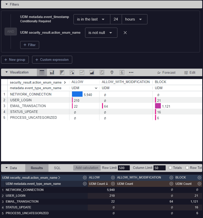
Configuration options for pivot in a data table
Use a pivot with date fields to create a time chart
You can use a pivot with date fields to create a time chart. The following
tile displays hourly event counts for values in the security_result_action_enum_name fields.
In this example, a pivot is applied to the security_result_action_enum_name field.
The filter limits the range of dates and filters out data where the security_result_action_enum_name
value is null. It uses the predefined metadata.event_timestamp Hour date field
that partitions data by hour.
To use a pivot with data fields, do the following:
- Open an existing dashboard to edit or create a new dashboard.
- Click Add > Visualization.
- From the Choose an Explore dialog, select UDM Events.
- Enter a tile name.
- Select the Dimension fields:
metadata.event_timestamp Hourandsecurity_result_action_enum_name. - Select the Measure field:
Count. - In the Filter section, create the following filters:
UDM metadata_event_timestampis in range, and then select both a start and end date and time.UDM security_result.action_enum_nameis not null.
- Under the In Use tab, check that the following fields are displayed. If any
are missing, repeat the previous steps to configure the tile.
metadata.event_timestampmetadata.event_timestamp Hour-metadatasecurity_result_action_enum_name-security_resultCount
- In the Data section, click the icon
in the
security_result.action_enum_namecolumn heading, and then select Pivot. A new row appears in the data grid. - In the Visualization section, select the Table icon.
- Click Run to display a preview of the visualization.
The following image shows these configuration options in the Edit Tile dialog.
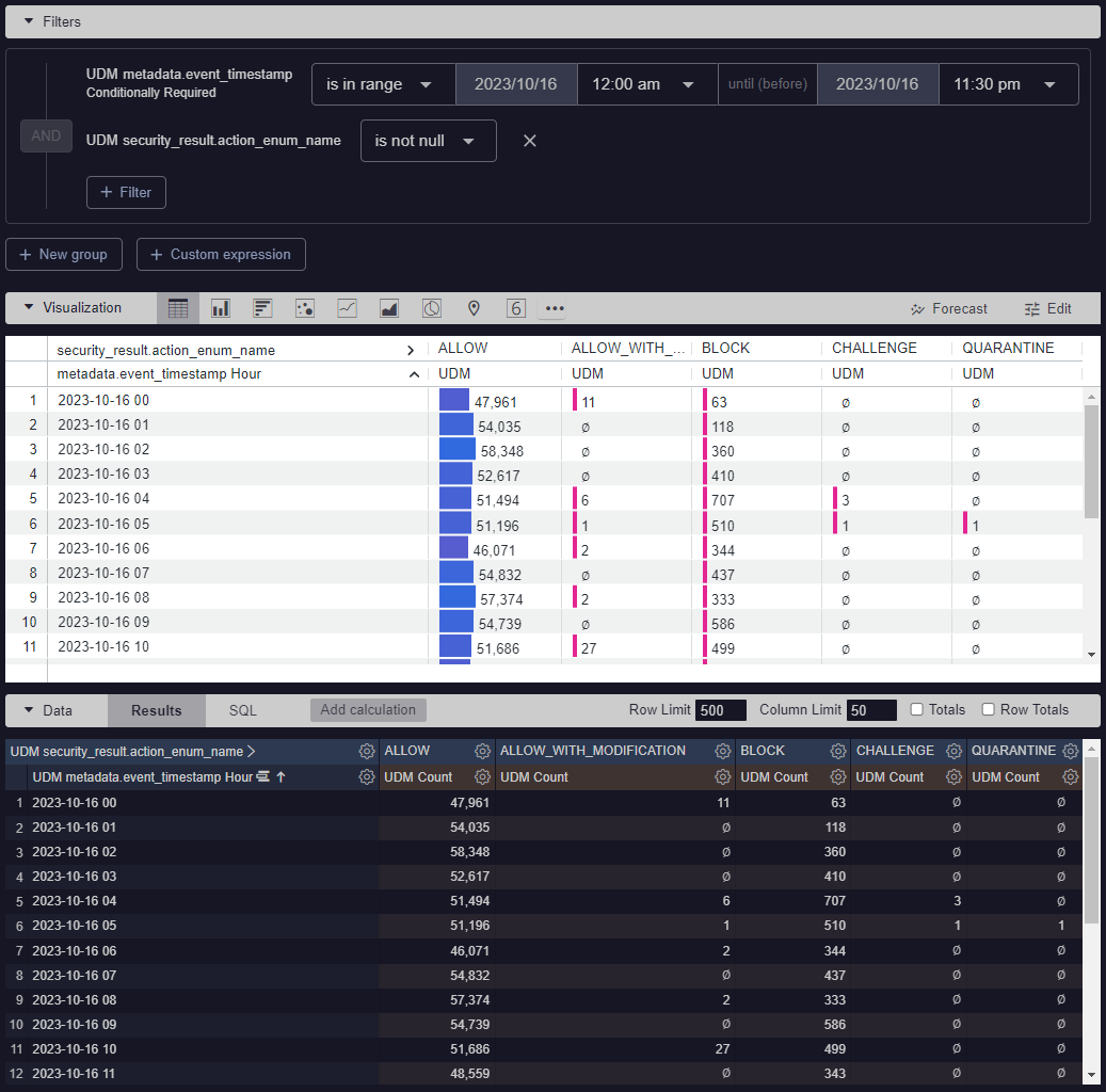
Configuration options for pivot in a date field
Create a chart with detailed timestamp measures
You can create a chart with event counts for each log type along with the oldest
(min) and most recent (max) event timestamp. This chart uses the metadata.product_name
field to identify the log type.
Follow these steps to create a chart with min or max timestamps:
Open an existing dashboard to edit or create a new dashboard.
Click Add > Visualization.
From the Choose an Explore dialog, select UDM Events.
Enter a tile name.
Select the Dimension field:
metadata.product_name.Select the Measure fields:
Count,metadata.event_timestamp (min) Date,metadata.event_timestamp (max) Date.Click Run to preview the visualization. The preview is displayed showing the
metadata.event_timestamp (min) Dateandmetadata.event_timestamp (max) Datevalues in the date format.Click Save. The Dashboards page is displayed with the newly added chart. The chart includes the metadata.product_name, UDM, metadata.event_timestamp (min) Date, and metadata.event_timestamp (max) Date columns with values.
Need more help? Get answers from Community members and Google SecOps professionals.
