One unique Looker feature is that it connects directly to your database. That means you can always access the freshest data and you can always drill down to the most granular level available. So, while you can see yearly or monthly summaries, Looker also provides the option of drilling in to the day, hour, or second instantly.
This page provides examples of how to customize and leverage data drilling to create more powerful analytic experiences for your users, including:
- Customizing how values are presented in basic drill data tables
- Customizing the drill visualization to create a visual drilling experience
Customizing how values are presented in basic drill data tables
Looker's web-native modern architecture lets you do far more than just drill from one level to the next-most granular level. You can build out any custom drill path with just a few parameters.
The following examples demonstrate how you can customize the way that data is presented in drill tables, including:
- Adding custom row limits (up to 5,000 rows) to a drill table
- Adding sorts to a drill table
- Adding pivots to a drill table
Adding row limits (up to 5,000 rows) to a drill table
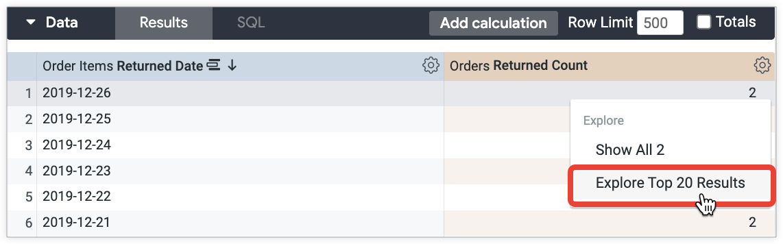
Adding row limits to a drill table lets you control how the data is presented to users when they drill on measure values. For example, what if you wanted to display only the first 20 results in a drill table when a user drills into a Returned Count measure value? You can use the link parameter and set the url subparameter to "{{ link }}&limit=20", as in the following LookML code:
measure: returned_count {
  type: count_distinct
  sql: ${id} ;;
  filters: [is_returned: "yes"]
  drill_fields: [detail*]
  link: {
    label: "Explore Top 20 Results"
    url: "{{ link }}&limit=20"
  }
}

set: detail {
  fields: [id, order_id, status, created_date, sale_price, products.brand, products.item_name, users.email]
}
This lets users drill into the top 20 results by selecting Explore Top 20 Results from the Returned Count measure's drill menu:
Adding sorts to a drill table
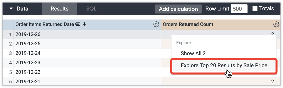
In addition to limiting data, you can also control how data is sorted in a drill table. For example, what if you wanted to display the 20 results by Sale Price when a user drills into a Returned Count measure value? You can use the link parameter and set the url subparameter to "{{ link }}&sorts=order_items.sale_price". The following LookML code combines custom sorting with a custom row limit:
measure: returned_count {
  type: count_distinct
  sql: ${id} ;;
  filters: [is_returned: "yes"]
  drill_fields: [detail*]
  link: {
    label: "Explore Top 20 Results by Sale Price"
    url: "{{ link }}&sorts=order_items.sale_price+desc&limit=20"
  }
}

set: detail {
  fields: [id, order_id, status, created_date, sale_price, products.brand, products.item_name, users.email]
}
This lets users drill into the top 20 results by sale price by selecting Explore Top 20 Results by Sale Price from the Sale Price measure's drill menu:
Adding pivots to a drill table
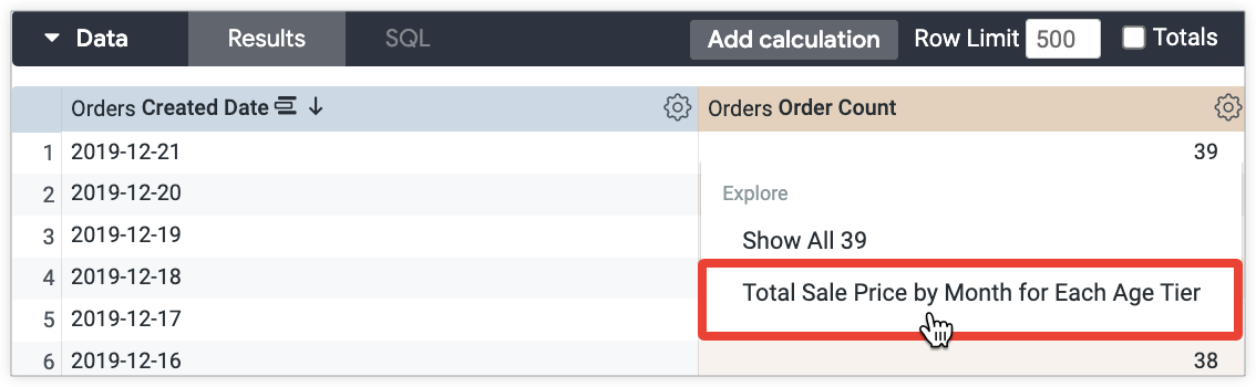
In addition to limiting and sorting data, you can also pivot dimensions in a drill table. For example, what if you wanted to add a pivot to an Age Tier field to show the year and gross margin percentage tier for each age group when a user drills into an Order Count measure value? You can use the link parameter and set the url subparameter to "&pivots=users.age_tier":
measure: order_count {
  type: count_distinct
  drill_fields: [created_year, item_gross_margin_percentage_tier, users.age_tier, total_sale_price]
  link: {
    label: "Total Sale Price by Month for Each Age Tier"
    url: "{{link}}&pivots=users.age_tier"
  }
  sql: ${order_id} ;;
}
This lets users drill into the year and gross margin percentage for each age group when they select Total Sale Price by Month for Each Age Tier from the Order Count measure's drill menu:
Creating a visual drilling experience
Data tables convey data in effective ways, but what if you want to visualize the data a user sees when they drill? There are several ways to display drill data in visualizations besides data tables. This section includes the following examples:
- Drilling with the Visual Drilling Labs feature
- Drilling to a scatter plot with a limit and moving average
- Drilling to a stacked line chart with pivots
- Drilling to a custom visualization
- Drilling to a table calculation that has conditional formatting
Drilling with the Visual Drilling Labs feature
The Visual Drilling Labs feature lets users drill into an Explore or a Look. With zero customization and a limited drill set, you can display drill data in different visualization types that are preselected based on the data by Looker.
The Visual Drilling Labs feature is not supported by dashboards. For dashboards, you can create a visual drilling experience with thelinkparameter without needing to enable the Labs feature. The sections following this one provide examples of how to create a visual drilling experience using thelinkparameter.
As an example, to show how many items have been sold by day, you can create a measure that drills into the Created Date and Total Sale Price fields:
measure: count {
  type: count_distinct
  sql: ${id} ;;
  drill_fields: [created_date, total_sale_price]
}

Visual drilling is the simplest option; however, what if you want to control what type of visualization is displayed to users when they drill? The following sections provide examples of how to further customize a drill visualization.
Drilling to a scatter plot with a limit and moving average
You can let users drill to a scatter plot chart that includes a moving average trend line. For example, suppose you want to display how many items have been sold by day as a scatter plot chart with a 30-day moving average:
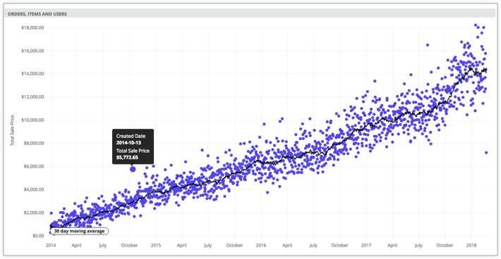
To do this, you can specify visualization settings in a URL using Liquid variables. These settings control the visualization that appears in the drill:
measure: count {
  type: count_distinct
  sql: ${id} ;;
  drill_fields: [created_date, total_sale_price]
  link: {
    label: "Show as scatter plot"
    url: "
    {% assign vis_config = '{
     \"stacking\" : \"\",
     \"show_value_labels\" : false,
     \"label_density\" : 25,
     \"legend_position\" : \"center\",
     \"x_axis_gridlines\" : true,
     \"y_axis_gridlines\" : true,
     \"show_view_names\" : false,
     \"limit_displayed_rows\" : false,
     \"y_axis_combined\" : true,
     \"show_y_axis_labels\" : true,
     \"show_y_axis_ticks\" : true,
     \"y_axis_tick_density\" : \"default\",
     \"y_axis_tick_density_custom\": 5,
     \"show_x_axis_label\" : false,
     \"show_x_axis_ticks\" : true,
     \"x_axis_scale\" : \"auto\",
     \"y_axis_scale_mode\" : \"linear\",
     \"show_null_points\" : true,
     \"point_style\" : \"circle\",
     \"ordering\" : \"none\",
     \"show_null_labels\" : false,
     \"show_totals_labels\" : false,
     \"show_silhouette\" : false,
     \"totals_color\" : \"#808080\",
     \"type\" : \"looker_scatter\",
     \"interpolation\" : \"linear\",
     \"series_types\" : {},
     \"colors\": [
     \"palette: Santa Cruz\"
     ],
     \"series_colors\" : {},
     \"x_axis_datetime_tick_count\": null,
     \"trend_lines\": [
      {
      \"color\" : \"#000000\",
      \"label_position\" : \"left\",
      \"period\" : 30,
      \"regression_type\" : \"average\",
      \"series_index\" : 1,
      \"show_label\" : true,
      \"label_type\" : \"string\",
      \"label\" : \"30 day moving average\"
      }
     ]
    }' %}
     {{ link }}&vis_config={{ vis_config | encode_uri }}&toggle=dat,pik,vis&limit=5000"
  }
}
Drilling to a stacked line chart with pivots
You can also let users drill to a stacked line chart, for example, a stacked line chart that displays the Total Sale Price for each Month Number, pivoted by Created Year:
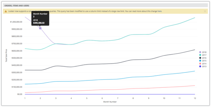
The following LookML specifies the settings for the preceding visualization:
measure: total_sale_price {
  type: sum
  value_format_name: usd
  sql: ${sale_price} ;;
  drill_fields: [total_sale_price, created_month_name, created_year]
  link: {
    label: "Show as stacked line"
    url: "
    {% assign vis_config = '{
     \"stacking\" : \"normal\",
     \"legend_position\" : \"right\",
     \"x_axis_gridlines\" : false,
     \"y_axis_gridlines\" : true,
     \"show_view_names\" : false,
     \"y_axis_combined\" : true,
     \"show_y_axis_labels\" : true,
     \"show_y_axis_ticks\" : true,
     \"y_axis_tick_density\" : \"default\",
     \"show_x_axis_label\" : true,
     \"show_x_axis_ticks\" : true,
     \"show_null_points\" : false,
     \"interpolation\" : \"monotone\",
     \"type\" : \"looker_line\",
     \"colors\": [
     \"#5245ed\",
     \"#ff8f95\",
     \"#1ea8df\",
     \"#353b49\",
     \"#49cec1\",
     \"#b3a0dd\"
     ],
     \"x_axis_label\" : \"Month Number\"
    }' %}
     {{ link }}&vis_config={{ vis_config | encode_uri }}&sorts=order_items.created_year+asc,order_items.created_month_name+asc&pivots=order_items.created_year&toggle=dat,pik,vis&limit=500&column_limit=15"
  } # NOTE the &pivots=
}
Drilling to a custom visualization
You can also let users to drill to a custom visualization:
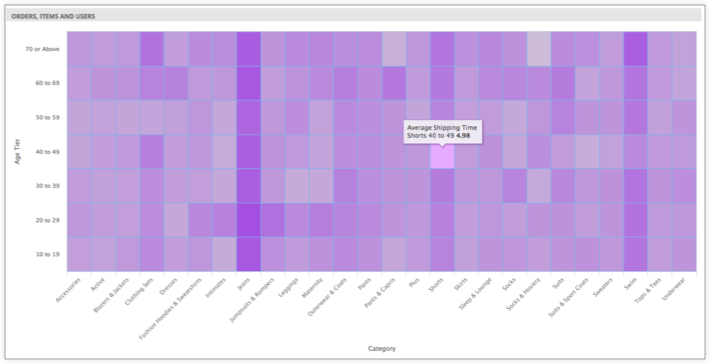
To do this, you can include the custom visualization in the visualization settings you specify for the link parameter:
measure: average_shipping_time {
  type: average
  value_format_name: decimal_2
  sql: ${shipping_time} ;;
  drill_fields: [products.category, users.age_tier, average_shipping_time]
  link: {
    label: "See as custom viz (heatmap)"
    url: "
    {% assign vis_config = '{
     \"minColor\" : \"#d6d6d6\",
     \"maxColor\" : \"#9a33e3\",
     \"dataLabels\" : false,
     \"custom_color_enabled\" : false,
     \"custom_color\" : \"forestgreen\",
     \"show_single_value_title\": true,
     \"show_comparison\" : false,
     \"comparison_type\" : \"value\",
     \"comparison_reverse_colors\": false,
     \"show_comparison_label\" : true,
     \"show_view_names\" : true,
     \"show_row_numbers\" : true,
     \"truncate_column_names\" : false,
     \"hide_totals\" : false,
     \"hide_row_totals\" : false,
     \"table_theme\" : \"editable\",
     \"limit_displayed_rows\" : false,
     \"enable_conditional_formatting\": false,
     \"conditional_formatting_include_totals\": false,
     \"conditional_formatting_include_nulls\": false,
     \"type\" : \"highcharts_heatmap\",
     \"stacking\" : \"\",
     \"show_value_labels\" : false,
     \"label_density\" : 25,
     \"legend_position\" : \"center\",
     \"x_axis_gridlines\" : false,
     \"y_axis_gridlines\" : true,
     \"y_axis_combined\" : true,
     \"show_y_axis_labels\" : true,
     \"show_y_axis_ticks\" : true,
     \"y_axis_tick_density\" : \"default\",
     \"y_axis_tick_density_custom\": 5,
     \"show_x_axis_label\" : true,
     \"show_x_axis_ticks\" : true,
     \"x_axis_scale\" : \"auto\",
     \"y_axis_scale_mode\" : \"linear\",
     \"ordering\" : \"none\",
     \"show_null_labels\" : false,
     \"show_totals_labels\" : false,
     \"show_silhouette\" : false,
     \"totals_color\" : \"#808080\",
     \"series_types\" : {},
     \"hidden_fields\" : [
     \"order_items.count\",
     \"order_items.total_sale_price\"
     ]
    }' %}
     {{ link }}&vis_config={{ vis_config | encode_uri }}&sorts=products.category+asc,users.age_tier+asc&toggle=dat,pik,vis&limit=5000"
  }
}
Drilling to a table calculation that has conditional formatting
You can also let users drill to a table calculation that displays conditional formatting:
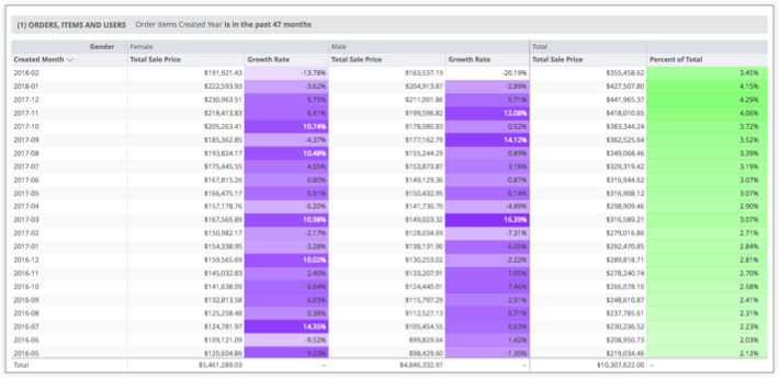
This can be defined in LookML as follows:
measure: total_sale_price {
  type: sum
  value_format_name: usd
  sql: ${sale_price} ;;
  drill_fields: [created_month, users.gender, total_sale_price]
  link: {
    label: "Table Calc & Total"
    url: "
    {% assign table_calc = '[
     { \"table_calculation\": \"percent_of_total\",
     \"label\": \"Percent of Total\",
     \"expression\": \"${order_items.total_sale_price:row_total} / sum(${order_items.total_sale_price:row_total})\",
     \"value_format\": null,
     \"value_format_name\": \"percent_2\",
     \"_kind_hint\": \"supermeasure\",
     \"_type_hint\": \"number\"
     },
     { \"table_calculation\": \"growth_rate\",
     \"label\": \"Growth Rate\",
     \"expression\": \"${order_items.total_sale_price} / offset(${order_items.total_sale_price},1) - 1\",
     \"value_format\": null,
     \"value_format_name\": \"percent_2\",
     \"_kind_hint\": \"measure\",
     \"_type_hint\": \"number\"
    }]' %}
    {% assign vis_config = '{
     \"type\": \"table\",
     \"show_view_names\": false,
     \"show_row_numbers\": false,
     \"truncate_column_names\": false,
     \"table_theme\": \"gray\",
     \"enable_conditional_formatting\": true,
     \"conditional_formatting\": [
     {
     \"type\": \"low to high\",
     \"value\": null,
     \"background_color\": null,
     \"font_color\": null,
     \"palette\": {
     \"name\": \"Custom\",
     \"colors\": [
     \"#FFFFFF\",
     \"#6e00ff\"
     ]},
     \"bold\": false,
     \"italic\": false,
     \"strikethrough\": false,
     \"fields\": [
     \"growth_rate\"
     ]},{
     \"type\": \"low to high\",
     \"value\": null,
     \"background_color\": null,
     \"font_color\": null,
     \"palette\": {
     \"name\": \"Custom\",
     \"colors\": [
     \"#FFFFFF\",
     \"#88ff78\"
     ]},
     \"bold\": false,
     \"italic\": false,
     \"strikethrough\": false,
     \"fields\": [
     \"percent_of_total\"
    ]}]}' %}
     {{link}}&total=on&row_total=right&dynamic_fields={{ table_calc |replace(') ', '' | encode_uri }}&pivots=users.gender&vis_config={{ vis_config |replace(') ', '' | encode_uri }}"
  }
}