Tetap teratur dengan koleksi
Simpan dan kategorikan konten berdasarkan preferensi Anda.
Opsi visualisasi Looker memungkinkan Anda menyesuaikan visualisasi, termasuk menambahkan garis referensi. Opsi garis referensi adalah nilai statis, median, rata-rata (mean), maksimum, minimum, dan rentang, yang dapat dipilih di setelan Edit Visualisasi.
Namun, bagaimana jika Anda ingin menggunakan garis referensi vertikal dalam grafik? Misalnya, bagaimana jika Anda ingin memvisualisasikan berbagai tahap peluncuran produk pada tanggal tertentu berdasarkan pesanan yang dilakukan selama periode tersebut?
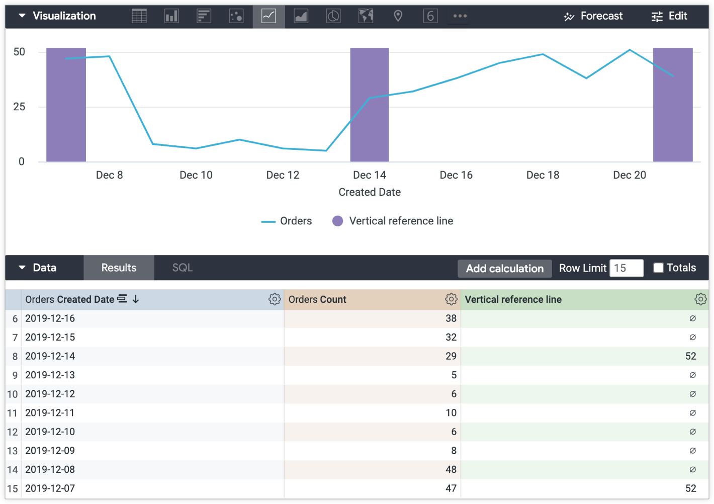
Solusi
Dengan menggunakan penghitungan tabel, Anda dapat membuat batang vertikal yang dapat dirujuk dalam grafik. Garis vertikal akan muncul seperti yang ada dalam contoh berikut.
Contoh berikut didasarkan pada Jelajahi dengan Jumlah Pesanan yang dikelompokkan menurut Tanggal Pembuatan Pesanan.
Untuk membuat garis referensi vertikal:
Buat penghitungan tabel yang mereferensikan titik data dalam visualisasi yang ingin Anda soroti dengan garis referensi vertikal. Contoh kasus penggunaan ini menggunakan ekspresi berikut untuk membuat garis referensi vertikal guna menandai tahap dalam tanggal peluncuran produk menggunakan Tanggal Pembuatan Pesanan:
if(
to_string(${orders.created_date}) = "2019-12-21" OR
to_string(${orders.created_date}) = "2019-12-14" OR
to_string(${orders.created_date}) = "2019-12-07"
,
max(${orders.count})+1, null
)
Selanjutnya, terapkan bagian berikut di menu Edit visualisasi:
Di menu Deret, tetapkan Jenis visualisasi untuk penghitungan tabel ke Kolom.
Di menu Plot, pastikan Pemosisi Derettidak ditetapkan ke Persentase yang Ditumpuk.
Visualisasi yang dihasilkan menampilkan garis yang mewakili jumlah pesanan yang dilakukan dari waktu ke waktu, dan batang vertikal yang dihasilkan oleh penghitungan tabel Garis referensi vertikal menandai tahap peluncuran produk dari waktu ke waktu — awal, tengah, dan akhir:
[[["Mudah dipahami","easyToUnderstand","thumb-up"],["Memecahkan masalah saya","solvedMyProblem","thumb-up"],["Lainnya","otherUp","thumb-up"]],[["Sulit dipahami","hardToUnderstand","thumb-down"],["Informasi atau kode contoh salah","incorrectInformationOrSampleCode","thumb-down"],["Informasi/contoh yang saya butuhkan tidak ada","missingTheInformationSamplesINeed","thumb-down"],["Masalah terjemahan","translationIssue","thumb-down"],["Lainnya","otherDown","thumb-down"]],["Terakhir diperbarui pada 2025-07-31 UTC."],[],[],null,["# How to create vertical reference lines\n\n| **Tip:** Starting in Looker 24.0, you can use the [Chart Config Editor](/looker/docs/chart-config-editor#add_vertical_reference_bands) to create more robust vertical reference lines and bands.\n\n\nLooker visualization options let you customize your visualization, including [adding reference lines](/looker/docs/best-practices/how-to-create-reference-lines-with-visualization-editor). The reference line options are static value, median, average (mean), maximum, minimum, and range, which can be selected in the **Edit Visualization** settings.\n\n\nBut what if you want to use vertical reference lines in a graph? For example, what if you want to visualize the various stages of a product launch on specific dates against the orders that were placed during that period?\n\nThe solution\n------------\n\n\nUsing [table calculations](/looker/docs/table-calculations), you can create vertical bars that you can reference in graphs. The vertical lines will appear like those in the following example.\n\n\nThe following example is based on an Explore with **Orders Count** grouped by **Orders Created Date**.\n\n\nTo create a vertical reference line:\n\n1. [Create a table calculation](/looker/docs/table-calculations#creating_table_calculations) that references the data points in the visualization that you want to highlight with vertical reference lines. This example of a use case uses the following expression to create vertical reference lines to mark stages in the product launch dates using the **Orders Created Date** :\n\n \u003cbr /\u003e\n\n ```\n if(\n to_string(${orders.created_date}) = \"2019-12-21\" OR\n to_string(${orders.created_date}) = \"2019-12-14\" OR\n to_string(${orders.created_date}) = \"2019-12-07\"\n ,\n max(${orders.count})+1, null\n )\n \n ```\n2. Next, apply the following sections in the visualization **Edit** menu:\n\n \u003cbr /\u003e\n\n - In the [**Series** menu](/looker/docs/line-options#series_menu_options), set the visualization **Type** for the table calculation to **Column**.\n - In the [**X** menu](/looker/docs/line-options#x_menu_options), change **Scale Type** to **Ordinal**.\n - In the [**Plot** menu](/looker/docs/line-options#plot_menu_options), make sure **Series Positioning** is *not* set to **Stacked Percentage**.\n\n\nThe resulting visualization displays the line representing the number of orders placed over time, and the vertical bars produced by the **Vertical reference line** table calculation mark the launch stages of the product over time --- beginning, middle, and end:"]]