Opsi garis referensi default mencakup nilai statis, median, rata-rata (mean), maksimum, minimum, dan rentang, yang dapat dipilih dari menu setelan opsi visualisasi Edit.
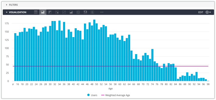
Namun, Anda mungkin ingin menampilkan metrik yang lebih spesifik — seperti rata-rata berbobot — dengan garis referensi, bukan opsi garis referensi default. Anda dapat membuat garis referensi kustom dengan membuat penghitungan tabel, lalu memetakan garis tersebut dalam visualisasi.
Melanjutkan contoh rata-rata berbobot yang ditampilkan sebelumnya, misalnya Anda ingin memberi bobot rata-rata usia pengguna berdasarkan jumlah pengguna dan memiliki pengukuran untuk setiap hal ini di Jelajahi. Untuk membuat garis referensi vertikal rata-rata berbobot, Anda harus melakukan langkah-langkah berikut:
Tambahkan ukuran Jumlah Pengguna dan Rata-Rata Usia Pengguna ke kueri Jelajahi.
Buat kalkulasi tabel seperti berikut untuk menghitung rata-rata berbobot dengan dua ukuran:
Penghitungan tabel akan menampilkan satu nilai — rata-rata berbobot — untuk setiap baris kueri.
Jika jenis visualisasi yang dipilih bukan diagram garis, seperti diagram kolom atau diagram batang, Anda dapat memvisualisasikan penghitungan tabel sebagai garis dengan memilih jenis visualisasi Garis untuk deret penghitungan tabel di tab
Deret pada menu Edit. Karena penghitungan tabel hanya menampilkan satu nilai, garis akan muncul sebagai garis referensi horizontal.
Jika tidak ingin Rata-rata Usia Pengguna muncul dalam visualisasi, Anda juga dapat menyembunyikan kolom tersebut menggunakan opsi Sembunyikan dari Visualisasi.
Jika divisualisasi sebagai diagram kolom, Jumlah Pengguna dan Rata-rata Usia Pengguna yang dikelompokkan menurut data Jelajahi Usia Pengguna akan terlihat seperti berikut dengan garis referensi Rata-rata Usia Berbobot:
Jika ingin dapat menggunakan kembali kalkulasi tabel di Eksplorasi mendatang, Anda dapat membuat ulang kalkulasi di antara kolom numerik dengan ukuran jenis number.
[[["Mudah dipahami","easyToUnderstand","thumb-up"],["Memecahkan masalah saya","solvedMyProblem","thumb-up"],["Lainnya","otherUp","thumb-up"]],[["Sulit dipahami","hardToUnderstand","thumb-down"],["Informasi atau kode contoh salah","incorrectInformationOrSampleCode","thumb-down"],["Informasi/contoh yang saya butuhkan tidak ada","missingTheInformationSamplesINeed","thumb-down"],["Masalah terjemahan","translationIssue","thumb-down"],["Lainnya","otherDown","thumb-down"]],["Terakhir diperbarui pada 2025-07-31 UTC."],[],[],null,["# Creating reference lines for visualizations with visualization menu settings\n\nYou can add a reference line to several available Looker visualization types:\n\n- [Column charts](/looker/docs/column-options#add_reference_line)\n- [Bar charts](/looker/docs/bar-options#add_reference_line)\n- [Line charts](/looker/docs/line-options#add_reference_line)\n- [Area charts](/looker/docs/area-options#add_reference_line)\n- [Scatterplot charts](/looker/docs/scatter-options#add_reference_line)\n\n\nDefault reference line options include static value, median, average (mean), maximum, minimum, and range, which can be selected from the visualization option settings [**Edit**](/looker/docs/line-options#value,_start_value,_and_end_value_(for_a_reference_line)) menu.\n\n\nHowever, you may want to represent a more specific metric --- such as a weighted average --- with a reference line, instead of the default reference line options. You can make custom reference lines by creating [table calculations](/looker/docs/table-calculations#creating_table_calculations_in_looker) and then plotting them in visualizations.\n\n\nContinuing with the weighted average example shown previously, let's say you wanted to weight average user age by the count of users and had measures for each of these in an Explore. To create a weighted average vertical reference line, you would perform the following steps:\n\n\n1. [Add](/looker/docs/creating-and-editing-explores#adding_more_dimensions_for_more_detail) the **Users Count** measure and **Users Average Age** measures to an Explore query.\n2. Create a table calculation like the following to calculate the weighted average with the two measures: \n\n ```\n mean(sum(${users.count}*${users.average_age})/sum(${users.count}))\n ```\n\n\n The table calculation will return a single value --- the weighted average --- for every row of the query.\n3. If the selected visualization type is not a line chart, such as a column chart or bar chart, you can visualize the table calculation as a line by selecting the **Line** visualization type for the table calculation series on the [**Series**](/looker/docs/creating-visualizations#including_multiple_visualization_types_on_a_single_chart) tab of the **Edit** menu. Since the table calculation only returns one value, the line will appear as a horizontal reference line.\n\n \u003cbr /\u003e\n\n If you do not want **Users Average Age** to appear in your visualization, you can also hide that field using the [**Hide from Visualization**](/looker/docs/creating-visualizations#specifying_lookml_fields_to_include_in_the_visualization) option.\n\n\u003cbr /\u003e\n\n\nVisualized as a column chart, the **Users Count** and **Users Average Age** grouped by **Users Age** Explore data looks like the following with the **Weighted Average Age** reference line:\n\n\nIf you want to be able to reuse the table calculation in future Explores, you can re-create the calculation between numeric fields with a [`number`](/looker/docs/reference/param-measure-types#number) type measure."]]