本頁所列的所有使用者資料皆為示例。
Looker 圖表會根據查詢中顯示的欄位類型,自動判斷要在 y 軸上繪製哪些值。舉例來說,如果探索針對 Orders Count 前 10 大的值,以 Users First Name 和 Users Age 細分資料,並以直欄圖呈現,系統就會自動將 Users First Name 和 Users Age 的 10 個維度值連結,並在 x 軸上以破折號 (–) 分隔。
如果您想將「使用者年齡」和「使用者姓名」分開,以便將「使用者年齡」繪製在 y 軸上,而「使用者姓名」和「訂單數量」則顯示在 x 軸上,該怎麼做呢?
以下兩種解決方案概述如何將維度 (例如「使用者年齡」) 轉換為評估資料,以便在 y 軸上進行視覺化:
使用資料表計算
資料表計算是將維度繪製在 y 軸上最快速、最簡單的方法。如果運算式中沒有指標,通常會以維度來繪製計算結果。您可以在計算式中加入測量指標,讓資料表計算以測量指標的形式運作。重點在於確保評量指標不會影響原始維度的值。
如要使用資料表計算,在 y 軸上繪製評量資料,請執行下列步驟:
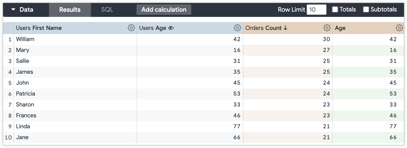
- 如果探索查詢中沒有任何評估資料,請新增任何評估資料 (例如計數),然後在視覺化呈現中隱藏該資料。如果查詢中已有要納入視覺化圖表的度量,就不需要隱藏。
-
接下來,建立資料表計算:
- 如果是數值欄位,計算方式如下:
${mydimension} + (0 * ${mymeasure}) -
對於字串欄位,計算會涉及兩個邏輯函式
if()和is_null():if(is_null(${mymeasure}),${string_dimension},${string_dimension})
- 如果是數值欄位,計算方式如下:
- 隱藏原始維度 (在本例中為「使用者年齡」),因為表格計算 (「年齡」測量指標) 會在圖表中代表維度的值。
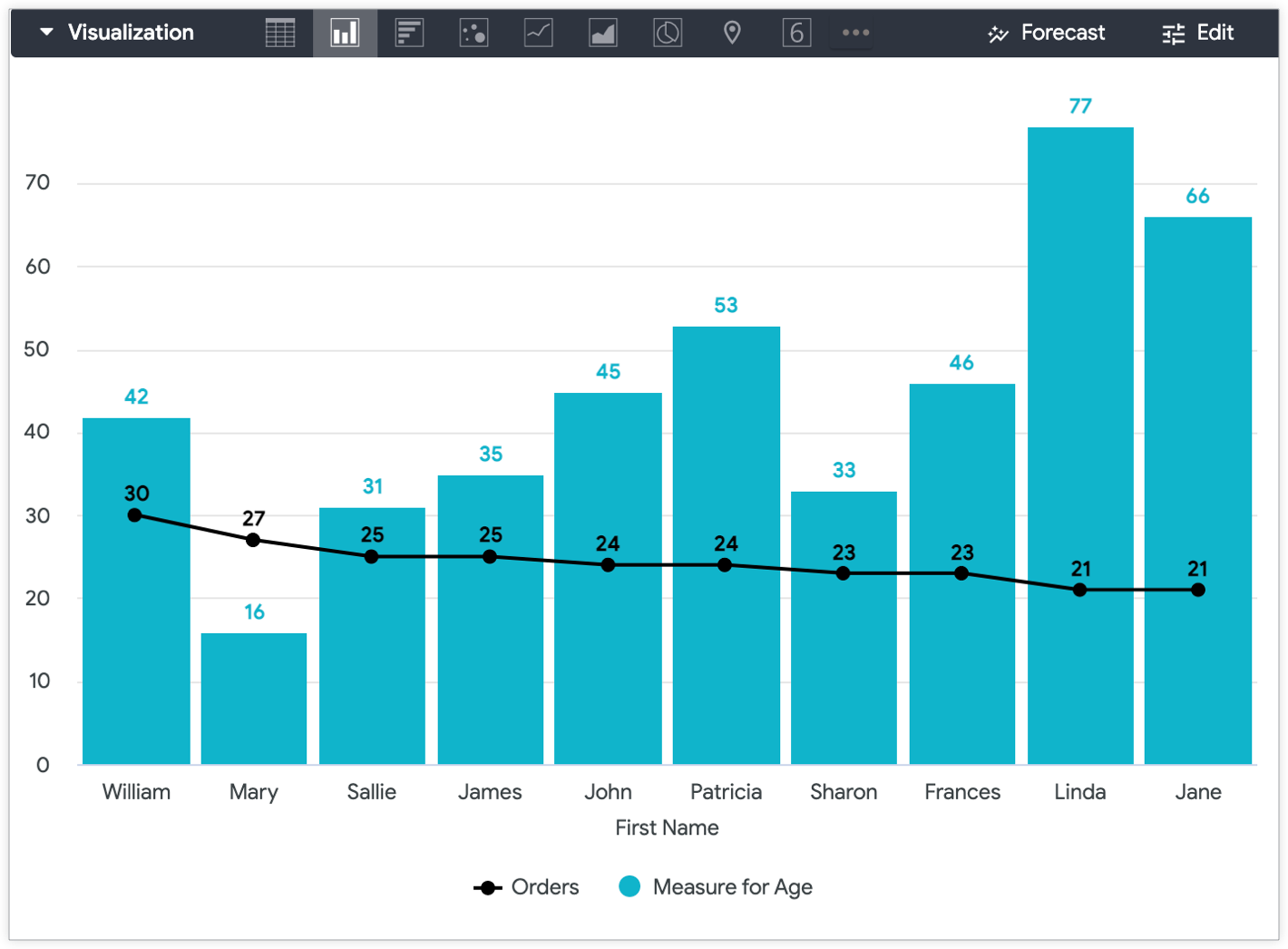
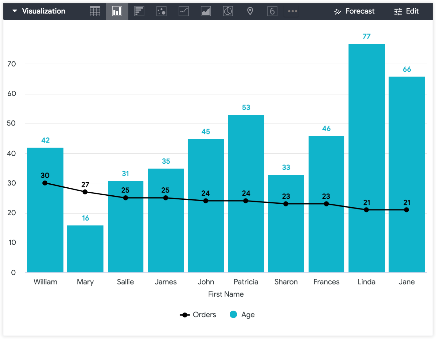
如要區分呈現方式中的值 (在本例中為「年齡」測量指標表格計算結果和「訂單數量」測量指標),您可以在單一圖表中使用多種呈現方式。
舉例來說,您可以將「訂單數量」值設為線條,將「使用者年齡」值設為欄,藉此區分這兩個值,並在 y 軸上繪製「使用者年齡」。
在 LookML 中建立測量指標
如果您日後打算再次在 y 軸上繪製特定維度,建議您在 LookML 中建立 sum 指標或 number 指標,將要繪製的維度轉換為指標。您可以透過欄位挑選器,將欄位新增至查詢,而非在「探索」中多次重新建立相同的資料表計算。
成效指標會如下所示:
    measure: measure_for_age { ## replace with a new name
        description: "Use this age field for displaying age on the y-axis"
        type: number ## or sum
        sql: ${age} ;; ## replace with your dimension
    }
在評估指標中加入 description,有助於使用者瞭解欄位的預期用途。
在本例中,measure_for_age 是 number 類型度量,因為 number 類型度量不會執行任何實際的匯總作業。也就是說,「年齡」評估值會顯示與「使用者年齡」相同的值,因為這是不會執行任何匯總作業的 number 類型評估值。
建立評估指標後,請在「探索」查詢中加入維度和新評估指標。在這個範例中,請加入「使用者姓名」和「使用者年齡」維度,以及「訂單數量」和「使用者年齡評估」成效指標。最後,隱藏測量指標的依據維度。
隱藏「探索」圖表的「使用者年齡」維度,並套用自訂圖表設定後,產生的「探索」圖表會在 y 軸上顯示「使用者年齡評估」,在 x 軸上顯示「使用者姓名」,並以線條顯示「訂單數量」值。