如何建立垂直參考線
您可以透過 Looker 的視覺化選項自訂視覺化內容,例如新增參考線。參考線選項包括靜態值、中位數、平均值、最大值、最小值和範圍,可在「編輯圖表」設定中選取。
不過,如果要在圖表中使用垂直參考線,舉例來說,如果您想將產品在特定日期推出的各個階段,與該期間下達的訂單進行視覺化呈現,該怎麼做呢?
解決方案
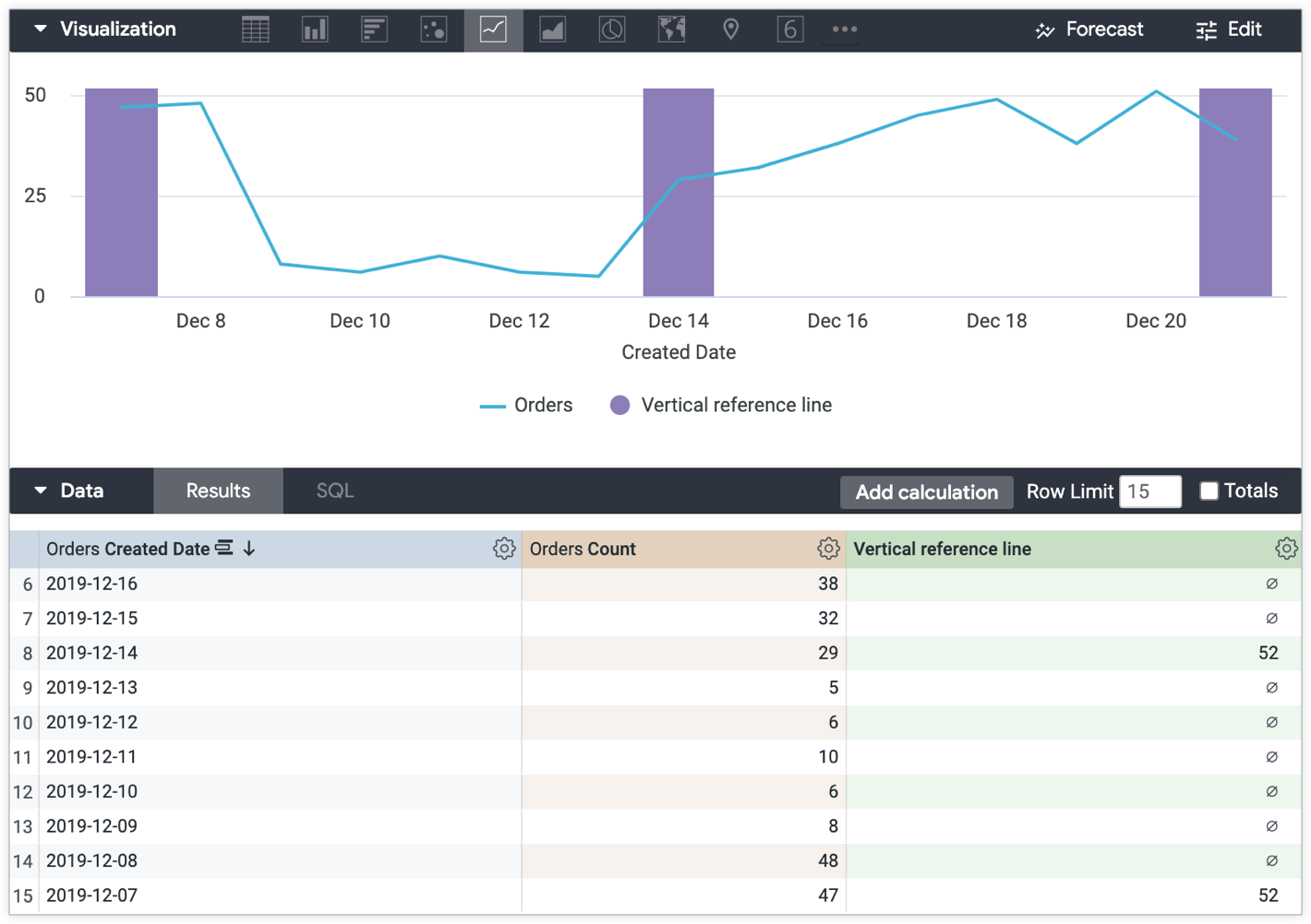
您可以使用表格計算建立可在圖表中參照的垂直長條。垂直線會顯示如下範例所示。
以下範例是根據「探索」中以「訂單數量」為依據,並按「訂單建立日期」分組的資料。
如要建立垂直參考線,請按照下列步驟操作:
-
建立表格運算式,參照您要使用垂直參考線醒目顯示的圖表資料點。這個用例範例使用下列運算式,建立垂直參考線,以便使用「訂單建立日期」標示產品推出日期的階段:
    if(
      to_string(${orders.created_date}) = "2019-12-21" OR
      to_string(${orders.created_date}) = "2019-12-14" OR
      to_string(${orders.created_date}) = "2019-12-07"
      ,
      max(${orders.count})+1, null
      )
-
接下來,請在視覺化圖表的「編輯」選單中套用下列部分:
-
在「系列」選單中,將資料表計算的圖表類型設為「欄」。
-
在 X 選單中,將「Scale Type」變更為「Ordinal」。
-
在「Plot」選單中,確認「Series Positioning」未設為「Stacked Percentage」。
產生的視覺化資料會顯示代表一段時間內下單數量的線條,而由垂直參考線資料表計算產生的垂直長條會標示產品的推出階段,包括開始、中間和結束:
除非另有註明,否則本頁面中的內容是採用創用 CC 姓名標示 4.0 授權,程式碼範例則為阿帕契 2.0 授權。詳情請參閱《Google Developers 網站政策》。Java 是 Oracle 和/或其關聯企業的註冊商標。
上次更新時間:2025-10-19 (世界標準時間)。
[[["容易理解","easyToUnderstand","thumb-up"],["確實解決了我的問題","solvedMyProblem","thumb-up"],["其他","otherUp","thumb-up"]],[["難以理解","hardToUnderstand","thumb-down"],["資訊或程式碼範例有誤","incorrectInformationOrSampleCode","thumb-down"],["缺少我需要的資訊/範例","missingTheInformationSamplesINeed","thumb-down"],["翻譯問題","translationIssue","thumb-down"],["其他","otherDown","thumb-down"]],["上次更新時間:2025-10-19 (世界標準時間)。"],[],[]]