This page describes the features of the Key Visualizer interface.
Before you read this page, you should be familiar with the Key Visualizer overview and ensure you have access to Key Visualizer.
Heatmaps
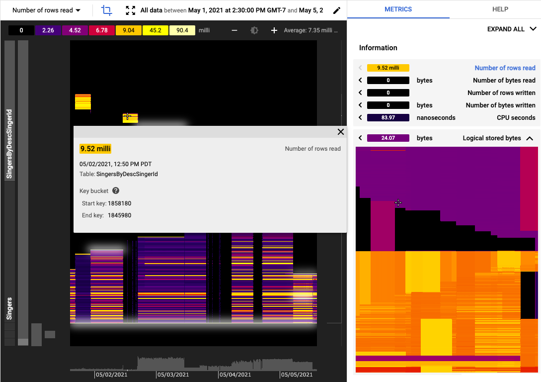
The core of a Key Visualizer scan is the heatmap, which shows the value of a metric over time, broken down into contiguous ranges of row keys. The x-axis of the heatmap represents time, and the y-axis represents row ranges. If the metric has a low value for a row range at a point in time, then the metric is cold, and it appears in a dark color. A high value is hot, and it appears in a bright color. The highest values appear in white.
Different types of usage result in different visual patterns within the heatmap, which can make it possible to diagnose issues at a glance. For more examples, see common Heatmap patterns.
Row ranges
A row range is a contiguous set of rows within a single table or index. It is defined by a start key and an end key.
A Spanner database typically has many tables and indexes. Key Visualizer selects up to 1,000 row ranges based on the existing keys in all tables and indexes across the entire database. On the heatmap, each key is first sorted based on its table or index name alphabetically. Within each table or index, keys are then sorted by their primary key values. As a result, a row range only consists of keys from a single table or index. For interleaved tables, row ranges of a parent table don't include any keys from its interleaved child tables.
Key Visualizer selects at most 1,000 row ranges. When there are more than 1,000 combined tables and indexes, some of those tables are rolled up into a single data point on the heatmap, which is shown as a single line. Therefore, potential hotspots might be hard to detect due to their tables being combined and downsampled.
If there are fewer than 1,000 tables and indexes, the heatmap has at least one row range representing every table.
Adjusting brightness
Key Visualizer heatmaps use dark colors to indicate normal or low values, and bright colors to indicate high values. If the colors in a heatmap are too bright or too dark, it might be difficult to see important patterns for a metric.
Values associated with each color are defined in the legend to the left of the Adjust Brightness buttons.
Keep in mind that for most metrics, Key Visualizer identifies which values are "high" and "low" based entirely on your usage of that database. For example, if you perform 20 reads per second in a specific row range and 1 read per second in other row ranges, Key Visualizer will use a bright color for that specific row range, even though 20 reads per second is a low number for Spanner.
To adjust the colors that are used for different values, use the + / - buttons on either side of the Adjust Brightness brightness_6 icon. When you increase the brightness, you lower the range of values that each color represents; when you lower the brightness, you increase the range of values.
Zooming in on time periods and row key ranges
When you open a heatmap, it displays values for the entire time period included in the scan, as well as the entire range of row keys in your table. If you notice an issue during a specific time period, or in a specific range of row keys, you can zoom in to examine the issue more closely.
There are several ways to zoom in or out:
- Scroll up or down within the heatmap.
- Click the Rectangular Zoom crop button, then click and drag to select an area to enlarge.
- Press and hold the
Shiftkey, then click and drag to select an area to enlarge. - Return to the previous area of the heatmap by pressing the
BackspaceorDeletekey. - Zoom out to view the entire table by clicking the Reset Zoom
zoom_out_map button or pressing the
Rkey.
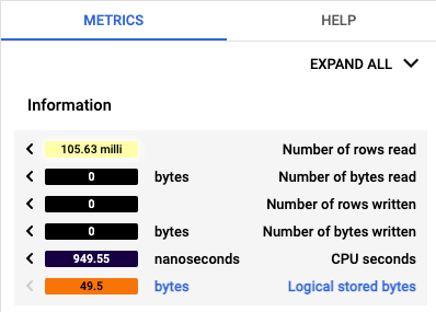
Pinning details about a metric
As you move your cursor over a heatmap, Key Visualizer displays a tooltip that contains details about the metric that is under the cursor. You can pin this tooltip in place by clicking on the heatmap. Pinned tooltips show more detail about the metric. Pinning a tooltip also makes it easier to take a screenshot of the tooltip or copy information from the tooltip.
Switching metrics
You can choose the metric to display in the heatmap from the drop-down metric list located at the top left of the page.
For descriptions of each metric, see Key Visualizer Metrics.
Finding connections between different metrics
You can view multiple metrics at the same time in Key Visualizer when you want to compare metrics or find correlations between metrics.
To view multiple metrics and their values at the same time, click Show info panel near the top right corner. A list of metrics appears in a pane to the right of the heatmap.
To examine several metrics at once, use the following tools in the info panel:
- To show or hide miniature heatmaps for all metrics, click
Expand AllorCollapse Allat the top right. - To show an individual metric's heatmap, click the metric name.
- To hide an individual metric's heatmap, click the metric name again.
To display a metric's heatmap in the main window, click the solid arrow at the left edge of the metric's title bar.
Hover over a miniature heatmap to see corresponding activity in the main view.
To compare different metrics for a row range at the same point in time, you can pin a value in a scan, then switch to a different metric at the same point in time:
- Point to a position of interest on the large heatmap in the main window.
- Click to pin the tooltip. The values in the side panel stay fixed to the row range and point in time you've pinned.
- To display a metric in the large heatmap, click the solid arrow on the left for that metric. The tooltip in the main window shows you the full details for that metric.
What's next
- Learn to recognize common patterns in heatmaps.
- Read about the metrics you can view in a heatmap.