Looker 시각화에서는 쿼리에 존재하는 필드 유형을 기반으로 y축에 표시할 값을 자동으로 결정합니다. 예를 들어 상위 주문 수 10개에 대한 사용자 이름과 사용자 연령을 분석하는 Explore는 열 차트로 시각화되며, 사용자 이름과 사용자 연령의 측정기준 값 10개가 자동으로 연결되고 x축에 대시 (–)로 구분됩니다.
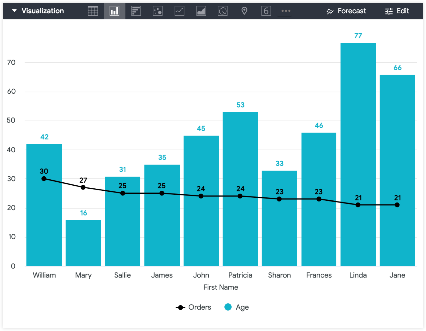
Y축에 사용자 연령이 표시되고 사용자 이름과 주문 수가 X축에 표시되도록 사용자 연령과 사용자 이름을 구분하려면 어떻게 해야 하나요?
다음 두 솔루션에서는 사용자 연령 등의 측정기준을 Y축에 시각화할 수 있는 측정값으로 변환하는 방법을 설명합니다.
테이블 계산 사용 — LookML을 개발하지 않고 Explore에서 직접 일회성 솔루션을 만듭니다.
측정값 만들기 — 향후 Explore에서 테이블 계산을 작성하지 않고도 표현식을 재사용할 수 있도록 LookML을 개발합니다.
테이블 계산 사용
테이블 계산은 Y축에 측정기준을 표시하는 가장 빠르고 쉬운 방법입니다. 계산은 보통 표현식과 관련된 측정값이 없는 경우 측정기준으로 표시됩니다. 계산 표현식에 측정값을 포함하면 테이블 계산 방법을 측정값으로 만들 수 있습니다. 핵심은 측정이 원래 측정기준의 값에 영향을 미치지 않도록 하는 것입니다.
테이블 계산을 사용하여 Y축에 측정값을 표시하려면 다음 단계를 수행합니다.
Explore 쿼리에 측정이 없는 경우 측정 (예: 개수)을 추가한 다음 시각화에서 숨기세요. 쿼리에 시각화에 포함할 측정이 이미 있는 경우 이를 숨길 필요가 없습니다.
그런 다음 테이블 계산을 만듭니다.
숫자 필드는 다음과 같이 계산됩니다.
${mydimension} + (0 * ${mymeasure})
계산 시 측정값에 0을 곱하여 원래 측정기준 값을 유지합니다.
문자열 필드의 경우 계산에는 두 가지 논리 함수(if() 및 is_null())가 대신 포함됩니다.
이 표현식은 Looker에 측정 값 대신 항상 문자열 측정기준 값을 표시하도록 지시합니다.
테이블 계산(연령 측정)이 시각화에서 측정기준의 값을 나타내므로 원래 측정기준(이 경우 사용자 연령)을 시각화에서 숨깁니다.
시각화에서 값을 구별하려면(이 예에서는 연령 측정 테이블 계산 및 주문 수 측정) 단일 차트에서 여러 보기 유형을 사용할 수 있습니다.
예를 들어 주문 수 값은 선으로 시각화하고 사용자 연령 값은 열로 시각화하여 사용자 연령을 Y축에 표시한 후에 구분할 수 있습니다.
LookML에서 측정 만들기
특정 측정기준을 나중에 Y축에 다시 표시하려는 경우 LookML에서 sum 측정 또는 number 측정을 만들어 측정에 표시할 측정기준을 만드는 방법을 더 지속 가능한 옵션으로 사용할 수 있습니다. Explore에서 동일한 테이블 계산을 여러 번 다시 만드는 대신 필드 선택 도구의 쿼리에 필드를 추가할 수 있습니다.
측정값은 다음과 같습니다.
measure: measure_for_age { ## replace with a new name
description: "Use this age field for displaying age on the y-axis"
type: number ## or sum
sql: ${age} ;; ## replace with your dimension
}
[[["이해하기 쉬움","easyToUnderstand","thumb-up"],["문제가 해결됨","solvedMyProblem","thumb-up"],["기타","otherUp","thumb-up"]],[["이해하기 어려움","hardToUnderstand","thumb-down"],["잘못된 정보 또는 샘플 코드","incorrectInformationOrSampleCode","thumb-down"],["필요한 정보/샘플이 없음","missingTheInformationSamplesINeed","thumb-down"],["번역 문제","translationIssue","thumb-down"],["기타","otherDown","thumb-down"]],["최종 업데이트: 2025-07-31(UTC)"],[],[],null,["# How to plot dimensions on a Y-axis\n\n\u003e *All user data presented on this page is made up for example purposes.*\n\n\nLooker visualizations automatically determine which values to plot on a y-axis\nbased on what field types are present in a query. For example, if an Explore\nthat breaks down **Users First Name** and **Users Age** for\nthe top 10 highest **Orders Count** is visualized as a column chart,\nthe 10 dimension values for **Users First Name** and **Users Age**\nare automatically concatenated and separated by a dash (--) on the x-axis.\n\n\nWhat if you want to separate **Users Age** and **Users First Name** so that **Users Age** is\nplotted on the y-axis, and **Users First Name** and **Orders Count** appear on the x-axis?\n\n\nThe two following solutions outline how to transform a dimension, such as **Users Age**, into a measure so that it can be visualized on the y-axis:\n\n- [Using a table calculation](#using_a_table_calculation) --- Create a one-off solution directly from an Explore without developing LookML.\n- [Creating a measure](#creating_a_measure_in_lookml) --- Develop LookML to be able to reuse an expression in future Explores without needing to create a table calculation.\n\n\u003cbr /\u003e\n\nUsing a table calculation\n-------------------------\n\n\nA [table calculation](/looker/docs/table-calculations) is the fastest and easiest way to plot a dimension on the y-axis. A calculation is typically plotted as a dimension if no measures are involved in the expression. You can make a table calculation behave as a measure by including a measure in the calculation's expression. The key is making sure the measure won't affect the value of the original dimension.\n\nTo use a table calculation to plot a measure on the y-axis, perform the following steps:\n\n1. If there is no measure in your Explore query, add any measure (such as a count), and then [hide](/looker/docs/creating-visualizations#specifying_lookml_fields_to_include_in_the_visualization) it from the visualization. If there is already a measure in your query that you want to include in the visualization, there's no need to hide it.\n2. Next, create a table calculation:\n - For a **numerical field** , the calculation will be as follows:\n\n \u003cbr /\u003e\n\n ```\n ${mydimension} + (0 * ${mymeasure})\n ```\n *The calculation preserves the original dimension value by multiplying the\n measure by 0.*\n - For a **string field** , the calculation will involve two [logical functions,](/looker/docs/functions-and-operators#logical_functions,_operators,_and_constants) `if()` and `is_null()`, instead: \n\n ```\n if(is_null(${mymeasure}),${string_dimension},${string_dimension})\n ```\n This expression tells Looker to *always* display the value of the string dimension in place of the measure values.\n3. Hide the original dimension --- **Users Age** in this case --- from the visualization, since the table calculation --- **Age** measure --- now represents the dimension's values in the visualization.\n\n\nTo distinguish between values in a visualization --- in this example, the **Age** measure table calculation and **Orders Count** measures --- you can use [multiple vis types](/looker/docs/creating-visualizations#including_multiple_visualization_types_on_a_single_chart) in a single chart.\n\n\nFor example, you can visualize **Orders Count** values as a line and **Users Age** values as\na column to distinguish them once **Users Age** is plotted on the y-axis.\n\n\nCreating a measure in LookML\n----------------------------\n\n\nIf you plan to plot a specific dimension on a y-axis again in the future, a more sustainable option is to create a\n[`sum` measure](/looker/docs/reference/param-measure-types#sum) or [`number` measure](/looker/docs/reference/param-measure-types#sum)\nin LookML that makes the dimension you want to plot into a measure. Instead of recreating the same table calculation in an Explore multiple times, you can add the field to a query from the field picker.\n\nThe measure will look similar to this: \n\n```\n measure: measure_for_age { ## replace with a new name\n description: \"Use this age field for displaying age on the y-axis\"\n type: number ## or sum\n sql: ${age} ;; ## replace with your dimension\n }\n```\n\u003e *Adding a [`description`](/looker/docs/reference/param-field-description) to the measure can help users understand the intended use of a field.*\n\n\nIn this case, `measure_for_age` is a `number` type measure, since `number` type measures do not perform any actual aggregation. This means **Measure for Age** will display the same values as **Users Age** because it is a `number` type measure that does not perform any aggregation.\n\n\nOnce you create the measure, include both the dimension *and* the new measure in the Explore query. For this example, include the dimensions **Users First Name** and **Users Age** , and include the measures **Orders Count** and **Users Measure for Age**. Finally, hide the dimension that the measure is based on.\n\n\nWith the **Users Age** dimension hidden from the Explore visualization and [custom visualization settings applied](#custom_visualization), the resulting Explore visualization displays the **Users Measure for Age** on the y-axis and **Users First Name** on the x-axis, and the **Orders Count** values as a line."]]