This document helps you choose when to use predefined dashboards and when to create dashboards. This document also lists techniques that you can use to avoid dashboard designs that can result in performance issues.
Choose Google Cloud, third-party, or custom dashboards
Cloud Monitoring automatically installs a dashboard when you create a resource in a Google Cloud project. These dashboards display metrics and general information about a single Google Cloud service. For example, if you add Compute Engine instances to your Google Cloud project, then Monitoring installs a dashboard named VM Instances in your Google Cloud project. You can't modify or copy these service-specific dashboards. However, you can copy charts from these dashboards to your custom dashboards. For more information, see View and customize Google Cloud dashboards.
Cloud Monitoring automatically installs a dashboard when you configure a supported third-party application and that application sends metric data to your Google Cloud project. These dashboards display metrics and general information about a single third-party application. You can find the list of supported third-party applications on the Integrations page. You can copy these dashboards and then edit the copy, and you can copy charts on these dashboards to custom dashboards. For more information, see Manage integrations.
Custom dashboards are dashboards that you create, copy from one project to another, install from a shared location, or import Grafana dashboards into Cloud Monitoring. Unlike dashboards for Google Cloud services and those for your supported integrations, custom dashboards let you view and analyze data from different sources in the same context. For example, you can create a dashboard that displays metric data, alerting policies, and log data.
When troubleshooting, you might want to use permanent filters that apply to some or all items on a custom dashboard. Or, you might want to share a dashboard with other people or groups in your organization.
To create custom dashboards, you can use the Google Cloud console, the Google Cloud CLI, or the Cloud Monitoring API. For more information, see Create and manage dashboards and Create and manage dashboards by API.
Choose the right widgets for your dashboard
When creating a custom dashboard, consider what kind of information that you want to view and how best to display that data. In addition to displaying metric data, dashboards can display incidents and charts for alerting policies, show log entries, and include descriptive text. When displaying metric data, you can view that data over a time interval or show only the most recent values.
To facilitate debugging, pair charts with tables. Charts display data over a time interval, so you can view historical behavior and identify anomalies. When you spot an anomaly on a chart, you can switch to the table view and then sort and filter the table to find values for specific time series. For example, you might modify the table to show values only for a particular disk or for instances located in a specific zone.
To simplify management of your dashboard content, place related charts and tables in a collapsible group. Groups have collapsed and expanded modes, and they let you manage what they contain as a collection.
Indicators show only the most recent value. Indicators are useful when you don't want to be notified that a single value is outside a desired operational range, but you do want a visual indication. The background color of an indicator changes based on how the measured value compares to the thresholds you select. You can create an alerting policy to notify you when all values recorded over a time interval are outside the desired range.
Charts that show data over time
To view time series data over a time interval, add one of the following types to your dashboard:
- Line chart
- Stacked-area chart
- Stacked-bar chart
- Heatmap chart
The following screenshot is an example of a line chart in color mode:
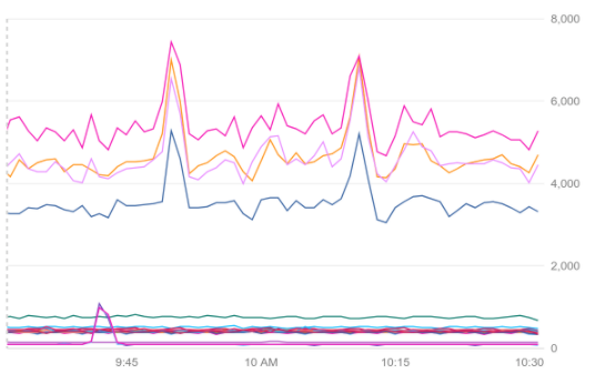
To display your time series with the highest possible resolution, use a line chart or a stacked-area chart. Choose a stacked-area chart when you want to view the sum of the time series, in addition to the contribution of each time series to the total. You can configure these charts to show only outliers, to compare current to past data, or to display statistical measures such as the "50th percentile". For more information, see Set chart display options.
To display time series with infrequent samples, such as quota metrics, use stacked-bar charts and set the time selector for the dashboard to at least one week. For examples that show how to chart quota metrics, see Chart and monitor quota metrics.
To display metrics with distribution values, use heatmap charts. Heatmaps use color to represent the values in the distribution. You can also display percentile lines or outliers. For more information, see About distribution-valued metrics.
Charts that show the most recent data
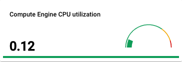
To view the most recent measurement, add a table, a gauge, or a scorecard to your dashboard. Tables can display multiple time series, and they let you sort and filter rows. In contrast, gauges and scorecards are indicators that display a single time series as compared to a color-coded threshold. For example, a red gauge indicates that the most recent measurement is in a danger range.
The following screenshot is an example of a gauge:
Avoid dashboard performance issues
The performance of a dashboard is sensitive to the number of charts it displays, and to the number of time series each chart displays. For example, when a chart displays many time series, it might take a long time to load or to refresh. The number of time series depends, in part, on the structure of the metric type and monitored-resource type associated with the time series. Each of these types has several labels; the Metrics list and Monitored resource list include the labels for each metric and monitored-resource type.
There is a single time series for each unique combination of values for the set of labels. The number of possible combinations is called the cardinality. For more information about labels, values, and cardinality, see Cardinality.
If you encounter performance issues when opening a dashboard or when displaying metric data, you can often mitigate the issues by using one of the techniques:
- Remove unnecessary information by filtering.
- Combine related information together by grouping time series.
- Focus on unusual data by sorting the time series that match a query, and then limiting the number of time series that are charted. For more information, see Show outliers.
- Reduce the number of labels or the range of values possible for a label for your user-defined metrics.
- Remove charts or other widgets from dashboards.
- Prioritize loading of metric data by grouping dashboard widgets.
Quotas and limits
For information about dashboard-specific quotas and limits, see Limits for charts.
What's next
Create dashboards:
Add widgets to your dashboards:
Configure dashboard properties: