This page illustrates how you can create dashboards by using the Cloud Monitoring API. For each example, the dashboard definition in JSON and the corresponding dashboard are shown. You can provide JSON to both Google Cloud CLI and to Cloud Monitoring API endpoints.
Cloud Monitoring also provides a curated set of dashboard definitions on GitHub. You can install these definitions in your Google Cloud project as custom dashboards. For information about this repository and how to install these dashboards, see Install sample dashboards.
When to use the API or the Google Cloud CLI
The Cloud Monitoring API and the Google Cloud CLI provide you with a way of managing many dashboards at once. While you can use the Google Cloud console to manage your dashboards, you might find it easier to use scripts that manage your custom dashboards in bulk.
You also need to use the API when you want to add the blank placeholder widget to your dashboard.
Using MQL or PromQL with the API
You create dashboards by using the dashboards.create
method. You pass to the API method a Dashboard object, which contains
one entry for each widget that the dashboard displays.
When a widget displays time-series data, such as a chart widget,
its entry in the Dashboard object
contains a TimeSeriesQuery object.
This object describes the time-series data to
chart, and you specify that data by using a
Monitoring filter, an
MQL query, or a PromQL query:
To use Monitoring filters, populate the
timeSeriesFieldfield. The examples on this page use Cloud Monitoring filters.To use an MQL query, populate the
timeSeriesQueryLanguagefield. For more information, see Building charts.To use a PromQL query, populate the
prometheusQueryfield. For general information, see PromQL in Cloud Monitoring.
Dashboard layouts
This section contains information about the different dashboard layouts that are available.
Dashboard in GridLayout
This dashboard shows a GridLayout with three widgets.
{
  "displayName": "Grid Layout Example",
  "gridLayout": {
    "columns": "2",
    "widgets": [
      {
        "title": "Widget 1",
        "xyChart": {
          "dataSets": {
            "timeSeriesQuery": {
              "timeSeriesFilter": {
                "filter": "metric.type=\"agent.googleapis.com/nginx/connections/accepted_count\"",
                "aggregation": {
                  "perSeriesAligner": "ALIGN_RATE"
                }
              },
              "unitOverride": "1"
            },
            "plotType": "LINE"
          },
          "timeshiftDuration": "0s",
          "yAxis": {
            "label": "y1Axis",
            "scale": "LINEAR"
          }
        }
      },
      {
        "text": {
          "content": "Widget 2"
        }
      },
      {
        "title": "Widget 3",
        "xyChart": {
          "dataSets": {
            "timeSeriesQuery": {
              "timeSeriesFilter": {
                "filter": "metric.type=\"agent.googleapis.com/nginx/connections/accepted_count\"",
                "aggregation": {
                  "perSeriesAligner": "ALIGN_RATE"
                }
              },
              "unitOverride": "1"
            },
            "plotType": "STACKED_BAR"
          },
          "timeshiftDuration": "0s",
          "yAxis": {
            "label": "y1Axis",
            "scale": "LINEAR"
          }
        }
      }
    ]
  }
}
The dashboard looks similar to the following example:

Dashboard in MosaicLayout
This dashboard shows a MosaicLayout with two widgets.
{
  "displayName": "Mosaic Layout Example",
  "mosaicLayout": {
    "columns": 12,
    "tiles": [
      {
        "xPos": 2,
        "yPos": 2,
        "width": 7,
        "height": 2,
        "widget": {
          "title": "CPU utilization in us-central1-a",
          "scorecard": {
            "timeSeriesQuery": {
              "timeSeriesFilter": {
                "filter": "metric.type=\"compute.googleapis.com/instance/cpu/utilization\" resource.type=\"gce_instance\" resource.label.zone=\"us-central1-a\"",
                "aggregation": {
                  "perSeriesAligner": "ALIGN_MEAN",
                  "crossSeriesReducer": "REDUCE_MAX"
                }
              },
              "unitOverride": "1"
            },
            "gaugeView": {
              "upperBound": 1.5
            },
            "thresholds": [
              {
                "value": 0.8,
                "color": "YELLOW",
                "direction": "ABOVE"
              },
              {
                "value": 1,
                "color": "RED",
                "direction": "ABOVE"
              }
            ]
          }
        }
      },
      {
        "xPos": 1,
        "yPos": 5,
        "width": 4,
        "height": 4,
        "widget": {
          "title": "My Chart",
          "xyChart": {
            "dataSets": [
              {
                "timeSeriesQuery": {
                  "timeSeriesFilter": {
                    "filter": "metric.type=\"compute.googleapis.com/instance/cpu/utilization\" resource.type=\"gce_instance\"",
                    "aggregation": {
                      "perSeriesAligner": "ALIGN_MEAN",
                      "crossSeriesReducer": "REDUCE_MAX",
                      "groupByFields": [
                        "resource.label.zone"
                      ]
                    }
                  },
                  "unitOverride": "'1'"
                },
                "plotType": "LINE",
                "minAlignmentPeriod": "60s"
              }
            ],
            "yAxis": {
              "label": "y1Axis",
              "scale": "LINEAR"
            }
          }
        }
      }
    ]
  }
}
The dashboard looks similar to the following example:

Dashboard in RowLayout
This dashboard displays a RowLayout with three widgets.
{
  "displayName": "Row Layout Example",
  "rowLayout": {
    "rows": [
      {
        "weight": "1",
        "widgets": [
          {
            "text": {
              "content": "Widget 1",
              "format": "MARKDOWN"
            }
          },
          {
            "text": {
              "content": "Widget 2",
              "format": "MARKDOWN"
            }
          },
          {
            "text": {
              "content": "Widget 3",
              "format": "MARKDOWN"
            }
          }
        ]
      }
    ]
  }
}
The dashboard looks similar to the following example:

Dashboard in ColumnLayout
This dashboard displays a ColumnLayout with three
widgets.
{
  "displayName": "Column Layout Example",
  "columnLayout": {
    "columns": [
      {
        "weight": "1",
        "widgets": [
          {
            "text": {
              "content": "Widget 1",
              "format": "MARKDOWN"
            }
          },
          {
            "text": {
              "content": "Widget 2",
              "format": "MARKDOWN"
            }
          },
          {
            "text": {
              "content": "Widget 3",
              "format": "MARKDOWN"
            }
          }
        ]
      }
    ]
  }
}
The dashboard looks similar to the following example:

Enable dashboard events, and add filters and labels
This section describes how you can add filters and labels to a dashboard, and how you can configure a dashboard to show events.
Enable events on dashboards
You can configure a dashboard to show events,
such as a Google Kubernetes Engine update event or a virtual machine failure event,
by including an annotations field in the Dashboard
object. The annotations field contains an instance of a
DashboardAnnotations object, which contains two fields:
The
defaultResourceNamefield lists the dashboard-level defaults for the Google Cloud projects to search for events. If you don't specify this field, then your selected project is searched.An array of
EventAnnotationobjects. Each object contains the following:- A
displayNamefield, which lets you define the label on the event-specific toggle. When this field isn't specified or when the value of this field is an empty string, the default name for the event is displayed. - An
enabledfield, which controls the value of the event's toggle. Whentrue, the toggle is in theonposition and events are shown on the dashboard. Whenfalse, the toggle is in theoffposition. - An
eventTypefield, which contains a value from theEventTypeenumeration. - A
filterfield, which lets you specify a query to append to the event-specific query. When the value of this field is an empty string, then the event-specific query is used. - A
resourceNamesfield, which lets you define a list of Google Cloud projects to search for events. When this field is an empty array, your selected project is searched.
- A
The following example shows an annotations field that specifies a
Google Kubernetes Engine event:
{
  "displayName": "Annotation example",
  "annotations": {
    "defaultResourceNames": [],
    "eventAnnotations": [
      {
        "displayName": "",
        "enabled": true,
        "eventType": "GKE_CLUSTER_UPDATE",
        "filter": "resource.labels.cluster_name=my-cluster",
        "resourceNames": []
      }
    ]
  },
  "dashboardFilters": [],
  "mosaicLayout": {
  ...
  },
  "labels": {}
}
In the previous example, the filter field is used to restrict the query
to the cluster my-name. The displayName field is set to
an empty string, so the default name for the event type is displayed on
the event's toggle. Finally, because the resourceNames is set to
an empty array, the log entries in your current Google Cloud project
are queried.
Add dashboard filters and variables
To control which data the widgets on a dashboard display, you can add variables and pinned filters. For more information and an example, see Dashboard filters.
Add dashboard labels
This sample shows a Dashboard object that
specifies the label named playbook.
{
  "displayName": "Example",
  "mosaicLayout": {
    "columns": 12,
    "tiles": [
      ...
    ]
  },
  "dashboardFilters": [],
  "labels": {
    "playbook": ""
  }
}
As the previous sample illustrates, the labels field is implemented as a
map, where the key and value fields are both strings. When you add a
label to a dashboard, set the key to the name of the label, and set the
value field to an empty string.
Adding labels to a dashboard is optional.
Dashboards with Widgets
This section includes examples of dashboards that contain different types of widgets.
Dashboard with an XyChart
This dashboard shows a dashboard with a basic XyChart. If
you ever used the Google Cloud console to create charts on dashboards, those charts
are instances of the XyChart widget.
Similar to the functionality provided in the Google Cloud console, the API
provides options to change the chart's PlotType or to
configure the chart's view modes.
{
  "dashboardFilters": [],
  "displayName": "Example line chart",
  "labels": {},
  "mosaicLayout": {
    "columns": 48,
    "tiles": [
      {
        "height": 16,
        "widget": {
          "title": "VM Instance - CPU utilization [MEAN]",
          "xyChart": {
            "chartOptions": {
              "mode": "COLOR"
            },
            "dataSets": [
              {
                "minAlignmentPeriod": "60s",
                "plotType": "LINE",
                "targetAxis": "Y1",
                "timeSeriesQuery": {
                  "timeSeriesFilter": {
                    "aggregation": {
                      "alignmentPeriod": "60s",
                      "crossSeriesReducer": "REDUCE_MEAN",
                      "groupByFields": [
                        "resource.label.\"zone\""
                      ],
                      "perSeriesAligner": "ALIGN_MEAN"
                    },
                    "filter": "metric.type=\"compute.googleapis.com/instance/cpu/utilization\" resource.type=\"gce_instance\""
                  }
                }
              }
            ],
            "thresholds": [],
            "yAxis": {
              "label": "",
              "scale": "LINEAR"
            }
          }
        },
        "width": 24
      }
    ]
  }
}
The chart on the dashboard looks similar to the following example:

The next section illustrates how to create a Log Analytics chart widget, how to display a threshold on a chart, and how to configure whether the chart uses the left Y-axis, right Y-axis, or both.
Dashboard with a Log Analytics chart
This dashboard shows a dashboard with a Log Analytics chart. The sample JSON contains a SQL query.
{
  "displayName": "Example",
  "dashboardFilters": [],
  "mosaicLayout": {
    "columns": 48,
    "tiles": [
      {
        "width": 24,
        "height": 16,
        "widget": {
          "title": "Sample analytics chart",
          "xyChart": {
            "chartOptions": {
              "mode": "COLOR"
            },
            "dataSets": [
              {
                "breakdowns": [],
                "dimensions": [
                  {
                    "column": "location",
                    "columnType": "STRING",
                    "maxBinCount": 5,
                    "sortColumn": "location",
                    "sortOrder": "SORT_ORDER_ASCENDING"
                  }
                ],
                "measures": [
                  {
                    "aggregationFunction": {
                      "parameters": [],
                      "type": "count"
                    },
                    "column": ""
                  }
                ],
                "plotType": "STACKED_BAR",
                "targetAxis": "Y1",
                "timeSeriesQuery": {
                  "opsAnalyticsQuery": {
                    "queryHandle": "",
                    "sql": "SELECT\n  CAST(JSON_VALUE(resource.labels.location) AS STRING) AS location,\n  severity,\nFROM\n  `VIEW`"
                  }
                }
              }
            ],
            "thresholds": [],
            "yAxis": {
              "label": "",
              "scale": "LINEAR"
            }
          }
        }
      }
    ]
  },
  "labels": {}
}
The chart on the dashboard looks similar to the following example:

Dashboard with an XyChart and a threshold
This dashboard shows a dashboard with a basic XyChart,
a threshold, and the left Y-axis configured.
{
  "dashboardFilters": [],
  "displayName": "Example line with threshold",
  "labels": {},
  "mosaicLayout": {
    "columns": 48,
    "tiles": [
      {
        "height": 16,
        "widget": {
          "title": "VM Instance - CPU utilization [MEAN]",
          "xyChart": {
            "chartOptions": {
              "mode": "COLOR"
            },
            "dataSets": [
              {
                "minAlignmentPeriod": "60s",
                "plotType": "LINE",
                "targetAxis": "Y1",
                "timeSeriesQuery": {
                  "timeSeriesFilter": {
                    "aggregation": {
                      "alignmentPeriod": "60s",
                      "crossSeriesReducer": "REDUCE_MEAN",
                      "groupByFields": [
                        "resource.label.\"zone\""
                      ],
                      "perSeriesAligner": "ALIGN_MEAN"
                    },
                    "filter": "metric.type=\"compute.googleapis.com/instance/cpu/utilization\" resource.type=\"gce_instance\""
                  }
                }
              }
            ],
            "thresholds": [
              {
                "label": "",
                "targetAxis": "Y1",
                "value": 0.2
              }
            ],
            "yAxis": {
              "label": "",
              "scale": "LINEAR"
            }
          }
        },
        "width": 24
      }
    ]
  }
}
In the preceding example, the JSON specifies the use of the left Y-axis because
it contains a y2Axis structure. In the targetAxis field, use "Y1" for the
right Y-axis and "Y2" for the left Y-axis. If you omit the targetAxis
field, then the right Y-axis is used.
The chart on this dashboard looks similar to the following example:

You can construct charts that display multiple metric types and that use
the left and right axes. The previous example illustrated a chart with
a single metric type, that is, there is one element in the dataSets array.
When you chart two metric types, the dataSets array contains two elements,
and each element specifies its targetAxis.
Dashboard with an XyChart with a STACKED_AREA PlotType
This dashboard shows an XyChart with a STACKED_AREA
PlotType.
{
  "dashboardFilters": [],
  "displayName": "Example stacked area",
  "labels": {},
  "mosaicLayout": {
    "columns": 48,
    "tiles": [
      {
        "height": 16,
        "widget": {
          "title": "VM Instance - CPU utilization [MEAN]",
          "xyChart": {
            "chartOptions": {
              "mode": "COLOR"
            },
            "dataSets": [
              {
                "minAlignmentPeriod": "60s",
                "plotType": "STACKED_AREA",
                "targetAxis": "Y1",
                "timeSeriesQuery": {
                  "timeSeriesFilter": {
                    "aggregation": {
                      "alignmentPeriod": "60s",
                      "crossSeriesReducer": "REDUCE_MEAN",
                      "groupByFields": [
                        "resource.label.\"zone\""
                      ],
                      "perSeriesAligner": "ALIGN_MEAN"
                    },
                    "filter": "metric.type=\"compute.googleapis.com/instance/cpu/utilization\" resource.type=\"gce_instance\""
                  }
                }
              }
            ],
            "thresholds": [],
            "yAxis": {
              "label": "",
              "scale": "LINEAR"
            }
          }
        },
        "width": 24
      }
    ]
  }
}
The chart on the dashboard looks similar to the following example:

Dashboard with an XyChart with a STACKED_BAR PlotType
This dashboard shows an XyChart with a STACKED_BAR
PlotType.
{
  "dashboardFilters": [],
  "displayName": "Example stacked bar",
  "labels": {},
  "mosaicLayout": {
    "columns": 48,
    "tiles": [
      {
        "height": 16,
        "widget": {
          "title": "VM Instance - CPU utilization [MEAN]",
          "xyChart": {
            "chartOptions": {
              "mode": "COLOR"
            },
            "dataSets": [
              {
                "minAlignmentPeriod": "60s",
                "plotType": "STACKED_BAR",
                "targetAxis": "Y1",
                "timeSeriesQuery": {
                  "timeSeriesFilter": {
                    "aggregation": {
                      "alignmentPeriod": "60s",
                      "crossSeriesReducer": "REDUCE_MEAN",
                      "groupByFields": [
                        "resource.label.\"zone\""
                      ],
                      "perSeriesAligner": "ALIGN_MEAN"
                    },
                    "filter": "metric.type=\"compute.googleapis.com/instance/cpu/utilization\" resource.type=\"gce_instance\""
                  }
                }
              }
            ],
            "thresholds": [],
            "yAxis": {
              "label": "",
              "scale": "LINEAR"
            }
          }
        },
        "width": 24
      }
    ]
  }
}
The dashboard looks similar to the following example:

Dashboard with a basic Scorecard
This dashboard shows a Scorecard without a gauge or
sparkline. The example shows the Compute Engine CPU utilization and the scorecard
has two thresholds. One threshold uses the color yellow to indicate that
CPU utilization is over 70%, the other threshold uses red to indicate that the
CPU utilization is over 90%.
Because the current CPU utilization is less than the specified thresholds, the color is green.
{
  "dashboardFilters": [],
  "displayName": "Example-basic scorecard",
  "labels": {},
  "mosaicLayout": {
    "columns": 48,
    "tiles": [
      {
        "height": 8,
        "widget": {
          "scorecard": {
            "thresholds": [
              {
                "color": "YELLOW",
                "direction": "ABOVE",
                "label": "",
                "value": 0.7
              },
              {
                "color": "RED",
                "direction": "ABOVE",
                "label": "",
                "value": 0.9
              }
            ],
            "timeSeriesQuery": {
              "outputFullDuration": true,
              "timeSeriesFilter": {
                "aggregation": {
                  "alignmentPeriod": "60s",
                  "crossSeriesReducer": "REDUCE_MEAN",
                  "groupByFields": [],
                  "perSeriesAligner": "ALIGN_MEAN"
                },
                "filter": "metric.type=\"compute.googleapis.com/instance/cpu/utilization\" resource.type=\"gce_instance\""
              }
            }
          },
          "title": "VM Instance - CPU utilization [MEAN]"
        },
        "width": 16
      }
    ]
  }
}
The dashboard looks similar to the following example:

Dashboard with a Scorecard with GaugeView
This dashboard adds a gauge to the basic scorecard in the previous example.
The GaugeView object can specify an upper and a lower bound, to specify the
range of values to show on the gauge. Since the scorecard shows values from
0 to 1, those upper and lower bounds are reasonable. To add the gauge, add the
following to the JSON for the basic scorecard:
  "gaugeView": {
    "lowerBound": 0,
    "upperBound": 1,
  },
The following shows the complete modified dashboard specification: The current value is under the thresholds, which are colored appropriately on the gauge.
{
  "dashboardFilters": [],
  "displayName": "Example-Gauge",
  "labels": {},
  "mosaicLayout": {
    "columns": 48,
    "tiles": [
      {
        "height": 8,
        "widget": {
          "scorecard": {
            "gaugeView": {
              "lowerBound": 0,
              "upperBound": 1
            },
            "thresholds": [
              {
                "color": "YELLOW",
                "direction": "ABOVE",
                "label": "",
                "value": 0.7
              },
              {
                "color": "RED",
                "direction": "ABOVE",
                "label": "",
                "value": 0.9
              }
            ],
            "timeSeriesQuery": {
              "outputFullDuration": true,
              "timeSeriesFilter": {
                "aggregation": {
                  "alignmentPeriod": "60s",
                  "crossSeriesReducer": "REDUCE_MEAN",
                  "groupByFields": [],
                  "perSeriesAligner": "ALIGN_MEAN"
                },
                "filter": "metric.type=\"compute.googleapis.com/instance/cpu/utilization\" resource.type=\"gce_instance\""
              }
            }
          },
          "title": "VM Instance - CPU utilization [MEAN]"
        },
        "width": 16
      }
    ]
  }
}
The chart on this dashboard looks similar to the following example:

Dashboard with a Scorecard with SparkChartView
This dashboard replaces the gauge in the previous example with a sparkline.
The SparkChartView object can create line charts or bar charts on a scorecard.
This example uses a line. As long as the value doesn't violate a threshold, it
is green. To add the sparkline, replace the gaugeView JSON object in the
previous chart with the following:
  "sparkChartView": {
    "sparkChartType": "SPARK_LINE"
  },
The scorecard looks similar to the following example:

Dashboard with a PieChart widget
Dashboards can display data by using a pie chart. Each time series contributes one slice to the pie. Pie charts don't show data over time; instead, they show only the most recent value.
All pie charts are specified by the PieChart widget.
To configure the chart to display the sum of the most recent measurements,
set the chartType field to DONUT. Otherwise, set this field to the
value of PIE.
"pieChart": {
  "chartType": "DONUT",
},
The following example configures a dashboard with two pie charts, with one pie chart configured as a donut:
{
  "dashboardFilters": [],
  "displayName": "Example Pie Donut",
  "labels": {},
  "mosaicLayout": {
    "columns": 48,
    "tiles": [
      {
        "height": 16,
        "widget": {
          "pieChart": {
            "chartType": "DONUT",
            "dataSets": [
              {
                "minAlignmentPeriod": "60s",
                "timeSeriesQuery": {
                  "timeSeriesFilter": {
                    "aggregation": {
                      "alignmentPeriod": "60s",
                      "perSeriesAligner": "ALIGN_RATE"
                    },
                    "filter": "metric.type=\"compute.googleapis.com/instance/disk/read_bytes_count\" resource.type=\"gce_instance\"",
                    "secondaryAggregation": {
                      "alignmentPeriod": "60s",
                      "perSeriesAligner": "ALIGN_MEAN"
                    }
                  }
                }
              }
            ]
          },
          "title": "VM Instance - Disk read bytes [MEAN]"
        },
        "width": 24
      },
      {
        "height": 16,
        "widget": {
          "pieChart": {
            "chartType": "PIE",
            "dataSets": [
              {
                "minAlignmentPeriod": "60s",
                "timeSeriesQuery": {
                  "timeSeriesFilter": {
                    "aggregation": {
                      "alignmentPeriod": "60s",
                      "perSeriesAligner": "ALIGN_RATE"
                    },
                    "filter": "metric.type=\"compute.googleapis.com/instance/disk/read_bytes_count\" resource.type=\"gce_instance\"",
                    "secondaryAggregation": {
                      "alignmentPeriod": "60s",
                      "perSeriesAligner": "ALIGN_MEAN"
                    }
                  }
                }
              }
            ]
          },
          "title": "VM Instance - Disk read bytes [MEAN]"
        },
        "width": 24,
        "xPos": 24
      },
    ]
  }
}
As shown in the following screenshot, both widgets display data as a pie chart, with one widget displaying the sum of the most recent values:

Dashboard with a Treemap widget
To view the most recent data as a series of nested rectangles, where each
rectangle corresponds to a unique collection of label values, add a tree map.
Assume that you've aggregated the data you are charting by the zone label.
If you set the widget type to treemap, then each rectangle on the
treemap corresponds to one zone. The color saturation of a rectangle is
proportional to the value it represents.
When exploring a treemap, use your pointer to activate the tooltip for the rectangle.
The following JSON configures a Treemap widget which
aggregates the time series by zone and storage type:
{
  "displayName": "Example Treemap",
  "dashboardFilters": [],
  "labels": {},
  "mosaicLayout": {
    "columns": 48,
    "tiles": [
      {
        "xPos": 24,
        "height": 16,
        "width": 24,
        "widget": {
          "title": "VM Instance - Write read bytes [SUM]",
          "id": "",
          "treemap": {
            "dataSets": [
              {
                "breakdowns": [],
                "measures": [],
                "timeSeriesQuery": {
                  "outputFullDuration": true,
                  "timeSeriesFilter": {
                    "aggregation": {
                      "alignmentPeriod": "60s",
                      "crossSeriesReducer": "REDUCE_SUM",
                      "groupByFields": [
                        "resource.label.\"zone\"",
                        "metric.label.\"storage_type\""
                      ],
                      "perSeriesAligner": "ALIGN_RATE"
                    },
                    "filter": "metric.type=\"compute.googleapis.com/instance/disk/write_bytes_count\" resource.type=\"gce_instance\""
                  },
                  "unitOverride": ""
                }
              }
            ],
            "treemapHierarchy": [
              "resource.label.\"zone\"",
              "metric.label.\"storage_type\""
            ]
          }
        }
      }
    ]
  }
}
The following screenshot shows the treemap widget with the previous configuration:
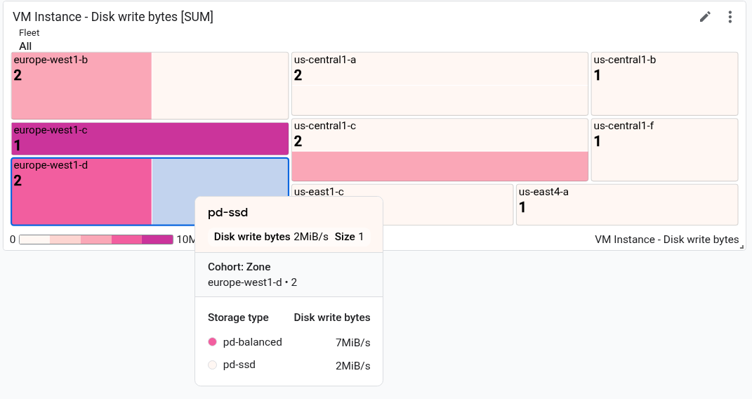
In the screenshot, the tooltip is shown for one rectangle.
Dashboard with a TimeSeriesTable widget
Dashboards can display data in a tabular format, where there is one row for each combination of unique label values. Tables don't show data over time; instead, they show either the most recent value or an aggregated value.
All tables are specified by the TimeSeriesTable widget:
To configure the time series to display, use the
dataSetsfield. Each object in thedataSetsarray corresponds to a single metric type. If you query for multiple metric types, the Google Cloud console attempts to display the most recent value for each query in the same table row. For more information, see How tables merge data from multiple metric types.- The
TimeSeriesQueryfield specifies the metric type. - If you want the table to display the aggregated value, where the data
is aggregated over the time-range value set by your dashboard, set the
timeSeriesQuery.outputFullDurationfield totrue.
- The
To configure the maximum number of rows to display, set the
pickTimeSeriesFilterfield. For example, to display only the two time series with the largest average value over the previous 10 minutes, include the following:"pickTimeSeriesFilter": { "direction": "TOP", "numTimeSeries": 2, "rankingMethod": "METHOD_MEAN" },If you omit the
pickTimeSeriesFilterfield, then the table displays a maximum of 300 rows.To configure how the table displays the data, use the
metricVisualizationfield:- To display only a value like "25%", either omit this field or set the
value to
"NUMBER". When you use this configuration, the Google Cloud console displays the widget as a Table widget. - To display the value and a visual indicator of the value compared to the
range of possible values, set the value of this field to
"BAR". When you use this configuration, the Google Cloud console displays the widget as a Top List widget.
- To display only a value like "25%", either omit this field or set the
value to
To configure which columns are displayed and the properties of the column, use the
columnSettingsarray. If this field isn't specified, then the table displays one column for each label.The value of the
"column"field must be set to label key or tovalue, which refers to the latest value of the time series. You can set the display name for a column, and you can configure the alignment of the data within the table cell:- To customize the column header, set the
displayNamefield. - To color the cell that displays the most recent value based on how the
value compares to a threshold, add a
thresholdsobject. - To change the text alignment, add an
alignmentfield.
The following example illustrates two columns:
"columnSettings": [ { "column": "device_name", "displayName": "Device", "visible": true }, { "alignment": "CENTER", "column": "value", "displayName": "Disk Write Bytes", "thresholds": [ { "color": "YELLOW", "direction": "ABOVE", "value": 4000 }, { "color": "RED", "direction": "ABOVE", "value": 5000 } ], "visible": true } ],- To customize the column header, set the
The following JSON describes a dashboard with two tables. The first table displays two metric types, the number of bytes read from instances and the number of bytes written to instances. An aggregated value is shown along with a reference bar. The second table shows the latest value of one metric type, and the value column has been configured to color code the cell based on how the value compares to a threshold:
{
  "displayName": "Example",
  "mosaicLayout": {
    "columns": 48,
    "tiles": [
      {
        "width": 44,
        "height": 17,
        "widget": {
          "title": "VM Instance - Disk read bytes [RATE], Disk write bytes [RATE]",
          "timeSeriesTable": {
            "dataSets": [
              {
                "timeSeriesQuery": {
                  "timeSeriesFilter": {
                    "filter": "metric.type=\"compute.googleapis.com/instance/disk/read_bytes_count\" resource.type=\"gce_instance\"",
                    "aggregation": {
                      "alignmentPeriod": "60s",
                      "perSeriesAligner": "ALIGN_RATE",
                      "groupByFields": []
                    },
                    "pickTimeSeriesFilter": {
                      "rankingMethod": "METHOD_MEAN",
                      "numTimeSeries": 30,
                      "direction": "TOP"
                    }
                  },
                  "unitOverride": "",
                  "outputFullDuration": true
                },
                "tableTemplate": "",
                "minAlignmentPeriod": "60s"
              },
              {
                "timeSeriesQuery": {
                  "timeSeriesFilter": {
                    "filter": "metric.type=\"compute.googleapis.com/instance/disk/write_bytes_count\" resource.type=\"gce_instance\"",
                    "aggregation": {
                      "alignmentPeriod": "60s",
                      "perSeriesAligner": "ALIGN_RATE",
                      "groupByFields": []
                    },
                    "pickTimeSeriesFilter": {
                      "rankingMethod": "METHOD_MEAN",
                      "numTimeSeries": 30,
                      "direction": "TOP"
                    }
                  },
                  "unitOverride": "",
                  "outputFullDuration": true
                },
                "tableTemplate": "",
                "minAlignmentPeriod": "60s"
              }
            ],
            "metricVisualization": "BAR",
            "columnSettings": [
              {
                "column": "Name (from instance_id)",
                "visible": true
              },
              {
                "column": "zone",
                "visible": true
              },
              {
                "column": "device_name",
                "visible": true
              },
              {
                "column": "storage_type",
                "visible": true
              },
              {
                "column": "device_type",
                "visible": true
              },
              {
                "column": "value",
                "visible": true,
                "displayName": "Read bytes"
              },
              {
                "column": "value-1",
                "visible": true,
                "displayName": "Written bytes"
              }
            ],
            "opsAnalyticsSettings": {
              "maxRows": "0",
              "showFilterBar": false,
              "pageSize": "0"
            },
            "displayColumnType": false
          },
          "id": ""
        }
      },
      {
        "yPos": 17,
        "width": 44,
        "height": 16,
        "widget": {
          "title": "VM Instance - Disk write bytes [RATE]",
          "timeSeriesTable": {
            "columnSettings": [
              {
                "column": "device_name",
                "displayName": "Device",
                "visible": true
              },
              {
                "alignment": "LEFT",
                "column": "instance_name",
                "displayName": "Instance name",
                "visible": true
              },
              {
                "column": "storage_type",
                "displayName": "Storage type",
                "visible": true
              },
              {
                "column": "device_type",
                "displayName": "Device Type",
                "visible": true
              },
              {
                "alignment": "CENTER",
                "column": "value",
                "displayName": "Disk Write Bytes",
                "thresholds": [
                  {
                    "color": "YELLOW",
                    "direction": "ABOVE",
                    "label": "",
                    "value": 4000
                  },
                  {
                    "color": "RED",
                    "direction": "ABOVE",
                    "label": "",
                    "value": 5000
                  }
                ],
                "visible": true
              },
              {
                "alignment": "LEFT",
                "column": "Name (from instance_id)",
                "displayName": "ID",
                "visible": true
              }
            ],
            "dataSets": [
              {
                "minAlignmentPeriod": "60s",
                "timeSeriesQuery": {
                  "timeSeriesFilter": {
                    "aggregation": {
                      "alignmentPeriod": "60s",
                      "perSeriesAligner": "ALIGN_RATE"
                    },
                    "filter": "metric.type=\"compute.googleapis.com/instance/disk/write_bytes_count\" resource.type=\"gce_instance\""
                  }
                }
              }
            ],
            "displayColumnType": false,
            "metricVisualization": "NUMBER",
            "opsAnalyticsSettings": {
              "maxRows": "0",
              "pageSize": "0",
              "showFilterBar": false
            }
          }
        }
      }
    ]
  },
  "dashboardFilters": [],
  "labels": {}
}
The following screenshot illustrates the previously-defined table:

Dashboard with a Text widget
This example shows a dashboard with a Text widget.
{
  "dashboardFilters": [],
  "displayName": "DB2+TE",
  "labels": {},
  "mosaicLayout": {
    "columns": 48,
    "tiles": [
    ...
      {
        "height": 16,
        "widget": {
          "text": {
            "content": "# Support information\n\n\nContact information: my-support-team@example.com\nOnline help: [Playbooks](https://example.com)\n\n",
            "format": "MARKDOWN",
            "style": {
              "backgroundColor": "",
              "fontSize": "FS_LARGE",
              "horizontalAlignment": "H_LEFT",
              "padding": "P_EXTRA_SMALL",
              "textColor": "",
              "verticalAlignment": "V_TOP"
            }
          }
        },
        "width": 24,
        "yPos": 14
      }
    ]
  }
}
The text widget looks similar to the following example:

Dashboard with an AlertChart widget
This dashboard shows a dashboard with an AlertChart
widget:
{
  "category": "CUSTOM",
  "displayName": "Alerting policy chart example",
  "mosaicLayout": {
    "columns": 12,
    "tiles": [
      {
        "height": 4,
        "widget": {
          "alertChart": {
            "name": "projects/my-project/alertPolicies/14205854094151528373"
          }
        },
        "width": 6,
      }
    ]
  }
}
Unlike other dashboard widgets, you don't specify a title or a metric filter
for these widgets. Instead, you specify the resource name for an alerting
policy. The last entry in the name field is the alerting policy identifier.
The chart on the dashboard looks similar to the following example:

In this example, the alerting policy is monitoring the CPU usage of two
different virtual machines. The dashed line shows the condition threshold,
which is set to 50%. The green chip with the label No incidents
indicates that there are no open incidents for the alerting policy. If
you place your pointer on the incidents chip, then a dialog opens that
links to the underlying alerting policy.
Dashboard with an ErrorReportingPanel widget
This dashboard shows a dashboard with an ErrorReportingPanel
widget:
{
  "dashboardFilters": [],
  "displayName": "Error reporting widget",
  "labels": {},
  "mosaicLayout": {
    "columns": 48,
    "tiles": [
      {
        "height": 16,
        "widget": {
          "errorReportingPanel": {
            "projectNames": [
              "projects/my-project"
            ],
            "services": [],
            "versions": []
          },
          "title": "Error Reporting Panel"
        },
        "width": 24,
      }
    ]
  }
}
We recommend that you configure the height of an error-reporting panel to be at least 16 units, and its width to be at least 24 units. In the previous example, the widget has a height of 16 units and width of 24 units.
The error-reporting panel displays the error groups from the selected project, and this panel can restrict the error groups to a specific resource type, service, or version of a service. The following example illustrates an error-reporting panel:

Dashboard with an IncidentList widget
This dashboard shows a dashboard with an IncidentList
widget:
{
  "category": "CUSTOM",
  "dashboardFilters": [],
  "displayName": "Incident widget",
  "labels": {},
  "mosaicLayout": {
    "columns": 12,
    "tiles": [
      {
        "height": 5,
        "widget": {
          "incidentList": {
            "monitoredResources": [],
            "policyNames": []
          },
          "title": "Incidents"
        },
        "width": 8,
        "xPos": 0,
        "yPos": 0
      }
    ]
  }
}
The previous example sets the title field to Incidents, and it configures
the widget to display all incidents for resources of type gce_instance.
When you configure this widget, you can select multiple alerting policies or
multiple resource types.
The incident widget on the dashboard looks similar to the following example:

Dashboard with a LogsPanel widget
This dashboard shows a dashboard with a LogsPanel
widget:
{
  "category": "CUSTOM",
  "displayName": "Logs Panel",
  "mosaicLayout": {
    "columns": 12,
    "tiles": [
      {
        "height": 4,
        "widget": {
          "logsPanel": {
            "filter": "",
            "resourceNames": [
              "projects/012012012012"
            ]
          },
          "title": "Logs Panel"
        },
        "width": 6,
        "xPos": 0,
        "yPos": 0
      }
    ]
  }
}
We recommend that you configure the height of a logs panel to be at least 3 units, and its width to be at least 4 units. In the previous example, the widget has a height of 4 units and width of 6 units.
The logs panel displays the logs from the Google Cloud projects listed
in the resourceNames field. The previous example specifies only one project;
however, you can include multiple projects in this list.
The logs panel looks similar to the following example:

For troubleshooting information, see API call to create dashboard with a logs panel fails.
Dashboard with a CollapsibleGroup widget
This dashboard shows a dashboard with a CollapsibleGroup
widget:
{
  "category": "CUSTOM",
  "displayName": "Group testing",
  "mosaicLayout": {
    "columns": 12,
    "tiles": [
      {
        "height": 4,
        "widget": {
          "collapsibleGroup": {
            "collapsed": false
          },
          "title": "My group"
        },
        "width": 12,
        "xPos": 0,
        "yPos": 0
      },
      {
        "height": 4,
        "widget": {
          "title": "VM Instance - CPU utilization [MEAN]",
          "xyChart": {
            "chartOptions": {
              "mode": "COLOR"
            },
            "dataSets": [
              {
                "minAlignmentPeriod": "60s",
                "plotType": "LINE",
                "targetAxis": "Y1",
                "timeSeriesQuery": {
                  "apiSource": "DEFAULT_CLOUD",
                  "timeSeriesFilter": {
                    "aggregation": {
                      "alignmentPeriod": "60s",
                      "crossSeriesReducer": "REDUCE_NONE",
                      "perSeriesAligner": "ALIGN_MEAN"
                    },
                    "filter": "metric.type=\"compute.googleapis.com/instance/cpu/utilization\" resource.type=\"gce_instance\"",
                    "secondaryAggregation": {
                      "alignmentPeriod": "60s",
                      "crossSeriesReducer": "REDUCE_NONE",
                      "perSeriesAligner": "ALIGN_NONE"
                    }
                  }
                }
              }
            ],
            "thresholds": [],
            "timeshiftDuration": "0s",
            "yAxis": {
              "label": "y1Axis",
              "scale": "LINEAR"
            }
          }
        },
        "width": 6,
        "xPos": 0,
        "yPos": 0
      }
    ]
  }
}
In the previous example, the collapsible group widget contains a single chart
that displays the CPU utilization of a VM instance. Collapsible group widgets
span an entire row of a table. A widget is included in a group when the
group's (x,y) position and height specifications include the (x,y)
position of the widget. In the previous example, the group is at the position
of (0,0) and its height is 4. The xyChart is at the position of (0,0), so
it is included in the group. However, if the position of that chart is
changed to be (0,5), then the chart is excluded from the group. Lastly, when
a widget's (x,y) position result in the widget being included in the group, the
height of the collapsible group widget might be expanded.
To include a group widget on a dashboard, the dashboard must have a
MosaicLayout.
The collapsible group widget looks similar to the following example:

Dashboard with a SingleViewGroup widget
A SingleViewGroup widget displays one member of a
group at a time. You specify the charts and other widgets that are members
in the group. Also, you control which widget in the group is displayed
by using a menu on the SingleViewGroup widget.
The SingleViewGroup widget supports two display styles,
DROPDOWN and TAB. The difference between these two styles is how you
select which member of the group to show. Widgets with a DROPDOWN style
provide a menu. Widgets with a TAB style provide tabs on the
widget's toolbar:
{
  "dashboardFilters": [],
  "displayName": "Example",
  "labels": {},
  "mosaicLayout": {
    "columns": 48,
    "tiles": [
      {
        "height": 16,
        "widget": {
          "singleViewGroup": {
            "displayType": "DROPDOWN"
          },
          "title": "Untitled group"
        },
        "width": 24,
        "yPos": 16
      },
      {
        "height": 16,
        "widget": {
          "title": "VM Instance - Disk read bytes [RATE]",
          "xyChart": {
            "chartOptions": {
              "mode": "COLOR"
            },
            "dataSets": [
              {
                "minAlignmentPeriod": "60s",
                "plotType": "LINE",
                "targetAxis": "Y1",
                "timeSeriesQuery": {
                  "timeSeriesFilter": {
                    "aggregation": {
                      "alignmentPeriod": "60s",
                      "perSeriesAligner": "ALIGN_RATE"
                    },
                    "filter": "metric.type=\"compute.googleapis.com/instance/disk/read_bytes_count\" resource.type=\"gce_instance\""
                  }
                }
              }
            ],
            "thresholds": [],
            "yAxis": {
              "label": "",
              "scale": "LINEAR"
            }
          }
        },
        "width": 24,
        "yPos": 16
      },
      {
        "height": 16,
        "widget": {
          "title": "VM Instance - Disk write bytes [RATE]",
          "xyChart": {
            "chartOptions": {
              "mode": "COLOR"
            },
            "dataSets": [
              {
                "minAlignmentPeriod": "60s",
                "plotType": "LINE",
                "targetAxis": "Y1",
                "timeSeriesQuery": {
                  "timeSeriesFilter": {
                    "aggregation": {
                      "alignmentPeriod": "60s",
                      "perSeriesAligner": "ALIGN_RATE"
                    },
                    "filter": "metric.type=\"compute.googleapis.com/instance/disk/write_bytes_count\" resource.type=\"gce_instance\""
                  }
                }
              }
            ],
            "thresholds": [],
            "yAxis": {
              "label": "",
              "scale": "LINEAR"
            }
          }
        },
        "width": 24,
        "yPos": 16
      }
    ]
  }
}
As shown in the previous example, the tiles array contains one
SingleViewGroup object; however, that object doesn't specify which objects
it contains. Instead, membership in the SingleViewGroup object is determined
by the values of the width and yPos fields. Objects whose values for the
width and yPos fields match the
values of the SingleViewGroup object are contained by the
SingleViewGroup object. In the previous example, the SingleViewGroup object
contains two charts.
Dashboard with a SectionHeader widget
A SectionHeader widget creates a horizontal divider in
your dashboard, and it creates an entry in the dashboard's table of
contents. You can customize the entry in the table of contents, and include
additional information in the widget. You can also configure the widget
to add a divider to the table of contents after the section header entry.
This dashboard shows a dashboard with a single chart and
a SectionHeader widget:
{
  "dashboardFilters": [],
  "displayName": "Example",
  "labels": {},
  "mosaicLayout": {
    "columns": 48,
    "tiles": [
      {
        "height": 16,
        "widget": {
          "title": "VM Instance - Disk write bytes [RATE]",
          "xyChart": {
            "chartOptions": {
              "mode": "COLOR"
            },
            "dataSets": [
              {
                "minAlignmentPeriod": "60s",
                "plotType": "LINE",
                "targetAxis": "Y1",
                "timeSeriesQuery": {
                  "timeSeriesFilter": {
                    "aggregation": {
                      "alignmentPeriod": "60s",
                      "perSeriesAligner": "ALIGN_RATE"
                    },
                    "filter": "metric.type=\"compute.googleapis.com/instance/disk/write_bytes_count\" resource.type=\"gce_instance\""
                  }
                }
              }
            ],
            "thresholds": [],
            "yAxis": {
              "label": "",
              "scale": "LINEAR"
            }
          }
        },
        "width": 24,
        "yPos": 4
      },
      {
        "height": 4,
        "widget": {
          "sectionHeader": {
            "dividerBelow": true,
            "subtitle": "Instance metrics"
          },
          "title": "Metrics"
        },
        "width": 48
      }
    ]
  }
}
In the SectionHeader object, the value of the title field is displayed
both in the widget and in the table of contents. The value of the
subtitle field is displayed only by the widget. When the value of
dividerBelow is true, then a divider is added to the table of contents.
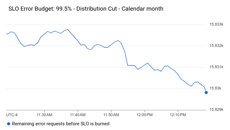
Dashboard with an SLO widget
This dashboard shows a dashboard with a SLO widget:
{
  "dashboardFilters": [],
  "displayName": "Example",
  "labels": {},
  "mosaicLayout": {
    "columns": 48,
    "tiles": [
      {
        "height": 16,
        "widget": {
          "title": "SLO Error Budget: 99.5% - Distribution Cut - Calendar month",
          "xyChart": {
            "chartOptions": {
              "mode": "COLOR"
            },
            "dataSets": [
              {
                "breakdowns": [],
                "dimensions": [],
                "legendTemplate": "Remaining error requests before SLO is burned",
                "measures": [],
                "plotType": "LINE",
                "targetAxis": "Y1",
                "timeSeriesQuery": {
                  "timeSeriesFilter": {
                    "aggregation": {
                      "perSeriesAligner": "ALIGN_NEXT_OLDER"
                    },
                    "filter": "select_slo_budget(\"projects/Project_Number/services/SERVICE_ID/serviceLevelObjectives/SLO_ID\")",
                  },
                  "unitOverride": "1"
                }
              }
            ],
            "thresholds": []
          }
        },
        "width": 24
      }
    ]
  }
}
As the previous JSON shows, SLO charts are represented as
XyChart objects. These objects specify all
aggregation fields, thresholds, and the
value of the filter field is a time-series selector. For more information
about these selectors, see Retrieving SLO data.
The SLO widget looks similar to the following example:
Dashboard with a blank widget
This example shows a dashboard with an empty, placeholder widget.
The value of the displayName field appears in the widget.
{
  "displayName": "Demo Dashboard",
  "gridLayout": {
    "widgets": [
      {
        "blank": {}
      }
    ]
  }
}
The dashboard looks similar to the following example:

Dashboard with widget-visibility configured
This dashboard contains a text widget and a variable. The value of the variable determines whether the text widget is displayed or hidden:
The variable named
showhas a default value ofa. The values of the variable are defined asa,b, andc. Because thevalueTypefield isSTRING_ARRAY, the variable can also be set to values likea or b.In the text widget, the entry labeled
visibilityConditiondefines the visibility of the widget. When the value of the variableshowincludesb, then the text widget is displayed. Otherwise, the text widget isn't displayed.
{
  "displayName": "Conditional Widget Example",
  "mosaicLayout": {
    "columns": 48,
    "tiles": [
      {
        "yPos": 16,
        "width": 24,
        "height": 16,
        "widget": {
          "title": "A text widget",
          "text": {
            "content": "Example showing how to use a custom variable to control visibility.",
            "format": "MARKDOWN",
            "style": {
              "backgroundColor": "#FFFFFF",
              "fontSize": "FS_LARGE",
              "horizontalAlignment": "H_LEFT",
              "padding": "P_EXTRA_SMALL",
              "pointerLocation": "POINTER_LOCATION_UNSPECIFIED",
              "textColor": "#212121",
              "verticalAlignment": "V_TOP"
            }
          },
          "visibilityCondition": {
            "templateVariableCondition": {
              "templateVariable": "show",
              "templateVariableValue": "b",
              "comparator": "REGEX_FULL_MATCH"
            }
          }
        }
      }
    ]
  },
  "dashboardFilters": [
    {
      "labelKey": "",
      "templateVariable": "show",
      "stringArrayValue": {
        "values": [
          "a"
        ]
      },
      "filterType": "VALUE_ONLY",
      "valueType": "STRING_ARRAY",
      "stringArray": {
        "values": [
          "a",
          "b",
          "c"
        ]
      }
    }
  ],
  "labels": {}
}
For restrictions related to configuring the visibility of a widget, see Set the visibility of a widget.