Explore heatmaps
This page describes how to analyze the heatmap in a Key Visualizer scan so you can identify the source of a Bigtable performance issue.
Before you read this page, you should be familiar with the overview of Key Visualizer. You may also want to:
- Learn how to open a Key Visualizer scan.
- See examples of common patterns in Key Visualizer heatmaps.
Review diagnostic messages
If Key Visualizer identifies an issue with your Bigtable usage patterns, the Key Visualizer scan will include diagnostic messages above the heatmap. Click on one of the diagnostic messages for detailed information about the issue.
For descriptions of each diagnostic message, see Key Visualizer diagnostic messages.
Adjust brightness
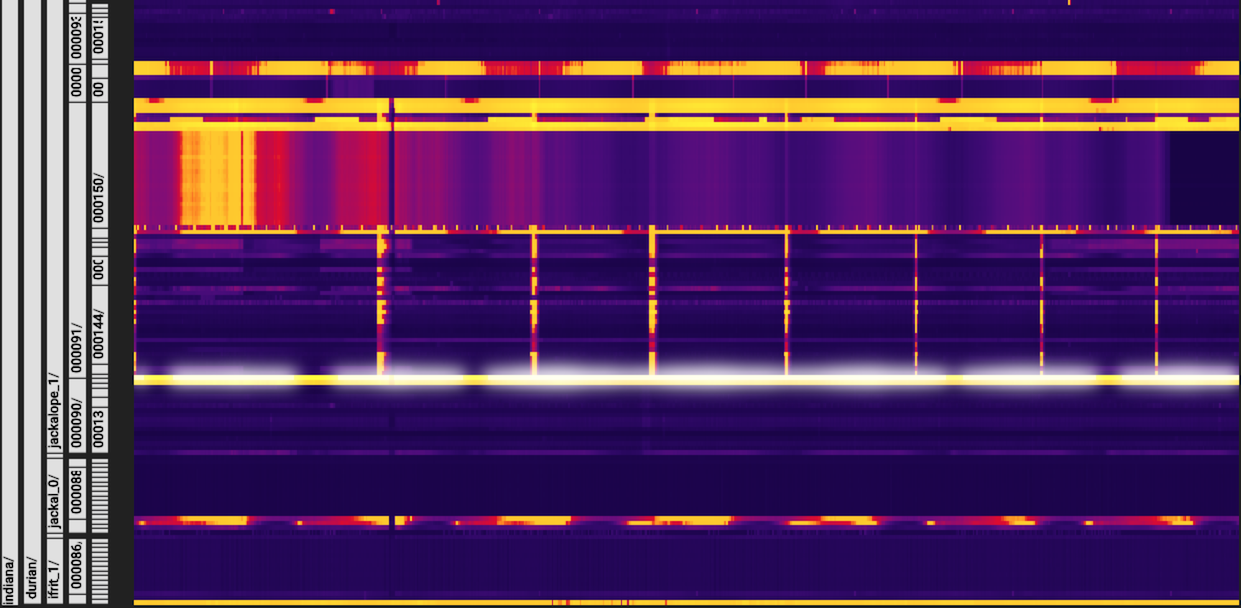
Key Visualizer heatmaps use dark colors to indicate normal or low values, and bright colors to indicate high values. If the colors in a heatmap are too bright or too dark, it might be difficult to see important patterns for a metric.
Keep in mind that for most metrics, Key Visualizer identifies which values are "high" and "low" based entirely on your usage of that table. For example, if you perform 20 reads per second in a specific row range and 1 read per second in other row ranges, Key Visualizer will use a bright color for that specific row range, even though 20 reads per second is a low number for Bigtable. The Warnings metrics and Performance metrics are exceptions to this rule—if these metrics appear in bright colors, then Key Visualizer has identified a potential problem.
To adjust the colors that are used for different values, use the + / - buttons on either side of the Adjust Brightness brightness_6 icon. When you increase the brightness, you lower the range of values that each color represents; when you lower the brightness, you increase the range of values.
Zoom in on time periods and row key ranges
When you open a heatmap, it displays values for the entire time period included in the scan, as well as the entire range of row keys in your table. If you notice an issue during a specific time period, or in a specific range of row keys, you can zoom in to examine the issue more closely.
There are several ways to zoom in or out:
- Scroll up or down within the heatmap.
- Click the Rectangular Zoom crop button, then click and drag to select an area to enlarge.
- Press and hold the
Shiftkey, then click and drag to select an area to enlarge. - Return to the previous area of the heatmap by pressing the
BackspaceorDeletekey. - Zoom out to view the entire table by clicking the Reset Zoom
zoom_out_map button or pressing the
Rkey.
Drill down by row key prefix
Row keys are often composed of a hierarchy of values, with each value separated by a delimiter. For
example, the row key memusage#1423523569918 contains an identifier for all rows that
capture memory usage, followed by a timestamp that identifies a specific set of data within that
group.
Key Visualizer automatically recognizes this type
of row key and breaks it down into a hierarchy, which helps you drill down into
the data for specific ranges of row keys more quickly.
To drill down into the heatmap's data for a group of row keys that share a common prefix:
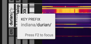
Move the cursor over one of the levels in the row-key hierarchy that appears to the left of the heatmap.
Key Visualizer highlights the area of the heatmap that shows this level of the hierarchy. It also shows the key prefix for all of the row keys at this level.

Click the level of the row-key hierarchy that you want to examine.
Key Visualizer zooms in on this level of the hierarchy.

Click another level of the row-key hierarchy to zoom in further, or press the
BackspaceorDeletekey to return to the previous area.
Pin details about a metric
As you move your cursor over a heatmap, Key Visualizer displays a tooltip that contains details about the metric that is under the cursor. You can pin this tooltip in place by clicking on the heatmap. Pinned tooltips show more detail about the metric. Pinning a tooltip also makes it easier to take a screenshot of the tooltip or copy information from the tooltip.
Switch metrics
By default, when you open a Key Visualizer scan, it displays the Ops metric, which gives you an overview of your usage pattern for the table. You can switch to a different metric at any time by clicking the Metric drop-down list above the heatmap, then clicking the metric you want to view. If an item in the list is disabled, the value of that metric was always zero.
For descriptions of each metric, see Key Visualizer Metrics.
Switch key format
By default, keys are displayed as serialized bytes. This means that printable characters display as ASCII characters, or text. Non-printable characters are displayed as a series of backslashes followed by three-digit numbers. Each number represents the octal representation of a byte.
For example, a key that contains both printable and non-printable bytes might look like this:
\360q\364\031\253\735\223xdf\272\022\362\251bn\101
You can choose to view keys in hexadecimal format instead of text format:
- Click the Settings button.
- Under Preferences, choose Hexadecimal.
- Click OK.
Find connections between different metrics
You can view multiple metrics at the same time in Key Visualizer when you want to compare metrics or find correlations between metrics. For example, you might want to see if hotspots on your Ops heatmap correlate with any hotspots on your Latency heatmap, which might indicate that the number of operations within a key bucket was causing increased latency.
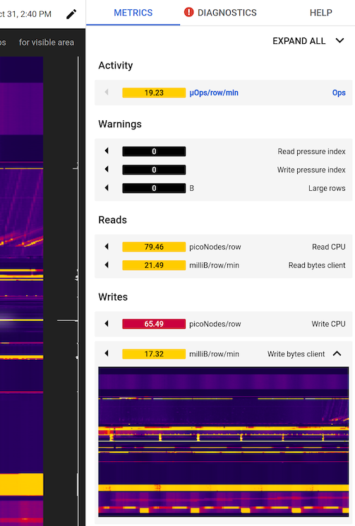
To view multiple metrics and their values at the same time, click Multimetric
near the top right corner. A list of metrics appears in a pane to the right of
the scan.

To examine several metrics at once, use the following tools in the multimetric pane:
To show or hide miniature heatmaps for all metrics, click
Expand AllorCollapse Allat the top right.To show an individual metric's heatmap, click the metric name.
To hide an individual metric's heatmap, click the metric name again.
To display a metric's heatmap in the main window, click the solid arrow at the left edge of the metric's title bar.

Hover over a miniature heatmap to see corresponding activity in the main view.
To compare different metrics for a key bucket at the same point in time, you can pin a value in a scan, then switch to a different metric at the same point in time:
- Point to a position of interest on the large heatmap in the main window.
- Click to pin the tooltip. The values in the side pane stay fixed to the key bucket and point in time you've pinned.
- To display a metric in the large heatmap, click the solid arrow on the left for that metric. The tooltip in the main window shows you the full details for that metric.
What's next
- Learn to recognize common patterns in heatmaps.
- Read about the metrics you can view in a heatmap.
- Understand the diagnostic messages that Key Visualizer can display.
- Learn more about row keys that contain multiple values.
