이 페이지에서는 Cloud Monitoring API를 사용하여 대시보드를 만드는 방법을 보여줍니다. 각 예시에는 JSON의 대시보드 정의와 해당 대시보드가 표시됩니다. Google Cloud CLI 및 Cloud Monitoring API 엔드포인트에 JSON을 제공할 수 있습니다.
Cloud Monitoring에서는 GitHub에서 선별된 대시보드 정의 집합도 제공합니다. Google Cloud 프로젝트에서 이러한 정의를 커스텀 대시보드로 설치할 수 있습니다. 이 저장소와 이러한 대시보드를 설치하는 방법은 샘플 대시보드 설치를 참조하세요.
API 또는 Google Cloud CLI의 사용 시점
Cloud Monitoring API와 Google Cloud CLI를 사용하면 많은 대시보드를 한 번에 관리할 수 있습니다. Google Cloud 콘솔을 사용하여 대시보드를 관리할 수 있지만 스크립트를 사용하여 커스텀 대시보드를 일괄 관리하는 것이 더 쉬울 수 있습니다.
또한 대시보드에 빈 자리표시자 위젯을 추가하려면 API를 사용해야 합니다.
API로 MQL 또는 PromQL 사용
dashboards.create 메서드를 사용하여 대시보드를 만듭니다. 대시보드에 표시되는 위젯마다 항목 하나를 포함하는 Dashboard 객체를 API 메서드에 전달합니다.
차트 위젯과 같이 위젯이 시계열 데이터를 표시하는 경우 Dashboard 객체의 해당 항목에 TimeSeriesQuery 객체가 포함됩니다.
이 객체는 차트로 작성할 시계열 데이터를 설명하며 Monitoring 필터, MQL 쿼리 또는 PromQL 쿼리를 사용하여 해당 데이터를 지정합니다.
Monitoring 필터를 사용하려면
timeSeriesField필드를 채웁니다. 이 페이지의 예시에서는 Cloud Monitoring 필터를 사용합니다.MQL 쿼리를 사용하려면
timeSeriesQueryLanguage필드를 채웁니다. 자세한 내용은 차트 작성을 참조하세요.PromQL 쿼리를 사용하려면
prometheusQuery필드를 채웁니다. 일반적인 정보는 Cloud Monitoring의 PromQL을 참조하세요.
대시보드 레이아웃
이 섹션에는 사용 가능한 다양한 대시보드 레이아웃에 대한 정보가 포함되어 있습니다.
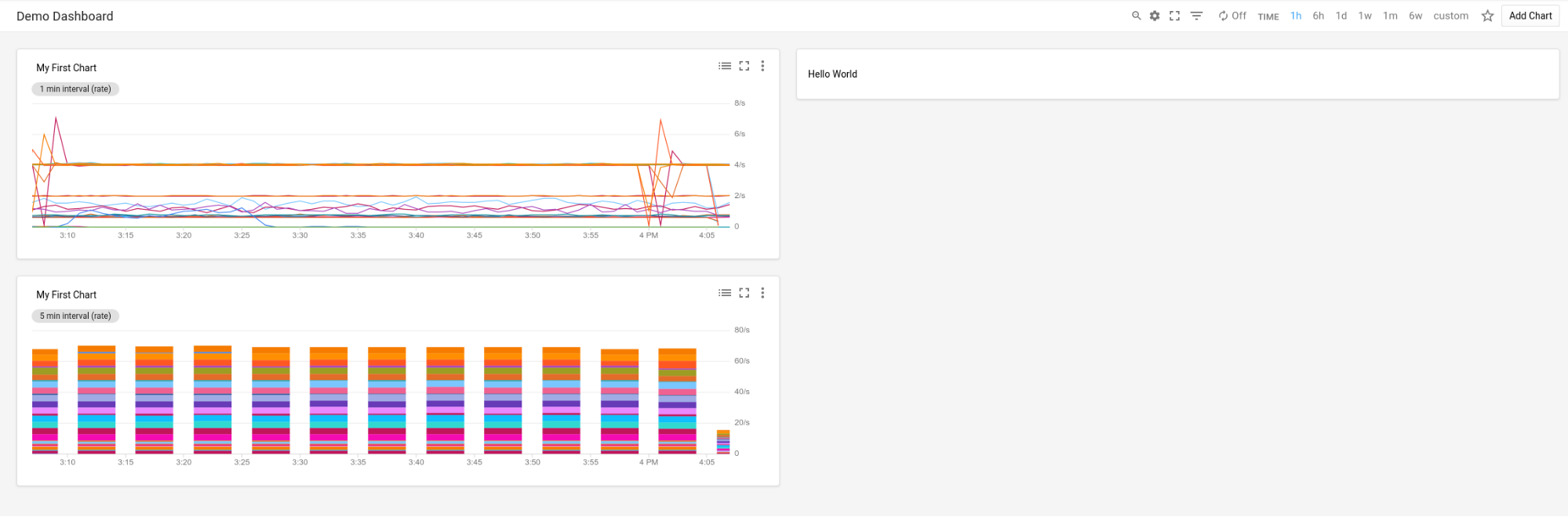
GridLayout의 대시보드
이 대시보드에는 세 개의 위젯이 있는 GridLayout이 표시됩니다.
{
  "displayName": "Grid Layout Example",
  "gridLayout": {
    "columns": "2",
    "widgets": [
      {
        "title": "Widget 1",
        "xyChart": {
          "dataSets": {
            "timeSeriesQuery": {
              "timeSeriesFilter": {
                "filter": "metric.type=\"agent.googleapis.com/nginx/connections/accepted_count\"",
                "aggregation": {
                  "perSeriesAligner": "ALIGN_RATE"
                }
              },
              "unitOverride": "1"
            },
            "plotType": "LINE"
          },
          "timeshiftDuration": "0s",
          "yAxis": {
            "label": "y1Axis",
            "scale": "LINEAR"
          }
        }
      },
      {
        "text": {
          "content": "Widget 2"
        }
      },
      {
        "title": "Widget 3",
        "xyChart": {
          "dataSets": {
            "timeSeriesQuery": {
              "timeSeriesFilter": {
                "filter": "metric.type=\"agent.googleapis.com/nginx/connections/accepted_count\"",
                "aggregation": {
                  "perSeriesAligner": "ALIGN_RATE"
                }
              },
              "unitOverride": "1"
            },
            "plotType": "STACKED_BAR"
          },
          "timeshiftDuration": "0s",
          "yAxis": {
            "label": "y1Axis",
            "scale": "LINEAR"
          }
        }
      }
    ]
  }
}
대시보드는 다음 예시와 비슷합니다.
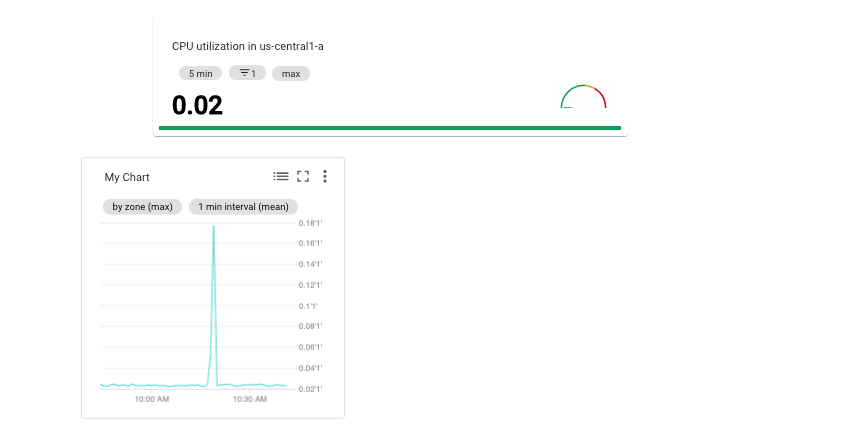
MosaicLayout의 대시보드
이 대시보드에는 두 개의 위젯이 있는 MosaicLayout이 표시됩니다.
{
  "displayName": "Mosaic Layout Example",
  "mosaicLayout": {
    "columns": 12,
    "tiles": [
      {
        "xPos": 2,
        "yPos": 2,
        "width": 7,
        "height": 2,
        "widget": {
          "title": "CPU utilization in us-central1-a",
          "scorecard": {
            "timeSeriesQuery": {
              "timeSeriesFilter": {
                "filter": "metric.type=\"compute.googleapis.com/instance/cpu/utilization\" resource.type=\"gce_instance\" resource.label.zone=\"us-central1-a\"",
                "aggregation": {
                  "perSeriesAligner": "ALIGN_MEAN",
                  "crossSeriesReducer": "REDUCE_MAX"
                }
              },
              "unitOverride": "1"
            },
            "gaugeView": {
              "upperBound": 1.5
            },
            "thresholds": [
              {
                "value": 0.8,
                "color": "YELLOW",
                "direction": "ABOVE"
              },
              {
                "value": 1,
                "color": "RED",
                "direction": "ABOVE"
              }
            ]
          }
        }
      },
      {
        "xPos": 1,
        "yPos": 5,
        "width": 4,
        "height": 4,
        "widget": {
          "title": "My Chart",
          "xyChart": {
            "dataSets": [
              {
                "timeSeriesQuery": {
                  "timeSeriesFilter": {
                    "filter": "metric.type=\"compute.googleapis.com/instance/cpu/utilization\" resource.type=\"gce_instance\"",
                    "aggregation": {
                      "perSeriesAligner": "ALIGN_MEAN",
                      "crossSeriesReducer": "REDUCE_MAX",
                      "groupByFields": [
                        "resource.label.zone"
                      ]
                    }
                  },
                  "unitOverride": "'1'"
                },
                "plotType": "LINE",
                "minAlignmentPeriod": "60s"
              }
            ],
            "yAxis": {
              "label": "y1Axis",
              "scale": "LINEAR"
            }
          }
        }
      }
    ]
  }
}
대시보드는 다음 예시와 비슷합니다.
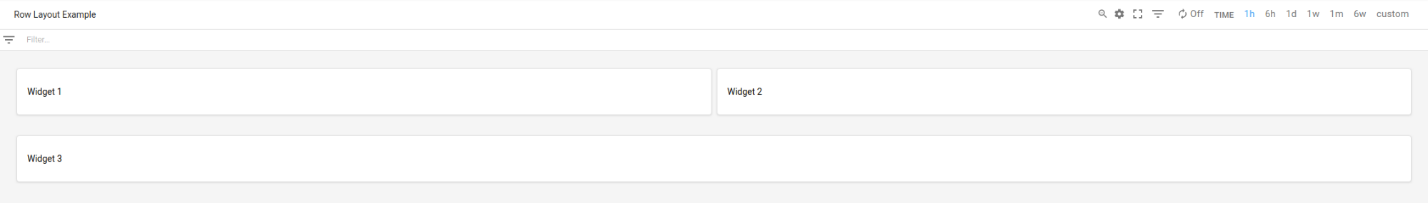
RowLayout의 대시보드
이 대시보드에는 세 개의 위젯이 있는 RowLayout이 표시됩니다.
{
  "displayName": "Row Layout Example",
  "rowLayout": {
    "rows": [
      {
        "weight": "1",
        "widgets": [
          {
            "text": {
              "content": "Widget 1",
              "format": "MARKDOWN"
            }
          },
          {
            "text": {
              "content": "Widget 2",
              "format": "MARKDOWN"
            }
          },
          {
            "text": {
              "content": "Widget 3",
              "format": "MARKDOWN"
            }
          }
        ]
      }
    ]
  }
}
대시보드는 다음 예시와 비슷합니다.
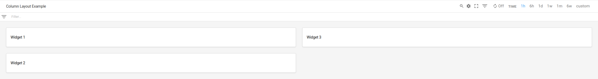
ColumnLayout의 대시보드
이 대시보드에는 세 개의 위젯이 있는 ColumnLayout이 표시됩니다.
{
  "displayName": "Column Layout Example",
  "columnLayout": {
    "columns": [
      {
        "weight": "1",
        "widgets": [
          {
            "text": {
              "content": "Widget 1",
              "format": "MARKDOWN"
            }
          },
          {
            "text": {
              "content": "Widget 2",
              "format": "MARKDOWN"
            }
          },
          {
            "text": {
              "content": "Widget 3",
              "format": "MARKDOWN"
            }
          }
        ]
      }
    ]
  }
}
대시보드는 다음 예시와 비슷합니다.
대시보드 이벤트 사용 설정, 필터 및 라벨 추가
이 섹션에서는 대시보드에 필터 및 라벨을 추가하고 이벤트를 표시하도록 대시보드를 구성하는 방법을 설명합니다.
대시보드에서 이벤트 사용 설정
Dashboard 객체에 annotations 필드를 포함하는 방식으로 Google Kubernetes Engine 업데이트 이벤트 또는 가상 머신 장애 이벤트와 같은 이벤트를 표시하도록 대시보드를 구성할 수 있습니다. annotations 필드에는 두 필드가 포함된 DashboardAnnotations 객체의 인스턴스가 포함됩니다.
defaultResourceName필드에는 이벤트를 검색할Google Cloud 프로젝트의 대시보드 수준 기본값이 나열됩니다. 이 필드를 지정하지 않으면 선택한 프로젝트가 검색됩니다.EventAnnotation객체의 배열입니다. 각 객체에는 다음이 포함됩니다.displayName필드: 이벤트별 전환 버튼에 라벨을 정의할 수 있습니다. 이 필드가 지정되지 않았거나 이 필드의 값이 빈 문자열이면 이벤트의 기본 이름이 표시됩니다.enabled필드: 이벤트 전환 버튼의 값을 제어합니다.true이면 전환 버튼이on위치에 있고 이벤트가 대시보드에 표시됩니다.false이면 전환 버튼이off위치에 있습니다.EventType열거의 값을 포함하는eventType필드filter필드: 이벤트별 쿼리에 추가할 쿼리를 지정할 수 있습니다. 이 필드의 값이 빈 문자열이면 이벤트별 쿼리가 사용됩니다.resourceNames필드: 이벤트를 검색할Google Cloud 프로젝트 목록을 정의할 수 있습니다. 이 필드가 빈 배열인 경우 선택한 프로젝트가 검색됩니다.
다음 예시에서는 Google Kubernetes Engine 이벤트를 지정하는 annotations 필드를 보여줍니다.
{
  "displayName": "Annotation example",
  "annotations": {
    "defaultResourceNames": [],
    "eventAnnotations": [
      {
        "displayName": "",
        "enabled": true,
        "eventType": "GKE_CLUSTER_UPDATE",
        "filter": "resource.labels.cluster_name=my-cluster",
        "resourceNames": []
      }
    ]
  },
  "dashboardFilters": [],
  "mosaicLayout": {
  ...
  },
  "labels": {}
}
앞의 예시에서는 filter 필드를 사용하여 쿼리를 my-name 클러스터로 제한합니다. displayName 필드가 빈 문자열로 설정되었으므로 이벤트 유형의 기본 이름이 이벤트 전환 버튼에 표시됩니다. 마지막으로 resourceNames가 빈 배열로 설정되어 있으므로 현재 Google Cloud 프로젝트의 로그 항목이 쿼리됩니다.
대시보드 필터 및 변수 추가
대시보드에서 위젯이 표시하는 데이터를 제어하려면 변수 및 고정된 필터를 추가하면 됩니다. 자세한 내용과 예시는 대시보드 필터를 참조하세요.
대시보드 라벨 추가
다음 샘플은 playbook이라는 라벨을 지정하는 Dashboard 객체를 보여줍니다.
{
  "displayName": "Example",
  "mosaicLayout": {
    "columns": 12,
    "tiles": [
      ...
    ]
  },
  "dashboardFilters": [],
  "labels": {
    "playbook": ""
  }
}
이전 샘플에서 알 수 있듯이 labels 필드는 map으로 구현되며, 여기서 key 필드와 value 필드는 모두 문자열입니다. 대시보드에 라벨을 추가할 때는 key를 라벨 이름으로 설정하고 value 필드를 빈 문자열로 설정합니다.
대시보드에 라벨을 추가하는 것은 선택사항입니다.
Widgets이 있는 대시보드
이 섹션에는 여러 유형의 위젯이 포함된 대시보드의 예시가 포함되어 있습니다.
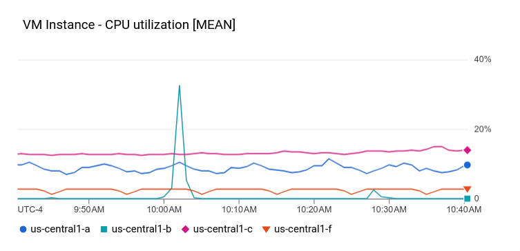
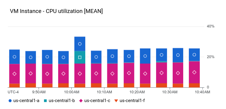
XyChart가 있는 대시보드
이 대시보드에는 기본 XyChart가 있는 대시보드가 표시됩니다. Google Cloud 콘솔을 사용하여 대시보드에 차트를 만든 적이 있으면 해당 차트는 XyChart 위젯의 인스턴스입니다.
Google Cloud 콘솔에서 제공하는 기능과 마찬가지로 API는 차트의 PlotType을 변경하거나 차트의 보기 모드를 구성하는 옵션을 제공합니다.
{
  "dashboardFilters": [],
  "displayName": "Example line chart",
  "labels": {},
  "mosaicLayout": {
    "columns": 48,
    "tiles": [
      {
        "height": 16,
        "widget": {
          "title": "VM Instance - CPU utilization [MEAN]",
          "xyChart": {
            "chartOptions": {
              "mode": "COLOR"
            },
            "dataSets": [
              {
                "minAlignmentPeriod": "60s",
                "plotType": "LINE",
                "targetAxis": "Y1",
                "timeSeriesQuery": {
                  "timeSeriesFilter": {
                    "aggregation": {
                      "alignmentPeriod": "60s",
                      "crossSeriesReducer": "REDUCE_MEAN",
                      "groupByFields": [
                        "resource.label.\"zone\""
                      ],
                      "perSeriesAligner": "ALIGN_MEAN"
                    },
                    "filter": "metric.type=\"compute.googleapis.com/instance/cpu/utilization\" resource.type=\"gce_instance\""
                  }
                }
              }
            ],
            "thresholds": [],
            "yAxis": {
              "label": "",
              "scale": "LINEAR"
            }
          }
        },
        "width": 24
      }
    ]
  }
}
이 대시보드의 차트는 다음 예시와 비슷합니다.
다음 섹션에서는 로그 애널리틱스 차트 위젯을 만드는 방법, 차트에 기준점을 표시하는 방법, 차트에서 왼쪽 Y축, 오른쪽 Y축 또는 둘 다를 사용할지 여부를 구성하는 방법을 설명합니다.
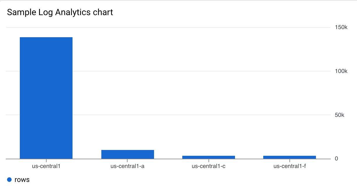
로그 애널리틱스 차트가 있는 대시보드
이 대시보드에는 로그 애널리틱스 차트가 있는 대시보드가 표시됩니다. 샘플 JSON에는 SQL 쿼리가 포함됩니다.
{
  "displayName": "Example",
  "dashboardFilters": [],
  "mosaicLayout": {
    "columns": 48,
    "tiles": [
      {
        "width": 24,
        "height": 16,
        "widget": {
          "title": "Sample analytics chart",
          "xyChart": {
            "chartOptions": {
              "mode": "COLOR"
            },
            "dataSets": [
              {
                "breakdowns": [],
                "dimensions": [
                  {
                    "column": "location",
                    "columnType": "STRING",
                    "maxBinCount": 5,
                    "sortColumn": "location",
                    "sortOrder": "SORT_ORDER_ASCENDING"
                  }
                ],
                "measures": [
                  {
                    "aggregationFunction": {
                      "parameters": [],
                      "type": "count"
                    },
                    "column": ""
                  }
                ],
                "plotType": "STACKED_BAR",
                "targetAxis": "Y1",
                "timeSeriesQuery": {
                  "opsAnalyticsQuery": {
                    "queryHandle": "",
                    "sql": "SELECT\n  CAST(JSON_VALUE(resource.labels.location) AS STRING) AS location,\n  severity,\nFROM\n  `VIEW`"
                  }
                }
              }
            ],
            "thresholds": [],
            "yAxis": {
              "label": "",
              "scale": "LINEAR"
            }
          }
        }
      }
    ]
  },
  "labels": {}
}
이 대시보드의 차트는 다음 예시와 비슷합니다.
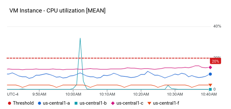
XyChart 및 기준점이 있는 대시보드
이 대시보드는 기본 XyChart, 기준점, 왼쪽 Y축이 구성된 대시보드를 보여줍니다.
{
  "dashboardFilters": [],
  "displayName": "Example line with threshold",
  "labels": {},
  "mosaicLayout": {
    "columns": 48,
    "tiles": [
      {
        "height": 16,
        "widget": {
          "title": "VM Instance - CPU utilization [MEAN]",
          "xyChart": {
            "chartOptions": {
              "mode": "COLOR"
            },
            "dataSets": [
              {
                "minAlignmentPeriod": "60s",
                "plotType": "LINE",
                "targetAxis": "Y1",
                "timeSeriesQuery": {
                  "timeSeriesFilter": {
                    "aggregation": {
                      "alignmentPeriod": "60s",
                      "crossSeriesReducer": "REDUCE_MEAN",
                      "groupByFields": [
                        "resource.label.\"zone\""
                      ],
                      "perSeriesAligner": "ALIGN_MEAN"
                    },
                    "filter": "metric.type=\"compute.googleapis.com/instance/cpu/utilization\" resource.type=\"gce_instance\""
                  }
                }
              }
            ],
            "thresholds": [
              {
                "label": "",
                "targetAxis": "Y1",
                "value": 0.2
              }
            ],
            "yAxis": {
              "label": "",
              "scale": "LINEAR"
            }
          }
        },
        "width": 24
      }
    ]
  }
}
위 예시에서 JSON은 y2Axis 구조를 포함하고 있기 때문에 왼쪽 Y축을 사용하도록 지정합니다. targetAxis 필드에서 오른쪽 Y축에는 'Y1'을 사용하고 왼쪽 Y축에는 'Y2'를 사용합니다. targetAxis 필드를 생략하면 오른쪽 Y축이 사용됩니다.
이 대시보드의 차트는 다음 예시와 비슷합니다.
여러 측정항목 유형을 표시하고 왼쪽 및 오른쪽 축을 사용하는 차트를 구성할 수 있습니다. 앞의 예시에서는 단일 측정항목 유형, 즉 dataSets 배열에 요소가 하나 있는 차트를 보여줍니다.
두 가지 측정항목 유형을 차트로 작성할 때 dataSets 배열에는 요소 두 개가 포함되며 각 요소에서 targetAxis를 지정합니다.
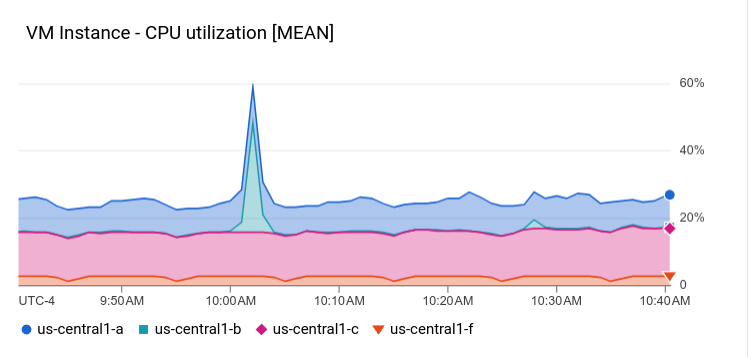
STACKED_AREA PlotType을 사용한 XyChart가 있는 대시보드
이 대시보드는 STACKED_AREA PlotType이 있는 XyChart를 표시합니다.
{
  "dashboardFilters": [],
  "displayName": "Example stacked area",
  "labels": {},
  "mosaicLayout": {
    "columns": 48,
    "tiles": [
      {
        "height": 16,
        "widget": {
          "title": "VM Instance - CPU utilization [MEAN]",
          "xyChart": {
            "chartOptions": {
              "mode": "COLOR"
            },
            "dataSets": [
              {
                "minAlignmentPeriod": "60s",
                "plotType": "STACKED_AREA",
                "targetAxis": "Y1",
                "timeSeriesQuery": {
                  "timeSeriesFilter": {
                    "aggregation": {
                      "alignmentPeriod": "60s",
                      "crossSeriesReducer": "REDUCE_MEAN",
                      "groupByFields": [
                        "resource.label.\"zone\""
                      ],
                      "perSeriesAligner": "ALIGN_MEAN"
                    },
                    "filter": "metric.type=\"compute.googleapis.com/instance/cpu/utilization\" resource.type=\"gce_instance\""
                  }
                }
              }
            ],
            "thresholds": [],
            "yAxis": {
              "label": "",
              "scale": "LINEAR"
            }
          }
        },
        "width": 24
      }
    ]
  }
}
이 대시보드의 차트는 다음 예시와 비슷합니다.
STACKED_BAR PlotType을 사용한 XyChart가 있는 대시보드
이 대시보드는 STACKED_BAR PlotType이 있는 XyChart를 표시합니다.
{
  "dashboardFilters": [],
  "displayName": "Example stacked bar",
  "labels": {},
  "mosaicLayout": {
    "columns": 48,
    "tiles": [
      {
        "height": 16,
        "widget": {
          "title": "VM Instance - CPU utilization [MEAN]",
          "xyChart": {
            "chartOptions": {
              "mode": "COLOR"
            },
            "dataSets": [
              {
                "minAlignmentPeriod": "60s",
                "plotType": "STACKED_BAR",
                "targetAxis": "Y1",
                "timeSeriesQuery": {
                  "timeSeriesFilter": {
                    "aggregation": {
                      "alignmentPeriod": "60s",
                      "crossSeriesReducer": "REDUCE_MEAN",
                      "groupByFields": [
                        "resource.label.\"zone\""
                      ],
                      "perSeriesAligner": "ALIGN_MEAN"
                    },
                    "filter": "metric.type=\"compute.googleapis.com/instance/cpu/utilization\" resource.type=\"gce_instance\""
                  }
                }
              }
            ],
            "thresholds": [],
            "yAxis": {
              "label": "",
              "scale": "LINEAR"
            }
          }
        },
        "width": 24
      }
    ]
  }
}
대시보드는 다음 예시와 비슷합니다.
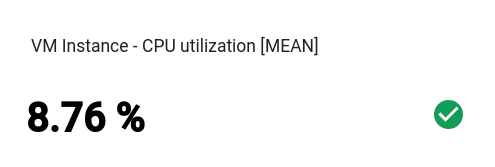
기본 Scorecard이 있는 대시보드
이 대시보드에는 게이지 또는 스파크라인이 없는 Scorecard가 표시됩니다. 예시에서는 Compute Engine CPU 사용률을 보여주며 스코어카드에는 두 개의 기준점이 있습니다. 한 기준점은 노란색을 사용하여 CPU 사용률이 70% 이상임을 나타내고, 다른 기준점은 빨간색을 사용하여 CPU 사용률이 90% 이상임을 나타냅니다.
현재 CPU 사용률이 지정된 기준점보다 낮으므로 색상은 녹색입니다.
{
  "dashboardFilters": [],
  "displayName": "Example-basic scorecard",
  "labels": {},
  "mosaicLayout": {
    "columns": 48,
    "tiles": [
      {
        "height": 8,
        "widget": {
          "scorecard": {
            "thresholds": [
              {
                "color": "YELLOW",
                "direction": "ABOVE",
                "label": "",
                "value": 0.7
              },
              {
                "color": "RED",
                "direction": "ABOVE",
                "label": "",
                "value": 0.9
              }
            ],
            "timeSeriesQuery": {
              "outputFullDuration": true,
              "timeSeriesFilter": {
                "aggregation": {
                  "alignmentPeriod": "60s",
                  "crossSeriesReducer": "REDUCE_MEAN",
                  "groupByFields": [],
                  "perSeriesAligner": "ALIGN_MEAN"
                },
                "filter": "metric.type=\"compute.googleapis.com/instance/cpu/utilization\" resource.type=\"gce_instance\""
              }
            }
          },
          "title": "VM Instance - CPU utilization [MEAN]"
        },
        "width": 16
      }
    ]
  }
}
대시보드는 다음 예시와 비슷합니다.
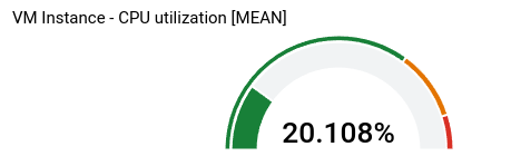
GaugeView를 사용한 Scorecard가 있는 대시보드
이 대시보드는 이전 예시의 기본 스코어카드에 게이지를 추가합니다.
GaugeView 객체는 상한값과 하한값을 지정하여 게이지에 표시할 값의 범위를 지정할 수 있습니다. 스코어카드는 0에서 1 사이의 값을 표시하므로 상한과 하한이 적절합니다. 게이지를 추가하려면 기본 스코어카드의 JSON에 다음을 추가합니다.
  "gaugeView": {
    "lowerBound": 0,
    "upperBound": 1,
  },
다음은 전체 수정된 대시보드 사양을 보여줍니다. 현재 값이 기준점보다 낮으며 이 값은 게이지에 적절하게 색이 지정됩니다.
{
  "dashboardFilters": [],
  "displayName": "Example-Gauge",
  "labels": {},
  "mosaicLayout": {
    "columns": 48,
    "tiles": [
      {
        "height": 8,
        "widget": {
          "scorecard": {
            "gaugeView": {
              "lowerBound": 0,
              "upperBound": 1
            },
            "thresholds": [
              {
                "color": "YELLOW",
                "direction": "ABOVE",
                "label": "",
                "value": 0.7
              },
              {
                "color": "RED",
                "direction": "ABOVE",
                "label": "",
                "value": 0.9
              }
            ],
            "timeSeriesQuery": {
              "outputFullDuration": true,
              "timeSeriesFilter": {
                "aggregation": {
                  "alignmentPeriod": "60s",
                  "crossSeriesReducer": "REDUCE_MEAN",
                  "groupByFields": [],
                  "perSeriesAligner": "ALIGN_MEAN"
                },
                "filter": "metric.type=\"compute.googleapis.com/instance/cpu/utilization\" resource.type=\"gce_instance\""
              }
            }
          },
          "title": "VM Instance - CPU utilization [MEAN]"
        },
        "width": 16
      }
    ]
  }
}
이 대시보드의 차트는 다음 예시와 비슷합니다.
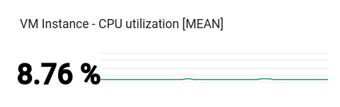
SparkChartView를 사용한 Scorecard가 있는 대시보드
이 대시보드는 이전 예시의 게이지를 스파크라인으로 대체합니다.
SparkChartView 객체는 스코어카드에 선 차트 또는 막대 그래프를 만들 수 있습니다.
이 예시에서는 줄을 사용하며, 값이 기준점을 위반하지 않는 한 녹색입니다. 스파크라인을 추가하려면 이전 차트의 gaugeView JSON 객체를 다음으로 바꿉니다.
  "sparkChartView": {
    "sparkChartType": "SPARK_LINE"
  },
스코어카드는 다음 예시와 비슷합니다.
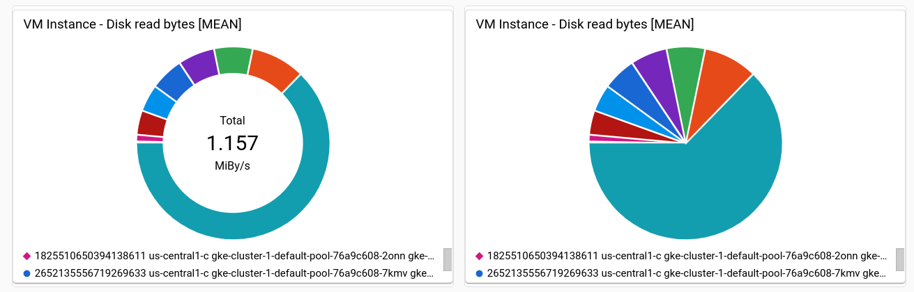
PieChart 위젯이 있는 대시보드
대시보드는 원형 차트를 사용하여 데이터를 표시할 수 있습니다. 각 시계열은 원형 차트의 한 조각에 해당합니다. 원형 차트에는 시간 경과에 따른 데이터가 표시되지 않고 대신 최신 값만 표시됩니다.
모든 원형 차트는 PieChart 위젯으로 지정됩니다.
최신 측정 항목의 합계를 표시하도록 차트를 구성하려면 chartType 필드를 DONUT으로 설정합니다. 그렇지 않으면 이 필드를 PIE의 값으로 설정합니다.
"pieChart": {
  "chartType": "DONUT",
},
다음 예시에서는 원형 차트 두 개가 있는 대시보드를 구성하는데, 원형 차트 하나는 도넛으로 구성됩니다.
{
  "dashboardFilters": [],
  "displayName": "Example Pie Donut",
  "labels": {},
  "mosaicLayout": {
    "columns": 48,
    "tiles": [
      {
        "height": 16,
        "widget": {
          "pieChart": {
            "chartType": "DONUT",
            "dataSets": [
              {
                "minAlignmentPeriod": "60s",
                "timeSeriesQuery": {
                  "timeSeriesFilter": {
                    "aggregation": {
                      "alignmentPeriod": "60s",
                      "perSeriesAligner": "ALIGN_RATE"
                    },
                    "filter": "metric.type=\"compute.googleapis.com/instance/disk/read_bytes_count\" resource.type=\"gce_instance\"",
                    "secondaryAggregation": {
                      "alignmentPeriod": "60s",
                      "perSeriesAligner": "ALIGN_MEAN"
                    }
                  }
                }
              }
            ]
          },
          "title": "VM Instance - Disk read bytes [MEAN]"
        },
        "width": 24
      },
      {
        "height": 16,
        "widget": {
          "pieChart": {
            "chartType": "PIE",
            "dataSets": [
              {
                "minAlignmentPeriod": "60s",
                "timeSeriesQuery": {
                  "timeSeriesFilter": {
                    "aggregation": {
                      "alignmentPeriod": "60s",
                      "perSeriesAligner": "ALIGN_RATE"
                    },
                    "filter": "metric.type=\"compute.googleapis.com/instance/disk/read_bytes_count\" resource.type=\"gce_instance\"",
                    "secondaryAggregation": {
                      "alignmentPeriod": "60s",
                      "perSeriesAligner": "ALIGN_MEAN"
                    }
                  }
                }
              }
            ]
          },
          "title": "VM Instance - Disk read bytes [MEAN]"
        },
        "width": 24,
        "xPos": 24
      },
    ]
  }
}
다음 스크린샷과 같이 두 위젯 모두 데이터를 원형 차트로 표시하며, 한 위젯은 최신 값의 합계를 표시합니다.
Treemap 위젯이 있는 대시보드
각 사각형이 고유한 라벨 값 모음에 해당하는 중첩된 사각형 계열로 최신 데이터를 표시하려면 트리맵을 추가합니다.
zone 라벨별로 차트에 표시할 데이터를 집계했다고 가정해 보겠습니다.
위젯 유형을 트리맵으로 설정하면 트리맵의 각 사각형은 하나의 영역에 해당합니다. 직사각형의 색상 채도는 직사각형이 나타내는 값에 비례합니다.
트리맵을 탐색할 때는 포인터를 사용하여 사각형의 도움말을 활성화합니다.
다음 JSON은 영역 및 스토리지 유형별로 시계열을 집계하는 Treemap 위젯을 구성합니다.
{
  "displayName": "Example Treemap",
  "dashboardFilters": [],
  "labels": {},
  "mosaicLayout": {
    "columns": 48,
    "tiles": [
      {
        "xPos": 24,
        "height": 16,
        "width": 24,
        "widget": {
          "title": "VM Instance - Write read bytes [SUM]",
          "id": "",
          "treemap": {
            "dataSets": [
              {
                "breakdowns": [],
                "measures": [],
                "timeSeriesQuery": {
                  "outputFullDuration": true,
                  "timeSeriesFilter": {
                    "aggregation": {
                      "alignmentPeriod": "60s",
                      "crossSeriesReducer": "REDUCE_SUM",
                      "groupByFields": [
                        "resource.label.\"zone\"",
                        "metric.label.\"storage_type\""
                      ],
                      "perSeriesAligner": "ALIGN_RATE"
                    },
                    "filter": "metric.type=\"compute.googleapis.com/instance/disk/write_bytes_count\" resource.type=\"gce_instance\""
                  },
                  "unitOverride": ""
                }
              }
            ],
            "treemapHierarchy": [
              "resource.label.\"zone\"",
              "metric.label.\"storage_type\""
            ]
          }
        }
      }
    ]
  }
}
다음 스크린샷은 이전 구성이 적용된 트리맵 위젯을 보여줍니다.
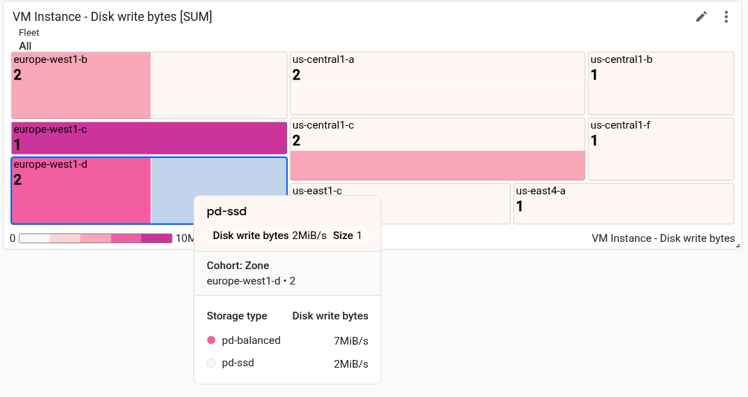
스크린샷에는 하나의 직사각형에 대한 도움말이 표시되어 있습니다.
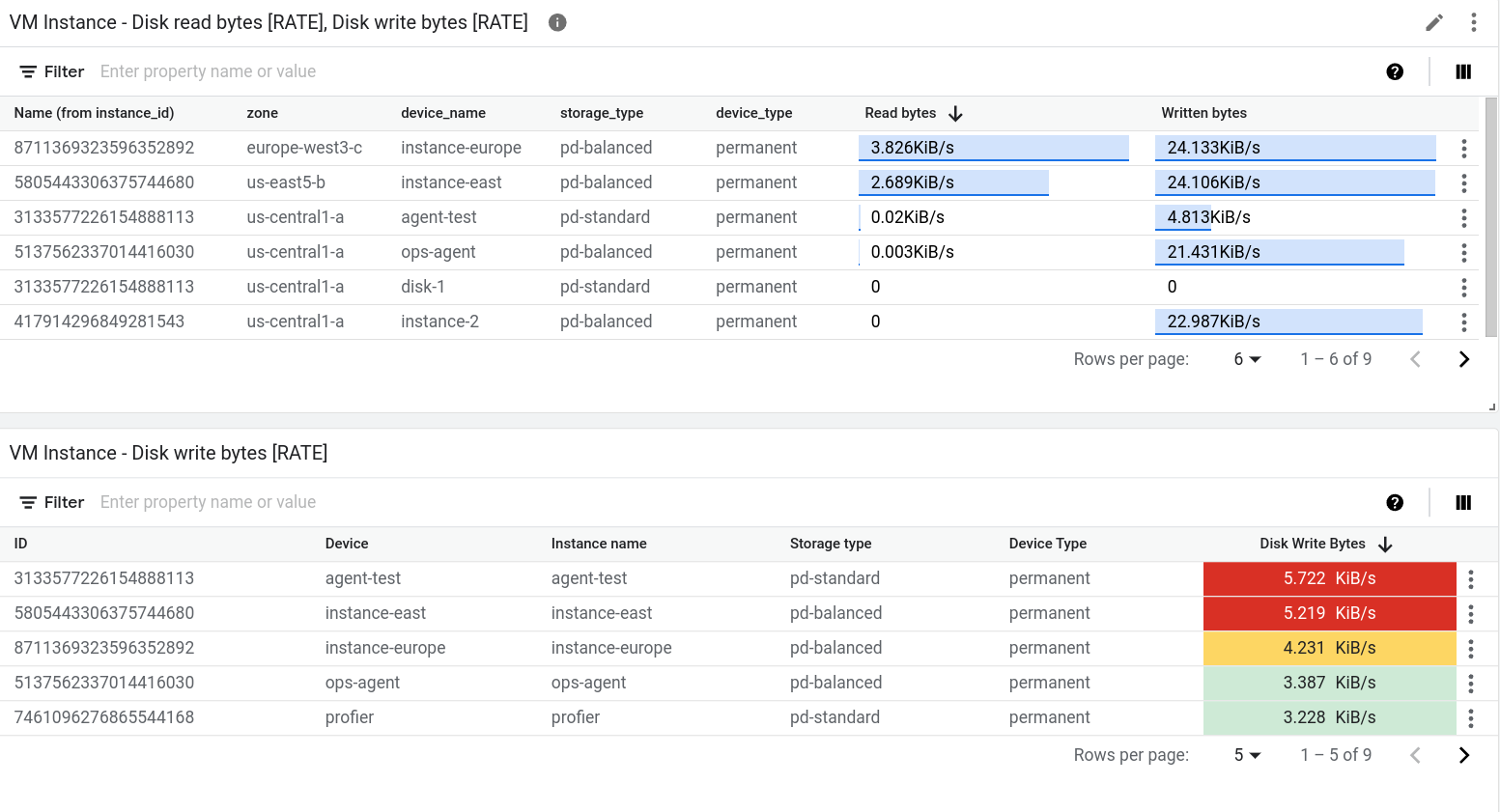
TimeSeriesTable 위젯이 있는 대시보드
대시보드는 테이블 형식으로 데이터를 표시할 수 있습니다. 여기에서는 각 고유 라벨 값의 조합이 하나의 행으로 표시됩니다. 테이블에는 시간 경과에 따른 데이터가 표시되지 않고, 대신 최신 값 또는 집계된 값 중 하나가 표시됩니다.
TimeSeriesTable 위젯에서 모든 테이블을 지정합니다.
표시할 시계열을 구성하려면
dataSets필드를 사용합니다.dataSets배열의 각 객체는 단일 측정항목 유형에 해당합니다. 여러 측정항목 유형을 쿼리할 경우 Google Cloud 콘솔은 동일한 테이블 행에 각 쿼리에 대한 최신 값을 표시하려고 시도합니다. 자세한 내용은 테이블에서 여러 측정항목 유형의 데이터를 병합하는 방법을 참조하세요.TimeSeriesQuery필드는 측정항목 유형을 지정합니다.- 대시보드에서 설정한 시간 범위 값을 기준으로 데이터가 집계된 값을 테이블에 표시하려면
timeSeriesQuery.outputFullDuration필드를true로 설정합니다.
표시할 최대 행 수를 구성하려면
pickTimeSeriesFilter필드를 설정합니다. 예를 들어 이전 10분 동안의 평균 값이 가장 큰 시계열 두 개만 표시하려면 다음을 포함합니다."pickTimeSeriesFilter": { "direction": "TOP", "numTimeSeries": 2, "rankingMethod": "METHOD_MEAN" },pickTimeSeriesFilter필드를 생략하면 테이블에 행이 최대 300개까지 표시됩니다.테이블에 데이터가 표시되는 방법을 구성하려면
metricVisualization필드를 사용합니다.- '25%'와 같은 값만 표시하려면 이 필드를 생략하거나 값을
"NUMBER"로 설정합니다. 이 구성을 사용하면Google Cloud 콘솔에 위젯이 테이블 위젯으로 표시됩니다. - 값과 값의 시각적 표시를 가능한 값의 범위와 비교하여 표시하려면 이 필드의 값을
"BAR"로 설정합니다. 이 구성을 사용하면Google Cloud 콘솔에 위젯이 상위 목록 위젯으로 표시됩니다.
- '25%'와 같은 값만 표시하려면 이 필드를 생략하거나 값을
표시되는 열과 열의 속성을 구성하려면
columnSettings배열을 사용합니다. 이 필드를 지정하지 않으면 테이블에 라벨당 열이 하나씩 표시됩니다."column"필드의 값은 라벨 키 또는 시계열의 최신 값을 나타내는value로 설정되어야 합니다. 열의 표시 이름을 설정할 수 있으며, 테이블 셀 내에서 데이터 정렬을 구성할 수 있습니다.- 열 헤더를 맞춤설정하려면
displayName필드를 설정합니다. - 값이 기준점과 비교되는 방식에 따라 최신 값을 표시하는 셀의 색상을 지정하려면
thresholds객체를 추가합니다. - 텍스트 정렬을 변경하려면
alignment필드를 추가합니다.
다음 예시는 두 개의 열을 보여줍니다.
"columnSettings": [ { "column": "device_name", "displayName": "Device", "visible": true }, { "alignment": "CENTER", "column": "value", "displayName": "Disk Write Bytes", "thresholds": [ { "color": "YELLOW", "direction": "ABOVE", "value": 4000 }, { "color": "RED", "direction": "ABOVE", "value": 5000 } ], "visible": true } ],- 열 헤더를 맞춤설정하려면
다음 JSON은 2개의 테이블이 포함된 대시보드를 설명합니다. 첫 번째 테이블에는 인스턴스에서 읽은 바이트 수와 인스턴스에 쓴 바이트 수라는 두 가지 측정항목 유형이 나와 있습니다. 집계된 값은 참조 막대와 함께 표시됩니다. 두 번째 테이블에는 한 가지 측정항목 유형의 최신 값이 나와 있으며 값 열은 값이 기준점과 비교되는 방식에 따라 셀의 색상 코드를 지정하도록 구성되었습니다.
{
  "displayName": "Example",
  "mosaicLayout": {
    "columns": 48,
    "tiles": [
      {
        "width": 44,
        "height": 17,
        "widget": {
          "title": "VM Instance - Disk read bytes [RATE], Disk write bytes [RATE]",
          "timeSeriesTable": {
            "dataSets": [
              {
                "timeSeriesQuery": {
                  "timeSeriesFilter": {
                    "filter": "metric.type=\"compute.googleapis.com/instance/disk/read_bytes_count\" resource.type=\"gce_instance\"",
                    "aggregation": {
                      "alignmentPeriod": "60s",
                      "perSeriesAligner": "ALIGN_RATE",
                      "groupByFields": []
                    },
                    "pickTimeSeriesFilter": {
                      "rankingMethod": "METHOD_MEAN",
                      "numTimeSeries": 30,
                      "direction": "TOP"
                    }
                  },
                  "unitOverride": "",
                  "outputFullDuration": true
                },
                "tableTemplate": "",
                "minAlignmentPeriod": "60s"
              },
              {
                "timeSeriesQuery": {
                  "timeSeriesFilter": {
                    "filter": "metric.type=\"compute.googleapis.com/instance/disk/write_bytes_count\" resource.type=\"gce_instance\"",
                    "aggregation": {
                      "alignmentPeriod": "60s",
                      "perSeriesAligner": "ALIGN_RATE",
                      "groupByFields": []
                    },
                    "pickTimeSeriesFilter": {
                      "rankingMethod": "METHOD_MEAN",
                      "numTimeSeries": 30,
                      "direction": "TOP"
                    }
                  },
                  "unitOverride": "",
                  "outputFullDuration": true
                },
                "tableTemplate": "",
                "minAlignmentPeriod": "60s"
              }
            ],
            "metricVisualization": "BAR",
            "columnSettings": [
              {
                "column": "Name (from instance_id)",
                "visible": true
              },
              {
                "column": "zone",
                "visible": true
              },
              {
                "column": "device_name",
                "visible": true
              },
              {
                "column": "storage_type",
                "visible": true
              },
              {
                "column": "device_type",
                "visible": true
              },
              {
                "column": "value",
                "visible": true,
                "displayName": "Read bytes"
              },
              {
                "column": "value-1",
                "visible": true,
                "displayName": "Written bytes"
              }
            ],
            "opsAnalyticsSettings": {
              "maxRows": "0",
              "showFilterBar": false,
              "pageSize": "0"
            },
            "displayColumnType": false
          },
          "id": ""
        }
      },
      {
        "yPos": 17,
        "width": 44,
        "height": 16,
        "widget": {
          "title": "VM Instance - Disk write bytes [RATE]",
          "timeSeriesTable": {
            "columnSettings": [
              {
                "column": "device_name",
                "displayName": "Device",
                "visible": true
              },
              {
                "alignment": "LEFT",
                "column": "instance_name",
                "displayName": "Instance name",
                "visible": true
              },
              {
                "column": "storage_type",
                "displayName": "Storage type",
                "visible": true
              },
              {
                "column": "device_type",
                "displayName": "Device Type",
                "visible": true
              },
              {
                "alignment": "CENTER",
                "column": "value",
                "displayName": "Disk Write Bytes",
                "thresholds": [
                  {
                    "color": "YELLOW",
                    "direction": "ABOVE",
                    "label": "",
                    "value": 4000
                  },
                  {
                    "color": "RED",
                    "direction": "ABOVE",
                    "label": "",
                    "value": 5000
                  }
                ],
                "visible": true
              },
              {
                "alignment": "LEFT",
                "column": "Name (from instance_id)",
                "displayName": "ID",
                "visible": true
              }
            ],
            "dataSets": [
              {
                "minAlignmentPeriod": "60s",
                "timeSeriesQuery": {
                  "timeSeriesFilter": {
                    "aggregation": {
                      "alignmentPeriod": "60s",
                      "perSeriesAligner": "ALIGN_RATE"
                    },
                    "filter": "metric.type=\"compute.googleapis.com/instance/disk/write_bytes_count\" resource.type=\"gce_instance\""
                  }
                }
              }
            ],
            "displayColumnType": false,
            "metricVisualization": "NUMBER",
            "opsAnalyticsSettings": {
              "maxRows": "0",
              "pageSize": "0",
              "showFilterBar": false
            }
          }
        }
      }
    ]
  },
  "dashboardFilters": [],
  "labels": {}
}
다음 스크린샷은 이전에 정의된 테이블을 보여줍니다.
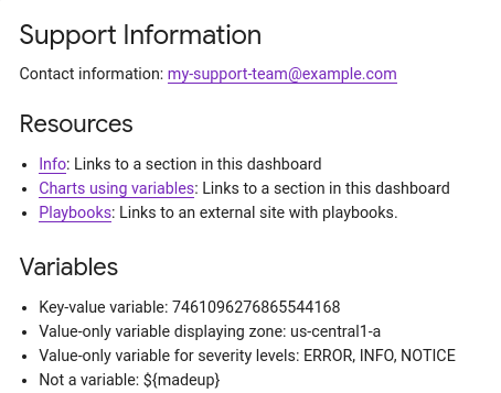
Text 위젯이 있는 대시보드
이 예시에서는 Text 위젯이 있는 대시보드를 보여줍니다.
{
  "dashboardFilters": [],
  "displayName": "DB2+TE",
  "labels": {},
  "mosaicLayout": {
    "columns": 48,
    "tiles": [
    ...
      {
        "height": 16,
        "widget": {
          "text": {
            "content": "# Support information\n\n\nContact information: my-support-team@example.com\nOnline help: [Playbooks](https://example.com)\n\n",
            "format": "MARKDOWN",
            "style": {
              "backgroundColor": "",
              "fontSize": "FS_LARGE",
              "horizontalAlignment": "H_LEFT",
              "padding": "P_EXTRA_SMALL",
              "textColor": "",
              "verticalAlignment": "V_TOP"
            }
          }
        },
        "width": 24,
        "yPos": 14
      }
    ]
  }
}
텍스트 위젯은 다음 예시와 비슷하게 표시됩니다.
AlertChart 위젯이 있는 대시보드
이 대시보드에서는 AlertChart 위젯이 있는 대시보드를 보여줍니다.
{
  "category": "CUSTOM",
  "displayName": "Alerting policy chart example",
  "mosaicLayout": {
    "columns": 12,
    "tiles": [
      {
        "height": 4,
        "widget": {
          "alertChart": {
            "name": "projects/my-project/alertPolicies/14205854094151528373"
          }
        },
        "width": 6,
      }
    ]
  }
}
다른 대시보드 위젯과 달리 이 위젯에 대해서는 제목 또는 측정항목 필터를 지정하지 않습니다. 대신 알림 정책에 대해 리소스 이름을 지정합니다. name 필드의 마지막 항목이 알림 정책 식별자입니다.
이 대시보드의 차트는 다음 예시와 비슷합니다.
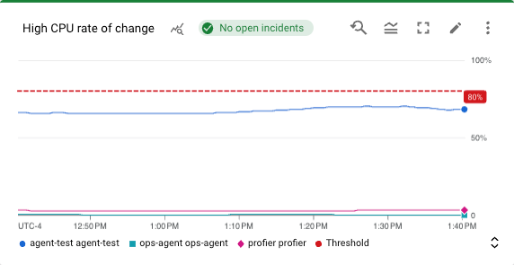
이 예시에서 알림 정책은 두 가지 서로 다른 가상 머신의 CPU 사용을 모니터링합니다. 점선은 50%로 설정된 조건 기준을 나타냅니다. No incidents 라벨이 있는 녹색 칩은 알림 정책에 대해 미해결된 이슈가 없음을 나타냅니다. 포인터를 이슈 칩에 배치하면 기본 알림 정책과 연결된 대화상자가 열립니다.
ErrorReportingPanel 위젯이 있는 대시보드
이 대시보드에서는 ErrorReportingPanel 위젯이 있는 대시보드를 보여줍니다.
{
  "dashboardFilters": [],
  "displayName": "Error reporting widget",
  "labels": {},
  "mosaicLayout": {
    "columns": 48,
    "tiles": [
      {
        "height": 16,
        "widget": {
          "errorReportingPanel": {
            "projectNames": [
              "projects/my-project"
            ],
            "services": [],
            "versions": []
          },
          "title": "Error Reporting Panel"
        },
        "width": 24,
      }
    ]
  }
}
오류 보고 패널에 대해 높이는 최소 16단위, 너비는 최소 24단위로 구성하는 것이 좋습니다. 이전 예시에서 위젯의 높이는 16단위, 너비는 24단위입니다.
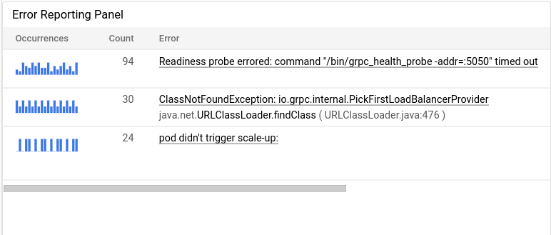
Error Reporting 패널에는 선택한 프로젝트의 오류 그룹이 표시되며, 이 패널을 통해 오류 그룹을 특정 리소스 유형, 서비스 또는 서비스 버전으로 제한할 수 있습니다. 다음 예시는 Error Reporting 패널을 보여줍니다.
IncidentList 위젯이 있는 대시보드
이 대시보드에서는 IncidentList 위젯이 있는 대시보드를 보여줍니다.
{
  "category": "CUSTOM",
  "dashboardFilters": [],
  "displayName": "Incident widget",
  "labels": {},
  "mosaicLayout": {
    "columns": 12,
    "tiles": [
      {
        "height": 5,
        "widget": {
          "incidentList": {
            "monitoredResources": [],
            "policyNames": []
          },
          "title": "Incidents"
        },
        "width": 8,
        "xPos": 0,
        "yPos": 0
      }
    ]
  }
}
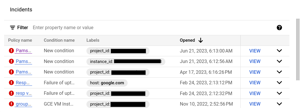
앞의 예시에서는 title 필드를 Incidents로 설정하고 gce_instance 유형의 리소스에 대한 모든 이슈를 표시하도록 위젯을 구성합니다.
이 위젯을 구성할 때 여러 알림 정책 또는 여러 리소스 유형을 선택할 수 있습니다.
대시보드의 이슈 위젯은 다음 예시와 비슷합니다.
LogsPanel 위젯이 있는 대시보드
이 예시에서는 LogsPanel 위젯이 있는 대시보드를 보여줍니다.
{
  "category": "CUSTOM",
  "displayName": "Logs Panel",
  "mosaicLayout": {
    "columns": 12,
    "tiles": [
      {
        "height": 4,
        "widget": {
          "logsPanel": {
            "filter": "",
            "resourceNames": [
              "projects/012012012012"
            ]
          },
          "title": "Logs Panel"
        },
        "width": 6,
        "xPos": 0,
        "yPos": 0
      }
    ]
  }
}
로그 패널의 높이는 최소 3단위로, 너비는 최소 4단위로 구성하는 것이 좋습니다. 이전 예시에서 위젯의 높이는 4단위, 너비는 6단위입니다.
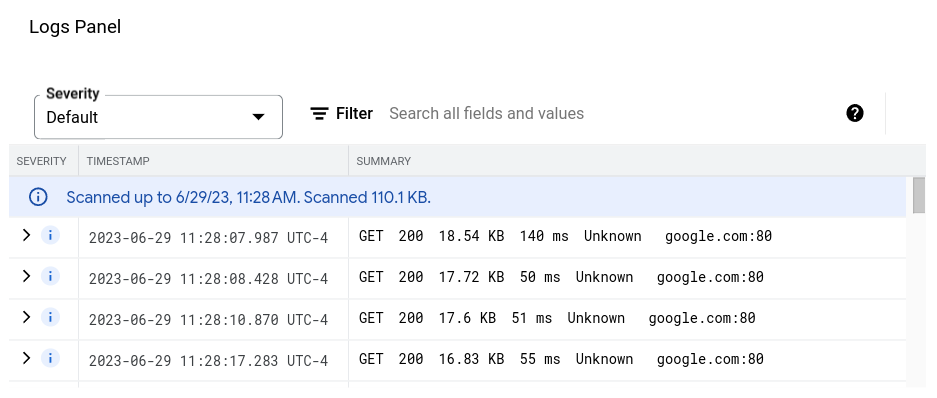
로그 패널에는 resourceNames 필드에 나열된 Google Cloud 프로젝트의 로그가 표시됩니다. 위의 예시에서는 하나의 프로젝트만 지정합니다. 하지만 이 목록에 여러 프로젝트를 포함할 수도 있습니다.
로그 패널은 다음 예시와 비슷하게 표시됩니다.
문제 해결 정보는 로그 패널이 있는 대시보드를 만들기 위한 API 호출 실패를 참조하세요.
CollapsibleGroup 위젯이 있는 대시보드
이 예시에서는 CollapsibleGroup 위젯이 있는 대시보드를 보여줍니다.
{
  "category": "CUSTOM",
  "displayName": "Group testing",
  "mosaicLayout": {
    "columns": 12,
    "tiles": [
      {
        "height": 4,
        "widget": {
          "collapsibleGroup": {
            "collapsed": false
          },
          "title": "My group"
        },
        "width": 12,
        "xPos": 0,
        "yPos": 0
      },
      {
        "height": 4,
        "widget": {
          "title": "VM Instance - CPU utilization [MEAN]",
          "xyChart": {
            "chartOptions": {
              "mode": "COLOR"
            },
            "dataSets": [
              {
                "minAlignmentPeriod": "60s",
                "plotType": "LINE",
                "targetAxis": "Y1",
                "timeSeriesQuery": {
                  "apiSource": "DEFAULT_CLOUD",
                  "timeSeriesFilter": {
                    "aggregation": {
                      "alignmentPeriod": "60s",
                      "crossSeriesReducer": "REDUCE_NONE",
                      "perSeriesAligner": "ALIGN_MEAN"
                    },
                    "filter": "metric.type=\"compute.googleapis.com/instance/cpu/utilization\" resource.type=\"gce_instance\"",
                    "secondaryAggregation": {
                      "alignmentPeriod": "60s",
                      "crossSeriesReducer": "REDUCE_NONE",
                      "perSeriesAligner": "ALIGN_NONE"
                    }
                  }
                }
              }
            ],
            "thresholds": [],
            "timeshiftDuration": "0s",
            "yAxis": {
              "label": "y1Axis",
              "scale": "LINEAR"
            }
          }
        },
        "width": 6,
        "xPos": 0,
        "yPos": 0
      }
    ]
  }
}
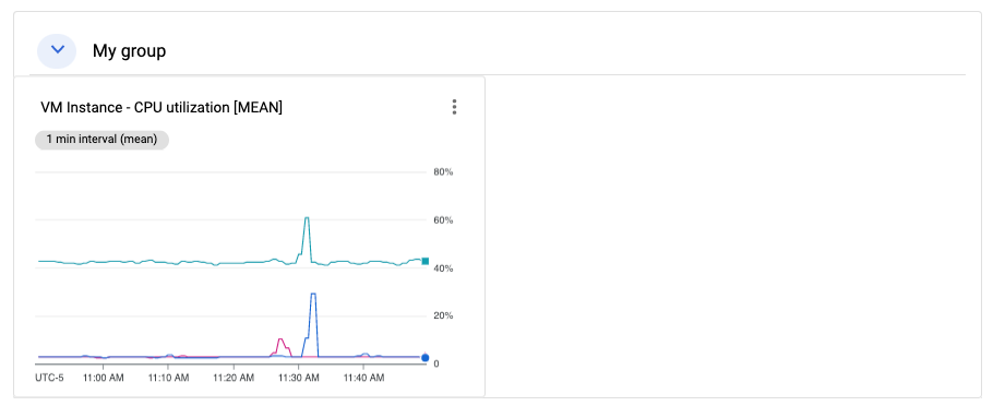
이전 예시에서 접을 수 있는 그룹 위젯에는 VM 인스턴스의 CPU 사용률을 표시하는 단일 차트가 포함되어 있습니다. 접을 수 있는 그룹 위젯은 테이블의 전체 행을 포함합니다. 그룹의 (x,y) 위치 및 높이 사양에 위젯의 (x,y) 위치가 포함되어 있으면 위젯이 그룹에 포함됩니다. 위의 예시에서 그룹은 (0,0) 위치에 있고 높이는 4입니다. xyChart는 (0,0) 위치에 있으므로 그룹에 포함됩니다. 그러나 차트의 위치가 (0,5)로 변경되면 차트가 그룹에서 제외됩니다. 마지막으로 위젯의 (x,y) 위치로 인해 위젯이 그룹에 포함되는 경우 접을 수 있는 그룹 위젯의 높이가 확장될 수 있습니다.
대시보드에 그룹 위젯을 포함하려면 대시보드에 MosaicLayout이 있어야 합니다.
축소형 그룹 위젯은 다음 예시와 비슷하게 표시됩니다.
SingleViewGroup 위젯이 있는 대시보드
SingleViewGroup 위젯은 그룹의 구성원을 한 번에 한 명씩 표시합니다. 그룹의 구성원인 차트 및 기타 위젯을 지정합니다. 또한 SingleViewGroup 위젯의 메뉴를 사용해서 표시되는 그룹의 위젯을 제어합니다.
SingleViewGroup 위젯은 DROPDOWN 및 TAB의 두 가지 표시 스타일을 지원합니다. 이러한 두 스타일 간의 차이는 표시할 그룹의 구성원을 선택하는 방법에 있습니다. DROPDOWN 스타일의 위젯은 메뉴를 제공합니다. TAB 스타일의 위젯은 위젯 툴바에서 탭을 제공합니다.
{
  "dashboardFilters": [],
  "displayName": "Example",
  "labels": {},
  "mosaicLayout": {
    "columns": 48,
    "tiles": [
      {
        "height": 16,
        "widget": {
          "singleViewGroup": {
            "displayType": "DROPDOWN"
          },
          "title": "Untitled group"
        },
        "width": 24,
        "yPos": 16
      },
      {
        "height": 16,
        "widget": {
          "title": "VM Instance - Disk read bytes [RATE]",
          "xyChart": {
            "chartOptions": {
              "mode": "COLOR"
            },
            "dataSets": [
              {
                "minAlignmentPeriod": "60s",
                "plotType": "LINE",
                "targetAxis": "Y1",
                "timeSeriesQuery": {
                  "timeSeriesFilter": {
                    "aggregation": {
                      "alignmentPeriod": "60s",
                      "perSeriesAligner": "ALIGN_RATE"
                    },
                    "filter": "metric.type=\"compute.googleapis.com/instance/disk/read_bytes_count\" resource.type=\"gce_instance\""
                  }
                }
              }
            ],
            "thresholds": [],
            "yAxis": {
              "label": "",
              "scale": "LINEAR"
            }
          }
        },
        "width": 24,
        "yPos": 16
      },
      {
        "height": 16,
        "widget": {
          "title": "VM Instance - Disk write bytes [RATE]",
          "xyChart": {
            "chartOptions": {
              "mode": "COLOR"
            },
            "dataSets": [
              {
                "minAlignmentPeriod": "60s",
                "plotType": "LINE",
                "targetAxis": "Y1",
                "timeSeriesQuery": {
                  "timeSeriesFilter": {
                    "aggregation": {
                      "alignmentPeriod": "60s",
                      "perSeriesAligner": "ALIGN_RATE"
                    },
                    "filter": "metric.type=\"compute.googleapis.com/instance/disk/write_bytes_count\" resource.type=\"gce_instance\""
                  }
                }
              }
            ],
            "thresholds": [],
            "yAxis": {
              "label": "",
              "scale": "LINEAR"
            }
          }
        },
        "width": 24,
        "yPos": 16
      }
    ]
  }
}
이전 예시와 같이 tiles 배열에는 하나의 SingleViewGroup 객체가 포함되어 있지만 해당 객체에 어떤 객체가 포함되는지 지정하지 않습니다. 대신 SingleViewGroup 객체의 멤버십은 width 및 yPos 필드의 값에 따라 결정됩니다. width 및 yPos 필드의 값이 SingleViewGroup 객체의 값과 일치하는 객체는 SingleViewGroup 객체에 포함된 것으로 간주됩니다. 이전 예시에서 SingleViewGroup 객체에는 차트 두 개가 포함되어 있습니다.
SectionHeader 위젯이 있는 대시보드
SectionHeader 위젯은 대시보드에 가로 구분선을 만들고 대시보드의 목차에 항목을 만듭니다. 목차의 항목을 맞춤설정하고 위젯에 추가 정보를 포함할 수 있습니다. 목차에서 섹션 헤더 항목 뒤에 구분선을 추가하도록 위젯을 구성할 수도 있습니다.
다음은 단일 차트와 SectionHeader 위젯이 있는 대시보드입니다.
{
  "dashboardFilters": [],
  "displayName": "Example",
  "labels": {},
  "mosaicLayout": {
    "columns": 48,
    "tiles": [
      {
        "height": 16,
        "widget": {
          "title": "VM Instance - Disk write bytes [RATE]",
          "xyChart": {
            "chartOptions": {
              "mode": "COLOR"
            },
            "dataSets": [
              {
                "minAlignmentPeriod": "60s",
                "plotType": "LINE",
                "targetAxis": "Y1",
                "timeSeriesQuery": {
                  "timeSeriesFilter": {
                    "aggregation": {
                      "alignmentPeriod": "60s",
                      "perSeriesAligner": "ALIGN_RATE"
                    },
                    "filter": "metric.type=\"compute.googleapis.com/instance/disk/write_bytes_count\" resource.type=\"gce_instance\""
                  }
                }
              }
            ],
            "thresholds": [],
            "yAxis": {
              "label": "",
              "scale": "LINEAR"
            }
          }
        },
        "width": 24,
        "yPos": 4
      },
      {
        "height": 4,
        "widget": {
          "sectionHeader": {
            "dividerBelow": true,
            "subtitle": "Instance metrics"
          },
          "title": "Metrics"
        },
        "width": 48
      }
    ]
  }
}
SectionHeader 객체에서 title 필드의 값은 위젯과 목차에 모두 표시됩니다. subtitle 필드의 값은 위젯에서만 표시됩니다. dividerBelow 값이 true이면 목차에 구분선이 추가됩니다.
SLO 위젯이 있는 대시보드
이 예시에서는 SLO 위젯이 있는 대시보드를 보여줍니다.
{
  "dashboardFilters": [],
  "displayName": "Example",
  "labels": {},
  "mosaicLayout": {
    "columns": 48,
    "tiles": [
      {
        "height": 16,
        "widget": {
          "title": "SLO Error Budget: 99.5% - Distribution Cut - Calendar month",
          "xyChart": {
            "chartOptions": {
              "mode": "COLOR"
            },
            "dataSets": [
              {
                "breakdowns": [],
                "dimensions": [],
                "legendTemplate": "Remaining error requests before SLO is burned",
                "measures": [],
                "plotType": "LINE",
                "targetAxis": "Y1",
                "timeSeriesQuery": {
                  "timeSeriesFilter": {
                    "aggregation": {
                      "perSeriesAligner": "ALIGN_NEXT_OLDER"
                    },
                    "filter": "select_slo_budget(\"projects/Project_Number/services/SERVICE_ID/serviceLevelObjectives/SLO_ID\")",
                  },
                  "unitOverride": "1"
                }
              }
            ],
            "thresholds": []
          }
        },
        "width": 24
      }
    ]
  }
}
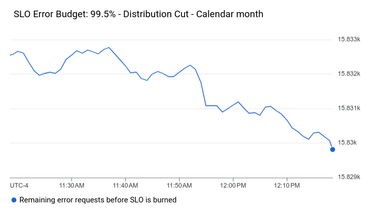
이전 JSON에 표시된 것처럼 SLO 차트는 XyChart 객체로 표현됩니다. 이러한 객체는 모든 집계 필드, 기준점을 지정하며 filter 필드의 값은 시계열 선택기입니다. 이러한 선택기에 대한 자세한 내용은 SLO 데이터 검색을 참조하세요.
SLO 위젯은 다음 예시와 비슷합니다.
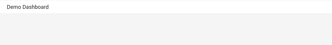
빈 위젯이 있는 대시보드
이 예시는 빈 자리표시자 위젯이 있는 대시보드를 보여줍니다.
displayName 필드의 값이 위젯에 표시됩니다.
{
  "displayName": "Demo Dashboard",
  "gridLayout": {
    "widgets": [
      {
        "blank": {}
      }
    ]
  }
}
대시보드는 다음 예시와 비슷합니다.
위젯 가시성이 구성된 대시보드
이 대시보드에는 텍스트 위젯과 변수가 포함됩니다. 변수의 값에 따라 텍스트 위젯의 표시 또는 숨김 여부가 결정됩니다.
show라는 변수에는 기본값a가 포함됩니다. 변수의 값은a,b,c로 정의됩니다.valueType필드가STRING_ARRAY이므로 변수를a or b와 같은 값으로 설정할 수도 있습니다.텍스트 위젯에서
visibilityCondition라벨로 표시된 항목은 위젯의 가시성을 정의합니다.show변수의 값에b가 포함된 경우에는 텍스트 위젯이 표시됩니다. 그렇지 않으면 텍스트 위젯이 표시되지 않습니다.
{
  "displayName": "Conditional Widget Example",
  "mosaicLayout": {
    "columns": 48,
    "tiles": [
      {
        "yPos": 16,
        "width": 24,
        "height": 16,
        "widget": {
          "title": "A text widget",
          "text": {
            "content": "Example showing how to use a custom variable to control visibility.",
            "format": "MARKDOWN",
            "style": {
              "backgroundColor": "#FFFFFF",
              "fontSize": "FS_LARGE",
              "horizontalAlignment": "H_LEFT",
              "padding": "P_EXTRA_SMALL",
              "pointerLocation": "POINTER_LOCATION_UNSPECIFIED",
              "textColor": "#212121",
              "verticalAlignment": "V_TOP"
            }
          },
          "visibilityCondition": {
            "templateVariableCondition": {
              "templateVariable": "show",
              "templateVariableValue": "b",
              "comparator": "REGEX_FULL_MATCH"
            }
          }
        }
      }
    ]
  },
  "dashboardFilters": [
    {
      "labelKey": "",
      "templateVariable": "show",
      "stringArrayValue": {
        "values": [
          "a"
        ]
      },
      "filterType": "VALUE_ONLY",
      "valueType": "STRING_ARRAY",
      "stringArray": {
        "values": [
          "a",
          "b",
          "c"
        ]
      }
    }
  ],
  "labels": {}
}
위젯의 가시성 구성과 관련된 제한사항은 위젯의 가시성 설정을 참조하세요.