This document describes how to work with chart legends. The legend looks like a table positioned adjacent to the graph. By default, the legend on a dashboard is configured to show only the colored dots that correspond to lines in the graph. The following screenshot shows a chart on a dashboard with the default legend:
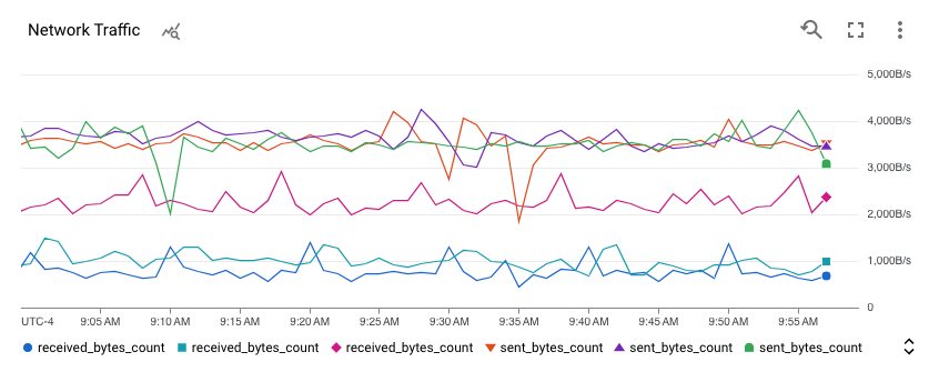
For charts on dashboards, you can also expand the legend to view more details, such as configurable data columns and a Value column. The Value column displays the values for the metric being charted, and other columns display the values of chosen metric or resource labels. The dashed bar on the chart indicates the time for which values are displayed.
To access resource-specific dashboards or to apply temporary filters to a dashboard, use the more_vert Actions for this timeseries menu in an expanded legend.
Show and hide legends
Charts on dashboards
You can show or hide the legends of all charts on a dashboard or of each chart individually:
- To show or hide the legends of every chart in a dashboard, in the dashboard toolbar, click settings Settings and then select Condensed or Table.
- To show or hide the legend of a particular chart, click unfold_more Expand legend, or select Expand chart legend in the more_vert More chart options menu.
Metrics Explorer
- To show a chart's full legend, in the toggle labeled Chart Table Both, select Both.
- To hide a chart's full legend, in the toggle labeled Chart Table Both, select Chart.
Legends for charts that display multiple metric types might be difficult to interpret. By default, the legend columns are selected from the metric and resource labels for the charted metric type. When a chart has multiple metric types, the result is that a specific legend column might not be meaningful for a specific time series.
Example: A chart displays the number of bytes written to and the number of bytes read from virtual machine (VM) instances. Assume that the bytes-read data is filtered to the
us-central1-azone. The legend includes azonecolumn, and the values in that column might be different thanus-central1-a. The reason is that the bytes-written metric type contains azonelabel and that metric data wasn't filtered by zone.Example: A chart displays the number of bytes written to VM instances and the CPU usage for those instances. The legend contains columns for the disk type and storage type. However, the values for those labels are empty for time legend fields. The reason is that the CPU usage metric type doesn't support those labels.
Select legend columns
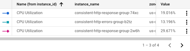
To change the columns that appear in the legend, expand the legend then click view_column Legend columns. Clicking the button brings up a configuration panel. This panel lists the metric and resource labels available to display as columns. Required columns have disabled checkboxes. The following screenshot shows the Columns button and the configuration panel for a particular legend:
![]()
When the chart is initially created, the system heuristically chooses a set of labels to show by default. You can select or clear labeled columns. The entries for required columns, most typically Value, are disabled and can't be cleared. When you change the configuration, you must have at least one metric or resource label selected.
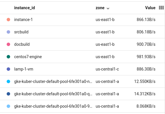
The legend displays a scrollbar when it has many columns to display, and paginates the legend when there are many rows to display. The following screenshot illustrates a legend with a scrollbar, and arrows for navigating through the pages:
Sort legend rows
You can sort the rows of the legend by any of the columns. Rows can be sorted into ascending or descending order. To sort a row, click the header. The most recently sorted column displays an arrow indicating the sort order. The following screenshot shows a legend that has been sorted by zone in descending order:
Understand legends in "Compare to Past" mode
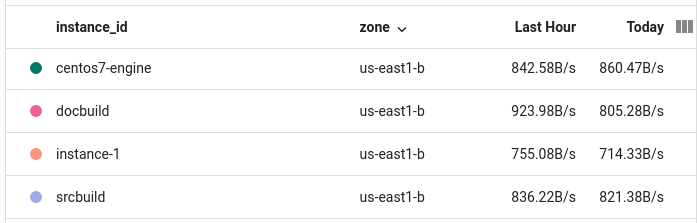
When you use Compare to Past mode on a chart, the legend is modified to include a second “values” column. The current Value column becomes Today, and the past values column is named appropriately—for example, Last Week. The following screenshot shows a legend for a table comparing current data to that of the last hour:
Configure the name of a legend column
The Legend Alias field lets you customize a description for the time series on your chart. These descriptions appear on the tooltip for the chart and on the chart legend in the Name column. By default, the descriptions in the legend are created for you from the values of different labels in your time series. Because the system selects the labels, the results might not be helpful to you. To build a template for descriptions, use this field.
You can enter plain text and templates in the Legend Alias field. When you add a template, you add an expression that is evaluated when the legend is displayed.
To add a legend template to a chart, do the following:
- In the Display pane, expand expand_more Legend Alias.
- Click add Display template variable suggestions
and select an entry from the menu.
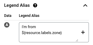
For example, if you select
zone, then the template${resource.labels.zone}is added.
For example, the following screenshot shows a legend template that contains
plain text and the expression ${resource.labels.zone}:
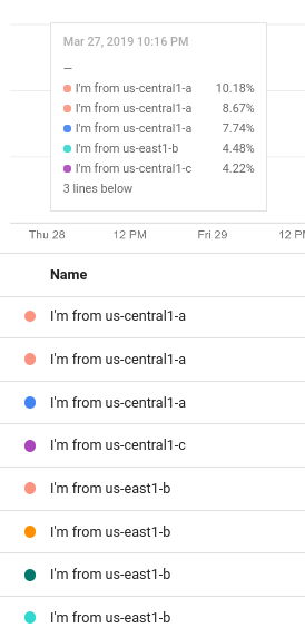
In the chart legend, the values generated from the template appear in a column with the header Name and in the tooltip:
You can configure the legend template to include multiple text strings and templates; however, the display space available on the tooltip is limited.
Access resource-specific dashboards
Charts on dashboards
When you are viewing a time series, you might want to view more information about the resource against which that time series is written. For some resources, you can go to the management page for that resource by using options in a chart's legend.
To go to the management page for a resource, do the following:
-
In the Google Cloud console, go to the
 Dashboards page:
If you use the search bar to find this page, then select the result whose subheading is Monitoring.
- In the toolbar of the Google Cloud console, select your Google Cloud project. For App Hub configurations, select the App Hub host project or the app-enabled folder's management project.
- Select a dashboard and then go to the chart or table that is displaying the time series of interest.
- If you are viewing a table, then scroll through the table until you find the row of interest. Next, go to the column that displays the numeric value, click more_vertActions for this timeseries, and then select Manage.
If you are viewing a chart, then do the following:
- On the chart, click unfold_more Expand legend.
- Scroll through the legend until you find the specific time series of interest, click more_vertActions for this timeseries, and then select Manage.
The following is a partial list of resources whose management page you can access from the legend options:
- BigQuery datasets
- Cloud Storage buckets
- Compute Engine disks and instances
- Google Kubernetes Engine clusters, containers, nodes, and pods
- External Application Load Balancers
- Pub/Sub subscriptions and topics
- Spanner instances
Metrics Explorer
Not supported.