The legacy Dialogflow CX Messenger integration provides a customizable chat dialog for your agent that can be embedded in your website. The chat dialog is implemented as a dialog window that can be opened and closed by your end-user. When opened, the chat dialog appears above your content in the lower right side of the screen.
Migrating to the latest Dialogflow CX Messenger
The latest version of Dialogflow CX Messenger provides authentication to control agent query access and more user interface configuration options. It is recommended that all users of the legacy version migrate to the new version.
If you enabled the Dialogflow CX Messenger integration before August 29, 2023, you might be using the legacy version. To determine whether you are using the legacy version, examine the messenger HTML code embedded on your website. If you see the following script, you are using the legacy version:
https://www.gstatic.com/dialogflow-console/fast/messenger-cx/bootstrap.js?v=1
To migrate to the new version:
- Delete all HTML, CSS, and JavaScript messenger code from your website.
- Follow the instructions for the latest Dialogflow CX Messenger integration.
HTML customizations
You can customize various aspects
for how the chat dialog appears and behaves.
The df-messenger HTML element has the following attributes:
| Attribute | Input policy | Value |
|---|---|---|
agent-id |
Required | Agent ID associated with the agent. This is prepopulated with your agent ID. |
chat-icon |
Optional | Icon used for the chat dialog open button. The Conversational Agents (Dialogflow CX) icon is the default. This field must be a public URL. The icon size should be 36px by 36px. |
chat-title |
Required | Title displayed at the top of the chat dialog. This is prepopulated with your agent's name. |
df-cx |
Required | Indicates that interaction is with a CX agent. Use "true" as the value. |
expand |
Optional | Boolean attribute that sets the chat dialog to be open when the page loads. By default, the chat dialog is closed when the page loads. |
intent |
Optional | A custom event that will be invoked when the chat dialog is opened. You can use an event handler that will be called for this event and will produce the first agent message. |
language-code |
Required | Default language code for the first intent. This is prepopulated with the agent's default language. |
location |
Required | The agent's region. |
session-id |
Optional | A session ID. If this is not supplied, the integration will generate a unique ID for each chat dialog. |
user-id |
Optional | Can be used to track a user across sessions. You can pass the value to Conversational Agents (Dialogflow CX) through the queryParams.payload.userId field in a detect intent request, and Conversational Agents (Dialogflow CX) provides this value to you through the WebhookRequest.payload.userId field. |
wait-open |
Optional | Boolean attribute that delays the custom event defined in the intent attribute until the dialog is actually opened. |
CSS customizations
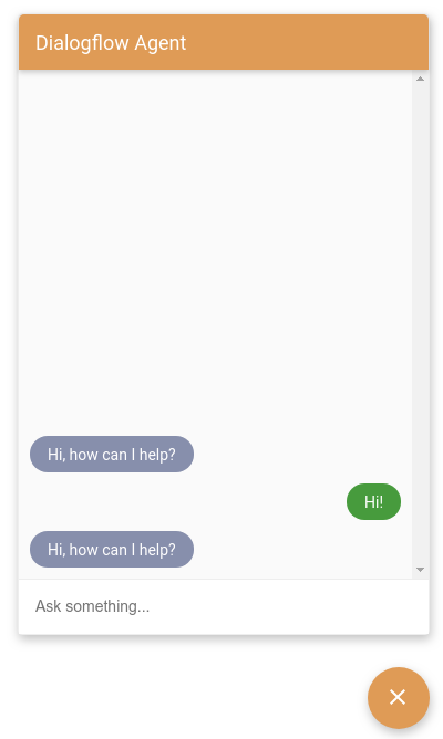
You can customize the style of your chat dialog by setting CSS variables.
The following CSS variables can be provided:
| CSS variable | Affected property |
|---|---|
df-messenger-bot-message |
Bubble background color for agent messages. |
df-messenger-button-titlebar-color |
Color for the floating button and the titlebar of the chat dialog. |
df-messenger-button-titlebar-font-color |
Font color for the title in the titlebar. |
df-messenger-chat-background-color |
Color for the chat dialog background. |
df-messenger-font-color |
Font color for messages. |
df-messenger-input-box-color |
Background color for the text input box. |
df-messenger-input-font-color |
Font color for the text input box. |
df-messenger-input-placeholder-font-color |
Font color for placeholder text in text input box. |
df-messenger-minimized-chat-close-icon-color |
Color of the close icon in the closed chat view. |
df-messenger-send-icon |
Color of the send icon in the text input box. |
df-messenger-user-message |
Bubble background color for user messages. |
Example code:
<style>
  df-messenger {
   --df-messenger-bot-message: #878fac;
   --df-messenger-button-titlebar-color: #df9b56;
   --df-messenger-chat-background-color: #fafafa;
   --df-messenger-font-color: white;
   --df-messenger-send-icon: #878fac;
   --df-messenger-user-message: #479b3d;
  }
</style>
The settings above will result in:
JavaScript events
Dialogflow Messenger triggers a variety of events that you can create event listeners for.
The
event target
for these events is the df-messenger element.
To add an event listener for the df-messenger element,
add the following JavaScript code,
where event-type is one of the event names described below:
const dfMessenger = document.querySelector('df-messenger');
dfMessenger.addEventListener('event-type', function (event) {
  // Handle event
  ...
});
The following event types are supported:
df-accordion-clicked
This event occurs when a user clicks an accordion element. The event structure looks like the following:
element: {
  title: string,
  subtitle: string,
  image: {
    src: {rawUrl: string}
  },
  text: string
}
df-button-clicked
This event occurs when a user clicks a button element. The event structure looks like the following:
element: {
  icon: {
    type: string,
    color: string
  },
  text: string,
  link: string,
  event: EventInput,
  payload: {}
}
df-chip-clicked
This event occurs when a user selects a suggestion chip. The event structure looks like the following:
query: string // Text of the suggestion chip that was selected.
df-info-card-clicked
This event occurs when the end-user clicks the information item in the titlebar. The event structure looks like the following:
element: {
  title: string,
  image: {
    src: {rawUrl: string}
  },
  actionLink: string
}
df-list-element-clicked
This event occurs when a user clicks an item in a list. The event structure looks like the following:
element: {
  title: string,
  subtitle: string,
  image: {
    src: {rawUrl}
  },
  event: {
    name: string
  },
  payload: {}
}
df-messenger-error
This event occurs when the Dialogflow API sends an error status code. The event structure looks like the following:
error: {
  "error": {
    "code": <error_code>,
    "message": <error_message>,
    "status": <error_status>
  }
}
df-messenger-loaded
This event is triggered when the df-messenger element is
fully loaded and initialized.
df-request-sent
This event occurs when a request is made to the Dialogflow API.
This event, along with df-response-received,
can be used to monitor request latency.
The event structure looks like the following:
requestBody: {
  "queryParams": {
    object(QueryParameters)
  },
  "queryInput": {
    object(QueryInput)
  },
  "inputAudio": string
}
df-response-received
This event occurs when a response is received from the Dialogflow API. The event structure looks like the following:
response: detectIntentResponse
df-user-input-entered
This event occurs when the end-user enters a query. The event structure looks like the following:
input: string // Text entered by user
JavaScript functions
The df-messenger element provides
functions
you can call to affect its behavior.
renderCustomText
This function renders a simple text message, as if it came from Conversational Agents (Dialogflow CX) as simple text response.
For example:
const dfMessenger = document.querySelector('df-messenger');
dfMessenger.renderCustomText('Custom text');
renderCustomCard
This function renders a custom card, as if it came from Conversational Agents (Dialogflow CX) fulfillment. The format of the custom payload response is defined in the Fulfillment section.
For example:
const dfMessenger = document.querySelector('df-messenger');
const payload = [
  {
    "type": "info",
    "title": "Info item title",
    "subtitle": "Info item subtitle",
    "image": {
      "src": {
        "rawUrl": "https://example.com/images/logo.png"
      }
    },
    "actionLink": "https://example.com"
  }];
dfMessenger.renderCustomCard(payload);
showMinChat
This function shows a minimal version of message lists.
For example:
const dfMessenger = document.querySelector('df-messenger');
dfMessenger.showMinChat();
Fulfillment
When creating fulfillment, you can create Text Responses and Custom Payloads . The text responses are used for basic agent responses, and the custom payloads are used for rich responses. The custom payload format for all response types has the following basic structure:
{
  "richContent": [
    [
      {
        "type": "type-id",
        ...
      },
      {
        "type": "type-id",
        ...
      }
    ],
    [
      {
        "type": "type-id",
        ...
      },
      {
        "type": "type-id",
        ...
      }
    ]
  ]
}
Note that the richContent value allows
one outer and multiple inner arrays.
Responses within an inner array are bound together in a single visual card.
When the outer array contains multiple inner arrays,
multiple cards are shown—one for each inner array.
The remaining subsections describe the various types of responses you can configure for a custom payload.
Info response type
The info response type is a simple title card that users can click or touch.
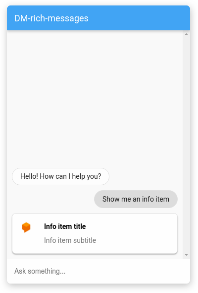
The following table describes the fields:
| Name | Type | Description |
|---|---|---|
type |
string | Response type: "info" |
title |
string | Card title |
subtitle |
string | Card subtitle |
image |
object | Image |
image.src |
object | Image source |
image.src.rawUrl |
string | Public URL for image |
actionLink |
string | URL to follow when card is clicked |
For example:
{
  "richContent": [
    [
      {
        "type": "info",
        "title": "Info item title",
        "subtitle": "Info item subtitle",
        "image": {
          "src": {
            "rawUrl": "https://example.com/images/logo.png"
          }
        },
        "actionLink": "https://example.com"
      }
    ]
  ]
}
Description response type
The description response type is an informative card that can have multiple lines of text.
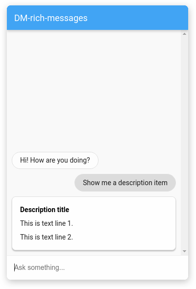
The following table describes the fields:
| Name | Type | Description |
|---|---|---|
type |
string | Response type: "description" |
title |
string | Card title |
text |
array<string> | Array of strings, where each string is rendered on a new line |
For example:
{
  "richContent": [
    [
      {
        "type": "description",
        "title": "Description title",
        "text": [
          "This is text line 1.",
          "This is text line 2."
        ]
      }
    ]
  ]
}
Image response type
The image response type is an image card that users can click or touch.
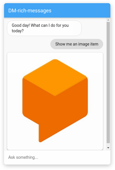
The following table describes the fields:
| Name | Type | Description |
|---|---|---|
type |
string | Response type: "image" |
rawUrl |
string | Public URL for image |
accessibilityText |
string | Alt text for image |
For example:
{
  "richContent": [
    [
      {
        "type": "image",
        "rawUrl": "https://example.com/images/logo.png",
        "accessibilityText": "Example logo"
      }
    ]
  ]
}
Button response type
The button response type is a small button with an icon that users can click or touch.
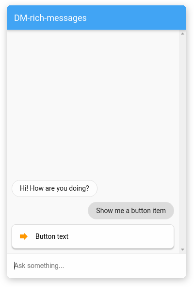
The following table describes the fields:
| Name | Type | Description |
|---|---|---|
type |
string | Response type: "button" |
icon |
object | Icon for button |
icon.type |
string | Icon from the Material icon library. The default icon is an arrow |
icon.color |
string | Color hexcode |
text |
string | Button text |
link |
string | URL to follow when button is clicked |
event |
object | Conversational Agents (Dialogflow CX) event that is triggered when the button is clicked. |
For example:
{
  "richContent": [
    [
      {
        "type": "button",
        "icon": {
          "type": "chevron_right",
          "color": "#FF9800"
        },
        "text": "Button text",
        "link": "https://example.com",
        "event": {
          "name": ""
        }
      }
    ]
  ]
}
List response type
The list response type is a card with multiple options users can select from.
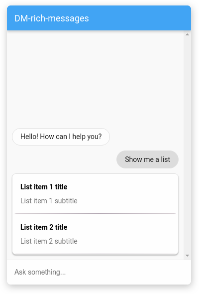
The response contains an array of list and divider
response types.
The following table describes the list type:
| Name | Type | Description |
|---|---|---|
type |
string | Response type: "list" |
title |
string | Option title |
subtitle |
string | Option subtitle |
event |
object | Conversational Agents (Dialogflow CX) event that is triggered when the option is clicked. |
The following table describes the divider type:
| Name | Type | Description |
|---|---|---|
type |
string | Response type: "divider" |
For example:
{
  "richContent": [
    [
      {
        "type": "list",
        "title": "List item 1 title",
        "subtitle": "List item 1 subtitle",
        "event": {
          "name": ""
        }
      },
      {
        "type": "divider"
      },
      {
        "type": "list",
        "title": "List item 2 title",
        "subtitle": "List item 2 subtitle",
        "event": {
          "name": ""
        }
      }
    ]
  ]
}
Accordion response type
The accordion response type is a small card that a user can click or touch to expand and reveal more text.
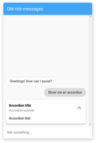
The following table describes the fields:
| Name | Type | Description |
|---|---|---|
type |
string | Response type: "accordion" |
title |
string | Accordion title |
subtitle |
string | Accordion subtitle |
image |
object | Image |
image.src |
object | Image source |
image.src.rawUrl |
string | Public URL for image |
text |
string | Accordion text |
For example:
{
  "richContent": [
    [
      {
        "type": "accordion",
        "title": "Accordion title",
        "subtitle": "Accordion subtitle",
        "image": {
          "src": {
            "rawUrl": "https://example.com/images/logo.png"
          }
        },
        "text": "Accordion text"
      }
    ]
  ]
}
Suggestion chip response type
The suggestion chip response type provides the end-user with a list of clickable suggestion chips.
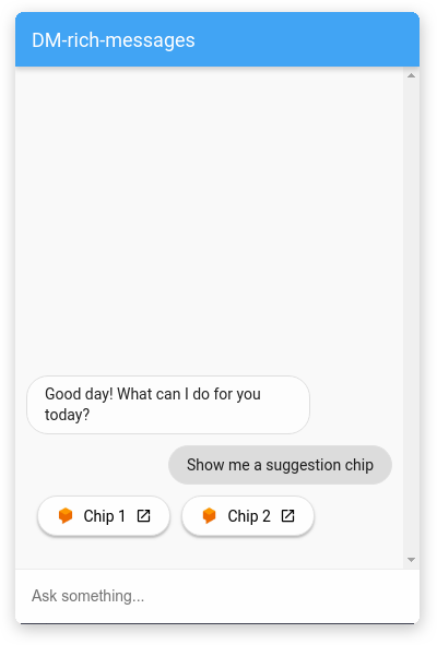
The following table describes the fields:
| Name | Type | Description |
|---|---|---|
type |
string | Response type: "chips" |
options |
array<object> | Array of Option objects |
options[].text |
string | Option text |
options[].image |
object | Option Image |
options[].image.src |
object | Option image source |
options[].image.src.rawUrl |
string | Option public URL for image |
options[].link |
string | Option link |
For example:
{
  "richContent": [
    [
      {
        "type": "chips",
        "options": [
          {
            "text": "Chip 1",
            "image": {
              "src": {
                "rawUrl": "https://example.com/images/logo.png"
              }
            },
            "link": "https://example.com"
          },
          {
            "text": "Chip 2",
            "image": {
              "src": {
                "rawUrl": "https://example.com/images/logo.png"
              }
            },
            "link": "https://example.com"
          }
        ]
      }
    ]
  ]
}
Combining response types
The individual rich message elements for Dialogflow CX Messenger can be used to construct a custom card to fit your needs. Here's an example using some of the elements listed above:
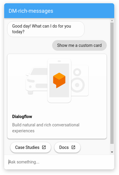
{
  "richContent": [
    [
      {
        "type": "image",
        "rawUrl": "https://example.com/images/logo.png",
        "accessibilityText": "Conversational Agents (Dialogflow CX) across platforms"
      },
      {
        "type": "info",
        "title": "Conversational Agents (Dialogflow CX)",
        "subtitle": "Build natural and rich conversational experiences",
        "actionLink": "https://cloud.google.com/dialogflow/docs"
      },
      {
        "type": "chips",
        "options": [
          {
            "text": "Case Studies",
            "link": "https://cloud.google.com/dialogflow/case-studies"
          },
          {
            "text": "Docs",
            "link": "https://cloud.google.com/dialogflow/docs"
          }
        ]
      }
    ]
  ]
}
Debugging
To test your agent locally with Dialogflow CX Messenger:
- Embed the Dialogflow CX Messenger element in a page as described in the HTML customizations section.
- Start a local HTTP server for that page with a specific port.
- Access that page at
http://localhost:port_number.
