This document describes how to configure a temporary chart that displays the time-series data collected by your project. Metrics Explorer can display only numeric time-series data.
Select the data to display
To configure which time series to display on a chart, you can build a query by making selections from menus, or you can write a query. When you write a query, you select your query language and then you use a query editor or a text-based interface:
Prometheus Query Language (PromQL) queries specify time series and how those time series are grouped and aligned. The PromQL interface supports an editor with suggestions.
It isn't generally possible to convert PromQL queries into forms that can be used by the other interfaces. Your unsaved queries are discarded when you switch to or from the PromQL tab.
Monitoring filter queries specify the time series but don't include grouping or alignment statements.
Any time series that Monitoring can chart can be specified by using a Monitoring filter. For example, to chart the number of processes running on a VM, you must use a Monitoring filter that specifies a function.
It isn't always possible to convert a Monitoring filter into the form required by other interfaces. Therefore, your query might be discarded if you switch to a different interface.
Queries typically specify a metric type, a resource type, and filters:
A metric type identifies the measurements to be collected from a resource. It includes a description of what is being measured and how the measurements are interpreted. A metric type is sometimes referred to as a metric. An example of a metric is "CPU utilization". For conceptual information, see Metric types.
A resource type specifies from which resource the metric data is captured. Resource type is sometimes called the monitored resource type or the resource. An example of a resource is a "Compute Engine virtual machine (VM) instance". For conceptual information, see Monitored resources.
PromQL queries include grouping and alignment statements. However, when you write a Monitoring filter or use menus to select the time series to chart, you configure the grouping and alignment settings by using menus.
Build queries by using menus
Building queries by using menus is the default configuration. Typically, if you select a a metric and a filter, and then switch to a different interface, your selections are preserved and reformatted for that interface. That is, a query constructed by menus can be converted to a PromQL query.
You can return from the other interfaces to the menu-driven interface by selecting tune Builder. However, your query is discarded. That is, a PromQL query can't be converted into an equivalent menu-driven form.
To build your query by using menus, do the following:
-
In the Google Cloud console, go to the leaderboard Metrics explorer page:
If you use the search bar to find this page, then select the result whose subheading is Monitoring.
- In the toolbar of the Google Cloud console, select your Google Cloud project. For App Hub configurations, select the App Hub host project or management project.
In the toolbar of the query pane, do the following:
In the Metric element, expand the Select a metric menu.
The Select a metric menu contains features that help you find the metric types available:
To find a specific metric type, use the filter_list Filter bar. For example, if you by enter
util, then you restrict the menu to show entries that includeutil. Entries are shown when they pass a case-insensitive "contains" test.To show all metric types, even those without data, click Active. By default, the menus only show metric types with data.
Make a selection from the Resources menu, the Metric categories menu, the Metrics menu, and then click Apply.
For example, to chart the CPU utilization of a Compute Engine virtual machine, you might select VM instance, Instance, CPU utilization, and the click Apply.
The Resources menu lists the resource from which the data is collected. When a metric isn't written against a resource, select Unspecified.
After the resource type and metric are selected, the chart shows all the available time series for that pair:
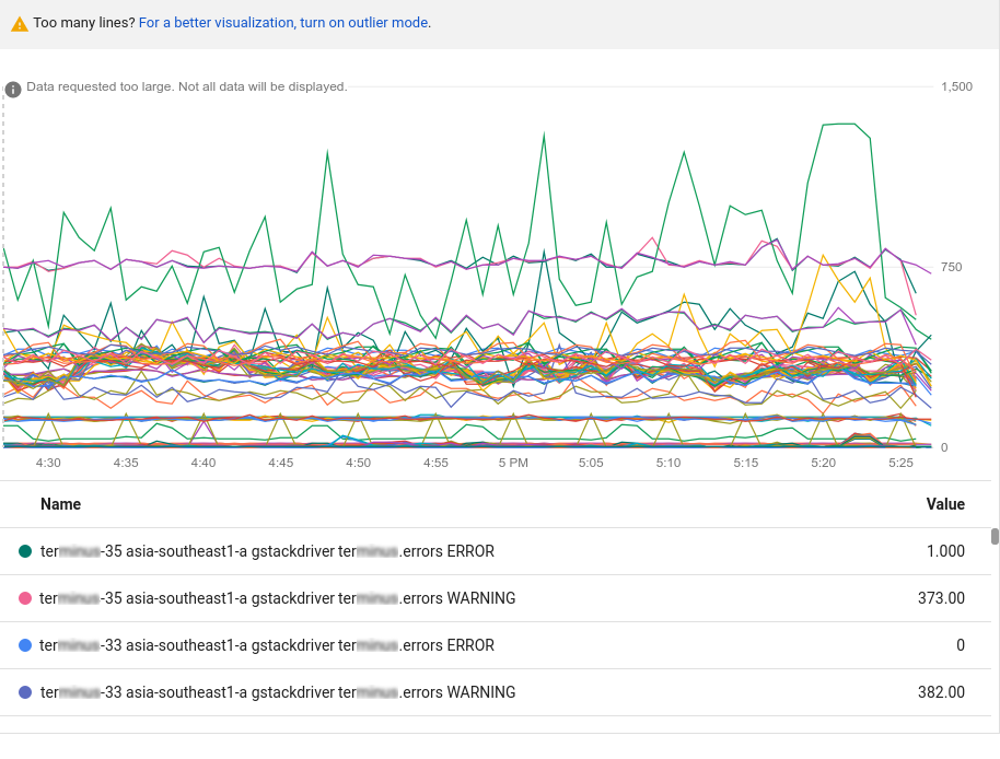
The previous chart contains more data than can be displayed; charts are limited to 50 displayable lines. The chart provides a notice that there is too much data to display. To reduce the amount of data, in the query toolbar, use the Sort & limit element. For more information, see Show outliers.
You can also use the filtering and aggregation options to reduce the amount of charted data. These techniques make the charts more useful for diagnostics and analysis, and they increase the performance and responsiveness of the user interface itself.
Optional: Add filters to restrict which time series are shown. The next section describes the filtering options.
Optional: Configure how the time series are grouped and aligned. For more information, see Choose how to display charted data.
Filter charted data
Filters ensure that only time series that meet some set of criteria are charted. When you apply filters, you might reduce the number of lines on the chart, which can improve the performance of the chart. Another way that you can improve the responsiveness of a chart is to configure aggregation options, and to sort and limit the number of time series that are displayed. For more information, see Show outliers.
A filter is composed of a label, a comparator, and a value. For example,
to match all time series whose zone label starts with "us-central1", you
could use the filter zone=~"us-central1.*", which uses a regular expression
to perform the comparison. There are four comparator operators:
- equals,
= - not equals,
!= - regular expression match,
=~ - regular expression does not match,
!=~
When you filter by the project ID or the resource container,
you must use the equals operator, (=). When you filter by
other labels, you can use any supported comparator.
Typically, you can filter metric and resource labels, and by
resource group.
When you supply multiple filtering criteria, the corresponding chart shows
only the time series that meet all criteria, a logical AND.
To add a filter when using the menu-driven interface of the Google Cloud console, do the following:
In the Filter element, click Add filter, and make a selection from the menu.
To change the comparison, select a value from the Comparator menu.
In the Value field, enter or select a value:
For a direct comparison,
=or!=, select the value from the menu or enter a value and click Ok. You can enter values such asus-central1-a, or you can create a filter string that begins withstarts_withorends_with. For example, to display data for anyus-central1zone you could enter the filter stringstarts_with("us-central1"). See Monitoring filters for more information on filter strings.Because the menu entries are derived from the received time series, when a monitored resource isn't generating data for the selected metric, you must enter a value for the label.
For a regular expression comparison,
=~or!=~, enter a RE2 regular expression into the Value field and click Ok. For example, the regular expressionus-central1-.*matches allus-central1zones.To match any US zone that ends with “a”, you could use the regular expression
^us.*.a$.You can't use regular expressions to filter the
project_idresource label.For example, to view only the time series from one of the
us-central1zones, apply azone=~"us-central1.*"filter.
When you add multiple filters, the following points apply:
You can use the same label multiple times, which lets you specify a filter for a range of values.
All filter criteria must be met; they constitute a logical
AND.
To edit the value or comparator for a filter, on the filter element, click arrow_drop_down Menu, make your changes, and then click Ok.
To delete a filter, click cancel Cancel.
Write PromQL queries
To enter a PromQL query, do the following:
-
In the Google Cloud console, go to the leaderboard Metrics explorer page:
If you use the search bar to find this page, then select the result whose subheading is Monitoring.
- In the toolbar of the Google Cloud console, select your Google Cloud project. For App Hub configurations, select the App Hub host project or management project.
- In the toolbar of the query-builder pane, select the button whose name is either code MQL or code PromQL.
- Verify that PromQL is selected in the Language toggle. The language toggle is in the same toolbar that lets you format your query.
- Optional: Disable the Auto-run toggle.
-
Enter your query into the query editor. For example, to chart the average CPU utilization of the VM instances in your Google Cloud project, use the following query:
avg(compute_googleapis_com:instance_cpu_utilization)For more information about using PromQL, see PromQL in Cloud Monitoring.
Click Run query.
When the Auto-run toggle is enabled, the Run query button isn't shown.
Write Monitoring-filter queries
When you want to do any of the following, you must use direct filter mode, which lets you enter a Monitoring filter:
- Display a service-level objective (SLO).
- Display the count of processes running on virtual machines (VMs).
- Display a custom metric for which you don't yet have data.
- Filter a time series based on a label for which you don't yet have data.
A Monitoring filter, or equivalently a
metric filter, is an expression that Monitoring
uses to identify the time series to chart.
For example, the following expression results
in a chart displaying a count of processes whose name includes nginx:
select_process_count("monitoring.regex.full_match(\".*nginx.*\")")
resource.type="gce_instance"
You can also use Monitoring filters to identify time series
by their resource and metric type. The following expression results in a
chart displaying the count of log entries for all Google Cloud virtual
machine instances in the us-east1-b zone:
metric.type="logging.googleapis.com/log_entry_count"
resource.type="gce_instance"
resource.label."zone"="us-east1-b"
To enter a Monitoring filter, do the following:
-
In the Google Cloud console, go to the leaderboard Metrics explorer page:
If you use the search bar to find this page, then select the result whose subheading is Monitoring.
- In the toolbar of the Google Cloud console, select your Google Cloud project. For App Hub configurations, select the App Hub host project or management project.
Click help_outline Help on the Metric element, and then select Direct Filter Mode.
The Metric and Filter elements are deleted, and a Filters element lets you enter text, is created.
If you selected a resource type, metric, or filters before switching to Direct Filter Mode mode, then those settings are shown in the Filters element.
In the text area of the Filters element, enter a Monitoring filter expression. For syntax information, see the following documents:
When you use direct filter mode and no data is available that satisfies the filter, an error is shown. Common error messages include
Chart definition invalidandNo data is available for the selected timeframe.Optional: Configure how the time series are grouped and aligned. For more information, see Choose how to display charted data.
To return to the menu-driven interface, click tune Exit direct filter mode.
Choose how to display charted data
The section covers how to display the selected data by setting the aggregation fields. Aggregation consists of alignment of data points within a time series, and combining different time series together. For a detailed explanation of aggregation, see Filtering and aggregation: manipulating time series.
- For information on view options, see Set chart display options.
- For more information about interacting with the chart itself, see Explore charted data.
The contents of this section doesn't apply when you've selected the data to chart by using PromQL.
Combine time series
You can reduce the amount of data returned for a metric by combining different time series. To combine multiple time series, you typically specify one or more labels and a function. Time series that have the same value for all specified labels are grouped, and then the function that you specified combines those time series into a new time series.
The settings in the Aggregation element can change the number of time series that your chart displays. The default settings for the this element are determined by the metric type you selected. To modify the display, do any of the following:
To display every time series, in the Aggregation element, ensure the first menu is set to Unaggregated and the second menu is set to None.
To combine time series, in the Aggregation element, do the following:
Expand the first menu and select a function.
The chart is refreshed and displays a single time series. For example, if you select Mean, then the displayed time series is the average of all time series.
The function menu supports common algebraic functions, like mean, minimum, maximum, and sum. The Count time series option counts the number of time series that match the metric and filter settings. The percentile options, like 99th percentile, are statistical values derived from the time series that match the metric and filter settings.
To combine time series that have the same label values, expand the second menu, and then select one or more labels.
The chart is refreshed and shows one time series for each unique combination of label values. For example, to display on time series per zone, set the second menu to zone.
To configure the spacing between data points, click add Add query element, select Min Interval, and then enter a value.
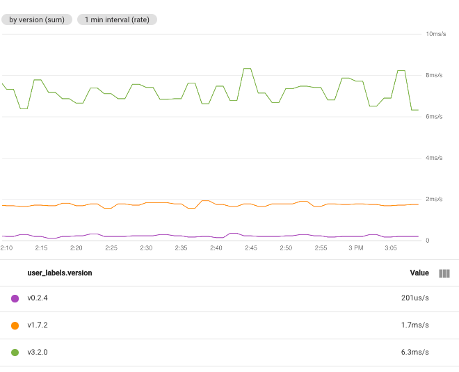
For example, if you set the function to Sum and select the label user_labels.version, then there is one time series for each value of the label user_labels.version. The data points in each time series are computed from the sum of all the values for individual time series for a specific version:
When you select multiple labels, time series that have the same values for the selected labels are combined. The resulting chart displays one time series for each combination of label values. The order in which you specify the labels doesn't matter. The following screenshot shows a chart where time series are combined by the user_labels.version and system_labels.machine_image labels:
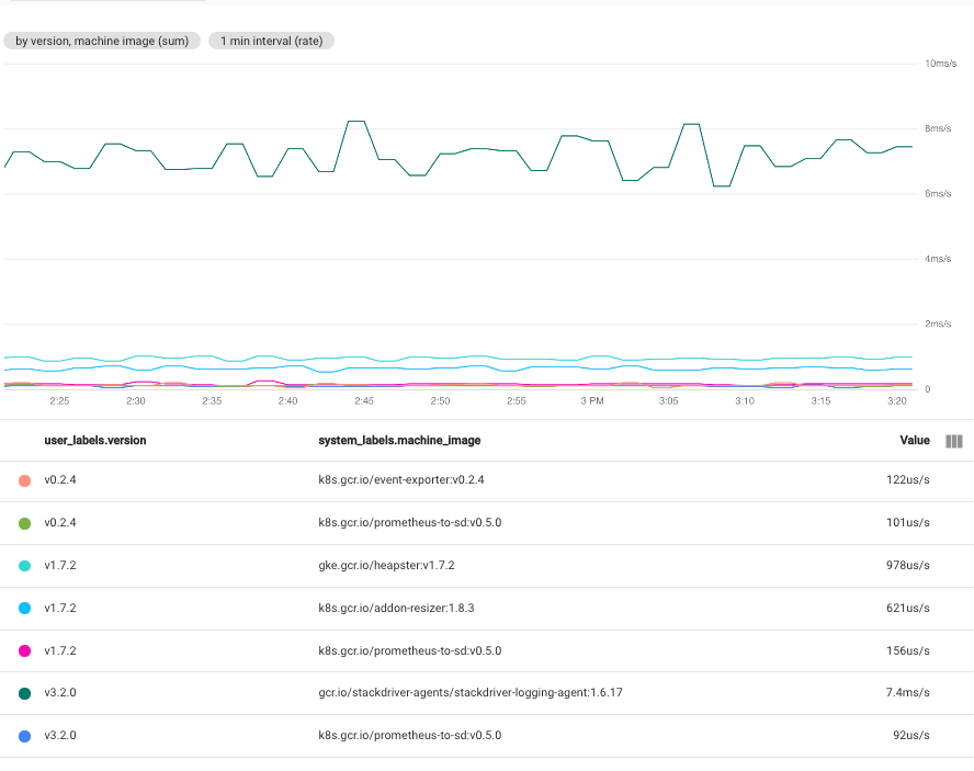
As shown, the chart displays one time series for each pair of label values. The fact that you get a time series for each combination of labels means that this technique can create more data than you can usefully put on a single chart.
Show all time series
To show all time series, on the Aggregation element, set the first menu to Unaggregated and the second menu to None.
Align time series
Alignment is the process of converting the time series data received by Monitoring into a new time series which has data points at fixed intervals. The process of alignment consists of collecting all data points received in a fixed length of time, applying a function to combine those data points, and assigning a timestamp to the result. That function might compute the average of all samples or it might extract the maximum of all samples.
Set alignment interval
To specify the fixed length of time for points to be combined, click add Add query element in the query pane, select Min Interval, and then complete the dialog.
For example, consider a metric with a sampling period of one minute. If a chart
is configured to display 1 hour of data, then the chart can display all 60 data
points. If the Min Interval field is set to 10 minutes, then the
chart displays 6 data points. However, if you now configure the chart to display
one week of data, then there are too many points to display in the chart so the
the interval over which points are combined is automatically modified.
In this example, the modified interval is one hour.
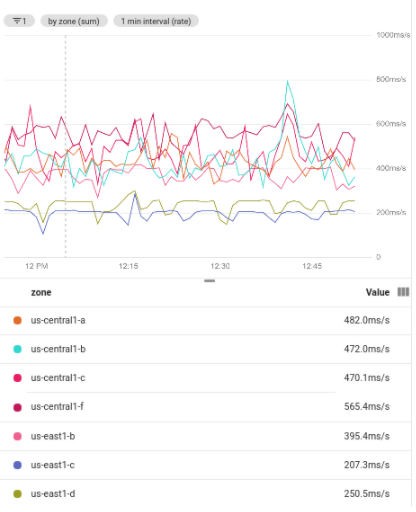
The following screenshot illustrates the CPU utilization of the
Compute Engine VM instances in a particular Google Cloud project.
In this image, the Min Interval field is set to 1 minute:
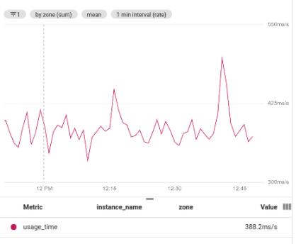
For comparison, the following screenshot illustrates the effect of changing
the interval from 1 minute to 5 minutes:
By increasing the period, the resulting chart has fewer points, decreasing from 60 points per time series to 10 points per time series. By increasing the Min Interval field, more points are combined, which has a smoothing effect on the plotted data.
Set alignment function
When you select the function for aggregation, Cloud Monitoring selects the alignment function for you. Cloud Monitoring determines the optimal alignment function based on the metric type you selected and your choice for the aggregation function. However, you can specify an alignment function and override the choice made by Cloud Monitoring.
To specify the alignment function, do the following:
- In the Aggregation element, expand the first menu and select Configure aligner. The Alignment function and Grouping elements are added.
- Expand the Alignment function element and make a selection.
While most of the supported alignment functions perform common mathematical functions, some perform more complicated actions:
next older: To retain only the most recent sample within an alignment period, select next older. This function is commonly used with uptime checks and is a good choice when you only care about the most recent value.
This function is valid only for gauge metrics.
percentile: To display a distribution metric on a plot type of line chart, stacked area chart, or stacked bar chart, you must select which percentile in the distribution to display. One way to specify this percentile is to select a percentile function. You can select the 5th, 50th, 95th, and the 99th percentiles. The aligned data point is determined by computing the specified percentile by using all data points in the alignment period.
This function is valid only for gauge and delta metrics when they have a distribution data type.
delta: To convert a cumulative metric or a delta metric into a delta metric with one sample per alignment period, use this function. Data interpolation might occur when you use this function. For an example, see Kinds, types, and conversions.
This function is valid only for cumulative and delta metrics.
rate: To convert a cumulative or delta metric into a gauge metric, use this function. If you choose this function, you can think of the time series being transformed as it was with a delta function and then divided by the alignment period. For example, if the unit of the original time series is MiB and the unit of the alignment period is second, then the chart has a unit of MiB per second. For more information, see Kinds, types, and conversions.
This function is valid only for cumulative and delta metrics.
For more information on the available alignment functions,
see Aligner
in the API reference.
Secondary grouping and alignment
When you have multiple time series that already represent aggregations, you can reduce all the time series on the chart to a single time series by choosing a Secondary Aggregator. For example, if you group data by zone, your chart shows one time series for each zone. To create a chart with a single time series, use the secondary aggregation fields.
For some metric types, you have the option to transform the data. If this option is available and if you set the Transform field to a value other than None, all other fields are the secondary aggregation settings.
When the secondary aggregation fields are configurable, to access those fields, to the following:
- Click add Add query element, and then select Secondary aggregation.
- Configure the Secondary aggregation element.
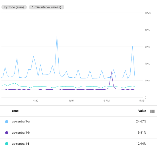
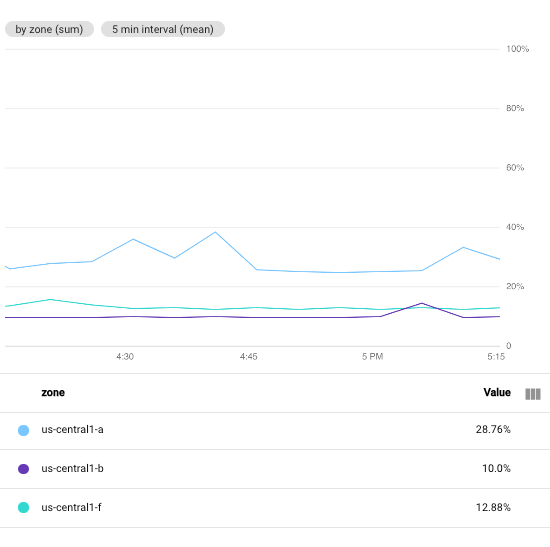
The following screenshot shows several time series that result from grouping a filtered set of data. The use of grouping requires aggregation; each group of lines is aggregated into one. The following screenshot shows time series grouped by zone:
The following screenshot shows the result of using secondary aggregation to find the mean value across the grouped time series:
Configure the name of a legend column
The Legend Alias field lets you customize a description for the time series on your chart. These descriptions appear on the tooltip for the chart and on the chart legend in the Name column. By default, the descriptions in the legend are created for you from the values of different labels in your time series. Because the system selects the labels, the results might not be helpful to you. To build a template for descriptions, use this field.
You can enter plain text and templates in the Legend Alias field. When you add a template, you add an expression that is evaluated when the legend is displayed.
To add a legend template to a chart, do the following:
- In the Display pane, expand expand_more Legend Alias.
- Click add Display template variable suggestions
and select an entry from the menu.
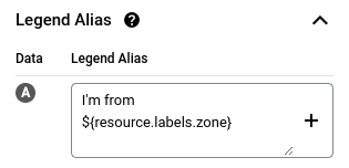
For example, if you select
zone, then the template${resource.labels.zone}is added.
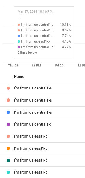
For example, the following screenshot shows a legend template that contains
plain text and the expression ${resource.labels.zone}:
In the chart legend, the values generated from the template appear in a column with the header Name and in the tooltip:
You can configure the legend template to include multiple text strings and templates; however, the display space available on the tooltip is limited.
What's next
- Explore charted data
- User-defined metrics overview
- Configure the legend template
- Set chart display options