This document describes how you can explore metric data by building a temporary chart with Metrics Explorer. For example, to view the CPU utilization of a virtual machine (VM), you can use Metrics Explorer to construct a chart that displays the most recent data. If you want permanent charts, then you can create a chart by using Metrics Explorer and save it to a custom dashboard. An alternative is to create a custom dashboard, which can display charts, logs, incidents, and other content, and then use the dashboard interface to add charts to that dashboard. For information about custom dashboards, see Create and manage custom dashboards.
You can create charts, such as those that chart a single metric type, and complex charts, such as those that chart multiple metric types. After you create a chart with Metrics Explorer, you can discard it, save it to a custom dashboard, save its configuration, or share it.
The following screenshot shows a single metric type—the CPU Utilization of a VM instance—charted on the Metrics Explorer page:
The previous screenshot shows multiple lines, each line shows the average CPU utilization for all VMs in a specific zone.
This feature is supported only for Google Cloud projects. For App Hub configurations, select the App Hub host project or the app-enabled folder's management project.
Chart a single metric type
To configure a chart to display a single metric, do the following:
-
In the Google Cloud console, go to the leaderboard Metrics explorer page:
If you use the search bar to find this page, then select the result whose subheading is Monitoring.
- In the toolbar of the Google Cloud console, select your Google Cloud project. For App Hub configurations, select the App Hub host project or the app-enabled folder's management project.
Specify the data to display on the chart. You can use a menu-driven interface, PromQL, or you can enter a Monitoring filter:
Menu-driven interface
Select the time series data that you want to view:
In the Metric element, expand the Select a metric menu.
The Select a metric menu contains features that help you find the metric types available:
To find a specific metric type, use the filter_list Filter bar. For example, if you by enter
util, then you restrict the menu to show entries that includeutil. Entries are shown when they pass a case-insensitive "contains" test.To show all metric types, even those without data, click Active. By default, the menus only show metric types with data.
For example, you might make the following choices:
- In the Active resources menu, select VM instance.
- In the Active metric categories menu, select uptime_check.
- In the Active metrics menu, select Request latency.
- Click Apply.
Optional: To specify a subset of data to display, in the Filter element, select Add filter, and then complete the dialog. For example, you can view data for one zone by applying a filter. You can add multiple filters. For more information, see Filter charted data.
For more information, see Select the data to chart.
Combine and align time series:
To display every time series, in the Aggregation element, set the first menu to Unaggregated and the second menu to None.
To combine time series, in the Aggregation element, do the following:
Expand the first menu and select a function.
The chart is refreshed and displays a single time series. For example, if you select Mean, then the displayed time series is the average of all time series.
To combine time series that have the same label values, expand the second menu, and then select one or more labels.
The chart is refreshed and shows one time series for each unique combination of label values. For example, to display on time series per zone, set the second menu to zone.
When the second menu is set to None, the chart displays one time series.
Optional: To configure the spacing between data points, click add Add query element, select Min Interval, and then enter a value.
For more information about grouping and alignment, see Choose how to display charted data.
Optional: To display only the time series with the highest or lowest values, use the Sort & Limit element.
PromQL
- In the toolbar of the query-builder pane, select the button whose name is either code MQL or code PromQL.
- Verify that PromQL is selected in the Language toggle. The language toggle is in the same toolbar that lets you format your query.
-
Enter your query into the query editor. For example, to chart the average CPU utilization of the VM instances in your Google Cloud project, use the following query:
avg(compute_googleapis_com:instance_cpu_utilization)For more information about using PromQL, see PromQL in Cloud Monitoring.
Monitoring filter
-
In the Metric element, click help_outline Help, and then select Direct Filter Mode.
The Metric and Filter elements are deleted, and a Filters element that lets you enter text, is created.
If you selected a resource type, metric, or filters before switching to Direct Filter Mode mode, then those settings are shown in the field of the Filters element.
- Enter a Monitoring filter in the field of the Filters element.
Combine and align time series:
To display every time series, in the Aggregation element, set the first menu to Unaggregated and the second menu to None.
To combine time series, in the Aggregation element, do the following:
Expand the first menu and select a function.
The chart is refreshed and displays a single time series. For example, if you select Mean, then the displayed time series is the average of all time series.
To combine time series that have the same label values, expand the second menu, and then select one or more labels.
The chart is refreshed and shows one time series for each unique combination of label values. For example, to display on time series per zone, set the second menu to zone.
When the second menu is set to None, the chart displays one time series.
Optional: To configure the spacing between data points, click add Add query element, select Min Interval, and then enter a value.
For more information about grouping and alignment, see Choose how to display charted data.
Update the chart settings based on your selected metric type:
For quota metric types, use the following settings:
- In the toolbar, set the time control to be at least one week. Quota metrics typically report one sample per day.
- In the Display pane, expand the Widget type menu and then select Stacked bar chart.
For metric types that have a
Distributionvalue type, ensure that the Widget type menu is set to Heatmap chart. For more information, see About distribution-valued metrics.For other metric types, use the Widget type menu to display how the data is shown. The Widget type menu lists all available widget types; however, some widgets might not be enabled. Consider a chart that displays multiple time series, and assume that each measured value is a double:
- Line chart, Stacked bar chart, and Stacked area chart widgets are listed as Compatible. You can select any of these types.
- The Heatmap widget is disabled because these widgets can only display distribution-valued data.
Optional: To change how a chart or table displays the selected data, use the options in the Display pane:
Chart options:
- Analysis mode menu: Select between line charts, x-ray, and statics.
- Compare to Past menu: Overlay current data with past data.
- Threshold Line menu: add a reference threshold.
- Legend Alias menu: configure the name of a legend column.
- Y-axis assignment, Y-axis labels, and Y-axis scale menus: Configure configure Y-axis assignment, labels, or scale.
Table options:
- Value option menu: Select between the latest value and an aggregated value.
- Visible columns menu: Select which columns are shown.
- Column formatting menu: Configure column names, alignment of data in a column, units, and whether cells are color-coded.
- Metric view menu: Select whether the value is show by itself or shown relative to a range of values.
- Legend Alias menu: configure the name of a legend column.
Chart multiple metric types
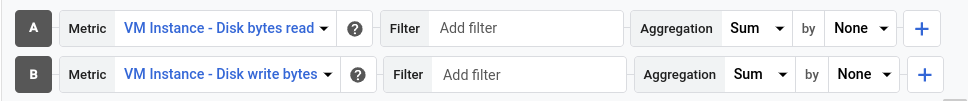
In some situations, you might want to display time series from different metric types on the same chart. For example, to compare the read and write loads on a VM, configure a chart to display the number of bytes read and the number of bytes written.
To chart multiple metrics, you must use the menu-driven interface. The other interfaces don't support charting multiple metrics.
To display multiple metrics on a chart, do the following:
-
In the Google Cloud console, go to the leaderboard Metrics explorer page:
If you use the search bar to find this page, then select the result whose subheading is Monitoring.
- In the toolbar of the Google Cloud console, select your Google Cloud project. For App Hub configurations, select the App Hub host project or the app-enabled folder's management project.
Specify the data to display on the chart.
Menu-driven interface
In the Metric element, and then select the first metric type whose data you want to view. For information about these steps, see Chart a single metric type.
The query for this selection has the A identifier.
For each additional metric type, do the following:
Select Add query. A new query is added. For example, a query with the label B might be added.
For the new query, in the Metric element, select a resource type and metric type. You can also add filters, combine time series, and sort and limit the number of displayed time series.
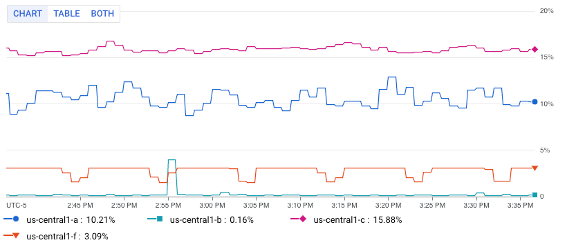
The following screenshot illustrates the Metrics Explorer display when there are two metric types charted:
Optional: In the Display pane, expand the Y-axis menu and configure which Y-axis is used for each metric type.
PromQL
Not supported.
Monitoring filter
Not supported.
Chart a ratio of metrics
Monitoring the number of errors reported might be useful; however, it is more likely that you need to monitor the rate of errors. That is, you want to know how many errors occurred as measured against the total number of responses. To meet this requirement, you can configure a chart to display the ratio of two metrics. For references to examples and for information about anomalies that can occur when you chart ratios of metrics, see Ratios of metrics.
To display a ratio of metrics on a chart, do the following:
-
In the Google Cloud console, go to the leaderboard Metrics explorer page:
If you use the search bar to find this page, then select the result whose subheading is Monitoring.
- In the toolbar of the Google Cloud console, select your Google Cloud project. For App Hub configurations, select the App Hub host project or the app-enabled folder's management project.
Specify the data to appear on the chart:
Menu-driven interface
Configure the numerator:
- In the Metric element, use the menus to select a resource type and metric type. For information about these steps, see Chart a single metric type.
- Update the aggregation fields. By default, averages all time series.
- Optional: Update the fixed length of time for points within a time series to be combined. To modify this field, click add Add query element, select Min Interval, and complete the dialog.
Select Add query and then configure the denominator:
For the new query, in Metric element, select a resource type and metric type.
Select a metric type whose metric kind is the same as the numerator. For example, if the numerator metric is a
GAUGEmetric, then the select aGAUGEmetric for the denominator.Update the aggregation fields.
We recommend that the labels for the denominator metric type match the values set for the numerator metric type. For example, you might select the
zonelabel for the numerator and denominator.You aren't required to use the same set of labels for both metric types; however, you can only select labels that are common to both metric types.
Click add Add query element, select Min Interval, and ensure this field is set to the value that is used by the numerator.
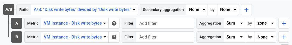
In the toolbar of the query pane, select Create ratio, and then complete the dialog.
After you create the ratio, three queries are shown:
- A/B Ratio identifies the ratio query.
- A identifies the query for the numerator.
- B identifies the query for the denominator.
The following example illustrates a ratio that compares the sum of the bytes written to disk per zone, to the total number of bytes written to disk:
Optional: To switch the numerator and denominator metrics, in the Ratio element, expand the menu, and then make a selection.
PromQL
- In the toolbar of the query-builder pane, select the button whose name is either code MQL or code PromQL.
- Verify that PromQL is selected in the Language toggle. The language toggle is in the same toolbar that lets you format your query.
-
Enter your query into the query editor. For example, to chart the ratio of average latency of your
my_summary_latency_secondsmetric, use the following query:sum without (instance)(rate(my_summary_latency_seconds_sum[5m])) / sum without (instance)(rate(my_summary_latency_seconds_count[5m]))For more information about using PromQL, see PromQL in Cloud Monitoring.
Monitoring filter
Not supported.
Save a chart for future reference
Metrics Explorer lets you create a chart that you can use to explore a metric. However, the charts created by this tool aren't persistent. When you navigate away from the Metrics Explorer page, the chart is discarded.
To save a chart you've configured with Metrics Explorer for future reference, add the chart to a custom dashboard or save the chart's URL:
To add the chart to a custom dashboard, do one of the following:
If you use the Google Cloud console to manage your custom dashboards, then select Save Chart in the Metrics Explorer toolbar, and complete the dialog. You can save the chart to an existing custom dashboard or you can create a dashboard.
If you use the Cloud Monitoring API to manage your custom dashboards, then update the JSON file that defines the dashboard and its contents. To access the JSON representation, click code JSON Editor in the chart toolbar.
For detailed information about using the API to manage your custom dashboards, see Create and manage dashboards by API.
To keep a reference to the chart configuration, save the chart URL. Because the chart URL encodes the chart configuration, when you paste this URL into a browser the chart you configured is displayed.
To obtain the chart's URL, click link Link in the chart toolbar.
Save a chart's configuration
When you manage custom dashboards by using the Cloud Monitoring API, you can use Metrics Explorer to help you construct the data you provide to the API:
To generate the JSON representation for a chart that you plan to add to a dashboard, configure the chart with Metrics Explorer. You can then use options within Metrics Explorer to view and copy the chart's JSON representation.
To identify the syntax for a Monitoring filter, which is used with the Cloud Monitoring API, use the menu-driven interface of Metrics Explorer to configure the chart. After you select the metric and filters, switch to direct filter mode to view the equivalent Monitoring filter.
Save the data displayed by the chart
To save the data displayed by the chart to your local system, click get_app Download CSV.
What's next
- Explore charted data
- Select metrics with Metrics Explorer
- View and manage metric usage
- Set chart display options