本页面介绍如何使用 Cloud Monitoring API 创建信息中心。对于每个示例,显示 JSON 格式的信息中心定义和相应的信息中心。您可以向 Google Cloud CLI 和 Cloud Monitoring API 端点提供 JSON。
Cloud Monitoring 还在 GitHub 上提供了一组精选的信息中心定义。您可以在 Google Cloud 项目中将这些定义安装为自定义信息中心。如需了解此代码库以及如何安装这些信息中心,请参阅安装示例信息中心。
何时使用 API 或 Google Cloud CLI
Cloud Monitoring API 和 Google Cloud CLI 为您提供了一种同时管理多个信息中心的方法。虽然您也可以使用 Google Cloud 控制台来管理信息中心,但您会发现使用脚本来批量管理自定义信息中心更轻松。
如果您想将空白占位符窗口微件添加到信息中心,也需要使用 API。
将 MQL 或 PromQL 与 API 搭配使用
您可以使用 dashboards.create 方法创建信息中心。您需要向 API 方法传递一个 Dashboard 对象,其中包含信息中心显示的每个 widget 的一个条目。
当 widget 显示时间序列数据(例如图表 widget)时,其在 Dashboard 对象中的条目会包含 TimeSeriesQuery 对象。
此对象说明要绘制成图表的时间序列数据,您可以使用 Monitoring 过滤条件、MQL 查询或 PromQL 查询指定这些数据:
如需使用 Monitoring 过滤条件,请填充
timeSeriesField字段。本页面上的示例使用 Cloud Monitoring 过滤条件。如需使用 MQL 查询,请填充
timeSeriesQueryLanguage字段。 如需了解详情,请参阅构建图表。如需使用 PromQL 查询,请填充
prometheusQuery字段。 如需了解一般信息,请参阅 Cloud Monitoring 中的 PromQL。
信息中心布局
本部分介绍了可用的不同信息中心布局。
GridLayout 布局的信息中心
此信息中心会显示 GridLayout 布局,其中有三个微件。
{
  "displayName": "Grid Layout Example",
  "gridLayout": {
    "columns": "2",
    "widgets": [
      {
        "title": "Widget 1",
        "xyChart": {
          "dataSets": {
            "timeSeriesQuery": {
              "timeSeriesFilter": {
                "filter": "metric.type=\"agent.googleapis.com/nginx/connections/accepted_count\"",
                "aggregation": {
                  "perSeriesAligner": "ALIGN_RATE"
                }
              },
              "unitOverride": "1"
            },
            "plotType": "LINE"
          },
          "timeshiftDuration": "0s",
          "yAxis": {
            "label": "y1Axis",
            "scale": "LINEAR"
          }
        }
      },
      {
        "text": {
          "content": "Widget 2"
        }
      },
      {
        "title": "Widget 3",
        "xyChart": {
          "dataSets": {
            "timeSeriesQuery": {
              "timeSeriesFilter": {
                "filter": "metric.type=\"agent.googleapis.com/nginx/connections/accepted_count\"",
                "aggregation": {
                  "perSeriesAligner": "ALIGN_RATE"
                }
              },
              "unitOverride": "1"
            },
            "plotType": "STACKED_BAR"
          },
          "timeshiftDuration": "0s",
          "yAxis": {
            "label": "y1Axis",
            "scale": "LINEAR"
          }
        }
      }
    ]
  }
}
此信息中心类似于以下示例:
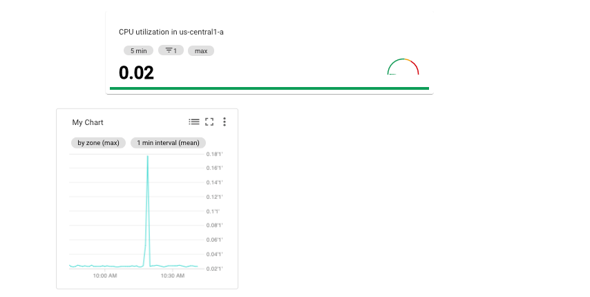
MosaicLayout 布局的信息中心
此信息中心会显示包含两个微件的 MosaicLayout。
{
  "displayName": "Mosaic Layout Example",
  "mosaicLayout": {
    "columns": 12,
    "tiles": [
      {
        "xPos": 2,
        "yPos": 2,
        "width": 7,
        "height": 2,
        "widget": {
          "title": "CPU utilization in us-central1-a",
          "scorecard": {
            "timeSeriesQuery": {
              "timeSeriesFilter": {
                "filter": "metric.type=\"compute.googleapis.com/instance/cpu/utilization\" resource.type=\"gce_instance\" resource.label.zone=\"us-central1-a\"",
                "aggregation": {
                  "perSeriesAligner": "ALIGN_MEAN",
                  "crossSeriesReducer": "REDUCE_MAX"
                }
              },
              "unitOverride": "1"
            },
            "gaugeView": {
              "upperBound": 1.5
            },
            "thresholds": [
              {
                "value": 0.8,
                "color": "YELLOW",
                "direction": "ABOVE"
              },
              {
                "value": 1,
                "color": "RED",
                "direction": "ABOVE"
              }
            ]
          }
        }
      },
      {
        "xPos": 1,
        "yPos": 5,
        "width": 4,
        "height": 4,
        "widget": {
          "title": "My Chart",
          "xyChart": {
            "dataSets": [
              {
                "timeSeriesQuery": {
                  "timeSeriesFilter": {
                    "filter": "metric.type=\"compute.googleapis.com/instance/cpu/utilization\" resource.type=\"gce_instance\"",
                    "aggregation": {
                      "perSeriesAligner": "ALIGN_MEAN",
                      "crossSeriesReducer": "REDUCE_MAX",
                      "groupByFields": [
                        "resource.label.zone"
                      ]
                    }
                  },
                  "unitOverride": "'1'"
                },
                "plotType": "LINE",
                "minAlignmentPeriod": "60s"
              }
            ],
            "yAxis": {
              "label": "y1Axis",
              "scale": "LINEAR"
            }
          }
        }
      }
    ]
  }
}
此信息中心类似于以下示例:
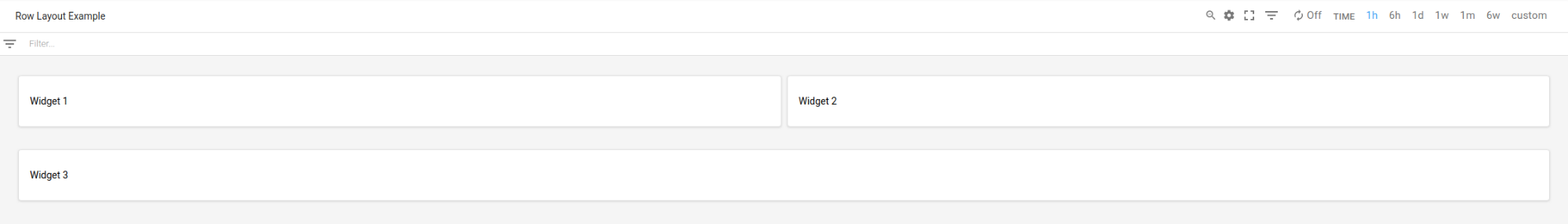
RowLayout 布局的信息中心
此信息中心会显示 RowLayout 布局,其中有三个微件。
{
  "displayName": "Row Layout Example",
  "rowLayout": {
    "rows": [
      {
        "weight": "1",
        "widgets": [
          {
            "text": {
              "content": "Widget 1",
              "format": "MARKDOWN"
            }
          },
          {
            "text": {
              "content": "Widget 2",
              "format": "MARKDOWN"
            }
          },
          {
            "text": {
              "content": "Widget 3",
              "format": "MARKDOWN"
            }
          }
        ]
      }
    ]
  }
}
此信息中心类似于以下示例:
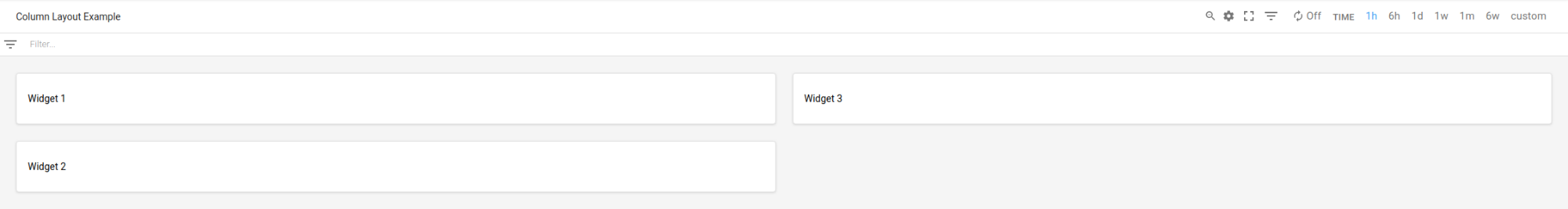
ColumnLayout 布局的信息中心
此信息中心会显示 ColumnLayout 布局,其中有三个微件。
{
  "displayName": "Column Layout Example",
  "columnLayout": {
    "columns": [
      {
        "weight": "1",
        "widgets": [
          {
            "text": {
              "content": "Widget 1",
              "format": "MARKDOWN"
            }
          },
          {
            "text": {
              "content": "Widget 2",
              "format": "MARKDOWN"
            }
          },
          {
            "text": {
              "content": "Widget 3",
              "format": "MARKDOWN"
            }
          }
        ]
      }
    ]
  }
}
此信息中心类似于以下示例:
启用信息中心事件,并添加过滤条件和标签
本部分介绍了如何向信息中心添加过滤条件和标签,以及如何将信息中心配置为显示事件。
在信息中心上启用事件
您可以通过在 Dashboard 对象中添加 annotations 字段,将信息中心配置为显示事件,例如 Google Kubernetes Engine 更新事件或虚拟机故障事件。annotations 字段包含一个 DashboardAnnotations 对象实例,其中包含两个字段:
defaultResourceName字段会列出Google Cloud 项目的信息中心级默认值,以便搜索事件。如果您未指定此字段,系统会搜索您选择的项目。EventAnnotation对象数组。每个对象都包含以下字段:displayName字段,可让您定义事件特有的切换开关上的标签。如果未指定此字段或此字段的值为空字符串,系统会显示事件的默认名称。enabled字段,可让您控制事件切换开关的值。值为true时,切换开关处于on位置,并且信息中心内会显示事件。值为false时,切换开关处于off位置。eventType字段,其中包含EventType枚举中的值。filter字段,可让您指定要附加到事件特有查询的查询。如果此字段的值为空字符串,则系统会使用事件特有的查询。resourceNames字段,可让您定义要搜索事件的Google Cloud 项目列表。如果此字段为空数组,系统会搜索您选择的项目。
以下示例展示了指定 Google Kubernetes Engine 事件的 annotations 字段:
{
  "displayName": "Annotation example",
  "annotations": {
    "defaultResourceNames": [],
    "eventAnnotations": [
      {
        "displayName": "",
        "enabled": true,
        "eventType": "GKE_CLUSTER_UPDATE",
        "filter": "resource.labels.cluster_name=my-cluster",
        "resourceNames": []
      }
    ]
  },
  "dashboardFilters": [],
  "mosaicLayout": {
  ...
  },
  "labels": {}
}
在前面的示例中,filter 字段用于将查询限制为集群 my-name。displayName 字段设置为空字符串,因此事件类型的默认名称会显示在事件的切换开关上。最后,由于 resourceNames 已设置为空数组,因此系统会查询当前 Google Cloud 项目中的日志条目。
添加信息中心过滤条件和变量
如需控制信息中心上的 widget 显示哪些数据,您可以添加变量和固定的过滤条件。如需了解详情和示例,请参阅信息中心过滤条件。
添加信息中心标签
此示例显示了指定名为 playbook 的标签的 Dashboard 对象。
{
  "displayName": "Example",
  "mosaicLayout": {
    "columns": 12,
    "tiles": [
      ...
    ]
  },
  "dashboardFilters": [],
  "labels": {
    "playbook": ""
  }
}
如前面的示例所示,labels 字段实现为 map,其中 key 和 value 字段都是字符串。向信息中心添加标签时,将 key 设置为标签的名称,并将 value 字段设置为空字符串。
向信息中心添加标签是可选的。
包含 Widgets 的信息中心
本部分包括包含不同类型 widget 的信息中心的示例。
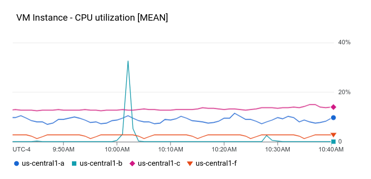
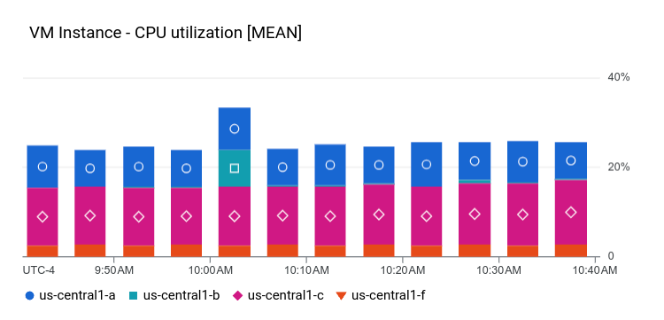
包含 XyChart 的信息中心
此信息中心会显示一个包含基本 XyChart 的信息中心。如果您曾使用 Google Cloud 控制台在信息中心创建图表,则这些图表会成为 XyChart widget 的实例。
与 Google Cloud 控制台中提供的功能类似,API 提供了用于更改图表的 PlotType 或配置图表的查看模式的选项。
{
  "dashboardFilters": [],
  "displayName": "Example line chart",
  "labels": {},
  "mosaicLayout": {
    "columns": 48,
    "tiles": [
      {
        "height": 16,
        "widget": {
          "title": "VM Instance - CPU utilization [MEAN]",
          "xyChart": {
            "chartOptions": {
              "mode": "COLOR"
            },
            "dataSets": [
              {
                "minAlignmentPeriod": "60s",
                "plotType": "LINE",
                "targetAxis": "Y1",
                "timeSeriesQuery": {
                  "timeSeriesFilter": {
                    "aggregation": {
                      "alignmentPeriod": "60s",
                      "crossSeriesReducer": "REDUCE_MEAN",
                      "groupByFields": [
                        "resource.label.\"zone\""
                      ],
                      "perSeriesAligner": "ALIGN_MEAN"
                    },
                    "filter": "metric.type=\"compute.googleapis.com/instance/cpu/utilization\" resource.type=\"gce_instance\""
                  }
                }
              }
            ],
            "thresholds": [],
            "yAxis": {
              "label": "",
              "scale": "LINEAR"
            }
          }
        },
        "width": 24
      }
    ]
  }
}
此信息中心上的图表类似于以下示例:
下一部分说明了如何创建 Log Analytics 图表 widget、如何在图表中显示阈值,以及如何配置图表是使用左侧 Y 轴和/或右侧 Y 轴。
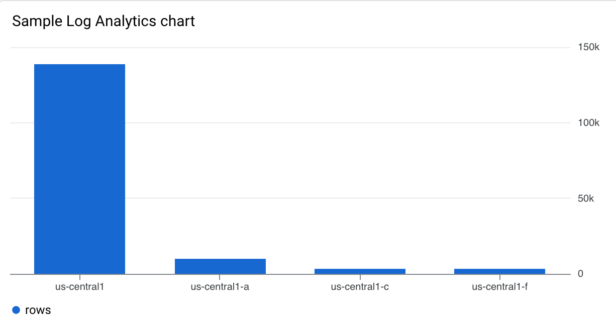
包含 Log Analytics 图表的信息中心
此信息中心显示了一个包含 Log Analytics 图表的信息中心。示例 JSON 包含 SQL 查询。
{
  "displayName": "Example",
  "dashboardFilters": [],
  "mosaicLayout": {
    "columns": 48,
    "tiles": [
      {
        "width": 24,
        "height": 16,
        "widget": {
          "title": "Sample analytics chart",
          "xyChart": {
            "chartOptions": {
              "mode": "COLOR"
            },
            "dataSets": [
              {
                "breakdowns": [],
                "dimensions": [
                  {
                    "column": "location",
                    "columnType": "STRING",
                    "maxBinCount": 5,
                    "sortColumn": "location",
                    "sortOrder": "SORT_ORDER_ASCENDING"
                  }
                ],
                "measures": [
                  {
                    "aggregationFunction": {
                      "parameters": [],
                      "type": "count"
                    },
                    "column": ""
                  }
                ],
                "plotType": "STACKED_BAR",
                "targetAxis": "Y1",
                "timeSeriesQuery": {
                  "opsAnalyticsQuery": {
                    "queryHandle": "",
                    "sql": "SELECT\n  CAST(JSON_VALUE(resource.labels.location) AS STRING) AS location,\n  severity,\nFROM\n  `TABLE_NAME_OF_LOG_VIEW`"
                  }
                }
              }
            ],
            "thresholds": [],
            "yAxis": {
              "label": "",
              "scale": "LINEAR"
            }
          }
        }
      }
    ]
  },
  "labels": {}
}
此信息中心上的图表类似于以下示例:
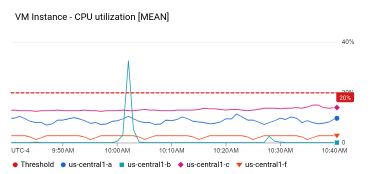
包含 XyChart 和阈值的信息中心
此信息中心会显示一个配置了基本 XyChart、阈值和左侧 Y 轴的信息中心。
{
  "dashboardFilters": [],
  "displayName": "Example line with threshold",
  "labels": {},
  "mosaicLayout": {
    "columns": 48,
    "tiles": [
      {
        "height": 16,
        "widget": {
          "title": "VM Instance - CPU utilization [MEAN]",
          "xyChart": {
            "chartOptions": {
              "mode": "COLOR"
            },
            "dataSets": [
              {
                "minAlignmentPeriod": "60s",
                "plotType": "LINE",
                "targetAxis": "Y1",
                "timeSeriesQuery": {
                  "timeSeriesFilter": {
                    "aggregation": {
                      "alignmentPeriod": "60s",
                      "crossSeriesReducer": "REDUCE_MEAN",
                      "groupByFields": [
                        "resource.label.\"zone\""
                      ],
                      "perSeriesAligner": "ALIGN_MEAN"
                    },
                    "filter": "metric.type=\"compute.googleapis.com/instance/cpu/utilization\" resource.type=\"gce_instance\""
                  }
                }
              }
            ],
            "thresholds": [
              {
                "label": "",
                "targetAxis": "Y1",
                "value": 0.2
              }
            ],
            "yAxis": {
              "label": "",
              "scale": "LINEAR"
            }
          }
        },
        "width": 24
      }
    ]
  }
}
在前面的示例中,JSON 指定使用左侧 Y 轴,因为它包含 y2Axis 结构。在 targetAxis 字段中,将“Y1”用于右 Y 轴,将“Y2”用于左 Y 轴。如果省略 targetAxis 字段,则使用右 Y 轴。
此信息中心上的图表类似于以下示例:
您可以构建显示多种指标类型并使用左右轴的图表。上一个示例展示了一个包含单个指标类型的图表,即 dataSets 数组中只有一个元素。
在将两个指标类型绘制成图表时,dataSets 数组包含两个元素,并且每个元素都指定了 targetAxis。
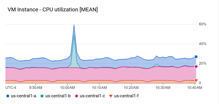
包含 STACKED_AREA PlotType 类型 XyChart 的信息中心
此信息中心会显示 STACKED_AREA PlotType 类型的 XyChart。
{
  "dashboardFilters": [],
  "displayName": "Example stacked area",
  "labels": {},
  "mosaicLayout": {
    "columns": 48,
    "tiles": [
      {
        "height": 16,
        "widget": {
          "title": "VM Instance - CPU utilization [MEAN]",
          "xyChart": {
            "chartOptions": {
              "mode": "COLOR"
            },
            "dataSets": [
              {
                "minAlignmentPeriod": "60s",
                "plotType": "STACKED_AREA",
                "targetAxis": "Y1",
                "timeSeriesQuery": {
                  "timeSeriesFilter": {
                    "aggregation": {
                      "alignmentPeriod": "60s",
                      "crossSeriesReducer": "REDUCE_MEAN",
                      "groupByFields": [
                        "resource.label.\"zone\""
                      ],
                      "perSeriesAligner": "ALIGN_MEAN"
                    },
                    "filter": "metric.type=\"compute.googleapis.com/instance/cpu/utilization\" resource.type=\"gce_instance\""
                  }
                }
              }
            ],
            "thresholds": [],
            "yAxis": {
              "label": "",
              "scale": "LINEAR"
            }
          }
        },
        "width": 24
      }
    ]
  }
}
此信息中心上的图表类似于以下示例:
包含 STACKED_BAR PlotType 类型 XyChart 的信息中心
此信息中心会显示 STACKED_BAR PlotType 类型的 XyChart。
{
  "dashboardFilters": [],
  "displayName": "Example stacked bar",
  "labels": {},
  "mosaicLayout": {
    "columns": 48,
    "tiles": [
      {
        "height": 16,
        "widget": {
          "title": "VM Instance - CPU utilization [MEAN]",
          "xyChart": {
            "chartOptions": {
              "mode": "COLOR"
            },
            "dataSets": [
              {
                "minAlignmentPeriod": "60s",
                "plotType": "STACKED_BAR",
                "targetAxis": "Y1",
                "timeSeriesQuery": {
                  "timeSeriesFilter": {
                    "aggregation": {
                      "alignmentPeriod": "60s",
                      "crossSeriesReducer": "REDUCE_MEAN",
                      "groupByFields": [
                        "resource.label.\"zone\""
                      ],
                      "perSeriesAligner": "ALIGN_MEAN"
                    },
                    "filter": "metric.type=\"compute.googleapis.com/instance/cpu/utilization\" resource.type=\"gce_instance\""
                  }
                }
              }
            ],
            "thresholds": [],
            "yAxis": {
              "label": "",
              "scale": "LINEAR"
            }
          }
        },
        "width": 24
      }
    ]
  }
}
此信息中心类似于以下示例:
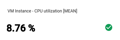
包含基本 Scorecard 的信息中心
此信息中心会显示 Scorecard,但不带仪表盘或迷你图。此示例显示了 Compute Engine CPU 利用率,统计信息摘要图表有两个阈值。一个阈值用黄色来表示 CPU 利用率超过 70%,另一个阈值用红色来表示 CPU 利用率超过 90%。
由于当前的 CPU 利用率低于指定的阈值,因此颜色为绿色。
{
  "dashboardFilters": [],
  "displayName": "Example-basic scorecard",
  "labels": {},
  "mosaicLayout": {
    "columns": 48,
    "tiles": [
      {
        "height": 8,
        "widget": {
          "scorecard": {
            "thresholds": [
              {
                "color": "YELLOW",
                "direction": "ABOVE",
                "label": "",
                "value": 0.7
              },
              {
                "color": "RED",
                "direction": "ABOVE",
                "label": "",
                "value": 0.9
              }
            ],
            "timeSeriesQuery": {
              "outputFullDuration": true,
              "timeSeriesFilter": {
                "aggregation": {
                  "alignmentPeriod": "60s",
                  "crossSeriesReducer": "REDUCE_MEAN",
                  "groupByFields": [],
                  "perSeriesAligner": "ALIGN_MEAN"
                },
                "filter": "metric.type=\"compute.googleapis.com/instance/cpu/utilization\" resource.type=\"gce_instance\""
              }
            }
          },
          "title": "VM Instance - CPU utilization [MEAN]"
        },
        "width": 16
      }
    ]
  }
}
此信息中心类似于以下示例:
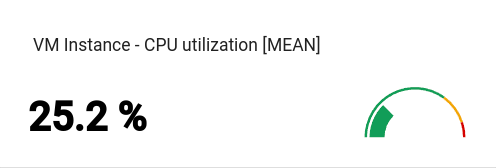
包含带有 GaugeView 的 Scorecard 的信息中心
此信息中心为上一个示例中的基本统计信息摘要添加了一个仪表盘。GaugeView 对象可以指定上限和下限,以指定要在仪表盘上显示的值的范围。由于统计信息摘要图表显示 0 到 1 的值,因此这些上下限是合理的。要添加仪表盘,请将以下内容添加到基本统计信息摘要的 JSON 中:
  "gaugeView": {
    "lowerBound": 0,
    "upperBound": 1,
  },
下面显示了完整的修改后的信息中心规范:当前值低于阈值,该值在仪表盘上以适当颜色显示。
{
  "dashboardFilters": [],
  "displayName": "Example-Gauge",
  "labels": {},
  "mosaicLayout": {
    "columns": 48,
    "tiles": [
      {
        "height": 8,
        "widget": {
          "scorecard": {
            "gaugeView": {
              "lowerBound": 0,
              "upperBound": 1
            },
            "thresholds": [
              {
                "color": "YELLOW",
                "direction": "ABOVE",
                "label": "",
                "value": 0.7
              },
              {
                "color": "RED",
                "direction": "ABOVE",
                "label": "",
                "value": 0.9
              }
            ],
            "timeSeriesQuery": {
              "outputFullDuration": true,
              "timeSeriesFilter": {
                "aggregation": {
                  "alignmentPeriod": "60s",
                  "crossSeriesReducer": "REDUCE_MEAN",
                  "groupByFields": [],
                  "perSeriesAligner": "ALIGN_MEAN"
                },
                "filter": "metric.type=\"compute.googleapis.com/instance/cpu/utilization\" resource.type=\"gce_instance\""
              }
            }
          },
          "title": "VM Instance - CPU utilization [MEAN]"
        },
        "width": 16
      }
    ]
  }
}
此信息中心上的图表类似于以下示例:
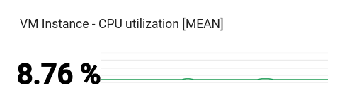
包含带有 SparkChartView 的 Scorecard 的信息中心
此信息中心将上一个示例中的仪表盘替换为迷你图。SparkChartView 对象可以在统计信息摘要上创建折线图或条形图。此示例使用了折线。只要值没有违反阈值,就会显示为绿色。要添加迷你图,请将上一个图表中的 gaugeView JSON 对象替换为以下内容:
  "sparkChartView": {
    "sparkChartType": "SPARK_LINE"
  },
该统计信息摘要图表类似于以下示例:
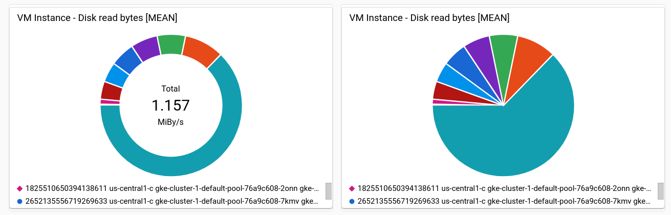
包含 PieChart 微件的信息中心
信息中心可以使用饼图显示数据。每个时序都会为饼图贡献一个扇区。饼图不会显示随时间变化的数据,而仅显示最新值。
所有饼图都由 PieChart widget 指定。如需将图表配置为显示最近测量结果的总和,请将 chartType 字段设置为 DONUT。否则,请将此字段设置为 PIE 的值。
"pieChart": {
  "chartType": "DONUT",
},
以下示例使用两个饼图配置信息中心,其中一个饼图配置为圆环图:
{
  "dashboardFilters": [],
  "displayName": "Example Pie Donut",
  "labels": {},
  "mosaicLayout": {
    "columns": 48,
    "tiles": [
      {
        "height": 16,
        "widget": {
          "pieChart": {
            "chartType": "DONUT",
            "dataSets": [
              {
                "minAlignmentPeriod": "60s",
                "timeSeriesQuery": {
                  "timeSeriesFilter": {
                    "aggregation": {
                      "alignmentPeriod": "60s",
                      "perSeriesAligner": "ALIGN_RATE"
                    },
                    "filter": "metric.type=\"compute.googleapis.com/instance/disk/read_bytes_count\" resource.type=\"gce_instance\"",
                    "secondaryAggregation": {
                      "alignmentPeriod": "60s",
                      "perSeriesAligner": "ALIGN_MEAN"
                    }
                  }
                }
              }
            ]
          },
          "title": "VM Instance - Disk read bytes [MEAN]"
        },
        "width": 24
      },
      {
        "height": 16,
        "widget": {
          "pieChart": {
            "chartType": "PIE",
            "dataSets": [
              {
                "minAlignmentPeriod": "60s",
                "timeSeriesQuery": {
                  "timeSeriesFilter": {
                    "aggregation": {
                      "alignmentPeriod": "60s",
                      "perSeriesAligner": "ALIGN_RATE"
                    },
                    "filter": "metric.type=\"compute.googleapis.com/instance/disk/read_bytes_count\" resource.type=\"gce_instance\"",
                    "secondaryAggregation": {
                      "alignmentPeriod": "60s",
                      "perSeriesAligner": "ALIGN_MEAN"
                    }
                  }
                }
              }
            ]
          },
          "title": "VM Instance - Disk read bytes [MEAN]"
        },
        "width": 24,
        "xPos": 24
      },
    ]
  }
}
如以下屏幕截图所示,两个 widget 均以饼图的形式显示数据,其中一个 widget 显示最新值的总和:
包含 Treemap 微件的信息中心
如需以一系列嵌套矩形的形式查看最新数据(其中每个矩形都对应一个唯一的标签值集合),请添加树状图。
假设您已按 zone 标签汇总要绘制成图表的数据。
如果您将 widget 类型设为树状图,则树状图上的每个矩形都对应一个区域。矩形的颜色饱和度与其所代表的值成正比。
浏览树状图时,使用指针激活矩形的提示。
以下 JSON 用于配置 Treemap widget,该 widget 会按区域和存储类型汇总时间序列:
{
  "displayName": "Example Treemap",
  "dashboardFilters": [],
  "labels": {},
  "mosaicLayout": {
    "columns": 48,
    "tiles": [
      {
        "xPos": 24,
        "height": 16,
        "width": 24,
        "widget": {
          "title": "VM Instance - Write read bytes [SUM]",
          "id": "",
          "treemap": {
            "dataSets": [
              {
                "breakdowns": [],
                "measures": [],
                "timeSeriesQuery": {
                  "outputFullDuration": true,
                  "timeSeriesFilter": {
                    "aggregation": {
                      "alignmentPeriod": "60s",
                      "crossSeriesReducer": "REDUCE_SUM",
                      "groupByFields": [
                        "resource.label.\"zone\"",
                        "metric.label.\"storage_type\""
                      ],
                      "perSeriesAligner": "ALIGN_RATE"
                    },
                    "filter": "metric.type=\"compute.googleapis.com/instance/disk/write_bytes_count\" resource.type=\"gce_instance\""
                  },
                  "unitOverride": ""
                }
              }
            ],
            "treemapHierarchy": [
              "resource.label.\"zone\"",
              "metric.label.\"storage_type\""
            ]
          }
        }
      }
    ]
  }
}
以下屏幕截图显示了使用上述配置的树状图 widget:
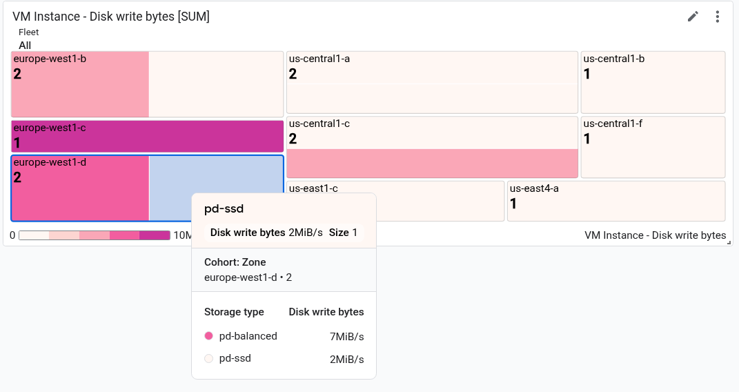
在屏幕截图中,提示显示在一个矩形中。
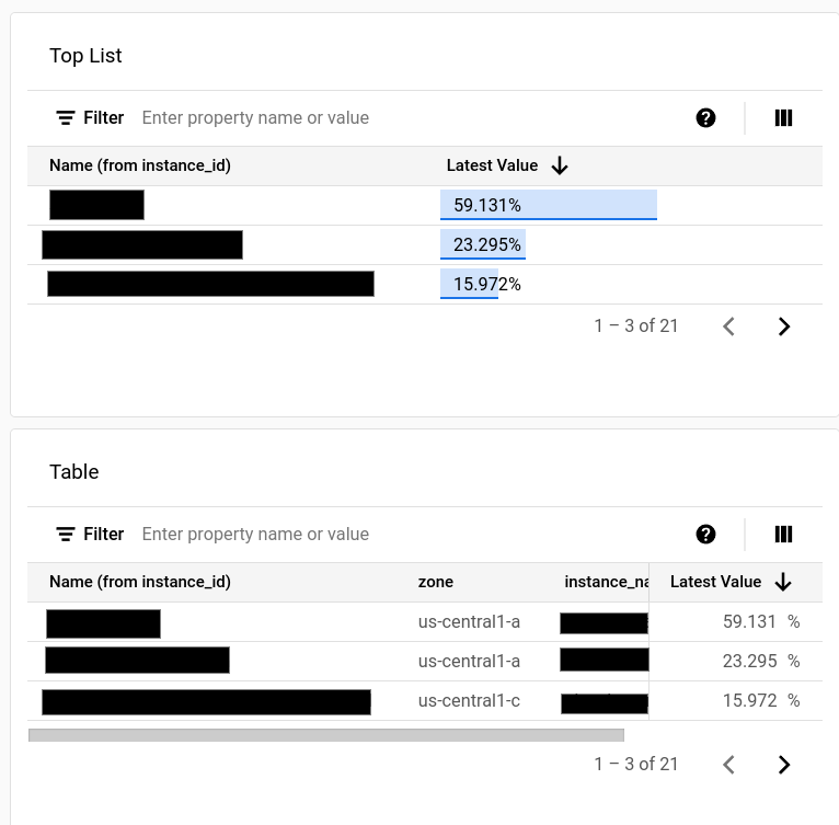
包含 TimeSeriesTable 微件的信息中心
信息中心可以用表格格式显示数据,其中每个唯一标签值组合都有一行。表格不会显示随时间变化的数据,而是显示最新值或汇总值。
所有表格都由 TimeSeriesTable widget 指定:
如需配置要显示的时间序列,请使用
dataSets字段。dataSets数组中的每个对象都对应于单一指标类型。如果您查询多种指标类型, Google Cloud 控制台会尝试在同一表格行中显示每个查询的最新值。如需了解详情,请参阅表格如何合并来自多种指标类型的数据。TimeSeriesQuery字段指定指标类型。- 如果您希望表格显示汇总值(即数据会根据信息中心设置的时间范围值进行汇总),请将
timeSeriesQuery.outputFullDuration字段设置为true。
如需配置要显示的行数上限,请设置
pickTimeSeriesFilter字段。例如,如需仅显示在过去 10 分钟内平均值最大的两个时间序列,请添加以下代码:"pickTimeSeriesFilter": { "direction": "TOP", "numTimeSeries": 2, "rankingMethod": "METHOD_MEAN" },如果您省略
pickTimeSeriesFilter字段,则表格最多可显示 300 行。如需配置表格显示数据的方式,请使用
metricVisualization字段:- 如需仅显示“25%”之类的值,请省略此字段或将值设置为
"NUMBER"。使用此配置时,Google Cloud 控制台会将该 widget 显示为表格 widget。 - 如需显示值以及可能值范围的比较值的视觉指示器,请将此字段的值设置为
"BAR"。 使用此配置时,Google Cloud 控制台会将该 widget 显示为排行榜 widget。
- 如需仅显示“25%”之类的值,请省略此字段或将值设置为
如需配置要显示的列及其属性,请使用
columnSettings数组。如果未指定此字段,则表格会针对每个标签显示一列。"column"字段的值必须设置为标签键或value,后者表示时间序列的最新值。您可以为列设置显示名称,还可以配置表单元格中数据的对齐方式:- 如需自定义列标题,请设置
displayName字段。 - 如需根据值与阈值的比较情况为显示最新值的单元格设置颜色,请添加
thresholds对象。 - 如需更改文本对齐方式,请添加
alignment字段。
以下示例展示了两个列:
"columnSettings": [ { "column": "device_name", "displayName": "Device", "visible": true }, { "alignment": "CENTER", "column": "value", "displayName": "Disk Write Bytes", "thresholds": [ { "color": "YELLOW", "direction": "ABOVE", "value": 4000 }, { "color": "RED", "direction": "ABOVE", "value": 5000 } ], "visible": true } ],- 如需自定义列标题,请设置
以下 JSON 描述了一个包含两个表格的信息中心。第一个表格显示了两种指标类型:从实例读取的字节数和写入实例的字节数。系统会显示汇总值以及参考条。第二个表格显示了某一指标类型的最新值,并且值列已配置为根据值与阈值的比较情况为单元格设置颜色编码:
{
  "displayName": "Example",
  "mosaicLayout": {
    "columns": 48,
    "tiles": [
      {
        "width": 44,
        "height": 17,
        "widget": {
          "title": "VM Instance - Disk read bytes [RATE], Disk write bytes [RATE]",
          "timeSeriesTable": {
            "dataSets": [
              {
                "timeSeriesQuery": {
                  "timeSeriesFilter": {
                    "filter": "metric.type=\"compute.googleapis.com/instance/disk/read_bytes_count\" resource.type=\"gce_instance\"",
                    "aggregation": {
                      "alignmentPeriod": "60s",
                      "perSeriesAligner": "ALIGN_RATE",
                      "groupByFields": []
                    },
                    "pickTimeSeriesFilter": {
                      "rankingMethod": "METHOD_MEAN",
                      "numTimeSeries": 30,
                      "direction": "TOP"
                    }
                  },
                  "unitOverride": "",
                  "outputFullDuration": true
                },
                "tableTemplate": "",
                "minAlignmentPeriod": "60s"
              },
              {
                "timeSeriesQuery": {
                  "timeSeriesFilter": {
                    "filter": "metric.type=\"compute.googleapis.com/instance/disk/write_bytes_count\" resource.type=\"gce_instance\"",
                    "aggregation": {
                      "alignmentPeriod": "60s",
                      "perSeriesAligner": "ALIGN_RATE",
                      "groupByFields": []
                    },
                    "pickTimeSeriesFilter": {
                      "rankingMethod": "METHOD_MEAN",
                      "numTimeSeries": 30,
                      "direction": "TOP"
                    }
                  },
                  "unitOverride": "",
                  "outputFullDuration": true
                },
                "tableTemplate": "",
                "minAlignmentPeriod": "60s"
              }
            ],
            "metricVisualization": "BAR",
            "columnSettings": [
              {
                "column": "Name (from instance_id)",
                "visible": true
              },
              {
                "column": "zone",
                "visible": true
              },
              {
                "column": "device_name",
                "visible": true
              },
              {
                "column": "storage_type",
                "visible": true
              },
              {
                "column": "device_type",
                "visible": true
              },
              {
                "column": "value",
                "visible": true,
                "displayName": "Read bytes"
              },
              {
                "column": "value-1",
                "visible": true,
                "displayName": "Written bytes"
              }
            ],
            "opsAnalyticsSettings": {
              "maxRows": "0",
              "showFilterBar": false,
              "pageSize": "0"
            },
            "displayColumnType": false
          },
          "id": ""
        }
      },
      {
        "yPos": 17,
        "width": 44,
        "height": 16,
        "widget": {
          "title": "VM Instance - Disk write bytes [RATE]",
          "timeSeriesTable": {
            "columnSettings": [
              {
                "column": "device_name",
                "displayName": "Device",
                "visible": true
              },
              {
                "alignment": "LEFT",
                "column": "instance_name",
                "displayName": "Instance name",
                "visible": true
              },
              {
                "column": "storage_type",
                "displayName": "Storage type",
                "visible": true
              },
              {
                "column": "device_type",
                "displayName": "Device Type",
                "visible": true
              },
              {
                "alignment": "CENTER",
                "column": "value",
                "displayName": "Disk Write Bytes",
                "thresholds": [
                  {
                    "color": "YELLOW",
                    "direction": "ABOVE",
                    "label": "",
                    "value": 4000
                  },
                  {
                    "color": "RED",
                    "direction": "ABOVE",
                    "label": "",
                    "value": 5000
                  }
                ],
                "visible": true
              },
              {
                "alignment": "LEFT",
                "column": "Name (from instance_id)",
                "displayName": "ID",
                "visible": true
              }
            ],
            "dataSets": [
              {
                "minAlignmentPeriod": "60s",
                "timeSeriesQuery": {
                  "timeSeriesFilter": {
                    "aggregation": {
                      "alignmentPeriod": "60s",
                      "perSeriesAligner": "ALIGN_RATE"
                    },
                    "filter": "metric.type=\"compute.googleapis.com/instance/disk/write_bytes_count\" resource.type=\"gce_instance\""
                  }
                }
              }
            ],
            "displayColumnType": false,
            "metricVisualization": "NUMBER",
            "opsAnalyticsSettings": {
              "maxRows": "0",
              "pageSize": "0",
              "showFilterBar": false
            }
          }
        }
      }
    ]
  },
  "dashboardFilters": [],
  "labels": {}
}
以下屏幕截图展示了之前定义的表格:
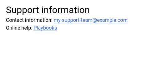
包含 Text 微件的信息中心
此示例显示了一个包含 Text 微件的信息中心。
{
  "dashboardFilters": [],
  "displayName": "DB2+TE",
  "labels": {},
  "mosaicLayout": {
    "columns": 48,
    "tiles": [
    ...
      {
        "height": 16,
        "widget": {
          "text": {
            "content": "# Support information\n\n\nContact information: my-support-team@example.com\nOnline help: [Playbooks](https://example.com)\n\n",
            "format": "MARKDOWN",
            "style": {
              "backgroundColor": "",
              "fontSize": "FS_LARGE",
              "horizontalAlignment": "H_LEFT",
              "padding": "P_EXTRA_SMALL",
              "textColor": "",
              "verticalAlignment": "V_TOP"
            }
          }
        },
        "width": 24,
        "yPos": 14
      }
    ]
  }
}
文本 widget 类似于以下示例:
包含 AlertChart 微件的信息中心
此信息中心示例展示了一个包含 AlertChart 微件的信息中心:
{
  "category": "CUSTOM",
  "displayName": "Alerting policy chart example",
  "mosaicLayout": {
    "columns": 12,
    "tiles": [
      {
        "height": 4,
        "widget": {
          "alertChart": {
            "name": "projects/my-project/alertPolicies/14205854094151528373"
          }
        },
        "width": 6,
      }
    ]
  }
}
与其他信息中心微件不同,您不需要为这些微件指定标题或指标过滤条件。但是,您可以为提醒政策指定资源名称。name 字段中的最后一个条目是提醒政策标识符。
此信息中心上的图表类似于以下示例:
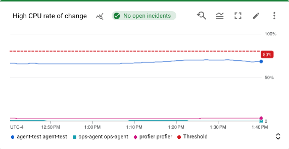
在此示例中,提醒政策会监控两个不同的虚拟机的 CPU 使用情况。虚线显示条件阈值,设置为 50%。带有 No incidents 标签的绿色卡片表示提醒政策没有未结突发事件。如果您将指针放在突发事件卡片上,系统会打开一个对话框,其中包含底层提醒政策的链接。
包含 ErrorReportingPanel 微件的信息中心
此信息中心示例展示了一个包含 ErrorReportingPanel 微件的信息中心:
{
  "dashboardFilters": [],
  "displayName": "Error reporting widget",
  "labels": {},
  "mosaicLayout": {
    "columns": 48,
    "tiles": [
      {
        "height": 16,
        "widget": {
          "errorReportingPanel": {
            "projectNames": [
              "projects/my-project"
            ],
            "services": [],
            "versions": []
          },
          "title": "Error Reporting Panel"
        },
        "width": 24,
      }
    ]
  }
}
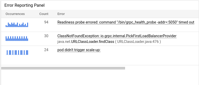
我们建议您将错误报告面板的高度配置为至少 16 个单位,将宽度配置为至少 24 个单位。在前面的示例中,widget 的高度为 16 个单位,宽度为 24 个单位。
错误报告面板会显示所选项目中的错误群组,并且可以将错误群组限制为特定资源类型、服务或服务版本。以下示例展示了错误报告面板:
包含 IncidentList 微件的信息中心
此信息中心示例展示了一个包含 IncidentList 微件的信息中心:
{
  "category": "CUSTOM",
  "dashboardFilters": [],
  "displayName": "Incident widget",
  "labels": {},
  "mosaicLayout": {
    "columns": 12,
    "tiles": [
      {
        "height": 5,
        "widget": {
          "incidentList": {
            "monitoredResources": [],
            "policyNames": []
          },
          "title": "Incidents"
        },
        "width": 8,
        "xPos": 0,
        "yPos": 0
      }
    ]
  }
}
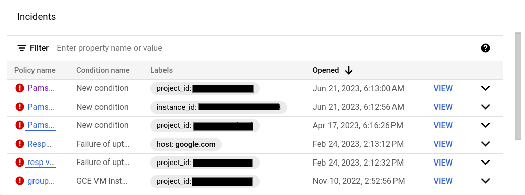
上一个示例将 title 字段设置为 Incidents,并将该 widget 配置为显示资源类型为 gce_instance 的所有事件。配置此 widget 时,您可以选择多个提醒政策或多个资源类型。
信息中心上的突发事件 widget 类似于以下示例:
包含 LogsPanel 微件的信息中心
此示例显示了一个包含 LogsPanel 微件的信息中心:
{
  "category": "CUSTOM",
  "displayName": "Logs Panel",
  "mosaicLayout": {
    "columns": 12,
    "tiles": [
      {
        "height": 4,
        "widget": {
          "logsPanel": {
            "filter": "",
            "resourceNames": [
              "projects/012012012012"
            ]
          },
          "title": "Logs Panel"
        },
        "width": 6,
        "xPos": 0,
        "yPos": 0
      }
    ]
  }
}
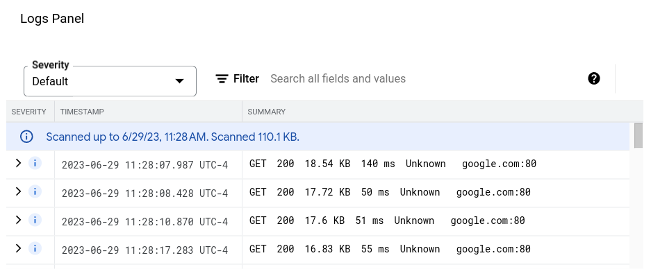
我们建议您将日志面板的高度配置为至少 3 个单位,将宽度配置为至少 4 个单位。在前面的示例中,微件的高度为 4 个单位,宽度为 6 个单位。
日志面板显示 resourceNames 字段中列出的 Google Cloud 项目中的日志。上例仅指定了一个项目;但是,您可以在此列表中添加多个项目。
日志面板类似于以下示例:
如需了解问题排查信息,请参阅使用日志面板创建信息中心的 API 调用失败。
包含 CollapsibleGroup 微件的信息中心
此示例显示了一个包含 CollapsibleGroup 微件的信息中心:
{
  "category": "CUSTOM",
  "displayName": "Group testing",
  "mosaicLayout": {
    "columns": 12,
    "tiles": [
      {
        "height": 4,
        "widget": {
          "collapsibleGroup": {
            "collapsed": false
          },
          "title": "My group"
        },
        "width": 12,
        "xPos": 0,
        "yPos": 0
      },
      {
        "height": 4,
        "widget": {
          "title": "VM Instance - CPU utilization [MEAN]",
          "xyChart": {
            "chartOptions": {
              "mode": "COLOR"
            },
            "dataSets": [
              {
                "minAlignmentPeriod": "60s",
                "plotType": "LINE",
                "targetAxis": "Y1",
                "timeSeriesQuery": {
                  "apiSource": "DEFAULT_CLOUD",
                  "timeSeriesFilter": {
                    "aggregation": {
                      "alignmentPeriod": "60s",
                      "crossSeriesReducer": "REDUCE_NONE",
                      "perSeriesAligner": "ALIGN_MEAN"
                    },
                    "filter": "metric.type=\"compute.googleapis.com/instance/cpu/utilization\" resource.type=\"gce_instance\"",
                    "secondaryAggregation": {
                      "alignmentPeriod": "60s",
                      "crossSeriesReducer": "REDUCE_NONE",
                      "perSeriesAligner": "ALIGN_NONE"
                    }
                  }
                }
              }
            ],
            "thresholds": [],
            "timeshiftDuration": "0s",
            "yAxis": {
              "label": "y1Axis",
              "scale": "LINEAR"
            }
          }
        },
        "width": 6,
        "xPos": 0,
        "yPos": 0
      }
    ]
  }
}
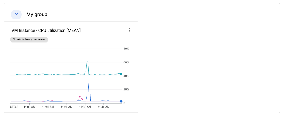
在上一个示例中,可收起群组 widget 包含一个显示虚拟机实例的 CPU 利用率的图表。可收起群组 widget 会跨越表格的整行。如果某群组的 (x,y) 位置和高度规范包含 widget 的 (x,y) 位置,则该群组包含该 widget。在上面的示例中,该群组位于 (0,0) 位置,其高度为 4。xyChart 位于位置 (0,0),因此包含在该群组中。但是,如果该图表的位置更改为 (0,5),则该图表将从该群组中排除。最后,当 widget 的 (x,y) 位置导致 widget 包含在群组中时,可收起群组 widget 的高度可能会扩展。
如需在信息中心上添加群组 widget,该信息中心必须具有 MosaicLayout。
可收起群组 widget 类似于以下示例:
包含 SingleViewGroup 微件的信息中心
SingleViewGroup widget 一次显示一个群组成员。您可以指定属于该群组中的成员的图表和其他 widget。此外,您还可以使用 SingleViewGroup widget 上的菜单来控制在该群组中显示哪个 widget。
SingleViewGroup widget 支持两种显示样式:DROPDOWN 和 TAB。这两种样式之间的区别在于您选择显示群组中哪个成员的方式。采用 DROPDOWN 样式的 widget 提供了菜单。采用 TAB 样式的 widget 在其工具栏上提供了标签页:
{
  "dashboardFilters": [],
  "displayName": "Example",
  "labels": {},
  "mosaicLayout": {
    "columns": 48,
    "tiles": [
      {
        "height": 16,
        "widget": {
          "singleViewGroup": {
            "displayType": "DROPDOWN"
          },
          "title": "Untitled group"
        },
        "width": 24,
        "yPos": 16
      },
      {
        "height": 16,
        "widget": {
          "title": "VM Instance - Disk read bytes [RATE]",
          "xyChart": {
            "chartOptions": {
              "mode": "COLOR"
            },
            "dataSets": [
              {
                "minAlignmentPeriod": "60s",
                "plotType": "LINE",
                "targetAxis": "Y1",
                "timeSeriesQuery": {
                  "timeSeriesFilter": {
                    "aggregation": {
                      "alignmentPeriod": "60s",
                      "perSeriesAligner": "ALIGN_RATE"
                    },
                    "filter": "metric.type=\"compute.googleapis.com/instance/disk/read_bytes_count\" resource.type=\"gce_instance\""
                  }
                }
              }
            ],
            "thresholds": [],
            "yAxis": {
              "label": "",
              "scale": "LINEAR"
            }
          }
        },
        "width": 24,
        "yPos": 16
      },
      {
        "height": 16,
        "widget": {
          "title": "VM Instance - Disk write bytes [RATE]",
          "xyChart": {
            "chartOptions": {
              "mode": "COLOR"
            },
            "dataSets": [
              {
                "minAlignmentPeriod": "60s",
                "plotType": "LINE",
                "targetAxis": "Y1",
                "timeSeriesQuery": {
                  "timeSeriesFilter": {
                    "aggregation": {
                      "alignmentPeriod": "60s",
                      "perSeriesAligner": "ALIGN_RATE"
                    },
                    "filter": "metric.type=\"compute.googleapis.com/instance/disk/write_bytes_count\" resource.type=\"gce_instance\""
                  }
                }
              }
            ],
            "thresholds": [],
            "yAxis": {
              "label": "",
              "scale": "LINEAR"
            }
          }
        },
        "width": 24,
        "yPos": 16
      }
    ]
  }
}
如上一个示例所示,tiles 数组包含一个 SingleViewGroup 对象;不过,该对象未指定其包含的对象。相反,SingleViewGroup 对象中的成员资格由 width 和 yPos 字段的值决定。width 和 yPos 字段的值与 SingleViewGroup 对象的值匹配的对象包含在 SingleViewGroup 对象中。在前面的示例中,SingleViewGroup 对象包含两个图表。
包含 SectionHeader 微件的信息中心
SectionHeader widget 会在信息中心内创建一个水平分隔线,并在信息中心的目录中创建一个条目。您可以自定义目录中的条目,并在 widget 中添加其他信息。您还可以配置 widget 以在部分标题条目之后向目录添加分隔符。
此信息中心展示了一个包含单个图表和 SectionHeader widget 的信息中心:
{
  "dashboardFilters": [],
  "displayName": "Example",
  "labels": {},
  "mosaicLayout": {
    "columns": 48,
    "tiles": [
      {
        "height": 16,
        "widget": {
          "title": "VM Instance - Disk write bytes [RATE]",
          "xyChart": {
            "chartOptions": {
              "mode": "COLOR"
            },
            "dataSets": [
              {
                "minAlignmentPeriod": "60s",
                "plotType": "LINE",
                "targetAxis": "Y1",
                "timeSeriesQuery": {
                  "timeSeriesFilter": {
                    "aggregation": {
                      "alignmentPeriod": "60s",
                      "perSeriesAligner": "ALIGN_RATE"
                    },
                    "filter": "metric.type=\"compute.googleapis.com/instance/disk/write_bytes_count\" resource.type=\"gce_instance\""
                  }
                }
              }
            ],
            "thresholds": [],
            "yAxis": {
              "label": "",
              "scale": "LINEAR"
            }
          }
        },
        "width": 24,
        "yPos": 4
      },
      {
        "height": 4,
        "widget": {
          "sectionHeader": {
            "dividerBelow": true,
            "subtitle": "Instance metrics"
          },
          "title": "Metrics"
        },
        "width": 48
      }
    ]
  }
}
在 SectionHeader 对象中,title 字段的值会同时显示在 widget 和目录中。只有该 widget 会显示 subtitle 字段的值。当 dividerBelow 的值为 true 时,系统会向目录添加分隔线。
具有 SLO widget 的信息中心
此示例显示了一个包含 SLO widget 的信息中心:
{
  "dashboardFilters": [],
  "displayName": "Example",
  "labels": {},
  "mosaicLayout": {
    "columns": 48,
    "tiles": [
      {
        "height": 16,
        "widget": {
          "title": "SLO Error Budget: 99.5% - Distribution Cut - Calendar month",
          "xyChart": {
            "chartOptions": {
              "mode": "COLOR"
            },
            "dataSets": [
              {
                "breakdowns": [],
                "dimensions": [],
                "legendTemplate": "Remaining error requests before SLO is burned",
                "measures": [],
                "plotType": "LINE",
                "targetAxis": "Y1",
                "timeSeriesQuery": {
                  "timeSeriesFilter": {
                    "aggregation": {
                      "perSeriesAligner": "ALIGN_NEXT_OLDER"
                    },
                    "filter": "select_slo_budget(\"projects/Project_Number/services/SERVICE_ID/serviceLevelObjectives/SLO_ID\")",
                  },
                  "unitOverride": "1"
                }
              }
            ],
            "thresholds": []
          }
        },
        "width": 24
      }
    ]
  }
}
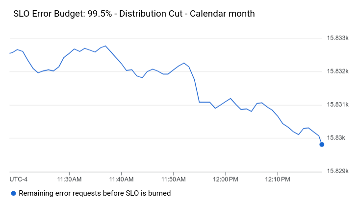
如前面 JSON 所示,SLO 图表表示为 XyChart 对象。这些对象指定了所有汇总字段、阈值,并且 filter 字段的值是时间序列选择器。如需详细了解这些选择器,请参阅检索 SLO 数据。
SLO widget 类似于以下示例:
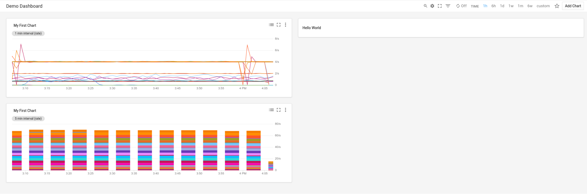
包含空白微件的信息中心
此示例展示了一个信息中心,其中包含一个空的占位符 widget。
displayName 字段的值会显示在微件中。
{
  "displayName": "Demo Dashboard",
  "gridLayout": {
    "widgets": [
      {
        "blank": {}
      }
    ]
  }
}
此信息中心类似于以下示例:
已配置 widget 可见性的信息中心
此信息中心包含一个文本 widget 和一个变量。变量的值决定了文本 widget 是显示还是隐藏:
名为
show的变量的默认值为a。变量的值定义为a、b和c。由于valueType字段为STRING_ARRAY,因此该变量还可以设置为a or b之类的值。在文本 widget 中,标记为
visibilityCondition的条目定义了 widget 的可见性。当变量show的值包含b时,系统会显示文本 widget。否则,系统不会显示文本 widget。
{
  "displayName": "Conditional Widget Example",
  "mosaicLayout": {
    "columns": 48,
    "tiles": [
      {
        "yPos": 16,
        "width": 24,
        "height": 16,
        "widget": {
          "title": "A text widget",
          "text": {
            "content": "Example showing how to use a custom variable to control visibility.",
            "format": "MARKDOWN",
            "style": {
              "backgroundColor": "#FFFFFF",
              "fontSize": "FS_LARGE",
              "horizontalAlignment": "H_LEFT",
              "padding": "P_EXTRA_SMALL",
              "pointerLocation": "POINTER_LOCATION_UNSPECIFIED",
              "textColor": "#212121",
              "verticalAlignment": "V_TOP"
            }
          },
          "visibilityCondition": {
            "templateVariableCondition": {
              "templateVariable": "show",
              "templateVariableValue": "b",
              "comparator": "REGEX_FULL_MATCH"
            }
          }
        }
      }
    ]
  },
  "dashboardFilters": [
    {
      "labelKey": "",
      "templateVariable": "show",
      "stringArrayValue": {
        "values": [
          "a"
        ]
      },
      "filterType": "VALUE_ONLY",
      "valueType": "STRING_ARRAY",
      "stringArray": {
        "values": [
          "a",
          "b",
          "c"
        ]
      }
    }
  ],
  "labels": {}
}
如需了解与配置 widget 的可见性相关的限制,请参阅设置 widget 的可见性。