This document describes how you can explore the data shown on a chart. For example, you can highlight specific time series and when you want more detail around a point of time, you can change the chart resolution. When troubleshooting, you might want to configure a chart to overlay data from an earlier time interval so that you can compare current and past data.
Charts are used in many places in Cloud Monitoring. For example, dashboards contain charts, and individual charts appear in Metrics Explorer and in the interface for configuring alerting conditions. For information about creating charts, see the following documents:
- To add a chart to a custom dashboard, see Add charts and tables to a custom dashboard.
- To create a temporary chart by using the Metrics Explorer, see Create charts with Metrics Explorer.
Highlight time series
You can examine individual time series by manipulating either the chart or its legend. This section describes how you can change the chart display so that one or more time series are highlighted while all other time series are dimmed.
Highlight a single time series
To highlight a single time series, do one of the following:
- Place your pointer on the graph line at a specific point in time. As you move your pointer on the graph, each time it touches a graph line, that line is highlighted.
Click the selected checkbox in the corresponding row of the table legend or click the line in the graph. After you select a specific line, you can move your pointer without the selection changing.
- To highlight a different line in the graph, select it.
- To remove the highlight for a line, click in an unused area of the graph or expand the legend and then clear that line's checkbox.
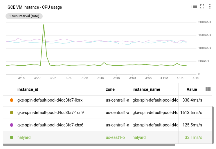
For example, in the following screenshot, the halyard time series has been
selected:
Highlight multiple time series
To highlight all lines between line-A and line-B,
select line-A, press shift, and then select line-B.
To highlight multiple lines, do one of the following:
- Press
ControlorCommand, and then select the lines of interest from the graph. - In the legend, select the checkboxes for the lines of interest.
To highlight multiple time series, click the corresponding rows in the table or press shift while selecting the time series of interest.
To remove the highlight on a time series, select its row in the legend.
To remove all highlights, click in an unused area of the graph.
Set a reference time
To select a reference time on a graph, you set a pin at the reference time. An unset pin appears on the graph when you place your pointer on the numbers along the X-axis. The unset pin is a dim line with an oval at its base that displays a time and a pin symbol.
When you set a pin the following occur:
- A blue line with an oval at its base appears on the graph. The base displays the reference time and a close Dismiss button. To remove the pin, click Dismiss.
- The legend field Value displays the value of the time series at the reference time.
- When the chart is on a dashboard, a pin is set on every chart on the dashboard.
You can only set one pin on a chart and you can either set the pin at the current time or at a specific time:
To set the pin at the current time, click Value in the legend heading of the chart.
To set the pin at a specific time, place your pointer along the X-axis at that time, and then click the oval.
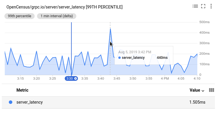
For example, the following screenshot illustrates a chart with a pin at
3:30 PM and a pointer at time 3:42 PM. The tooltip displays the
timestamp that corresponds to the pointer position. The tooltip displays 440ms,
which is the value of the time series server_latency at 3:42 PM.
The legend displays 1.505ms, which is the value of the time series
server_latency at 3:30 PM:
Change the graph resolution
There are multiple ways that you can change the resolution of a chart. For information about how to change the resolution of all charts on a dashboard, see Set the display period.
Expand a specific time interval
To magnify the graph in a specific time interval, do the following:
- Place your pointer in the graph area at one end of the time interval that you want to view in more detail.
Drag your pointer horizontally to the other end of the interval. The drag action creates a dim region between two time selectors.
After you release the pointer button, the graph is redrawn using the range of X-axis values that you selected. The Y-axis range is automatically adjusted based on the values in the time period you selected.
Optional: Change the vertical resolution of the chart.
When you select a time period for any chart on a dashboard, the dashboard disables auto-refresh and indicates that behavior by showing the button on the dashboard toolbar. To enable auto-refresh, click the button.
Expand the time resolution around a point in time
To magnify the graph around a specific point in time, do the following:
- Place your pointer in the graph area at the point in time that you want to view in more detail.
- To expand, or contract, the time axis, press
ControlorCommand, and then use two fingers on a trackpad pointer or the scroll wheel on a pointer.
Shift the time range
To shift the range of times being displayed, do the following:
- Place your pointer in the graph area at the point in time interval that you want to view in more detail.
- To display earlier or later data, press
ControlorCommandand then select and drag your pointer.
Expand the vertical resolution
To magnify an interval of values, follow these steps:
- Place your pointer in the graph area at one end of the value range that you want to view in more detail.
Drag your pointer vertically to the other end of the range to create. The drag action creates a dim region between two values on the Y-axis.
After you release the pointer button, the graph is redrawn using the Y-axis range that you selected.
Optional: Change the horizontal resolution of the chart.
When you select a time period for any chart on a dashboard, the dashboard disables auto-refresh and indicates that behavior by showing the button on the dashboard toolbar. To enable auto-refresh, click the button.
Reset the resolution
To reset a chart to its original state, click youtube_searched_for Reset zoom on the chart toolbar. The reset applies to all charts on a dashboard.
You can also click zoom_out Reset zoom on the dashboard toolbar.
Set the display period
The chart can display data for a range of periods, typically from 1 hour to 6 weeks.
On a dashboard, you can also specify a custom display period on the dashboard toolbar. This display period applies to all the charts on the dashboard. You can set the display period for isolated charts, like those in Metrics Explorer, as well.
Changing the time range on a chart changes the range of data shown and can result in realignment of the time-series. For conceptual information, see Alignment: within-series regularization.
To change the displayed time range, use the time-range selector.
For a new project, data may not be available for all parts of the range.
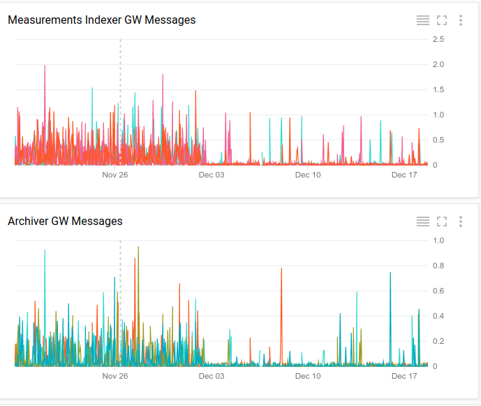
The following screenshot shows two charts from a dashboard. The display period, on the X-axis, is shared across charts on a dashboard.
Select dynamic or static data
Charts display data within a window of time. By default, this window advances, with “now” always at the right edge of the chart. The time selection determines the window into the past, for example, 1 hour. The data on the chart is dynamic; as new data is generated, it appears at “now”. By default, this behavior is enabled.
You can keep the time window from changing by turning off auto-refresh. This static option is useful when you want to study a past event. If you turn off Auto-Refresh, the button turns dim and is labeled OFF.
Dashboards provide a single Auto-Refresh button that applies all charts on the dashboard. When building a chart on the Metrics Explorer page, auto-refresh is always on.
Show outliers
Sorting the time series that match a query, and then limiting the number of time series that are charted, lets you chart the anomalous lines rather than the highly representative ones. Limiting the number of lines charted also helps ensure that individual charts are both responsive and intelligible. You can limit the number of times series that are displayed when you display data by using line, stacked bar, stacked area, and heatmap widgets.
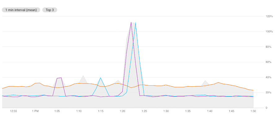
For example, the following screenshot illustrates a chart in color-mode.
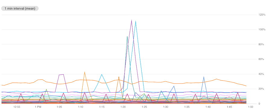
This chart contains many lines and is difficult to interpret. To restrict the chart to only shows the top three lines, ranked by mean, use the Sort & Limit fields. A small annotation on the chart describes the display criteria. In the background, shown in gray, is an outline of all time-series data. You cannot disable the gray content.
Charts on dashboards
To configure a chart to display the top or bottom outliers, do the following:
-
In the Google Cloud console, go to the
 Dashboards page:
If you use the search bar to find this page, then select the result whose subheading is Monitoring.
- In the toolbar of the Google Cloud console, select your Google Cloud project. For App Hub configurations, select the App Hub host project or the app-enabled folder's management project.
- Select a dashboard.
- In the chart's toolbar, select edit Edit.
In the chart's Query pane, go to the Sort & limit element, and then complete the dialog. The options let you select how time series are ranked and whether you want the top or bottom outliers to be shown.
If the Sort & limit element isn't shown, then click add Add query element.
Metrics Explorer
To configure a chart to display the top or bottom outliers, do the following:
-
In the Google Cloud console, go to the leaderboard Metrics explorer page:
If you use the search bar to find this page, then select the result whose subheading is Monitoring.
- In the toolbar of the Google Cloud console, select your Google Cloud project. For App Hub configurations, select the App Hub host project or the app-enabled folder's management project.
- Select a resource type and metric type to chart.
In the chart's Query pane, go to the Sort & limit element, and then complete the dialog. The options let you select how time series are ranked and whether you want the top or bottom outliers to be shown.
If the Sort & limit element isn't shown, then click add Add query element.
Compare current to past data
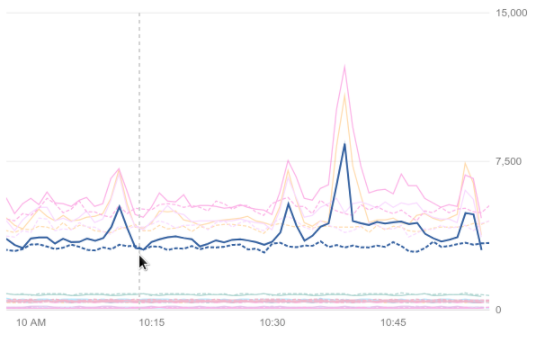
The Compare to Past option lets you select a time range from the past by specifying the hours, days, or weeks. The data from that time range is then superimposed as a dotted line over the current data on a line chart. The legend also shows past and present values.
Compare to Past is available only for line charts.
The data superimposed on your chart is for the same display period as your chart, but from the specified time in the past. For example, consider a chart that shows data from 10am to 11am. If you specify data from 2 weeks ago as 'past data', then you see data collected between 10am and 11am on the day two weeks past.
If there is no data available from the requested period, then there aren't any changes on the chart.
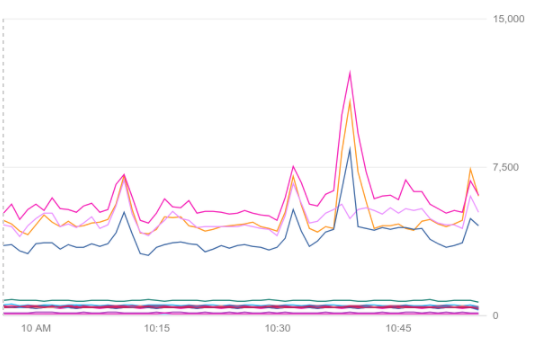
The following screenshots show the same chart with and without the data from 2 weeks ago.
Without past data:
With past data and one time series highlighted:
Charts on dashboards
To compare current to past data on a chart, do the following:
-
In the Google Cloud console, go to the
 Dashboards page:
If you use the search bar to find this page, then select the result whose subheading is Monitoring.
- In the toolbar of the Google Cloud console, select your Google Cloud project. For App Hub configurations, select the App Hub host project or the app-enabled folder's management project.
- Select a dashboard.
- In the chart's toolbar, select edit Edit.
- In the Display pane, click the Compare to Past option.
Set the Value and Scope fields to specify how far in the past to go.
For example, if Value is
2and Scope isweeks, then the chart displays the current data and data from the 2 weeks in the past.
Metrics Explorer
To compare current to past data on a chart, do the following:
-
In the Google Cloud console, go to the leaderboard Metrics explorer page:
If you use the search bar to find this page, then select the result whose subheading is Monitoring.
- In the toolbar of the Google Cloud console, select your Google Cloud project. For App Hub configurations, select the App Hub host project or the app-enabled folder's management project.
- Select a resource type and metric type to chart.
In the chart's Display pane, expand expand_more Compare to past, select Enable compare to past, and then enter a value for the Timeshift duration.
For example, if the Timeshift duration field is set to 1w and the time-range selector is set to Last 1 hour, then the chart displays one hour of current data and one hour of data from two weeks in the past.
Configure heatmap chart options
Heatmap charts display distribution-valued metrics. This section describes how you can modify the displays of these charts to show percentiles and exemplars. Exemplars are a way to associate arbitrary data with metric data. You can use them to attach non-metric data to measurements. One use of exemplars is to associate trace data with metric data. When Monitoring displays the metric data, the chart is annotated when an exemplar exists. These annotations let you correlate your metric and trace data. For more information, see Correlate metrics and traces by using exemplars.
Show percentile lines on a heatmap chart
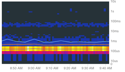
To hide or show the overlay of the 50th, 95th, and 99th percentile lines,
on a heatmap chart, click ![]() Percentile lines
in the chart toolbar. By default, the percentile lines are shown.
Percentile lines
in the chart toolbar. By default, the percentile lines are shown.
The following screenshot illustrates the chart with the percentile lines displayed:
Show only percentile lines on a heatmap chart
To hide or show the heatmap chart, click  Heatmap
in the chart toolbar.
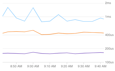
The following screenshot shows the chart when the percentile lines are shown but the heat map itself has been hidden:
Show exemplars on a heatmap chart
For heatmap charts on dashboards,
to hide or show Cloud Trace exemplars,
click  Trace exemplars in the chart toolbar.
Exemplars aren't always available.
The following screenshot illustrates a section of a heat map, each light-blue circle corresponds to a trace exemplar:
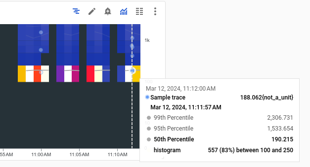
The previous heatmap was generated by running a Java instrumentation sample. This sample uses OpenTelemetry, an open-source tracing package, to instrument a Java application.
To view the details of a specific exemplar, select it. The displayed details include a graph that shows the trace spans. For more information, see Find and explore traces.
Show the chart configuration
Charts on dashboards
To view the configuration of a chart displayed on a dashboard, click query_stats Query stats:
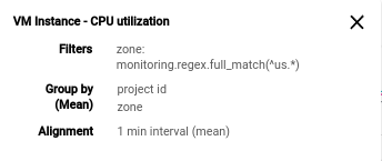
The previous example lists the metric type that is charted, the filters, the grouping options, and the alignment options.
Metrics Explorer
The chart configuration fields are always visible.
Show the chart legend
Charts on dashboards
You can show or hide the legends of all charts on a dashboard or of each chart individually:
- To show or hide the legends of every chart in a dashboard, in the dashboard toolbar, click settings Settings and then select Condensed or Table.
- To show or hide the legend of a particular chart, click unfold_more Expand legend, or select Expand chart legend in the more_vert More chart options menu.
Metrics Explorer
- To show a chart's full legend, in the toggle labeled Chart Table Both, select Both.
- To hide a chart's full legend, in the toggle labeled Chart Table Both, select Chart.
For more information, see Show and hide legends.
What's next
To filter widgets on a dashboard, do the following:
To configure the visual display of a chart by using the Google Cloud console, see Set chart display options.
To configure the chart legends by using the Google Cloud console, see Configure legends.
For an introduction to Cloud Monitoring metrics, see Metrics, time series, and resources.
To create your own metrics, see User-defined metrics and Log-based metrics.
